Hi@akhtar,
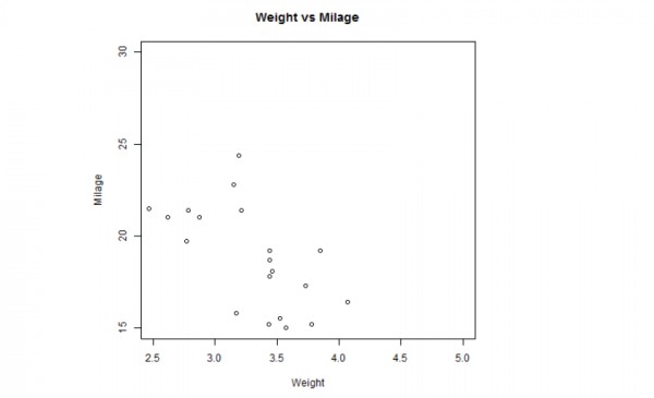
Scatterplots show many points plotted in the Cartesian plane. Each point represents the values of two variables. One variable is chosen in the horizontal axis and another in the vertical axis. The below script will create a scatterplot graph for the relation between wt(weight) and mpg(miles per gallon).
input <- mtcars[,c('wt','mpg')]
png(file = "scatterplot.png")
plot(x = input$wt,y = input$mpg,
   xlab = "Weight",
   ylab = "Milage",
   xlim = c(2.5,5),
   ylim = c(15,30),
   main = "Weight vs Milage"
)

 REGISTER FOR FREE WEBINAR
X
 Thank you for registering
Join Edureka Meetup community for 100+ Free Webinars each month
JOIN MEETUP GROUP