Hi@akhtar,
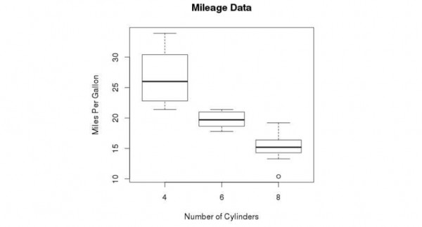
Boxplots are a measure of how well distributed is the data in a data set. It divides the data set into three quartiles. The below script will create a boxplot graph for the relation between mpg (miles per gallon) and cyl (number of cylinders).
png(file = "boxplot.png")
boxplot(mpg ~ cyl, data = mtcars, xlab = "Number of Cylinders", ylab = "Miles Per Gallon", main = "Mileage Data")

 REGISTER FOR FREE WEBINAR
X
 Thank you for registering
Join Edureka Meetup community for 100+ Free Webinars each month
JOIN MEETUP GROUP