Creating a stacked chart from 1 column in Power BI

0 votes
Hi. I have a column called "Test Type" that has 4 different results: good, tight, no seal and supercharged.

I want to create an stacked chart showing the total attempts (i.e. sum of all the test type) and the "good" results, so I can show an idea of the % of "good" results among all of the attempts of the test type.

Can you help me with this?

thanks
Jul 30, 2020 in Power BI by veronicabello
• 120 points
1,489 views
So you have a requirement of creating a stacked chart from the data in a single column? Is that what you meant?

1 answer to this question.

0 votes

Hi @Veronicabello,

Follow the below steps:

1. Create a group with the elements that you need in the stacked column.

Right-click on the column and click New Group.
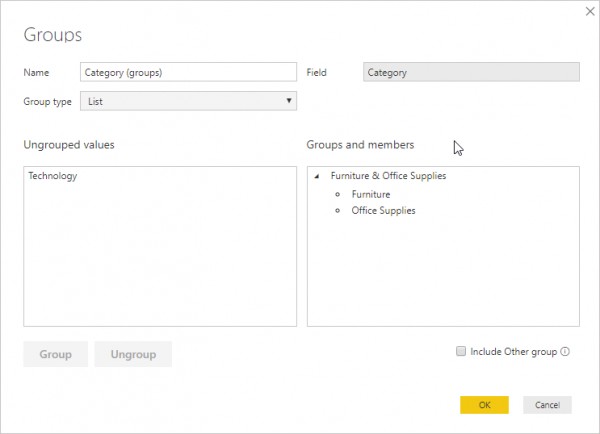
Select the values in field and click on Group. Click ok.

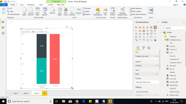
2. Place the created group column in Axis and measure or aggregated column in Values.

3. Drop the column in legend and select vertically stacked column chart.

You can see a stacked column and other individual columns.

Example- 
Hope it helps!.

answered Aug 3, 2020 by Reshma

Related Questions In Power BI

+1 vote
1 answer

Stacked and a independent column chart in power BI

Hi Rahul, Follow the below steps: 1. Create a ...READ MORE

answered Jun 12, 2019 in Power BI by anonymous
• 33,030 points
9,789 views
0 votes
0 answers

Creating Stacked Column Chart without unpivot of data in Power Query

h READ MORE

Jan 21, 2020 in Power BI by Prakash
• 140 points

closed Mar 24, 2020 by Sirajul 612 views
0 votes
0 answers

Creating Stacked Column Chart without unpivot of data in Power Query

​Hello, For creating Stacked Column Chart into PBI, ...READ MORE

Jan 21, 2020 in Power BI by Prakash
• 140 points
854 views
+1 vote
1 answer

Have column with multiple values in powerBI, for use with a slicer in power bi

It can be achieved depending on the result you ...READ MORE

answered Oct 22, 2018 in Power BI by Hannah
• 18,570 points
7,001 views
0 votes
1 answer

How do you add a slicer from different table in Power BI?

In order to add a slicer from ...READ MORE

answered Mar 5, 2019 in Power BI by Phalguni
• 1,020 points
1,277 views
0 votes
1 answer

How can I get a column value from previous row in Power Query?

Hi Sindhu, add this line as your ...READ MORE

answered Mar 18, 2019 in Power BI by Cherukuri
• 33,030 points
7,638 views
+2 votes
2 answers

How can we merge two metrics in microstrategy?

So far we saw reporting with one ...READ MORE

answered Feb 8, 2019 in MicroStrategy by Suresh
• 720 points
3,649 views
0 votes
1 answer

motion charts - Tableau

Motion charts can be obtained by using ...READ MORE

answered Jun 20, 2019 in Tableau by Cherukuri
• 33,030 points
747 views
0 votes
1 answer

How to plot 3D charts in Python?

Hi@akhtar, Python is capable of creating 3d charts. ...READ MORE

answered Jun 29, 2020 in Python by MD
• 95,440 points
944 views
0 votes
0 answers

Php / Html - How can I draw a graph of an array?

I discovered an array's mean, mode, median, ...READ MORE

Aug 16, 2022 in HTML by Deepak
• 980 points
605 views
webinar REGISTER FOR FREE WEBINAR X
REGISTER NOW
webinar_success Thank you for registering Join Edureka Meetup community for 100+ Free Webinars each month JOIN MEETUP GROUP