


Tableau Certification Training Course
- 61k Enrolled Learners
- Weekend
- Live Class
(23050)


 Copy Link!
“Tableau is a trending and market-leading BI tool used to visualize and analyze your data in an easily digestible format. It allows you to work on live data and spend more time on data analysis rather than data wrangling.” Well, this was just an overview of Tableau; let’s proceed and understand what Tableau is.
This blog is the first of the Tableau Tutorial blog series by edureka. Tableau is one of the most sought-after skills in Data Visualization. In this part of the blog series “What is Tableau?”, I will explain what Tableau is and how to work on it, showcasing you the real power of data visualization using Tableau.
This example of Anscombe’s Quartet will show you the Power of Data Visualization.
Now you would ask “ what is Anscombe’s quartet? ”
Well, Anscombe’s quartet comprises four datasets that have nearly identical simple descriptive statistics, yet appear very different when graphed. Each dataset consists of eleven (x,y) points.
In the below image, you will notice that the data points in each dataset is very similar, but when you create a graph for the same, each dataset comes up with its own visualization.
[/vc_column_text][/vc_column_inner][/vc_row_inner]
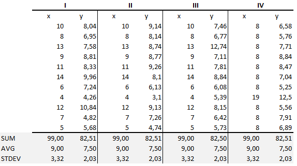
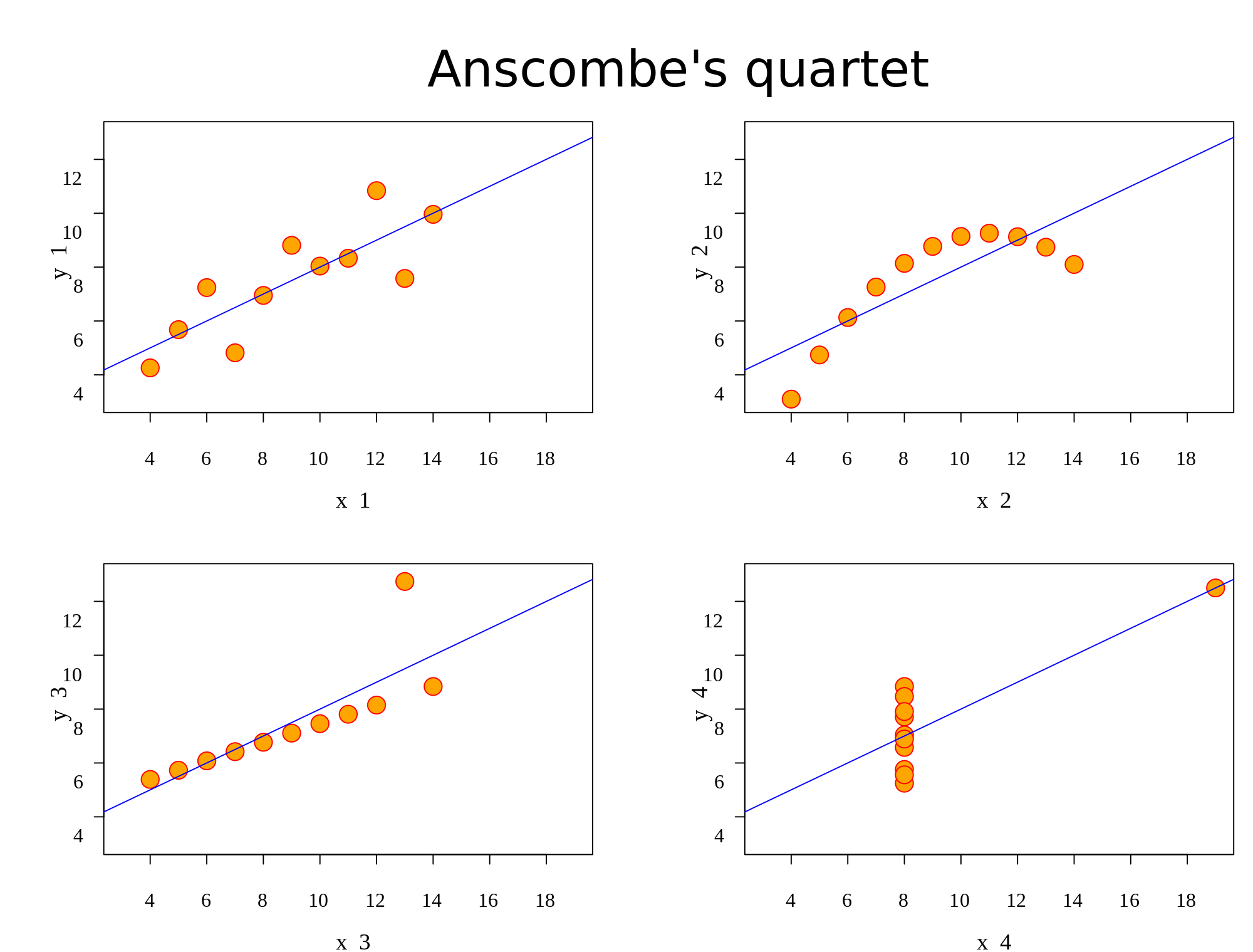
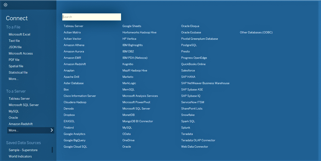
Tableau easily connects to nearly any data source, be it corporate Data Warehouse, Microsoft Excel or web-based data

Tableau allows you to connect and perform analysis on your live data.
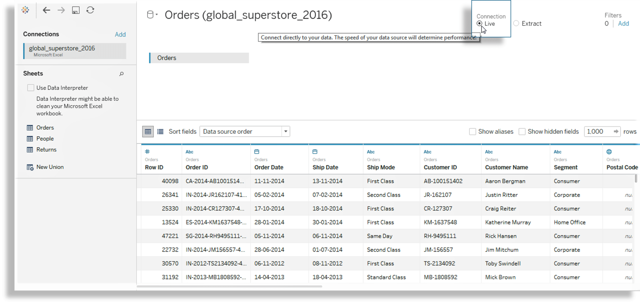
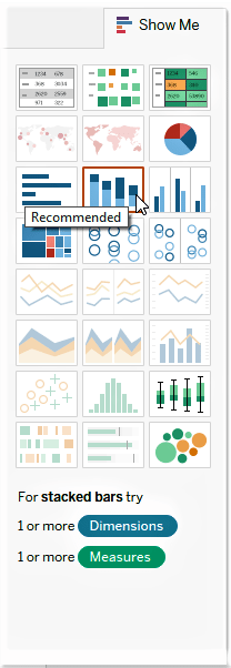
Tableau is awesome at recommending which visualization to use. Show Me smartly highlights view types (graphs) that work best with the field types (Attributes) in your data.
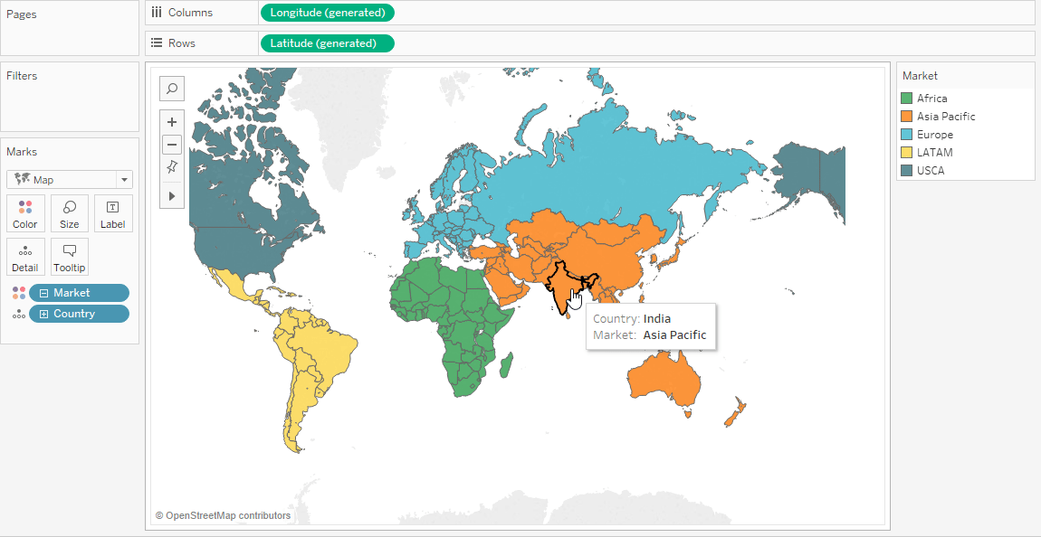
Unlike other BI Tools using Map in Tableau is very simple.You can easily select it from the ShowMe list.

Use Tableau and get connected to different data sources from files and servers. You can work on various file formats like CSV, JSON, TXT or even get your data imported from servers like Tableau Server, MySQL, Amazon Redshift & many more.
[/vc_column_text][/vc_column][/vc_row]
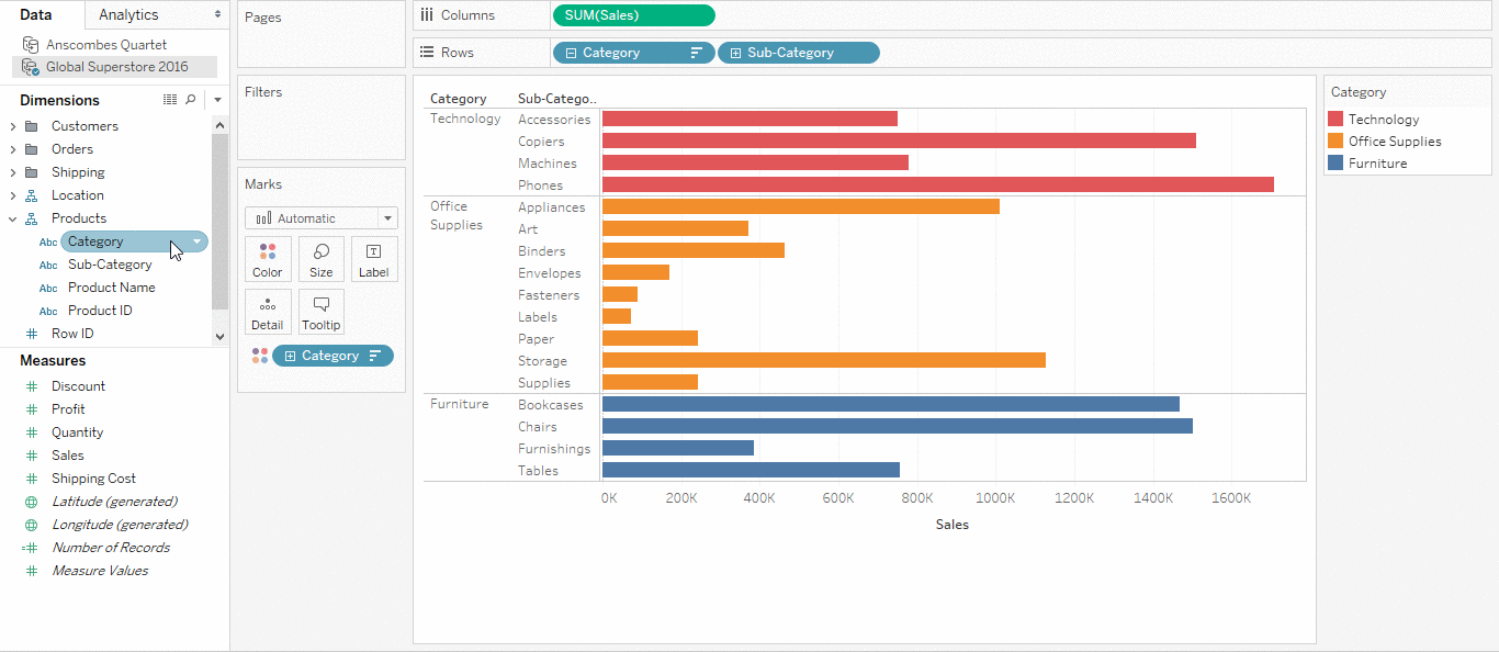
Since we have established connection with Tableau, now its turn to understand Tableau’s UI and see how fields from the Measures and Dimension (under the Data Pane) play an important role in creating visualization. You will also learn about Page Shelf, Filter Shelf and Marks Card.
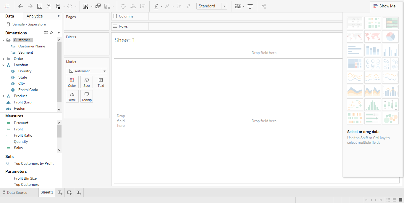
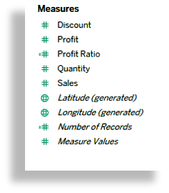
Measures are the fields which can be measured, aggregated or used for different calculation purpose. It helps you to answer your business-related questions. Generally, a field containing a numeric value is placed under the measure.
Ex: Discount, Profit, Sales, etc
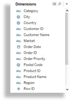
The dimension consists of those values which cannot be aggregated. It is used for categorizing facts.
Ex: Category, Country, City, etc
Page Shelf allows you to analyze your data based on the individual values contained within a field. It creates a set of pages, with a different view on each page.
Filter Shelf allows you to add or remove data from your view. You can add Dimensions and Measures from the data pane to filter shelf to filter your data. Once filtered the fields will be displayed on the Filter Shelf.
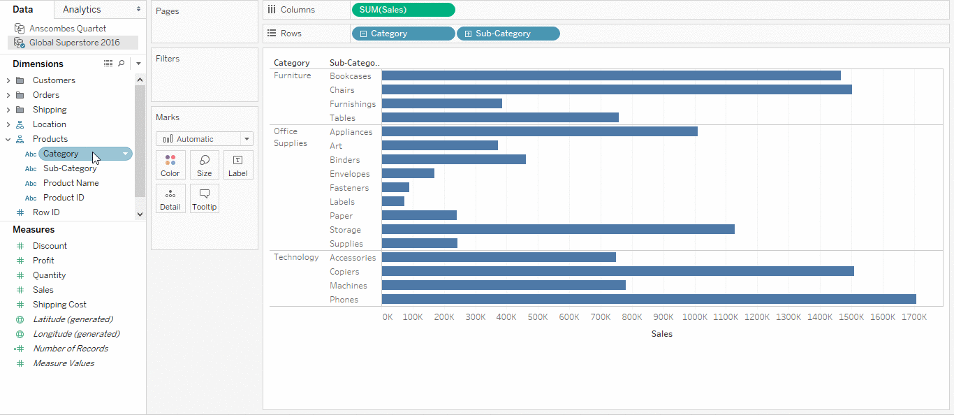
Use Row and Column Shelf to add dimension and measure to complete the visualization. Row is treated as the X-Axis and Column as Y-Axis.
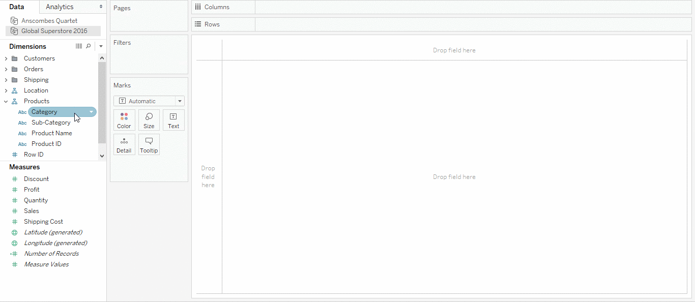
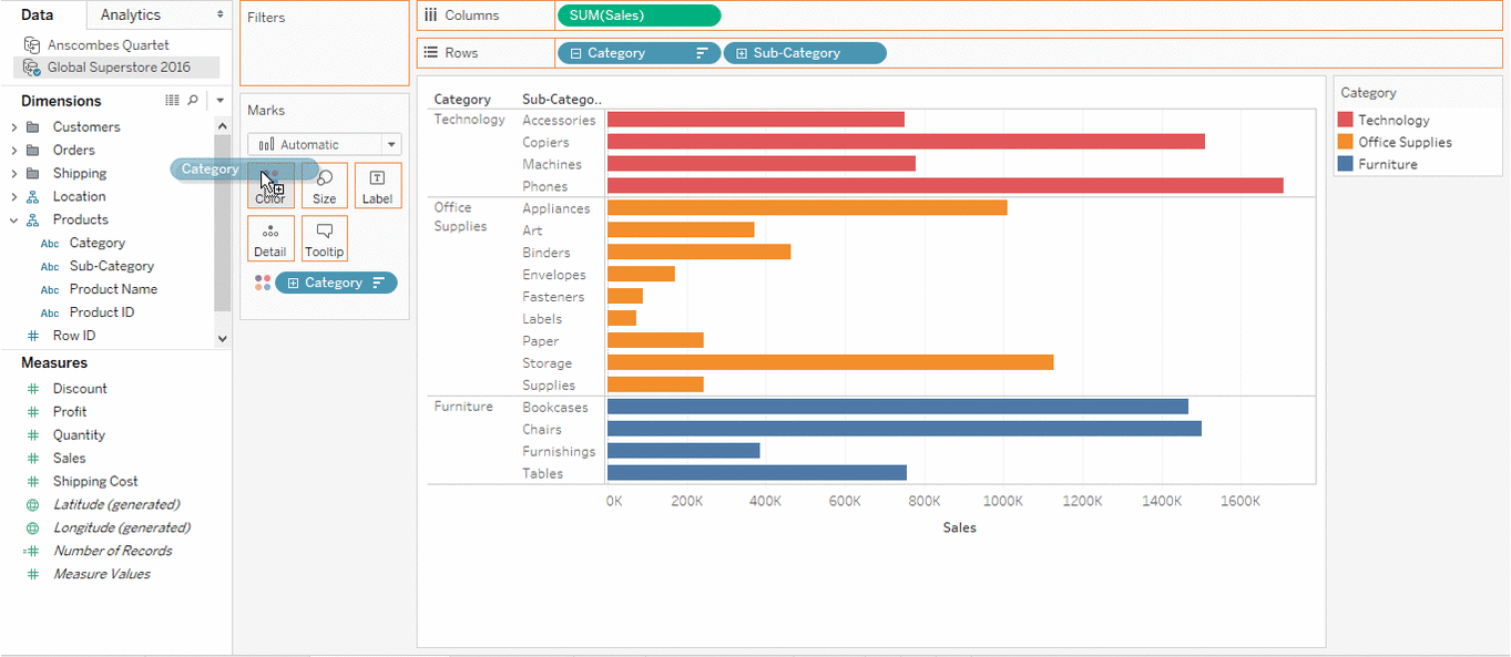
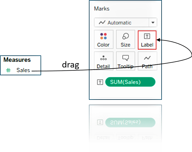
Mark Shelf is a region in Tableau where you can drag your fields to set mark properties.It helps you in enhancing visualization by setting colour, size, label, detail, path or shapes.
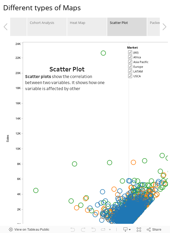
I guess by now you are well versed with Tableau’s Terminologies. Lets move ahead and explore some of the visualization which you can easily create in Tableau. Following is an interactive visualization where you can explore the different types of graphs including: Bar Chart, Heat Map, Scatter Plot, Packed Bubble and few others.
I hope you got a fair idea of “What is Tableau?” from this blog. Still hungry for more knowledge? Don’t worry the next blog on Tableau Tutorial will give you better understanding of the tool. I will showcase many real-life scenarios in that blog. If you wish to master Tableau, Edureka has a curated course on Tableau Training Certification which covers various concepts of data visualization in depth, including conditional formatting, scripting, linking charts, dashboard integration, Tableau integration with R and more.
If you are interested in getting certified in Tableau, hit the below button to explore more about Data Visualization Using Tableau Training and Certification by Edureka. You can also subscribe to our YouTube Channel to get more free content from Edureka.


 Thank you for registering Join Edureka Meetup community for 100+ Free Webinars each month JOIN MEETUP GROUP


Very Informative, very helpful !!! .. share more tips and tricks
Hey Sameer! Thank you for appreciating our work. We keep updating our blogs on a regular basis. Do subscribe and stay connected with us. Cheers :)