


Advanced Power BI Certification Course with G ...
- 13k Enrolled Learners
- Weekend
- Live Class
(4230)


 Copy Link!
This article will introduce you to various ways to use Dual Axis Charts in Tableau.
Dual-axis charts in Tableau are named so because they have two independent axis layered on top of each other.More often than not, they display a combination of different mark types.
For example, here you can create a visualization displaying a measure with bars on one axis and lines on the second. This is one of my favorite chart in Tableau because there’s the ability to add a new axis, and yet have individual control over the axes. This unlocks some additional flexibility that creates several practical applications that can be used to improve your analysis, user experience, and design.
This post will show you how to build a dual-axis chart in Tableau as well as three different ways to use them:
Before moving on with this article on Ways To Use Dual Axis Charts in Tableau check out this video to learn more about Tableau Charts in detail.
So, I’m going to be using the Sample – Superstore dataset provided by Tableau. Now, let’s begin by making a traditional dual-axis combination chart.
You might be familiar with it, but I’ll also be sharing a second approach that you may not know which might save you a click or two.
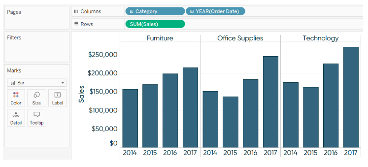
This first chart portrays sales by year as bars on one axis, and profit ratio by year as lines on the other; both measures shall also be broken down by the Category dimension.
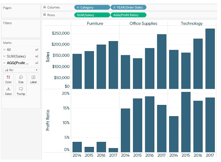
Next, let’s place the second measure which is the Profit Ratio on the Rows Shelf.
At this point, you have two individual bar charts on two rows. There are two ways in which you can convert these two separate bar charts into a dual-axis bar chart.
First, and the way most people learn, is to right-click on the second measure pill on the Rows Shelf, and choose Dual Axis.
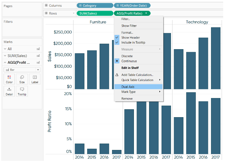
The second and a slightly more efficient method is to hover over the axis of the second row.
In both cases, you end up with a dual-axis bar chart.
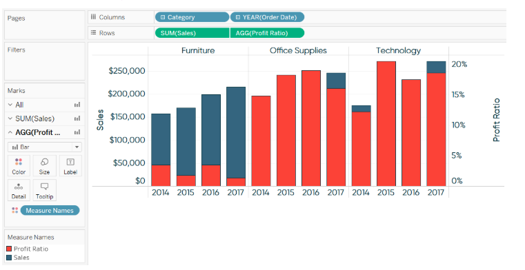
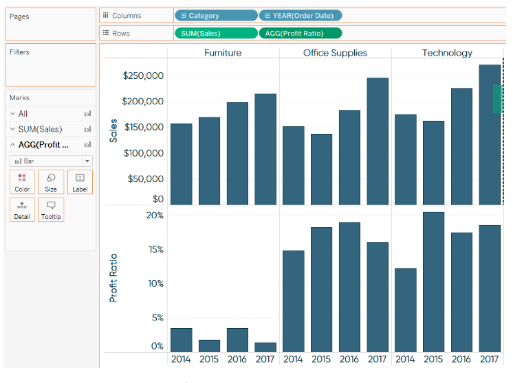
Traditionally this should work better with a dual-axis combination chart. So, that’s what we’re going to do.
Now, for a dual-axis combination chart, we need a combination of mark types. When you have more than one measure on the Rows Shelf and/or Columns Shelf, each measure ends up getting its own Marks Shelf. What this means is that you can edit the mark types for the measures independently of each other.
Here’s how the final view looks after I change the mark type of Profit Ratio from bar to line.
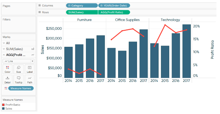
Lines should strictly be used when there is a relationship between the data points over time or if they’re being connected by a continuous dimension / measure. Discrete fields are processed in a particular order on the Rows Shelf or Columns Shelf in Tableau.
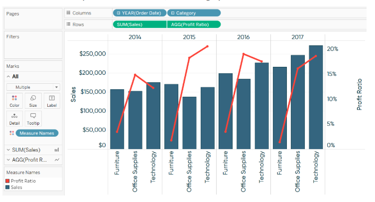
So for this example, Sales and Profit Ratio are broken down by the Category dimension first, then the Year(Order Date) dimension second. That works, but what if we wanted to break the two measures down by first the Year(Order Date) and then Category? Here’s how it’d look:
Moving on with this article on Ways To Use Dual Axis Charts in Tableau
The following graph is a remake of the CNN Money Calculator from money.cnn.com.
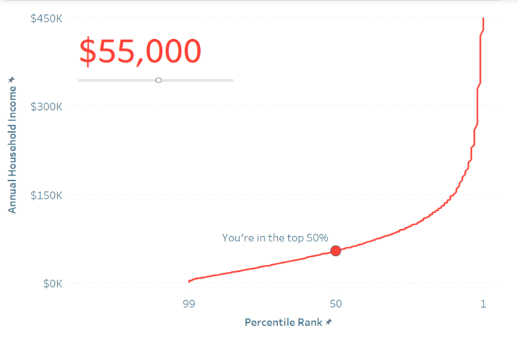
The given viz features a curve that shows how each household income ranks by percentile. This is a very common “descriptive” view that describes high-level statistics. The real value is obtained by using the second axis to display where the individual using the dashboard, ranks on that curve. This makes the user a part of the story and is a way more engaging user experience.
To achieve this effect, I used a parameter in Tableau, which comes in-buit, that would allow the end user to choose any of the household income options between $2,000 and $450,000. After making this selection, the circle moves to the appropriate place based on user selection. Also, the label would get updated with a caption telling the end user what percentile rank their household income is in.
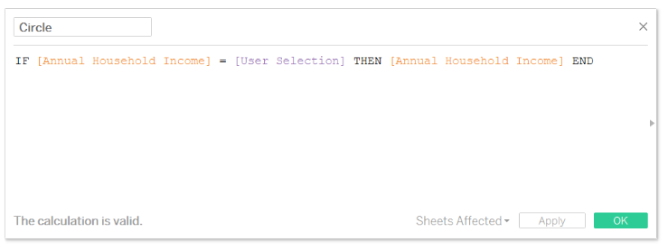
This is a dual-axis combination chart. The curve for the left axis uses the mark type of a line chart, and the circle is a second measure that only displays a circle for the end user’s selection on the right axis. The trick to getting just one circle to show up is this simple formula that computes whether the user’s parameter selection matches the household income value on the Y-axis.
Once you have this calculation, you can build the curve on the left axis and put the measure for the circle on the right.
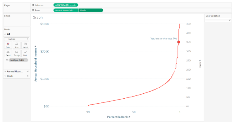
To finalize this view, you can synchronize the axes by right-clicking the axis for Circle and select the Synchronize Axis option. This ensures the circle to line up perfectly with the line on the opposite axis. Lastly, hide the axis on the right by right-clicking on it and unchecking the option Show Header.
Moving on with this article on 3 Ways To Use Dual Axes Charts in Tableau
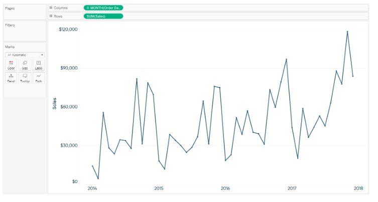
Suppose you have a line graph showing sales by month trend.
Now I’ll put the Sales measure on the right axis, synchronize both of these axes, and change the mark type for the second axis to Area.
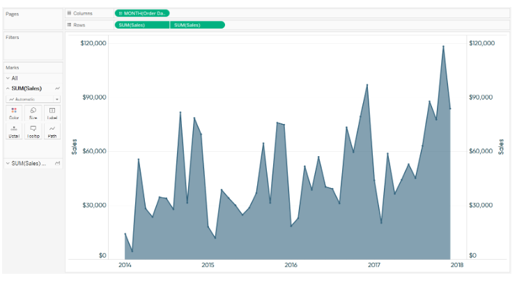
At this point we have a dual-axis combination chart with Sales by month as a line graph and as an area chart. To finalise the view, hide the right axis and reduce the opacity of the area to 10%.
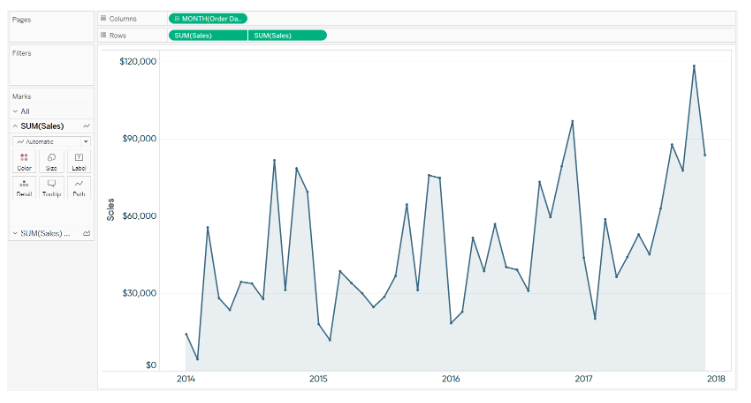
You can only use the second axis for a single purpose at one time. But if you are not using it for one of the former two reasons produced above, this is a third application that can serve to enhance your traditional line graphs.
This brings us to the end of this article on Ways To Use Dual Axis Charts in Tableau.
If you wish to master Tableau, Edureka has a curated course on Tableau Training Course which covers various concepts of data visualization in-depth, including conditional formatting, scripting, linking charts, dashboard integration, Tableau integration with R, and more. It comes with 24*7 support to guide you throughout your learning period. New batches are starting soon.
Got a question for us? Please mention it in the comments section and we will get back to you at the earliest.


 Thank you for registering Join Edureka Meetup community for 100+ Free Webinars each month JOIN MEETUP GROUP