In this article we will understand Transform In CSS in detail and follow it up with a detailed practical demonstration. Following pointers will be covered in this article,
With the advancement in the website functionalities, it is equally important to provide clever integrations on your website to make it appealing and better. Adding various CSS elements that compliment your site are the need of the hour.
People stay off the websites that don’t really appeal to the masses. So, how about trying to transform some of the elements and beautify your CSS with a lesser compression value.
To fulfill similar needs, we have transform CSS property that transforms elements by either skewing, rotating, scaling, or translating them.
Moving on with this article on Transform In CSS
What is transform CSS?
Transforming a CSS element means to provide it an edge in either 2D or 3D form. It visually changes the styling of an element.
2D transformation works on X and Y axes. You can provide any edge or structure on both the axes to make changes. While for 3D transformation, it needs to work on X, Y as well as Z axes to provide the depth needed. For more check out this full stack developer course today/
CSS 2D transform properties:
| Function | Description |
matrix(n,n,n,n,n,n) | Matrix of six values |
translate(x,y) | Allows the element to move along the X- and the Y-axis |
translateX(n) | Allows the element to move along the X-axis |
translateY(n) | Allows the element to move along the Y-axis |
scale(x,y) | Changes the width and height of the elements |
scaleX(n) | Changes the element’s width |
scaleY(n) | Changes an elements height |
rotate(angle) | Allows to rotate the element in an angle which is specified in the parameter |
skew(x-angle,y-angle) | Skews the element along the X- and the Y-axis |
skewX(angle) | Skews the element along the X-axis |
skewY(angle) | Skews the element along the Y-axis |
CSS 3D transform properties:
Property | Description |
transform | Applies a 2D or 3D transformation to an element |
transform-origin | Allows you to change the position on transformed elements |
transform-style | Specifies how nested elements are rendered in 3D space |
perspective | Specifies the perspective on how 3D elements are viewed |
perspective-origin | Specifies the bottom position of 3D elements |
backface-visibility | Defines whether or not an element should be visible when not facing the screen |
For example:
css
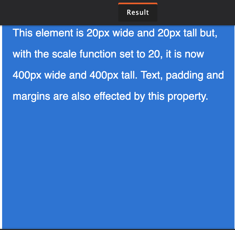
.element {
width: 20px;
height: 20px;
transform: scale(20);
}
Now, when you do so, the defined element will be scaled by 20 times.
Not only this, you can also scale axis wise for horizontal scaling and vertical scaling.
transform: scaleX(2);
transform: scaleY(.5);
To provide a proper transformation across all the browsers you can:
div {
-webkit-transform: scale(1.5);
-moz-transform: scale(1.5);
-o-transform: scale(1.5);
transform: scale(1.5);
}
The transform CSS property improves the coordinate space of the CSS visual formatting level.
What is visual formatting level?
Visual formatting level means to process a document and visually present it on the media platforms. With visual formatting, you can transform each element as a model that agrees with the CSS box model. CSS box model defines an element in a standard rectangular box format defining the size, position, and properties.
Note: Only transformable elements can be transformed.
Moving on with this article on Transform In CSS
What are the various transform properties?
Let’s look at all the transforming properties:
1.scale(): Scaling means to change the size of the element either horizontally or vertically.
For vertical scaling: scaleX
For horizontal scaling: scaleY
For an element, you can also change the font-size, padding, height, or width. The default value is 1 which also means providing 0.5 as the value halves it while providing 2 doubles the scaling.
2. skew(): Skew property allows a user to tilt an element to the right or left from one coordinate point. It is almost like turning a rectangle into a parallelogram. You can skew an element by its coordinates.
Example:
.element {
transform: skewX(25deg);
}
.element {
transform: skewY(25deg);
When you do so, the element skews 25 degrees horizontally and vertically by using skewX or skewY.
3. rotate(): You can rotate an element clockwise by using this property. You can rotate it 180 degrees or 360 degree to bring it back to its original place.
.element {
transform: rotate(25deg);
}
For providing rotation too, you can use any of the three dimensions: rotateX, rotateY, or rotateZ.
4. translate(): You can move an element properly upside down or sideways.
.element {
transform: translate (20px, 10px);
}
Translate will move an object/element specified upside down or sideways. The first specified value moves the object right wards (negative will move it left side) and the second value moves it down (specifying a negative value will move it upwards).
If this might confuse you, then apply the X axis to change the position of element horizontally and Y axes to change the position vertically. The most amazing aspect about transform property is that, applying transform will only allow the element to move, keeping every other element or text intact. The distance is generally taken in pixels or percentages.
For example:
.element {
transform: translateX (value);
transform: translateY (value);
}
5. perspective(): You can provide a depth in the perspective of an element. It allows to give a 3D transformation to an element by making it cubical in the transformation.
translate3d(x, y, z)
translateZ(z)
translate3d(x, y, z) translateZ(z)
The introduction of z axis gives the element a 3D visualisation. translateZ() moves the element toward the viewer while a negative value moves it away.
6. matrix(): Combine all the transforms into one.
rotate(45deg) translate(24px, 25px)
Applying matrix() combines all the transform properties in one array.
Applying transform properties can greatly enhance your element and therefore your website appeal. Do try them!
This brings us to the end of this article on Transform In CSS.
Learn the secrets of stunning UI/UX design with our UI UX Design Course.
If you’re interested in learning more about web-development, check out the Web Development Certification Training by Edureka. Web Development Certification Training will help you Learn how to create impressive websites using HTML5, CSS3, Twitter Bootstrap 3, jQuery and Google APIs and deploy it to Amazon Simple Storage Service(S3).
If you are still interested If you have any question, you could post it in the comment section of this “What is CSS” blog, and we will get back to you as soon as possible.


