


Advanced Power BI Certification Course with G ...
- 13k Enrolled Learners
- Weekend/Weekday
- Live Class
(4230)


 Copy Link!
When you talk about Data Visualization, the first word that comes to your mind is – Tableau. I am guessing that’s why you might be here reading this Tableau tutorial because you have heard about the advantages of Tableau. The demand for tableau is at peak because of its increasing adoption in the market.
This is my first blog in this Tableau Tutorial blog series which will explain how to get started with Tableau. Hope you will enjoy learning about Tableau with this Tableau Tutorial blog.
Let us first start this Tableau tutorial by understanding the concepts behind Data Visualization.
Data Visualization is one of the most important part of data analysis. It has always been important to present the data in an understandable and visually appealing format. Data visualization is one of the skills that Data Scientists have to master in order to communicate better with the end users.
Data is the word here.
Let me first give you an idea of the kind and amount of data that we are dealing with. According to SiliconAngle, there was 2.5 zetabytes of stored data world over in the year 2012 and it is set to hit more than 50 zetabytes mark by the end of 2017. To put things in perspective, this data has largely been produced by websites and cross platform transactions. Add to it the fact that there would be a total of 20 billion “smart” devices connected to the internet by the end of 2020 and the numbers can be baffling!
Data visualization allows data scientists to converse with their end users. The outcome of data analysis is not immediately comprehensible to the people who do not directly deal with data. Data visualization bridges that gap and makes people appreciate the possibility of data analysis.
Let us consider the following example to understand this:
The following image shows the x and y co-ordinates of different points to be plotted on a graph. The numbers look almost the same, don’t they? Maybe the lines will look similar after we plot each set on the graph.
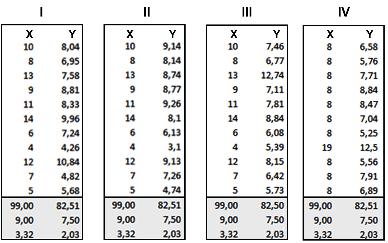
So, now take a look at the image below when we plot these points in our graph:
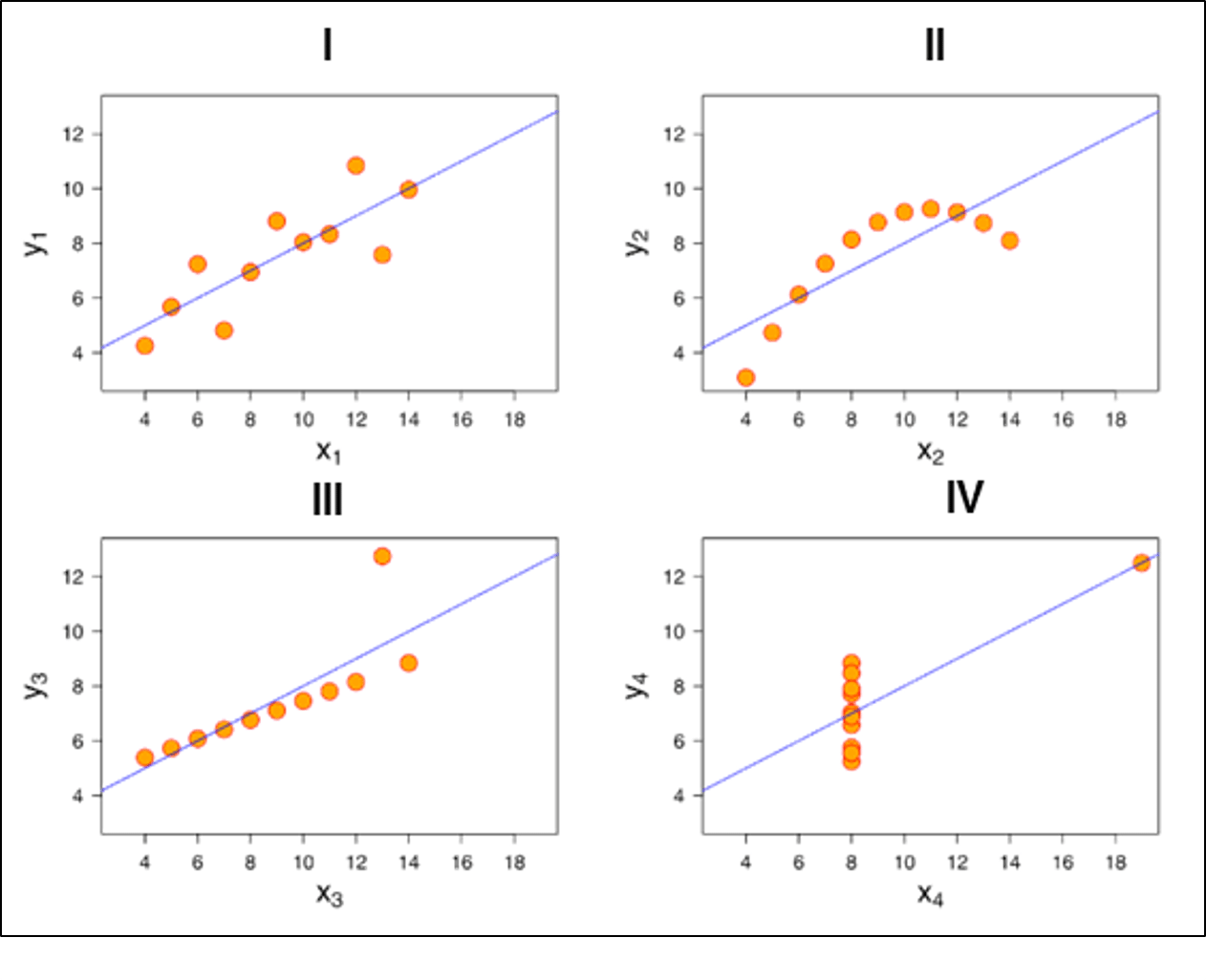
You see how different they look like when you actually visualize it. It wasn’t possible for us to figure out the nature of each line until we visualized it.
This Edureka Tableau Full Course video will help you understand and learn Tablea…
Here are the top 5 data visualization tools that are being used extensively in BI:
Let us know a little bit about all of them in this tableau tutorial.
 Tableau:
Basic version of Tableau data visualization tool is free which can perform regular tasks such as:
 Excel:
You can actually do some pretty complex things with Excel, from ‘heat maps’ of cells to scatter plots. As an entry-level tool, it can be a good way of quickly exploring data, or creating visualizations for internal use, but the limited default set of colors, lines and styles make it difficult to create graphics that would be usable in a professional publication or website.
 Microsoft Power BI:
Microsoft Power BI is a cloud-based business intelligence and analytics service that provides a full overview of your most critical data.
Connecting to all of your data sources, Power BI simplifies data evaluation and sharing with scalable dashboards, interactive reports, embedded visuals and more.
 Domo:
Domo:
Domo is designed to be available for all business users, regardless of technical expertise, to help them make better business decisions.
Domo recently launched Business Cloud, the world’s first open, self-service platform to run an entire organization. Business Cloud brings together the data, the people and the insights users need to find answers to critical business questions and make faster, better-informed decisions to improve performance.
 Qlikview:
The QlikView business discovery platform is one of a few visual analytics tools offered by Qlik. QlikView can’t create the same elegant visualizations that the other tools offer, but the software’s dynamic model means that you can quickly analyze your data in multiple dimensions. In addition, QlikView is able to work off of data in memory instead of off your disk, allowing for real-time operational BI environments (like monitoring financial transactions).
QlikView is able to work with a wide variety of data sources, including SAP, Oracle, Salesforce.com and other legacy data files like Excel spreadsheets. What’s more, QlikView can combine these disparate data sources into a single visualization or dashboard.
But now the big question is which tool should you go for? Well, I say go with Tableau. Take a look below to know why in our next section of Tableau tutorial for beginners.
Below are some of the pros or features of Tableau which will spellbind you to start using it right away!
Tableau Features:
1. Apt visualizations:
Tableau connects to many different data sources and can visualize larger data sets than Power BI can. Once in Tableau, a dashboard shows the basics of the users’ data. The user can then drill down into data sets by downloading a worksheet. From there, they can apply various visualizations to the data.
In Tableau, you select the data and switch between visualizations on the fly. It’s easier to jump between visualizations in Tableau.
Tableau visualizes data from the start, allowing you to see the significance right away. Tableau differentiates correlations using color, size, labels and shapes, giving you context as you drill down and explore on a granular level.
2. Depth of discovery:
The features of Tableau gives users ways to answer questions as they investigate data visualizations. The solution can show basic trends as predictions, use “what if” queries to adjust data hypothetically, and visualize components of data dynamically for comparisons.
3. Implementation:
Tableau provides a variety of implementation and consulting services. For enterprise-level deployment, there’s a four-step process spanning weeks, and for smaller-scale deployments, there are quick-start options that can complete setup in a matter of hours.
Tableau provides a variety of implementation and consulting services. For enterprise-level deployment, there’s a four-step process:
4. Automation functionality:
Tableau is a little more intuitive with creating processes and calculations. For example, when creating calculations in a tabular format, the formula can be typed once, stored as a field and applied to all rows referencing that source. This makes it easier to create and apply recurring processes. Tableau’s flexibility also allows users to create custom formulas that aren’t available in most of the tools.
5. Data source connectors:
Tableau offers hundreds of native connectors to easily pull, cleanse and correlate data from practically any source without having to create custom code.
Tableau extracts large data sets from sources for quick, ad-hoc analysis using two different methods: Live Connection and In-memory. Both adapt to your local database and, based on the size and capacity, sync data quickly by extracting the relevant data to a query. It also has a general Open Database Connectivity (ODBC) connection for any connections that don’t have a native connector provided. This is the reason, you can see an increasing demand graph for Tableau certification training.
In this tableau tutorial blog we will explore all about Tableau products.
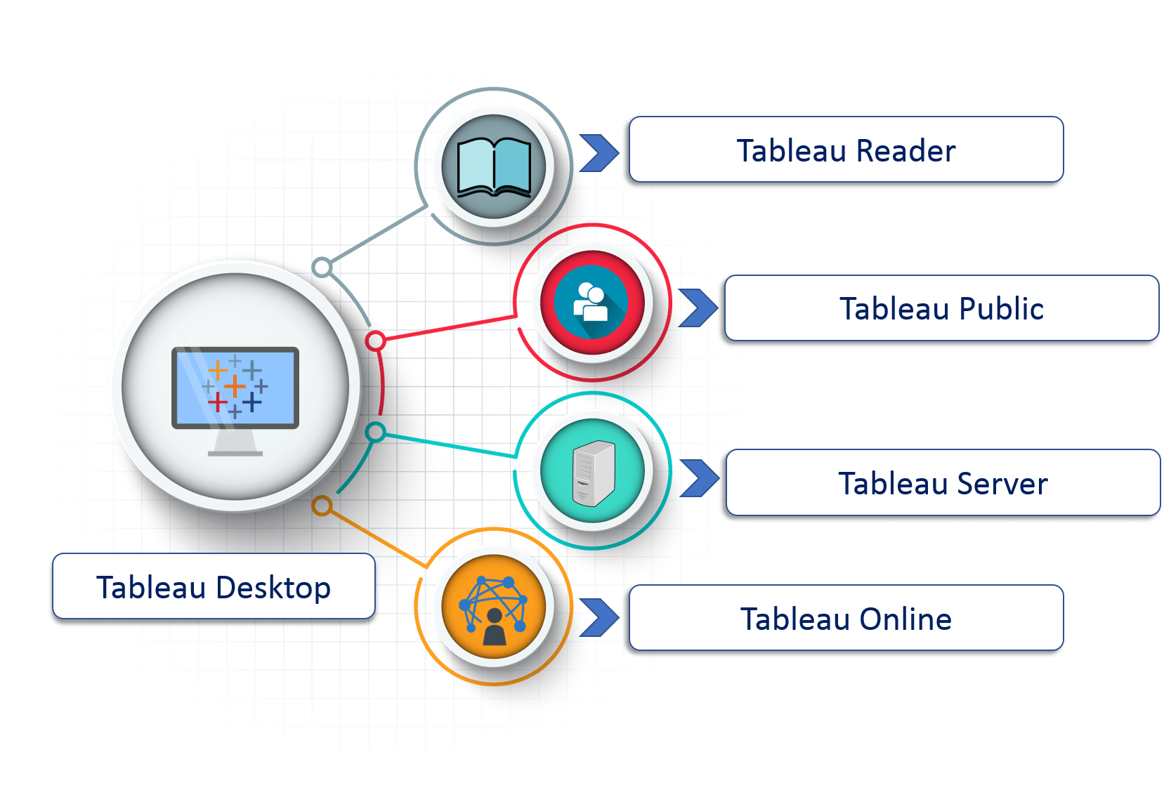 1. Tableau Desktop:
It is a self service business analytics and data visualization that anyone can use. It translates pictures of data into optimized queries. With tableau desktop, you can directly connect to data from your data warehouse for live upto date data analysis. You can also perform queries without writing a single line of code. Import all your data into Tableau’s data engine from multiple sources & integrate altogether by combining multiple views in a interactive dashboard.
2. Tableau Server:
It is more of a enterprise level Tableau software. You can publish dashboards with Tableau Desktop and share them throughout the organization with web-based Tableau server. It leverages fast databases through live connections.
3. Tableau Online:
This is a hosted version of Tableau server which helps makes business intelligence faster and easier than before. You can publish Tableau dashboards with Tableau Desktop and share them with colleagues.
4. Tableau Reader:
It’s a free desktop application that enables you to open and view visualizations that are built in Tableau Desktop. You can filter, drill down data but you cannot edit or perform any kind of interactions.
5. Tableau Public:
Tableau Public is a free Tableau software which you can use to make visualizations with but you need to save your workbook or worksheets in the Tableau Server which can be viewed by anyone.
Let us start by taking a look at the datatypes that Tableau supports. Refer to the diagram below which shows all the compatible data types of Tableau.
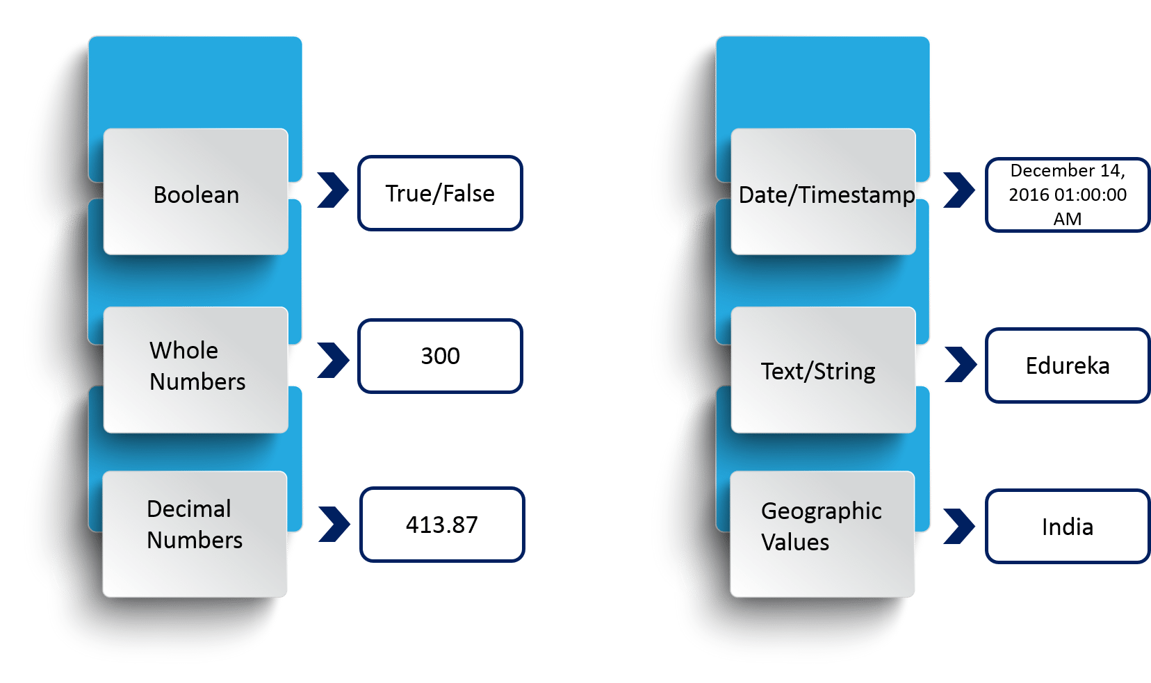
The above diagram shows you the data types that Tableau supports with respective examples.
Now, the data types that we are dealing with can also be categorized broadly into two categories and they are:
Refer to the diagram below to understand the differences between Dimensions and Measures.

In order to make it more understandable to you, A dimension is used to add more detail to describe your data. Lets move on to next part of Tableau tutorial.
You just need to follow the below 3-step mantra to use Tableau:
1. Connect to data
The first thing to do in Tableau is to connect to your data. There are mainly two types of connections-
Connecting to your local file or connecting to a server.
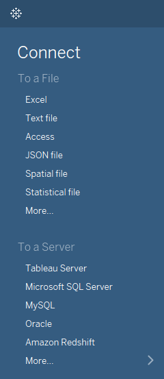
Tableau can connect to any local file or database such as-
Local connection gives the maximum speed of data processing.
Tableau can connect to your data server too. It can connect to almost any type of data server. Below are some of the most popular databases that Tableau can connect:
While working on Tableau, data can have Live Connection where any change in the source data will be automatically updated in Tableau. On the other hand, data can be Extracted to Tableau repository so that any change made here will not affect the original source data.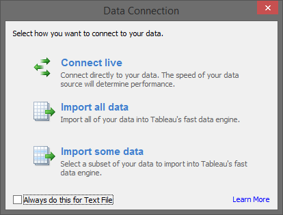
Data Joins
You can also integrate different data-sets together to link up and produce better insights. There are different ways to join data-sets. Refer to the diagram below to understand them all.
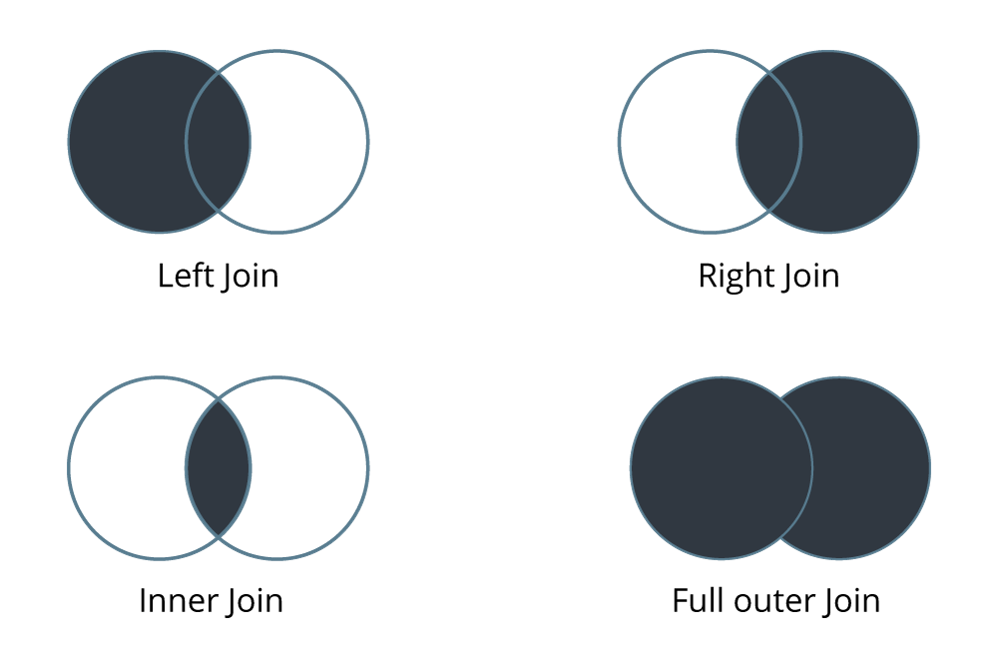
In the above diagram shows the four data-set join options available in Tableau.
2. Play around with the UI
This is how the user interface looks like:
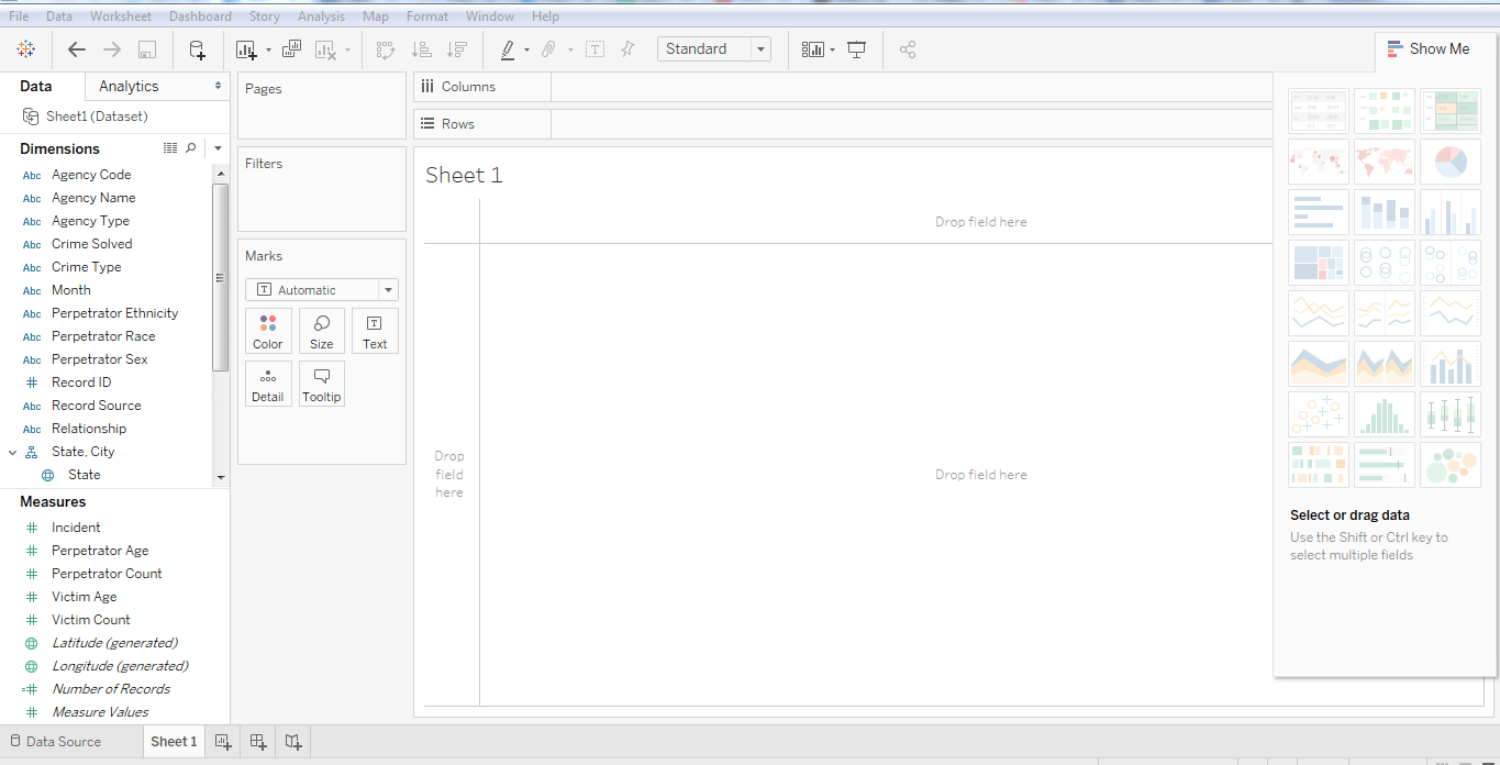
UI- Show me the data
This is the pane with which you can create visualizations. You can create different visualization in order to represent your dataset. The diagram below shows the ‘show me’ data pane:
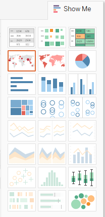
Some visualizations might not be available at times because of incompatible dataset.
Uncover the versatility of Tableau functions and transform your data analysis capabilities with our comprehensive guide.
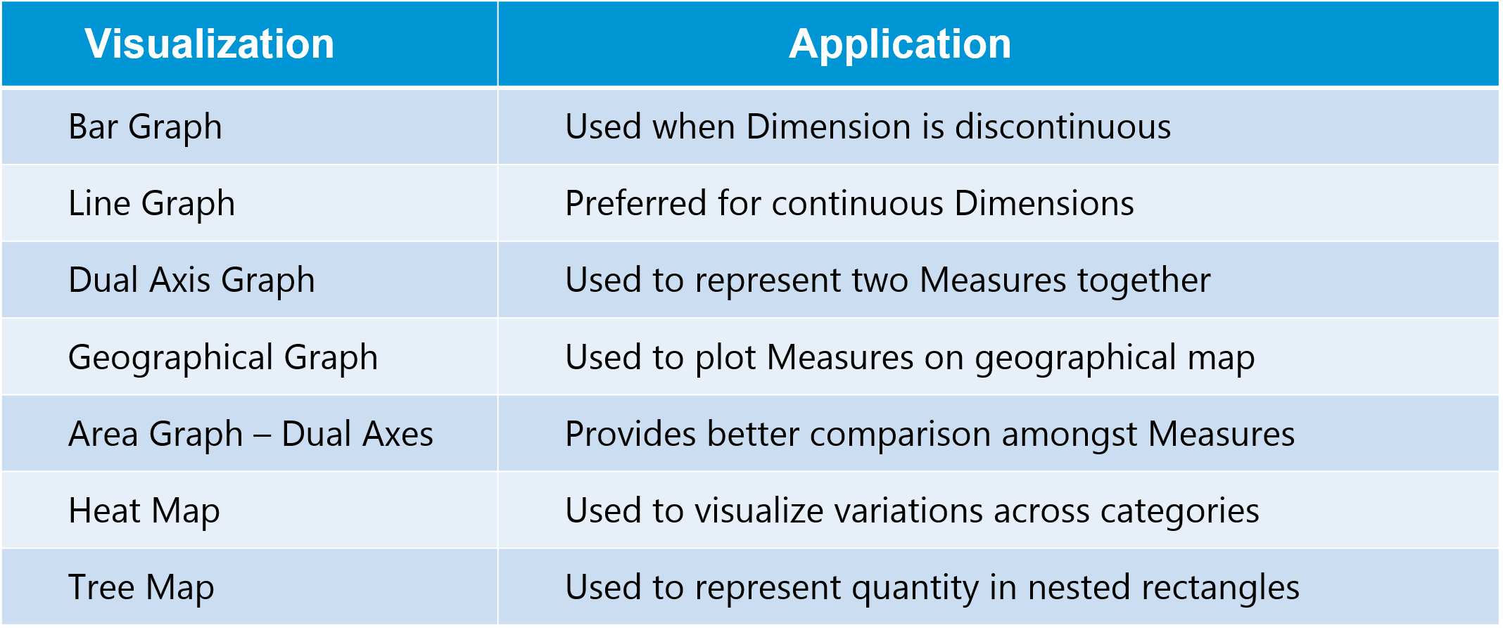
Below are the most popular visualizations used widely in Tableau:
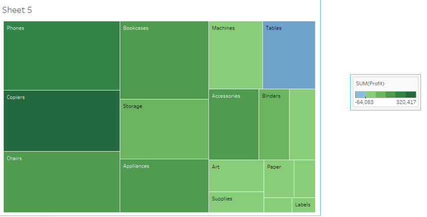
Tree Map
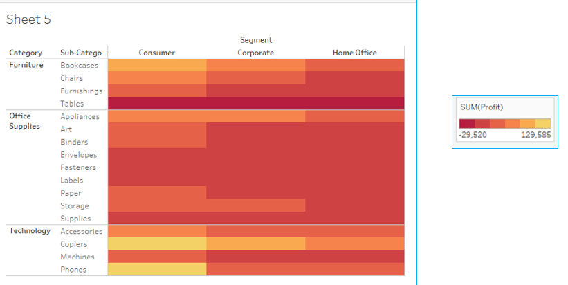
Heat Map
 Now let’s explore few more options available in our UI.
Menu
The menu bar in Tableau consists of various options to edit your visualization. Let me take you through them one by one.
![]() File menu
File menu
This Menu is used to create new Tableau workbook and open existing workbooks from both local system and Tableau server. The important features in this menu are:
Data Menu
This Menu is used to create new data source to fetch the data for analysis and visualization. It also allows you to replace or upgrade existing data source.
The important features in this menu are as follows:
Worksheet menu
This Menu is used to create new worksheet along with various display features like showing the title and captions etc.
The important features in this menu are as follows:
Dashboard menu
This Menu is used to create a new dashboard along with various display features like showing the title and exporting the image etc..
The important features in this menu are as follows:
Story Menu
This Menu is used to create a new story which has many sheets or dashboards with related data.
The important features in this menu are as follows:
Analysis Menu
This Menu is used for analyzing the data present in the sheet. Tableau provides many out of box features like calculating the percentage and doing a forecast etc..
The important features in this menu are as follows:
Map Menu
This Menu is used for building map views in Tableau. You can assign geographic roles to fields in your data.
The important features in this menu are as follows:
Format Menu
This Menu is used for applying the various formatting options to enhance the look and feel of the dashboards created. It provides features like borders, colours, alignment of text etc..
The important features in this menu are as follows:
Server Menu
Server Menu is used to login to the Tableau server if you have access and publish your results to be used by others. It is also used to access the workbooks published by others.
The important features in this menu are as follows:
3. Create Visualizations
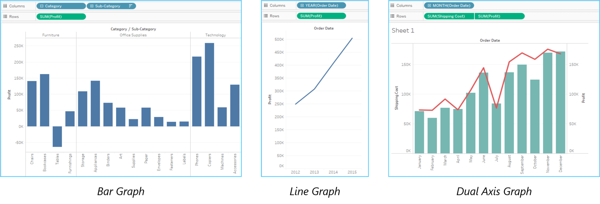
Above in this Tableau tutorial, you have seen the different The following table tells you how to choose the right visualization for your dataset out of many available options.
Now, let us have a look at a case study to understand how Tableau can help in solving real-life business problems in next section of Tableau Tutorial.
Learn to effectively break down and present cumulative data changes with stunning waterfall charts in Tableau. Transform complex datasets into clear, actionable insights.
Datamatics is the subsidiary of world’s largest bank based on market capitalization, dealing in securities and stocks investments. It provides services in all major areas of investment like equity, IPO, derivatives, mutual funds, insurance etc.
Business need:
Being a part of an extremely dynamic industry, tracking the slightest market development is of highest priority for the client. They needed a solution that could enable them to react quickly to the varying market trends. A solution that would be able to generate hassle-free, ad-hoc & secured reports that could provide accurate data visualization.
Challenges:
Unable to react quickly to market developments and regulatory requirements The existing system had a high turnaround time which delayed the overall decision making process.
Restricted and inflexible data visualization reports resulted in poor interpretation of data The system compromised on security aspects and had high IT support dependency Lack of effective versatility to do ad-hoc analyses from multiple viewpoints.
Solution:
Datamatics selected Tableau, a leading Data Visualization BI tool in the market. As per requirements gathered, various Dashboards and Reports were designed for various levels. Refer to the diagram below to understand how Datamatics made use of Tableau:
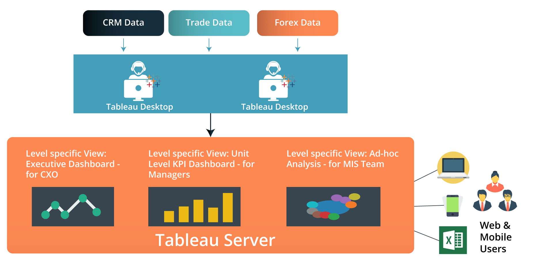
Tableau was connected with the existing data bases of the organization. Unique and relevant visual dashboards & reports were developed for people at different levels across the organization as well as to cater the day-to-day needs of different departments.
Results:
This is how Tableau helped Datamatics and has been helping many other companies worldwide. Elevate your data analysis game with Sets in Tableau – explore their power and potential in our comprehensive guide.
I hope you have enjoyed reading this Tableau tutorial blog. I will be coming up with more blogs in the coming days on Tableau. You will be learning how to make proper insights, dashboards, contributing viz and many more. Elevate your preparation and ace your Tableau developer interview with our expertly curated collection of Tableau interview questions.
Got a question for us? Please mention it in the comments section and we will get back to you at the earliest.


 Thank you for registering Join Edureka Meetup community for 100+ Free Webinars each month JOIN MEETUP GROUP
Nice information about tableau courses. it’s really useful guide for learners.