


Are you the one who builds outstanding dashboards for people in your company? If yes, then my friend you have crawled over to the right post. In this post, I’ve highlighted some of the amazing “Tableau tips and tricks” which you can apply right away and make your dashboards even more effective to stand out in the crowd.
You know what, you can create calendars within the tableau, or even animate your visualization.


Here are some Tableau tips and tricks for you:


1. Tableau tips and tricks: Calendar in Tableau
This is a simple yet an out of the box trick which you can use to impress your colleagues. Let’s learn how to create Calendar in just 4 steps!
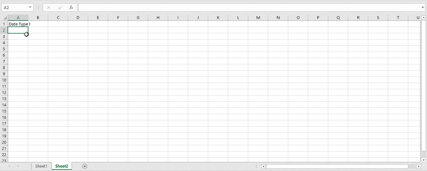
Step 1: Create a dataset for the year:
To start with, you need some data that has dates in it. For this blog, I simply went to Excel, entered 1/01/2018, and pulled down to 31/12/2018, saved the file in .xls format and connect the data-set to Tableau.

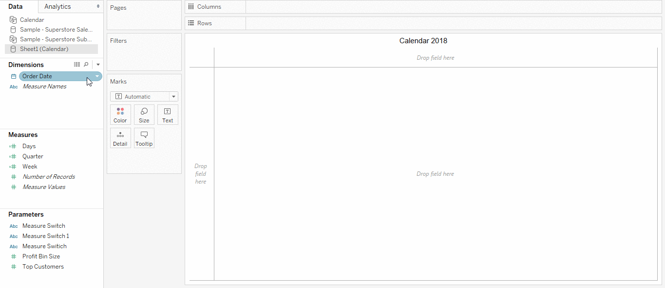
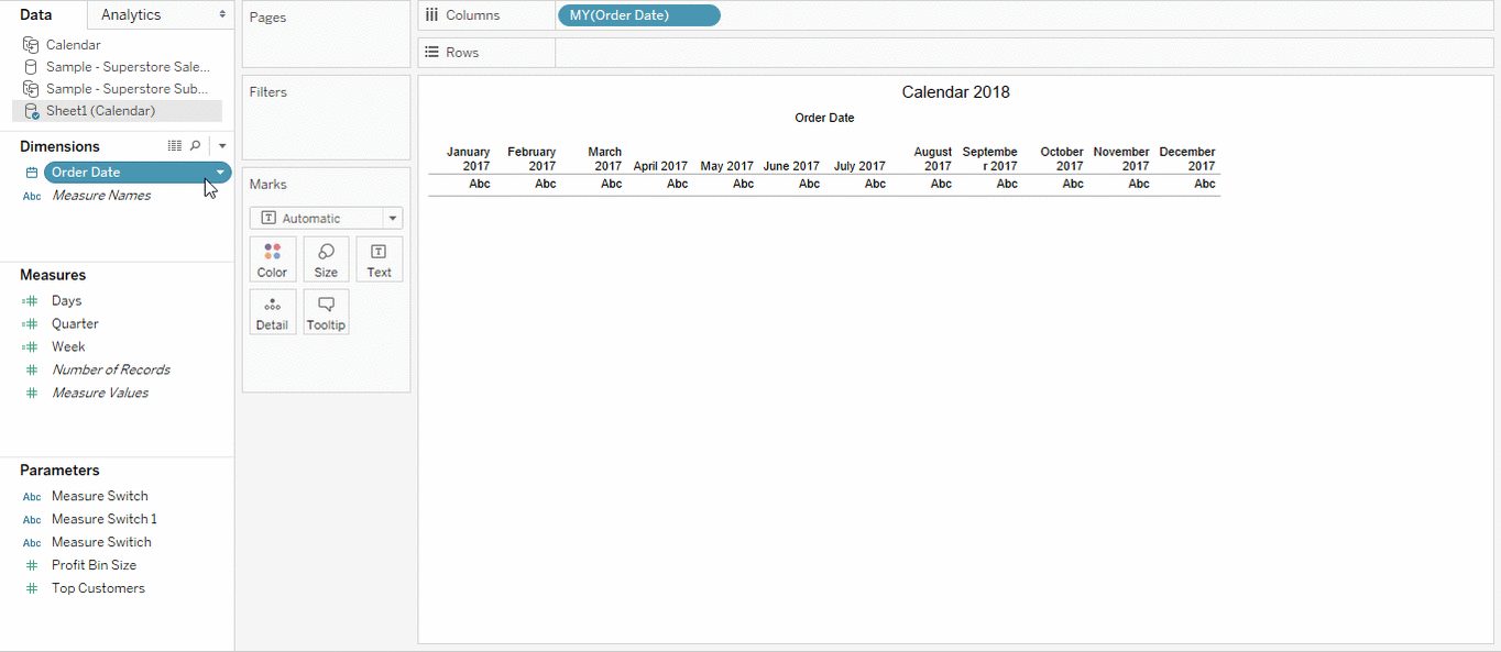
Step 2: Adding date to column shelf
Add ‘Order Date’ to column shelf and change it to (‘Month/Year’) Custom date format

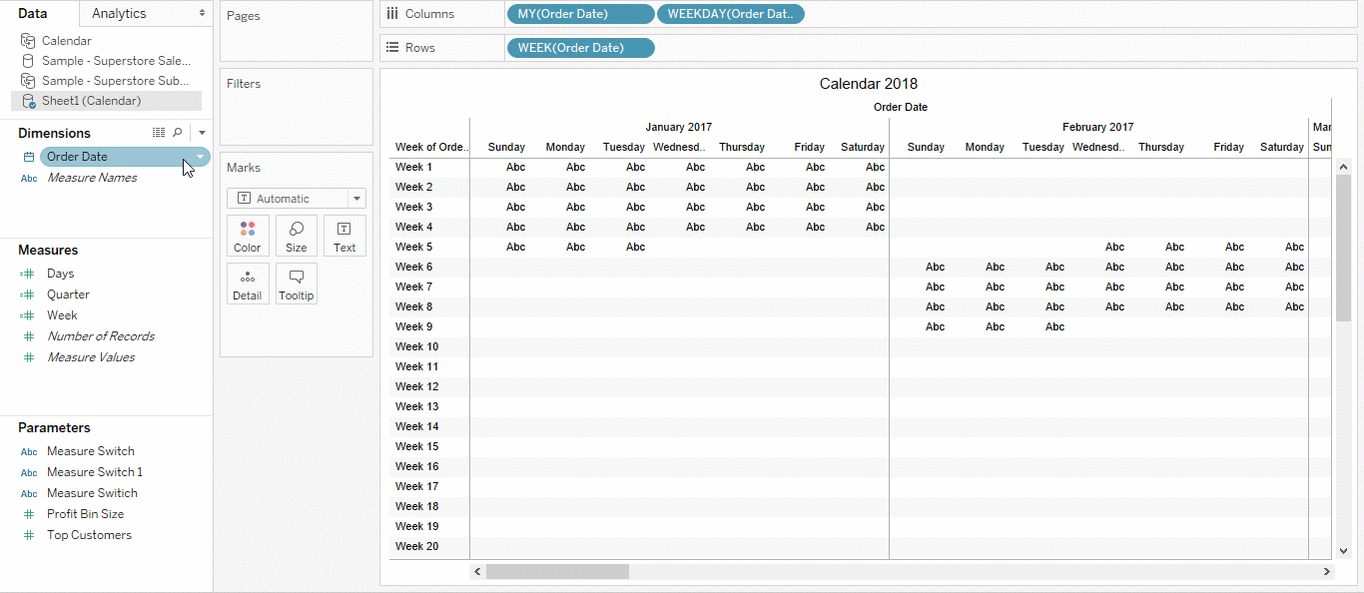
Step 3: Adding Week and Weekday to Row and Column shelf
Change ‘Order Date’ to weekday and week number and add it to Column and Row shelf.

Step 4: Adding Filters and Marks to finally build the Calendar
Use filters and marks to display the monthly calendar
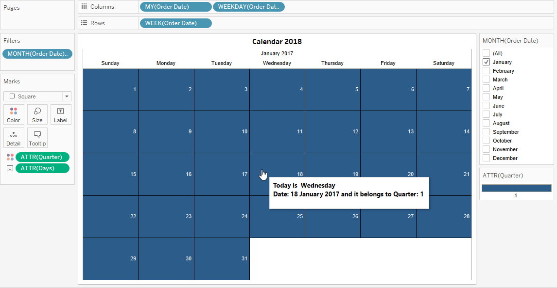
Final Calendar:
Well, this is the final calendar which you will get at the end. Just an FYI, you can also add other parameters like sales, or profit and get a calendar view of them.

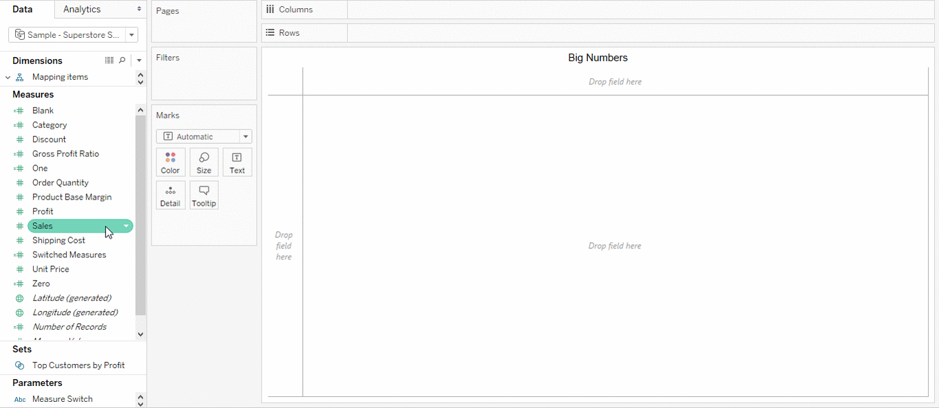
Let’s learn another hack from tableau and learn how to use a parameter to give the end user the ability to switch through different metrics.
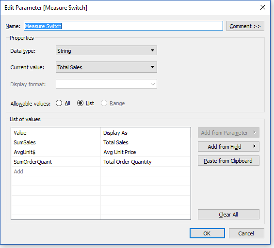
Step 1: Create Parameter
Create a String Parameter ‘Measure Switch’. In order to give the ability to switch between different measures, let’s create a list of parameters. Under the list of values on the left side we have the actual value of the parameter and on the right, we have a name which the user clicking on the parameter will see. So let’s fill it out in the following manner.


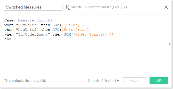
Step 2: Create Calculated Field
Next steps come is creating a calculated field. Our calculated field will check the parameter, and based on the value it will pick a visualization and show the visualization. Here’s what it looks like:
Step 3: Create Visualization I
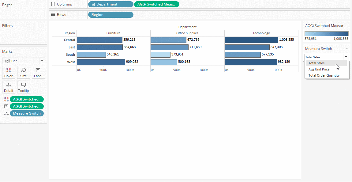
Done with creating calculated field? Let’s move on to create a visualization by adding ‘Region’ to rows and ‘Department’ to columns. Also, add the newly created calculated field ‘Switched Measures’ to the column. Finally, add the same calculated field to the colour and the text shelf.

Step 4: Create Visualization II
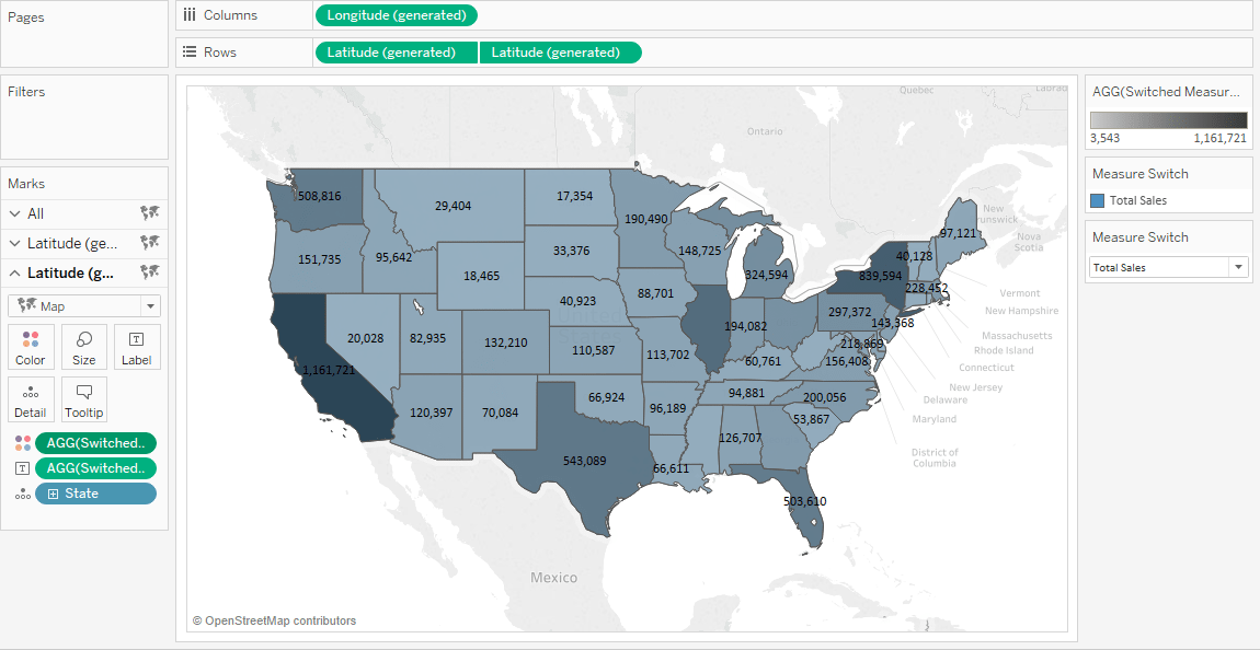
1. On a new sheet, change the marks to ‘filled map’ and add “State” to details.
2. We’re going to eventually create a dual axis map, so add Latitude on the rows shelf.
3. On the marks shelf, add the parameter we created “Measure Switch” to the colours shelf.
4. Now click the map below that one and add the calculated field we made “Switched Measures” to the text and colour shelf.
5. Finally, right click on the second pill on the rows self and set to the dual axis. Here’s what it looks like:
3. Tableau Tips and Tricks: Blend Like a Pro!
Data blending is a method for combining data coming from one data source with columns of data from another data source.
Usually, you can use joins to combine your data, but at times when factors like the type of data and its granularity is to be considered then in such cases, it’s better to use data blending.
For example, suppose you have a part of data stored in Salesforce and rest in an Excel workbook. Now since the data you want to combine is stored in two different databases, and the granularity of the data captured in each table is also different in the two data sources, so data blending is the best way to combine this data.

Pretty interesting!! right? Let me show you, it’s a very easy trick.
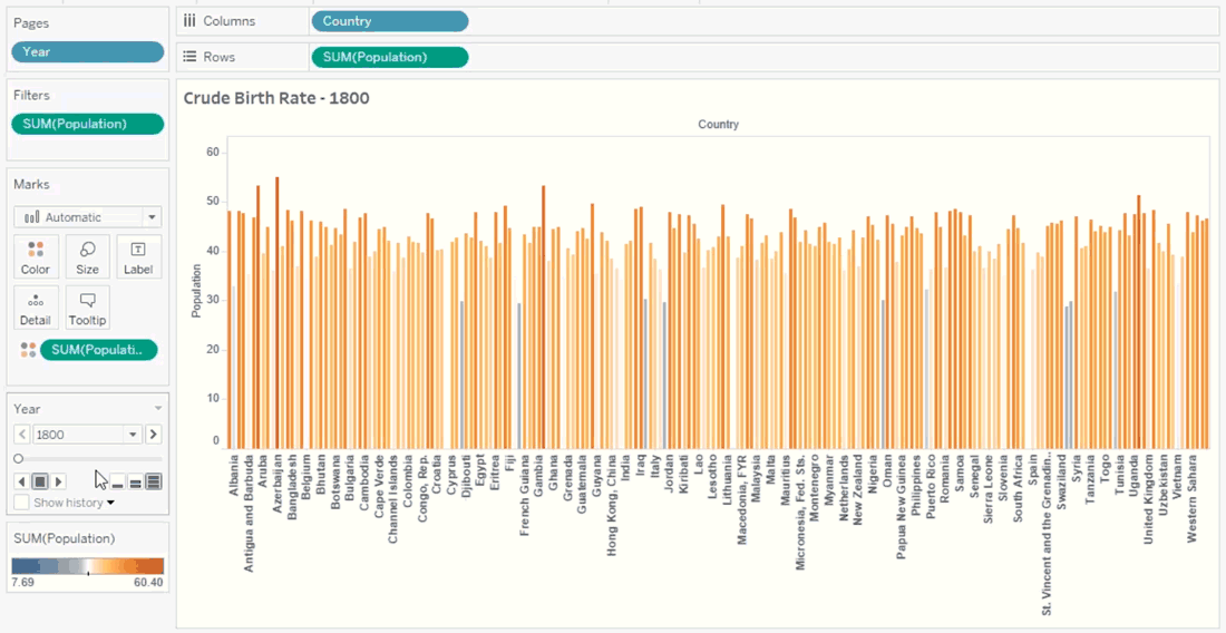
5. Tableau Tips and Tricks: Animated Visualization
Yes! you heard it right, you can add animation to your visualization. Let’s visualize how the population of the world increased in past 200 years. Sounds cool right! This is where Tableau’s Page Shelf come into the picture. Let’s add the date to the page shelf and see how crude birth rate has reduced over year.

I hope you enjoyed my blog and found some hidden features of Tableau. Just reading won’t make you a Tableau Jedi, go Ahead and start exploring Tableau. If you wanna learn about more such exciting features in Tableau, click below to enrol yourself and get certified in Edureka’s Tableau Certification Program.