UpasanaResearch Analyst, Tech Enthusiast, Currently working on Azure IoT & Data Science...Research Analyst, Tech Enthusiast, Currently working on Azure IoT & Data Science with previous experience in Data Analytics & Business Intelligence.
Tableau is a powerful and one of the fastest growing data visualization tools used in the Business Intelligence Industry. It helps in simplifying raw data into a very easily understandable format. However, for someone just beginning to explore this tool, it isn’t really feasible to cough up the kind of money it requires. Hence, we have Tableau Public.
Table of Content
Now, because of its utility to beginners, it makes for a very essential module in mostTableau Training Curriculum. In this blog, we shall discuss the following concepts:
Data analysis is very fast with Tableau and the visualizations created are in the form of dashboards and worksheets. The data that is created using Tableau can be understood by the professional at any level in an organization. It even allows a non-technical user to create a customized dashboard. Which just adds to the reasons you should learn Tableaufor.
Tableau Public, much like Tableau, is this easy-to-use tool for telling visual interactive stories on the web with the only exception that it’s absolutely free!
For example, the New York Times published an article in December 2015 that contained an infographic showing the tendencies of politicians to lie or tell the truth, based on findings from PolitiFact. I redesigned the graphics to better show these proclivities and added the ability to link to the PolitiFact findings.
Tableau Public is great at building visualizations like this and we can recreate this one with just a few simple steps.
Open, Create and Share.
Step 1: The Data
Open USDA_activity_dataset.xls. I shall be putting the source file in for you all.
The data details physical activity, obesity, and other health information in nearly 100 columns, for more than 3000 rows, one for each county in the US.
Step 2: Connect to Data Source
Drag and drop your dataset on top of the Tableau Public icon on your desktop to open.
At the dialog box, click OK to connect.
Tableau automatically recognizes categorical fields, like “State”, and numerical measures like “Adult obesity rate”.
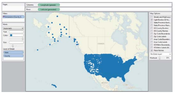
Step 3: Create the first view
Double click on “State” and “County”. Tableau Public recognizes they are geographical fields and geocodes them accordingly. You may get a warning message; if so, check so that you don’t see it again.
Notice there is a point at 0 degrees latitude and longitude. These are null values. Select them by clicking to one side of the point, keep the mouse button depressed to draw a rectangle over it, then release. Right click on the selected null values and select Exclude.
Right click on the Exclusions in Filter and select Make Global, so that this will apply to all subsequent views. Now you have a map showing a dot for every county where you have a record.
Drag “Adult obesity rate” from the Measures panel into Color, and copy it into Size shelf to encode counties by those values. Change the Color to what you like.
Now add a filter to enable the selection of individual states. Click and drag “State” into the Filters shelf, click OK at the dialog box.
Right click on “State” in the Filters shelf and select Show Quick Filter. Deselect All and then select Alabama.
Rename the worksheet “Map View” by right-clicking on the tab at the bottom. Finished state of the first view looks like the following.
Step 4: Add a second view
Add new worksheet.
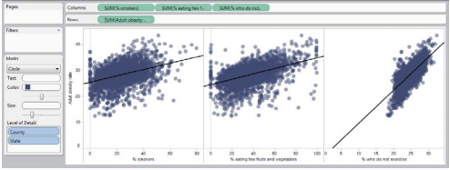
Drag “Adult obesity rate” onto Rows and “% smokers”,“% eating few fruits and vegetables” and “% who do not exercise” into Columns.
Drag “County” and “State” into Level of Detail. Without this step, Tableau’s default behavior is to sum the values across all the counties and states, which will give you a single data point for each graph, and not the desired scatter plots.
Change Color to purple, open the Drop down menu next to “Automatic” and select Circle, then move the slider below to the left to increase transparency of the points.
Select Analysis in the top menu and check Trend Lines.
Rename the worksheet “Scatterplot View” by right-clicking on the tab at the bottom. Finished state of the second view looks something like this.
Step 5: Create a Dashboard with both views
Double click on each view, bringing both out onto the dashboard. Select State filter > Compact list.
Right click on this filter again, and select Make Global. This will ensure that selecting a state alters both views simultaneously.
After this step, the rest all are custom decisions that you will be making.
Right click on this filter for the third time, select Customize and uncheck Show “All” Value. This prevents users from seeing the entire data for the whole country.
Right click on the titles of each view and select Hide Title.
Rename the dashboard “Obesity by state and county”.
Double click on Title under Objects. The dashboard should now look like this.
Step 6: Save to the web
Go to Size> Edit.
Select the size and layout best for your website.
Click File on the top menu and select Save to Web.
You’ll be prompted to log in with your tableau public credentials. If you don’t have an account, you can create one for free by clicking on here. After logging in, give your workbook a name and tableau public will publish your visualizations exactly how you built it on the desktop
Step 7: Embed on your website/blog
In the Save To Web Results window that has opened up, scroll down beneath the visualization and click on Share.
Copy and paste the embed code into the HTML of your web page.
This visualization is now completely live.
This means that viewers can see tooltips, use filters or any other functionality you’ve built into the dashboard. To share our visualization, you can use the social media buttons or share to get the direct URL to your dashboard.
You can also embed the dashboard on our website or blog by copying and pasting the embed code directly into our web page. This allows your visualization to live right next to any graphics or text.
Tableau Desktop Public allows you to connect only to local data and you must make an extract to the Public Workbook to Tableau Server Public.
Tableau’s paid version has the following pricing as of the current fiscal year.
Tableau Desktop Personal : $35
Tableau Desktop Professional : $70
Tableau Server : $35
Tableau Online : $42
Under the old model, a license, with annual maintenance, cost $999for Desktop Personal and $1,999for Desktop Professional.
Tableau desktop Public does not allow you to save your workbook locally in your PC, you must save it to Tableau server Public whereas you can do so for the paid version.
There is a limit in the number of rows in your data source that recently was increased to 1 million rows on Tableau Public which is unlimited for the paid version of Tableau.


 Copy Link!
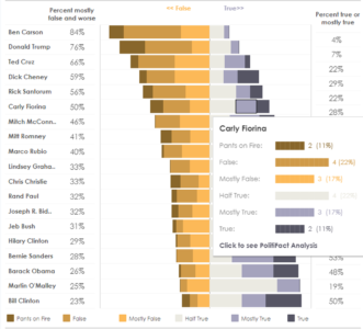
 warning message; if so, check so that you don’t see it again.
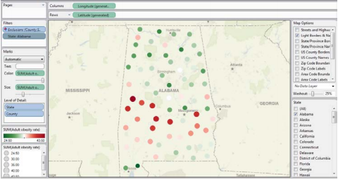
 Add new worksheet.
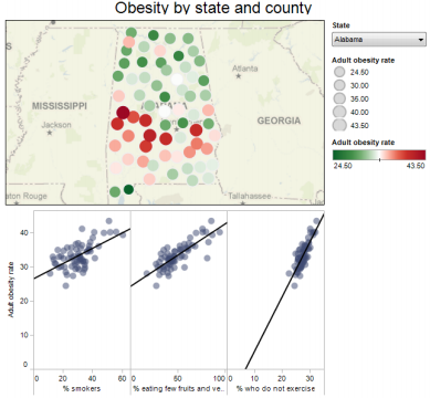
 You can also embed the dashboard on our website or blog by copying and pasting the embed code directly into our web page. This allows your visualization to live right next to any graphics or text.


 Thank you for registering Join Edureka Meetup community for 100+ Free Webinars each month JOIN MEETUP GROUP