


Advanced Power BI Certification Course with G ...
- 13k Enrolled Learners
- Weekend
- Live Class
(4230)


 Copy Link!
One of the most significant aspects of data analysis is Data visualization. It has always been critical to convey information in a way that is both intelligible and pleasant to the eye. One of the skills that Data Scientists must acquire in order to connect more effectively with end-users is Data Visualization. Tableau is the first term that springs to mind when you think about Data Visualization. I’m presuming you’ve heard of Tableau’s benefits and how it works, which is why you’ve come here to read this blog on Tableau Dashboards. So without any further delay, let’s get started with what are Tableau Dashboards. With this Tableau Dashboard blog, I hope you will enjoy learning about making Tableau Dashboards for data visualizations.
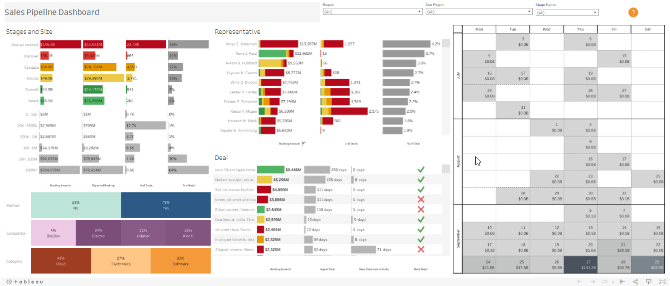
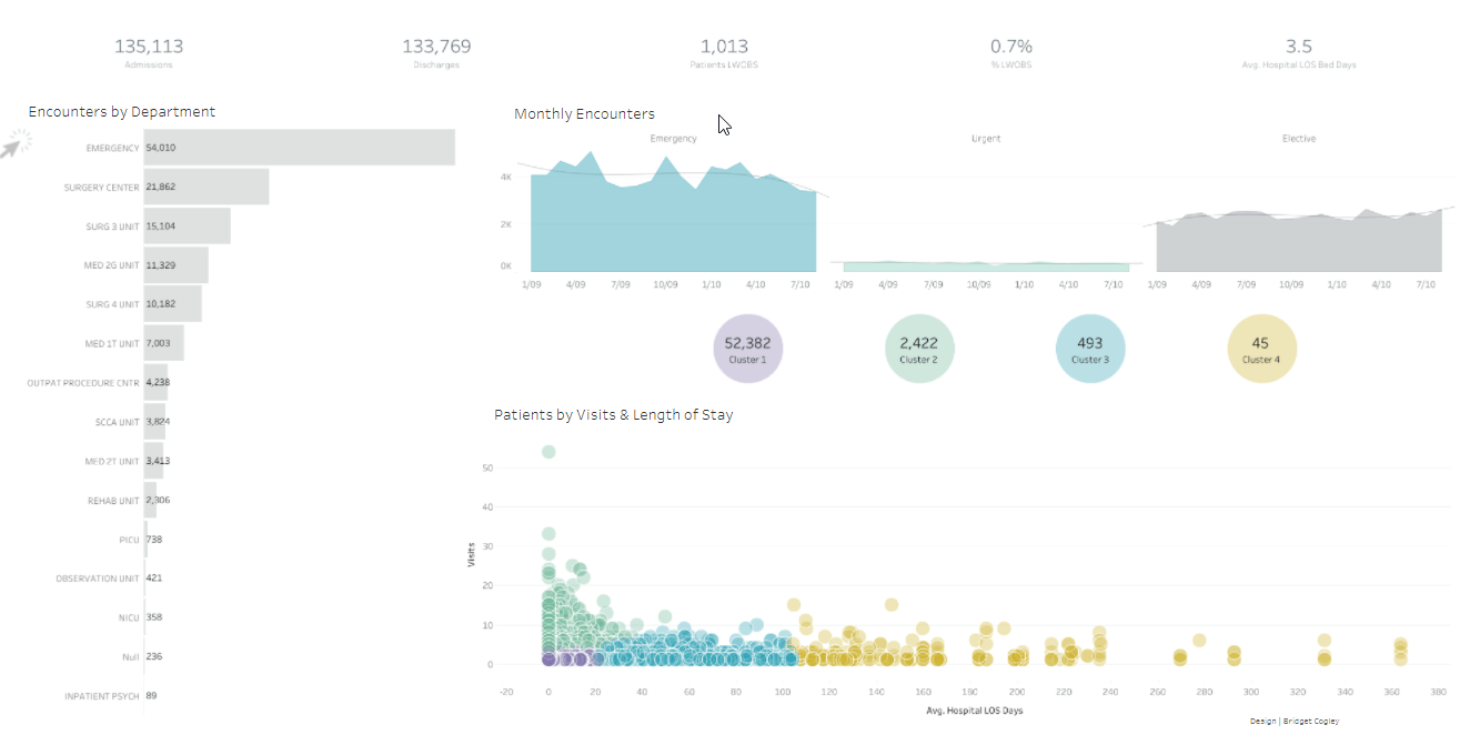
A dashboard is a centralized presentation of many spreadsheets and related data in one location. It’s used to compare and track a variety of data at the same time. The many data views are all presented at the same time. Dashboards are tabs at the bottom of the spreadsheet that are often updated with the most recent data from the data source. You may add views from any worksheet in the workbook to a dashboard, as well as a variety of supporting objects including text areas, web pages, and photos. Each view you add to the dashboard is linked to the worksheet it belongs to. As a result, if you change the worksheet, the dashboard is updated, and if you change the dashboard’s view, the worksheet is updated.
In today’s market, Tableau is a commonly utilized Business Intelligence solution. Its appeal stems from its capacity to handle large amounts of data while still being very easy to deploy, understand, and utilize. Tableau takes raw data and turns it into a visual masterpiece that helps organizations make data-driven choices. Tableau Dashboards offer an easy interface with self-explanatory wizards that make it simple for non-technical users to build visualizations. To undertake analysis, just drag and drop dimensions and Tableau charts onto the drawing space.
Tableau Dashboards are a collection of distinct views or visualizations, each of which displays a different type of data. It provides customers with a comprehensive picture of all data on a single screen. It’s as simple as dragging views from the sheets section to the visualization area to create dashboards.
Creating or building a dashboard entails more than just using Tableau’s visualization tools. A dashboard should provide the most relevant facts that allows a user to consume information quickly. Tableau has a number of interaction features, like as tooltips and filters, that may be used without cluttering the viewable space, resulting in a pleasant dashboard experience.
For a detailed tutorial on tableau watch this video:
Before starting let’s have a quick understanding of different options available on navigation in Tableau:
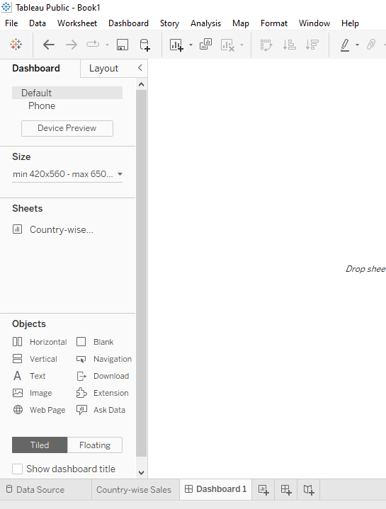
By default, you’ll be working on the Tableau Dashboard tab, which lets you personalise almost every aspect of the dashboard. The layout tab allows you to change the proportions and positioning of individual dashboard components. All sizes in the Layout tab are in pixels.
The Device Preview option allows you to see how the dashboard will appear on various devices, and you can even store alternate versions of the dashboard so that it appears differently depending on the device.
This is where you may set the height and width of the dashboard in pixels. You may choose from a variety of standard sizes or specify a bespoke size. If you choose Automatic, the dashboard will automatically modify the various components to accommodate all of the available space on the screen it’s being presented on. On the surface, this choice looks to be a good match, but keep in mind that it isn’t truly “responsive,” and the display can be inconsistent.
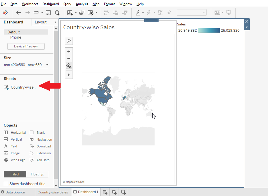
Here you’ll find a list of individual worksheets in your workbook that you may upload to the dashboard. The sample shown above was created using three pages from the workbook: Map, Trends, and Bar Chart. It’s a good idea to give the worksheets meaningful names so they’re simple to discover, but you can also see a thumbnail preview by hovering over the name in the left menu.
Horizontal: Adds a horizontal layout container to which other items can be added.
Vertical: Adds a vertical layout container to which other items can be added.
Text: This command starts a mini word processor where you can type and format whatever text you choose.
Image: Adds a picture from your computer to the dashboard.
Web Page: Adds a web page link to the dashboard (requires an Internet connection to display the web page).
Blank: Fills the dashboard with blank space, which might be handy when dashboard items in a tiled layout are too close together.
When dashboard elements are tiled, they take up the entirety of each tile’s available area. While dashboard objects are floating, you may customise their exact size and placement. Each of these layouts has its own set of benefits and drawbacks, and the one you select is mostly influenced by your specific use case. Most Tableau users enjoy the automated scaling that comes with a tiled layout; we prefer the predictability and precision that comes with floating elements.
Here we will discuss the step-by-step process to create a dashboard on Tableau
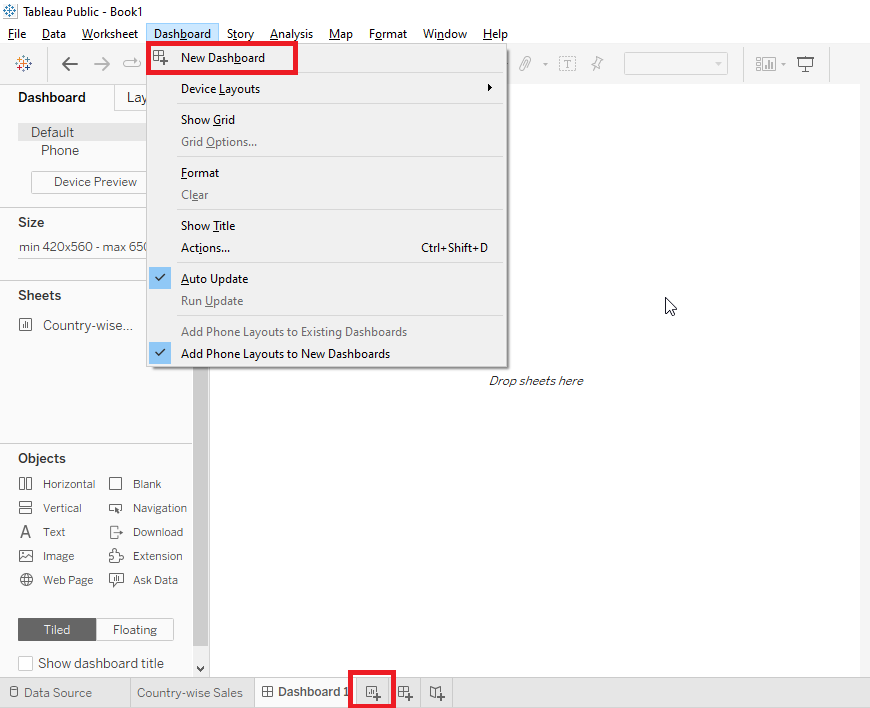
1. New Dashboard
Click on Dashboard option on the Menu bar
Select a New Dashboard
Change name of the Dashboard according to requirement
From the left panel, drag sheets on the Dashboard
Select the sheet and add your data to start creating visualizations
Drag the second sheet to your dashboard
You can swap sheet between sheets with the swap button
You can add multiple sheets as per your requirement
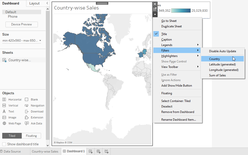
You can add Filters, Slicers, Graphs, Shapes, Pie charts and different options to customize your dashboard.
You can add texts to provide more information on your customization and headers.
Webpage links and images can also be added from more information on your dashboard
After you are doing with customizing your dashboard, you can view it in full screen by pressing F7 as shortcut or you can view it in Presentation Mode. Here you can see how your dashboard looks finally to the viewers.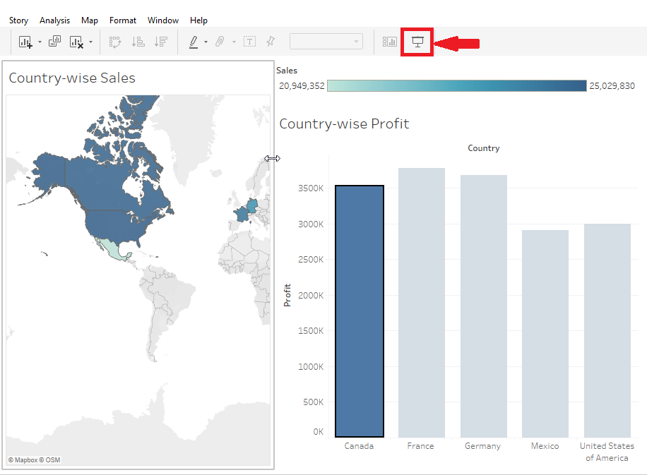
Dashboards are graphical user interfaces that provide a consolidated view of important information and data from various sources. They are designed to visually represent complex data sets in a simplified and easy-to-understand manner. Dashboards are commonly used in business intelligence, data analytics, and monitoring systems to track key performance indicators (KPIs), metrics, and trends.
The underlying mechanism of dashboards involves the following key elements:
Overall, dashboards simplify complex data analysis and enable users to monitor, understand, and act upon important information effectively. By providing a centralized view of key metrics, they facilitate data-driven decision-making and enhance organizational performance.
Learn to effectively break down and present cumulative data changes with stunning waterfall charts in Tableau. Transform complex datasets into clear, actionable insights.
This blog should have given you a good idea of “What is Tableau Dashboard?” Do you still want to learn more? Don’t worry, the Tableau Tutorial will help you better comprehend the tool. For that we have videos on YouTube which you can go through for better hands-on understanding of Tableau. If you’re interested in becoming Tableau certified, click the link below to learn more about Edureka’s Tableau Training. You may also obtain more free Edureka material by subscribing to our YouTube channel.
Got a question for us? Please mention it in the comments section and we will get back to you at the earliest.


 Thank you for registering Join Edureka Meetup community for 100+ Free Webinars each month JOIN MEETUP GROUP
Hi Vishnu!,
Can u please help me with the 4 quadrants in Performance of different states how was it formulated in calculated field(AGG(Identifying quadrants).
Thanks much!
Hi! this blog is so informative and thank you so much for this.
But after going through this tutorial I could not understand how can I upload my shape file and pull it to tableau?, which format should I use and how to get that format, is there a tool which can help me to do so?
Thanks again
After completion of Tableau Desktop training, what should you have to write in your resume, whether it’s TB Developer or something else and if you have 10 years of total work experience in some other sector but in Tableau you are fresher then how should you mention it in your resume?
Hey Abhay! Mentioning the completion of course along with the certification is one way to go about it. Also, you can write about the project you have completed to add some credibility to your certificates. Hope this helps. Cheers!
Thank you for your valuable feedback.
I want to know some few more things. 1st- will companies hire to that person who has experience in other sector but he’s fresher in Tableau, if yes, could you please suggest me some companies names?
2nd after completion of Tableau course from Edureka, will they provide placement also?
Hey Abhay! Companies will place your profile higher than other candidates as you have 10 years of work ex. That being said, you need to have a proper justification for switching fields after this long. We can not specifically name companies that are hiring but, you can find this data easily over the internet.
After completing your course with Edureka, you will be given a course completion certificate that holds value and can be verified by your future employees. We are planning to come up with a job assistance service in the future. Meanwhile, we would be happy to help you out with your resume and interviews.
Hi Vishnu, Great post, very clear and precise.
Wouldn’t it be better for readers to follow you along with the post? Only if the data was provided?
Could you look into it?
Thanks
Great blog! Very well explained! :)
Thanks for the wonderful feedback, Amit! Do check out some of our other Tableau blogs here: https://www.edureka.co/blog/?s=tableau Cheers!