


Today, you have a lot of data and even more questions about it. You know there’s a chart or graph out there that will show you the data you want to see, but it’s not always easy knowing which Tableau charts or graph is best without some trial and error.
This blog puts together different Tableau Charts with the type of data you’re analyzing and questions you want to answer, to help you find the appropriate chart for your needs.
Tableau Full Course – Learn Tableau in 6 Hours | Tableau Training for Beginners | Edureka

This Edureka Tableau Full Course video will help you understand and learn Tableau in detail. This Tableau Tutorial is ideal for both beginners as well as professionals who want to master up their Tableau concepts.
Lets explore the difference types of Charts in Tableau:
Bar Charts in Tableau
Bar charts are definitely one of the most, if not the most common data visualizations across all BI platforms. You can quickly highlight differences between categories, show trends and outliers, and reveal historical highs and lows at a glance. Bar charts are simple, yet, effective, especially when you have data that can be split into many categories.
To create a Bar Chart,
- Go to a new worksheet.
- Drag Category into Column.
- Drag Profit into Rows.
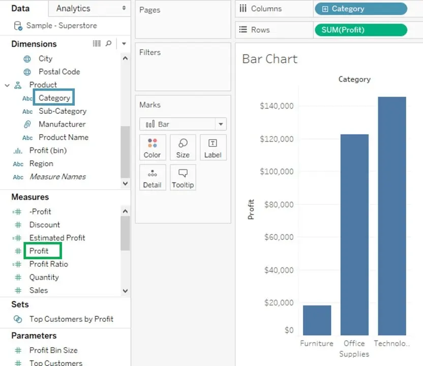

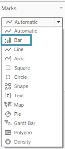
- If the bar chart does not appear automatically, you can go to the Marks card and select the Bar option.

Line Charts in Tableau
The line chart, or line graph, is another familiar method for displaying data. It connects several distinct data points, presenting them as one continuous evolution. The result is a simple, straightforward way to visualize changes in one value relative to another.
- Go to a new Worksheet
- Drag Order Date into Columns.
- Drag Sales into Rows.
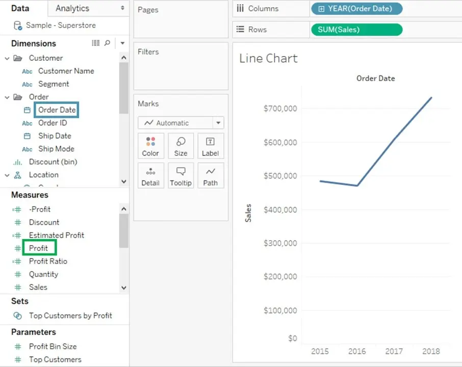

- If the line chart does not appear automatically, you can go to the Marks card and select the Line option.

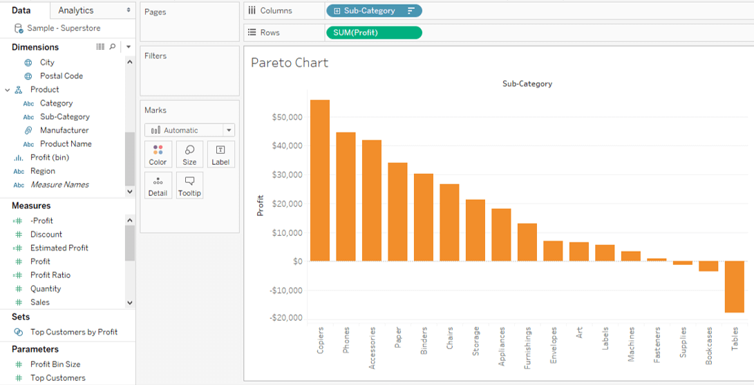
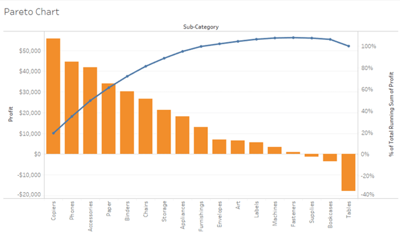
You could also use table calculations to create a Pareto chart, showing the accumulation of multiple categories. A Pareto chart consists of both bar and line graph and the same measure is used to create the graphs but the Measure shelf values are manipulated differently. The basic purpose of using this Chart is to identify the contribution of members present in a field. The procedure for making this chart in Tableau is as follows.
- Go to a new Worksheet
- Drag Sub-Category into Columns.
- Drag Profit into Rows.
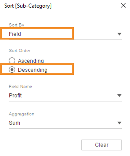
- Select Sort option from the drop-down list you get by right-clicking on the Sub-Category pill.
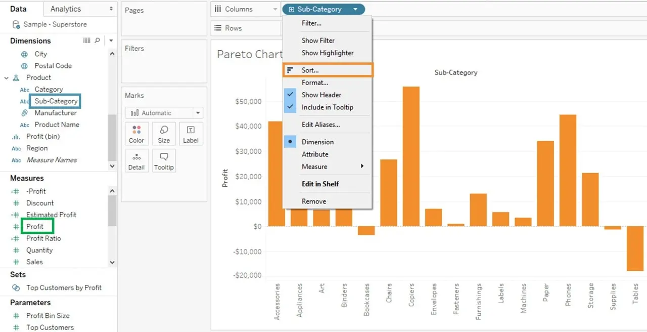

- Click on Descending in Sort order.
- Select Field in Sort by section. Select the field as Profit and choose Sum as aggregation.
- Click on OK.


- Drag Profit again into Rows.
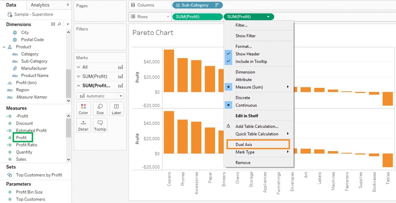
- Right-click on the newly added Profit and Select Dual Axis option. And it will give you a dotted graph as shown below.

- Go to Marks Card
- Select SUM(Profit) for the marks card list.
- Click on the drop-down button as shown in the image.
- Select Bar as chart type.

- Select SUM(Profit)(2) from the list.
- Click on Line from the list.
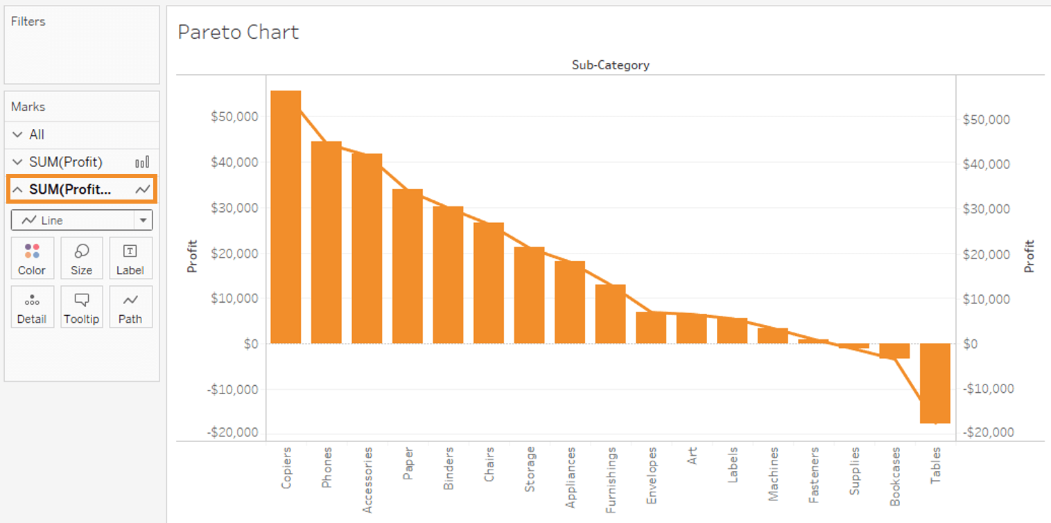


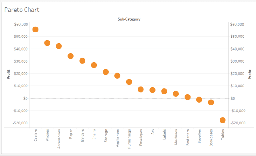
- Select SUM(Profit) on the right side of rows as shown in the image.
- Right click on it and select Add Table Calculation from the list.
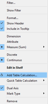
- It opens the Primary Calculation Type window.
- Select Running Total from the drop-down.
- Select Sum as Aggregation from the drop-down.
- Click on Compute Using Table (across).
- Check in the Add Secondary Calculation box.
- It expands the window for Secondary Calculation Type. Select Percent of Total from the dropdown list.
- Select on Compute Using Table (across).
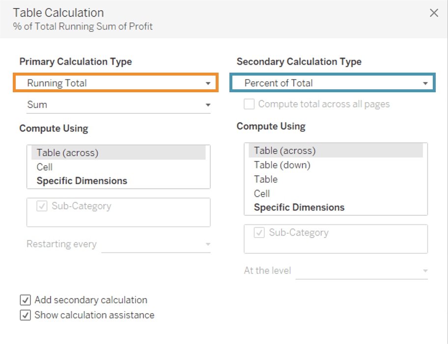
- Now close the Window by clicking on the close icon as shown in the image.
- Go to the last marks card namely SUM (Profit).
- Click on Color icon present in the marks card.
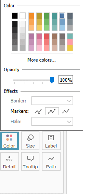


- Select any color of your choice. This changes the color of the line present in the graph.

Area Chart in Tableau
Area charts represent any quantitative data over various periods of time. It is basically a line graph where the area between line and axis is generally filled with color. The steps to achieve this are as follow.
- Go to a new Worksheet.
- Hold the control key in keyboard and select Order Date and Quantity.
- Click on Show Me option present at the top right corner of the worksheet.
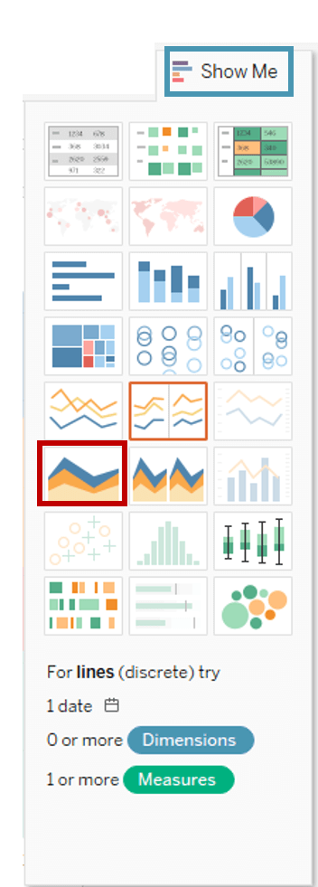
- Select the Area Chart icon as shown in the figure.
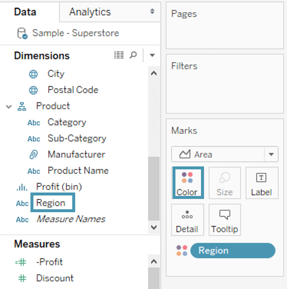
- Drag Region from dimension pane and add it in Color icon of Marks card.


- This creates an area chart.
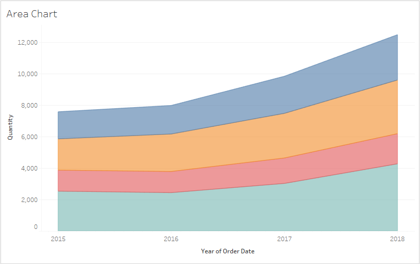

Tableau Charts | Data Visualization Using Tableau | Edureka

Tableau can create interactive visualizations customized for the target audience. In this video, you will learn about the measures, chart types, and its features.
Tableau Charts: Histogram
Histograms show how your data is distributed across distinct groups. By grouping your data into specific categories (also known as “bins”), then plotting the number of records in a category as a vertical bar, you can quickly see which bins the majority of your data falls in. The histogram is your best option for visualizing how data fall into categories. For example, the number of customers by company size, student performance on an exam, and frequency of a product defect.
The procedure to create histogram is shown below.
- Go to a new Worksheet.
- Select Discount from the measures.
- Click on Show Me button present in the top right corner of the worksheet.
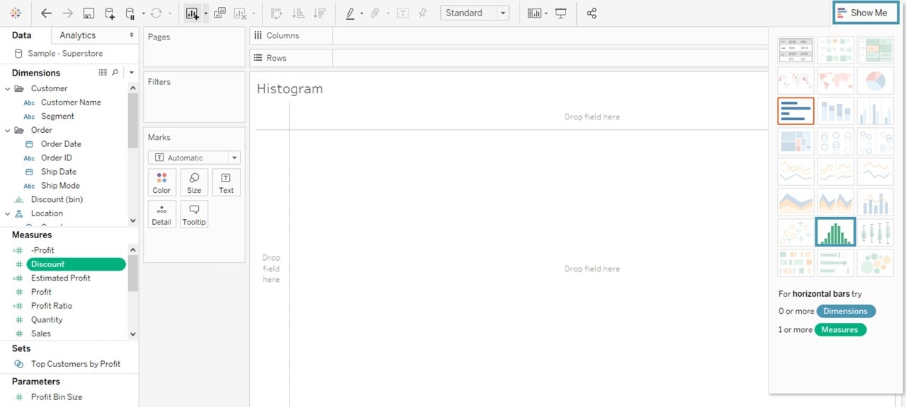

- Select the Histogram icon as shown in the image.

It creates a histogram charts in Tableau.
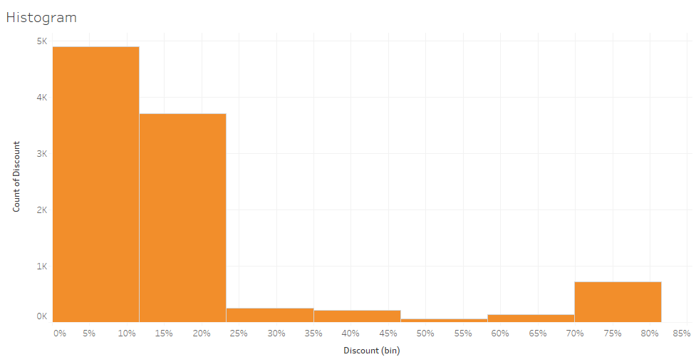
Tableau Charts: Pie Charts
Pie charts are powerful for adding detail to other visualizations. The angle of the pie determines the measured value. Different colors can be assigned to pie to represent the members in a dimension.
- Go to a new Worksheet
- Select Segment and Sales from data pane.
- Click on ShowMe button present in the top right corner of the worksheet.
- Select Pie Chart from the list.

It creates a Pie Chart as shown above.
Tip: Alone, a pie chart doesn’t give the viewer a way to quickly and accurately compare the information. Since the viewer has to create the context on their own, key points from your data are missed. Instead of making a pie chart the focus of your dashboard, try using them to drill down on other visualizations. This approach uses the pie chart’s simplicity to add information, without distracting from the larger picture.
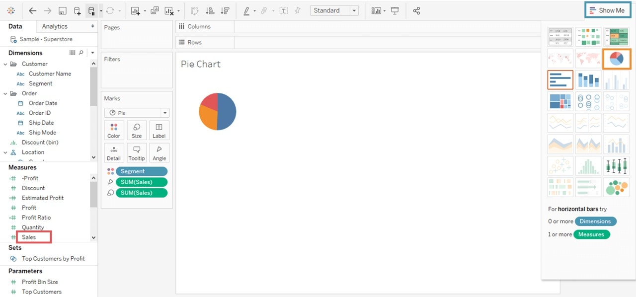
Tableau Charts: Tree Maps
Treemaps relate different segments of your data to the whole. By nesting rectangles within others, treemaps show how individual data points fit in a hierarchy. As the name of the chart suggests, each rectangle is subdivided into smaller rectangles, or sub-branches, based on its proportion to the whole. They make efficient use of space to show the percent total for each category. When a dataset can be broken down in many different ways, a treemap might be the best way to show what categories most of the data falls in. For example, storage usage across computer machines, managing the number and priority of technical support cases and comparing fiscal budgets between years.
To achieve this objective, the following are the steps.
- Drag and drop the measure Profit two times to the Marks Card. Once to the Size shelf and again to the Color shelf.
- Drag and drop the dimension Ship Mode to the Label shelf. Choose the chart type TreeMap from Show Me and the following chart appears.
Tableau Charts: Scatter Plots
Scatter plots are an effective way to give you a sense of trends, concentrations, and outliers that facilitate deeper investigations of your data. A scatter plot presents lots of distinct data points on a single chart. The chart can then be enhanced with analytics like cluster analysis or trend lines. Scatter plots are used to show if one variable is a good predictor of another, or if they tend to change independently. This type of chart easily lends itself to many types of analysis.
For example, male versus the female likelihood of having lung cancer at different ages, technology early adopters’ and laggards’ purchase patterns of smartphones, and shipping costs of different product categories to different regions.
A scatter plot can be designed by following the procedure given below.
- Go to a new Worksheet.
- Drag Discount into Columns.
- Drag Sales into Rows.
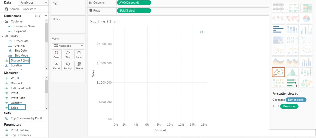

- This creates a scatter plot by default. But you can always do more to it.
3. Drag Sub-Category into Color icon present in the Marks card.
- It creates a scatter plot showing the relationship between discount and sales for each sub-category.
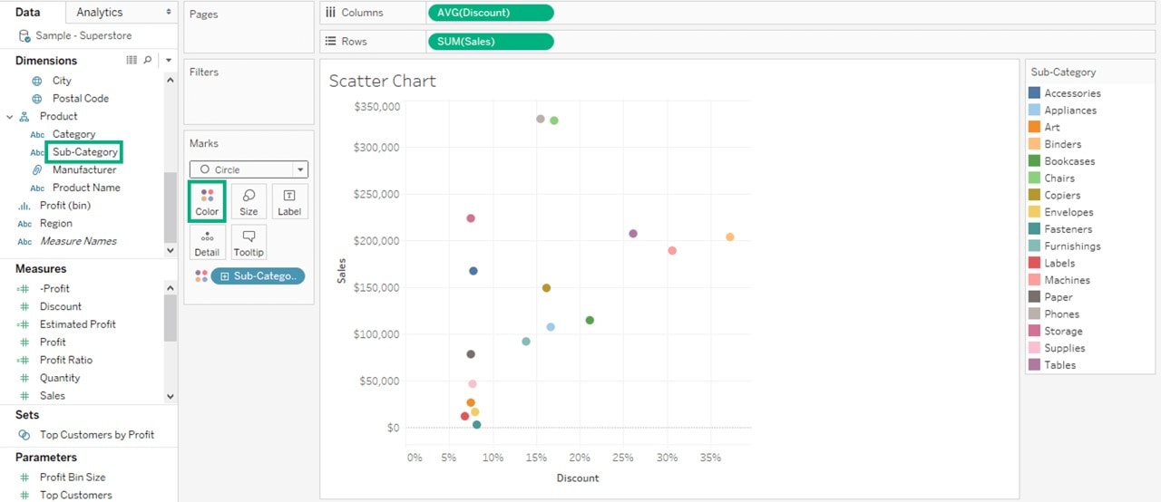

Tableau Charts: Bubble Charts
Although bubbles aren’t technically their own type of visualization, using them as a technique adds great detail to scatter plots or maps. Varying the size and color of circles creates visually compelling charts that present large volumes of data at once. Bubbles can add more detail to the traditional two-axis chart, highlighting the relationship between three or more variables, without overwhelming the viewer.
The procedure to create a bubble chart is given below.
- Go to a new Worksheet.
- Hold on the Control key on the keyboard.
- Click on Sub-Category and Sales.
- Click on the Show Me option.
- Go to a new Worksheet.
- Select the Packed bubbles icon as shown in the image and it creates a bubble chart.
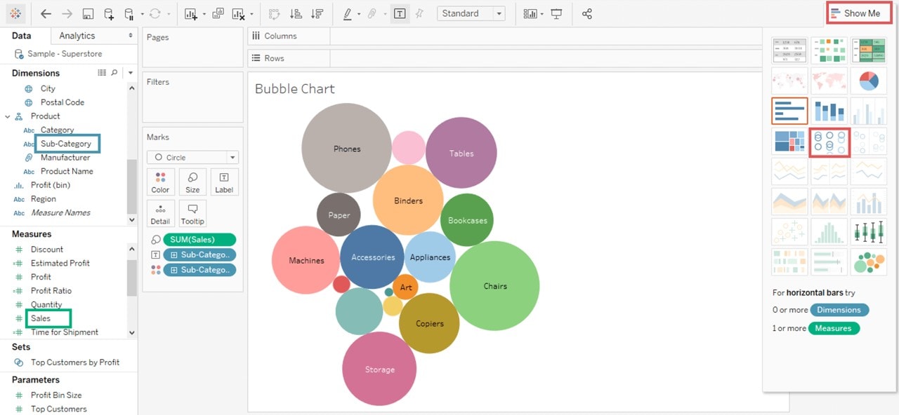

Tableau Charts: Heat Maps
Heat maps are a great way to compare data across two or more categories using color. Patterns guide viewers around the chart, quickly showing them where the intersection of categories is strongest and weakest. Heat maps are best for presenting data sets with lots of categories. This chart type can pack hundreds of comparisons into a small area, and still be easy to understand at a glance. For example, sales quota assessment, actual spending vs. budget, and performance spectrum (great/good/poor).
The procedure to create a heat map is given as follows:
- Go to a new Worksheet.
- Hold the control key in keyboard and select Sub-Category and Sales from the data pane.
- Click on the Show me button present in the top right corner of the worksheet.
- Select the Heat Map icon as shown in the image.
- Drag Profit into the Color box.
- Drag Region into Columns.
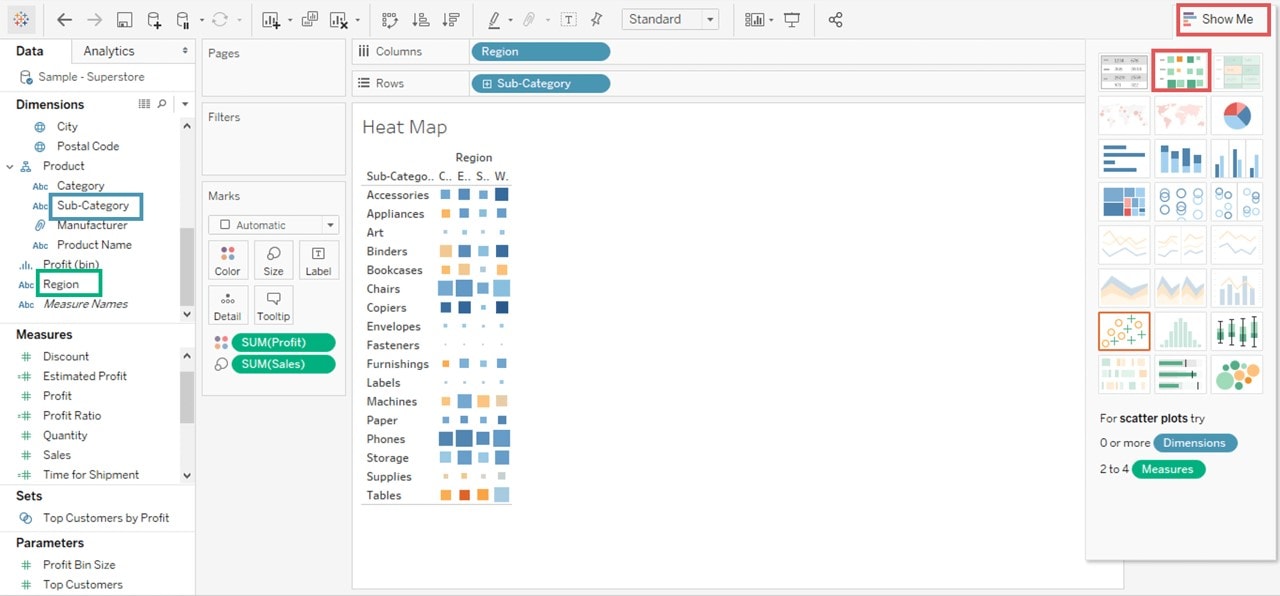

This will create a Heat map.
Tableau Charts: Maps
These are a no-brainer for visualizing any kind of location information, whether it’s postal codes, state abbreviations, country names, or your own custom geocoding. Maps highlight geographic trends in a format everyone knows and understands. If you have geographic information associated with your data, maps are a simple and compelling way to show how location correlates with trends in your data. For example, insurance claims by state, product export destinations by country, car accidents by zip code, and custom sales territories.
- Navigate to a worksheet.
- In the Data pane, under Dimensions, double-click State.
- From Measures, drag Sales to Size on the Marks card. The data points on the map update to show the number of sales proportionally.
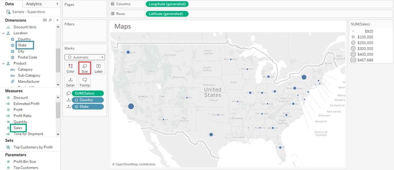
- Select Maps, followed by Map Layers.
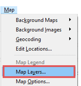
- In the Map Layers pane, do the following:
- Click the Style drop-down and select Normal.
- Under Map Layers, clear Country/Region Names.
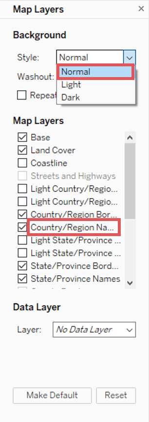
The background map updates with the new settings.


Tableau Charts: Bullet Charts
Bullet charts show progress against a goal by comparing measures. At its core, a bullet graph is a variation of a bar chart. Designed to replace dashboard gauges, meters, and thermometers, a bullet chart shows more information while using less space. A bullet chart shows how a metric is doing at a single point in time. Because it doesn’t display history, this chart is best suited for quick “how are we doing” dashboards, rather than deep analysis.
To achieve this objective, the following are the steps.
- Drag and drop the dimension Sub-Category from the data pane into the column shelf.
- Drag and drop the measures Profit to the Rows shelf.
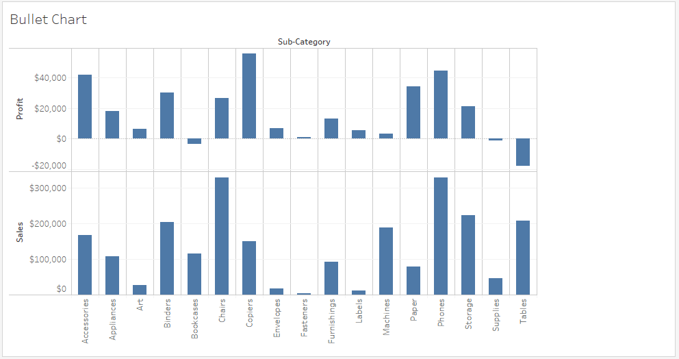

This chart appears which shows the two measures as two separate categories of bar charts, each representing the values for sub-categories.
- Drag the Sales measure to the Marks card. Using Show Me, choose the bullet graph option.
- The following chart shows the bullet graph.
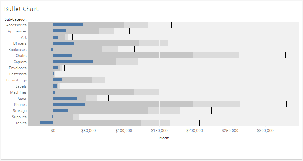

Tableau Charts: Gantt Charts
Gantt charts are purpose-built for illustrating the start and finish dates of steps in a process or project. This chart can easily illustrate key deliverables, owners, and deadlines. Time series data is presented in a natural, easy to understand format on a Gantt chart. For example, duration of a machine’s use, or availability of players on a team. Gantt chart shows steps that need to be completed before others can begin, or which resources are overcommitted. Gantt charts aren’t limited to projects, though: Represent any time series data with this chart type. Try using these to show how a multi-step process has performed over time. Color can be used to show which steps are under- or over performing.
The procedure to create a Gantt chart is given as follows.
- Go to a new Worksheet.
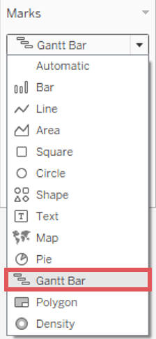
- Click on the drop-down button in Marks Card.
- Select Gantt Bar from the list.

- Drag Order Date into Columns.
- Right Click on the Order date and select the Day as shown in the image.
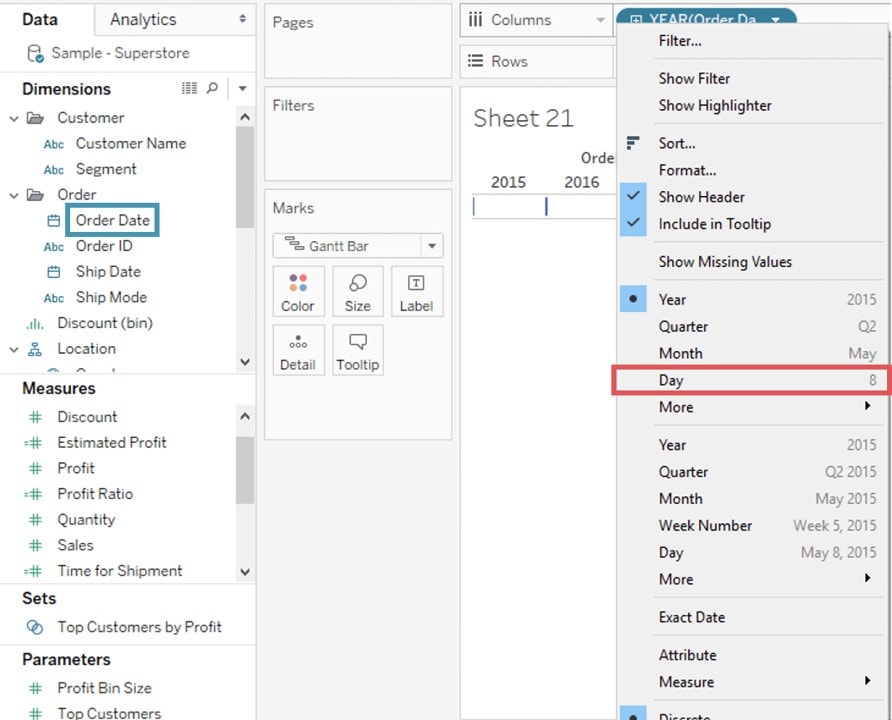
- Right Click on the Order date and select the Day as shown in the image.
- Click on Analysis Present in the Menu bar.
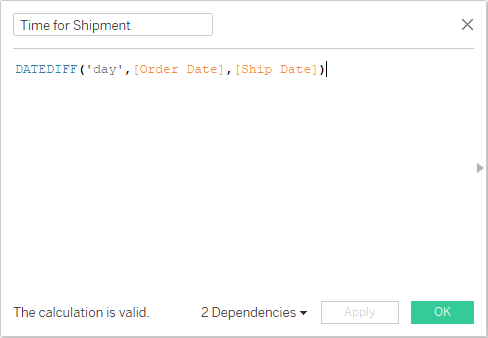
- Select Create Calculated Field present in the list.
- Enter the name of the calculated field as Time for Shipment.
- Type the formula as shown in the image to create the difference between Order Date and Ship Date.
- Click on OK.
- Drag Ship Mode into Rows.
- Drag Time for Shipment into size icon present in the marks card.
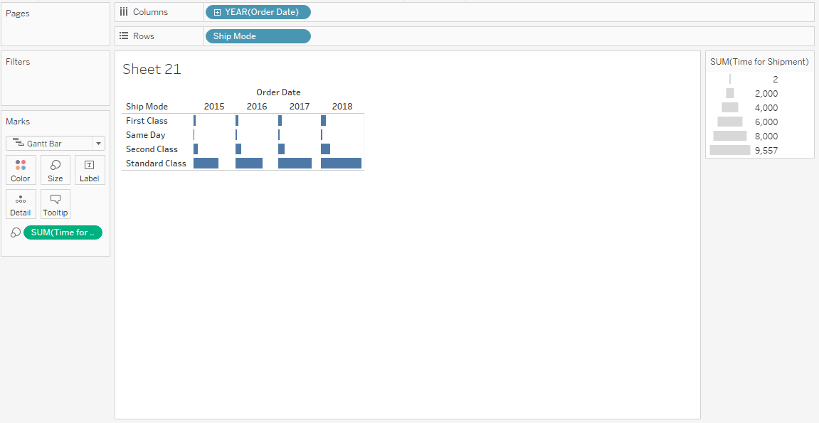
- Drag Order Date into Columns.


This creates a Gantt chart. It shows the time taken for each shipment across different ship mode.
Tableau Charts: Box and Whisker Plots
Box-and-whisker plots, or boxplots, are a common way to show distributions of data. The name refers to the two parts of the diagram: the box, which contains the median of the data along with the 1st and 3rd quartiles (25% greater and less than the median), and the whiskers, which typically represents data within 1.5 times the interquartile range (the difference between the 1st and 3rd quartiles). The whiskers can also be used to also show the maximum and minimum points within the data. Use box-and-whisker diagrams to understand your data at a glance. See how data is skewed towards one end and identify outliers in your data. For example, comparing scores between sites, analyzing data before and after a process change, or examining data from duplicate machines manufacturing the same products.
- Open a new Worksheet.
- Drag the Segment dimension to Columns.
- Drag the Discount measure to Rows. Tableau creates a vertical axis and displays a bar chart—the default chart type when there is a dimension on the Columns shelf and a measure on the Rows shelf.
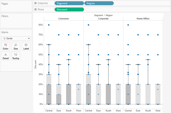
- Drag the Region dimension to Columns, and drop it to the right of Segment. Now you have a two-level hierarchy of dimensions from left to right in the view, with regions (listed along the bottom) nested within segments (listed across the top).
- Click Show Me in the toolbar, then select the box-and-whisker plot chart type.
- Drag Region from the Marks card back to Columns, to the right of Segment.
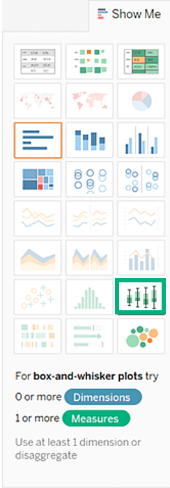

Tableau displays a box plot. The horizontal lines are flattened box plots, which is what happens when boxplots are based on a single mark. Box plots are intended to show a distribution of data, and that can be difficult when data is aggregated, as in the current view. 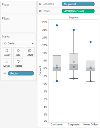

- To disaggregate data, select Analysis > Aggregate Measures. This command turns aggregation on or off, and because data is aggregated by default in Tableau, the first time you select this command, it disaggregates the data. Now, instead of a single mark for each column in the view, you see a range of marks, one for each row in your data source.
- To disaggregate data, select Analysis > Aggregate Measures. This command turns aggregation on or off, and because data is aggregated by default in Tableau, the first time you select this command, it disaggregates the data. Now, instead of a single mark for each column in the view, you see a range of marks, one for each row in your data source.

Tableau Charts: Waterfall Charts
A waterfall chart derives its name from its analogous orientation and flow. Here we have plotted the Running Sales of the Superstore over its years, indicating that the Sales actually dipped and also the measure by how much. This implies that such charts are used to analyze the cumulative effect of a Measure and see how it increases and decreases as a whole. To understand this better, let’s visualize it.
- Right-click on the green Profit Pill and select Quick Table Calculation > Running Total.
- Change the Mark Type from Automatic to Gantt Bar:
- Create a Calculated Field called NegProfit like so.
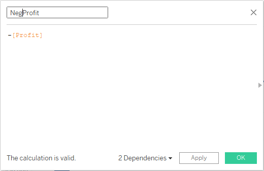
- Drag this NegProfit over Size in the Marks’ shelf to get:

The calculated field was used to fill in the space in the Gantt Chart. A negative value in Profit would extend the bar downwards, whereas a positive one would extend it upwards.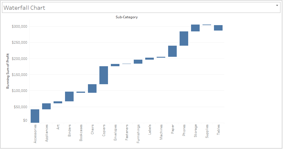

The length of each small bar in the chart represents the amount of change in Profit from one month to the next.
- Finally, drag Profit over to Color in the Marks card.
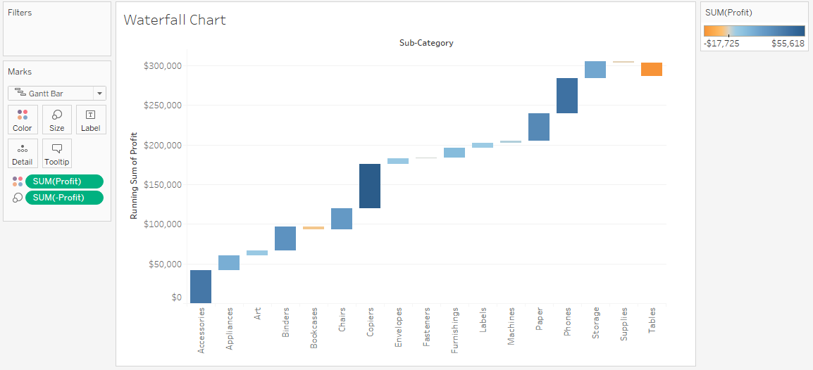
- You can also, go ahead and change the color to a two-step variation and distinctly view the rise and fall.

The graph that you will get could be very easily represented in the form of a Bar Chart as well. But I am sure you would agree that using a Waterfall chart was a more intuitive way of representing the data, especially to see the changes in Measures such as Sales and Profit over the years.
Tableau Charts: Motion Charts
Okay, so now this chart is actually quite simple, but I found it fascinating enough for it to make it into this blog. It is inspired by Hans Rosling’s World Economic Presentation. If you’ll haven’t seen, I’d recommend you take a minute after this session and give it a look.
By now making trend lines like the following should be easy for you. But what we’ll be doing is creating this is motion. Like a GIF, but better.
So, let’s get started!
- Create a Trend Chart with X-axis as the Order Date (in the format of Month) and Sales and Profit are the Measures
- All you need to do to make the Motion Chart is drag Order Date over to the Pages shelf and change the format again to match with the X-axis.
- Change the Mark Type from Automatic to Circle.
- Go to Show History and select Trails to view the trend change. And voilà! Your Motion Chart is ready for launch.
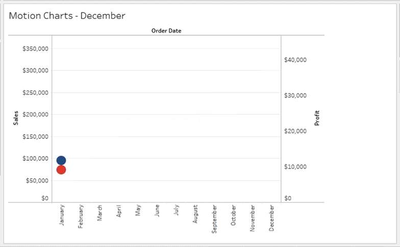
- Press on the arrow buttons to see the motions, change the Show History customizations, the speed etc.

Stranding your data in isolated, static graphs limits the number and depth of questions you can answer. Let your analysis become your organization’s centerpiece by using it to fuel exploration. Combine related charts. Add a map. Provide filters to dig deeper. The impact? Immediate business insight and answers to questions that actually drive business decisions.
So, which chart is right for you?
If you’re an aspiring Tableau developer, understanding Tableau is essential. Check out our Tableau Training Course to get all the information you should learn about this powerful software.