Data Science with Python Certification Course
- 131k Enrolled Learners
- Weekend
- Live Class
Python is a storehouse of numerous immensely powerful libraries and frameworks. Among them, is Seaborn, which is a dominant data visualization library, granting yet another reason for programmers to complete Python Certification. In this Python Seaborn Tutorial, you will be leaning all the knacks of data visualization using Seaborn.
Before moving on, let’s glance through all the topics of discussion in this article:
So let’s begin first by reasoning out the importance of Python Seaborn.
As mentioned earlier, the Python Seaborn library is used to ease the challenging task of data visualization and it’s based on Matplotlib. Seaborn allows the creation of statistical graphics through the following functionalities:
An API that is based on datasets allowing comparison between multiple variables
Supports multi-plot grids that in turn ease building complex visualizations
Univariate and bivariate visualizations available to compare between subsets of data
Availability of different color palettes to reveal various kinds of patterns
Estimates and plots linear regression automatically
So, if you were wondering as to why use Seaborn when you already have Matplotlib, here is the answer to it.
Matplotlib can be personalized but it’s difficult to figure out what settings are required to make plots more attractive. On the other hand, Seaborn comes with numerous customized themes and high-level interfaces to solve this issue.
When working with Pandas, Matplotlib doesn’t serve well when it comes to dealing with DataFrames, while Seaborn functions actually work on DataFrames.
How to install Seaborn?
To install the Python Seaborn library, you can use the following commands based on the platform you use:
pip install seaborn
or
conda install seaborn
Once this is installed, just make sure to install the packages and libraries that seaborn is dependent on.
Mandatory dependencies for seaborn are:
There is one recommended dependency as well which is:
To install these libraries, you can use the same commands as shown previously for Seaborn with their respective names. Once installed, they can be imported easily. Seaborn allows you to load any dataset from GIT using the load_dataset() function. You can also view all the available datasets using get_dataset_names() function as follows:
EXAMPLE:
import seaborn as sns
sns.get_dataset_names()
This will return a list of all the available datasets.
Now that you have set up your environment for working with seaborn, let’s move on further to see how to use it’s plotting functions in Python.
The process of understanding relationships between variables of a dataset and how these relationships, in turn, depend on other variables is known as statistical analysis. Let’s now take a deeper look at functions needed for this:
This is a figure-level-function that makes use of two other axes functions for Visualizing Statistical Relationships which are:
These functions can be specified using the ‘kind’ parameter of relplot(). In case this parameter is given, it takes the default one which is scatterplot(). Before you begin writing your code, make sure to import the required libraries as follows:
import numpy as np
import pandas as pd
import matplotlib.pyplot as plt
import seaborn as sns
sns.set(style="darkgrid")
Please note that the style attribute is also customizable and can take any value such as darkgrid, ticks, etc which I will discuss later in the plot-aesthetics section. Let’s now take a look at a small example:
EXAMPLE:
f = sns.load_dataset("flights")
sns.relplot(x="passengers", y="month", data=f);
OUTPUT:
As you can see, the points are plotted in 2-dimensions. However, you can add another dimension using the ‘hue’ semantic. Let’s take a look at an example of the same:
EXAMPLE:
f = sns.load_dataset("flights")
sns.relplot(x="passengers", y="month", hue="year", data=f);
You will see the following output:
OUTPUT:
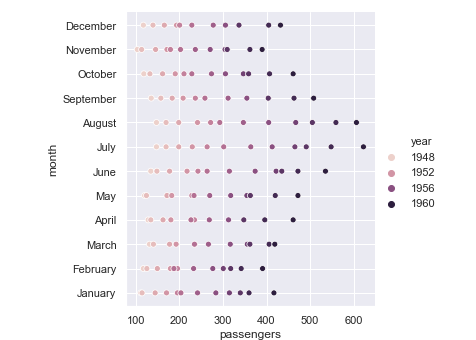
However, there are many more customizations that you can try out such as colors, styles, size, etc. Let me just show how you can change the color in the following example:
EXAMPLE:
sns.set(style="darkgrid")
f = sns.load_dataset("flights")
sns.relplot(x="passengers", y="month", hue="year",palette="ch:r=-.5,l=.75", data=f);
OUTPUT:
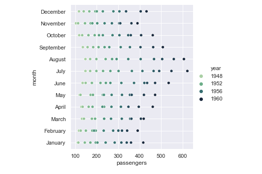
This function will allow you to draw a continuous line for your data. You can use this function by changing the ‘kind’ parameter as follows:
EXAMPLE:
a=pd.DataFrame({'Day':[1,2,3,4,5,6,7],'Grocery':[30,80,45,23,51,46,76],'Clothes':[13,40,34,23,54,67,98],'Utensils':[12,32,27,56,87,54,34]},index=[1,2,3,4,5,6,7])
g = sns.relplot(x="Day", y="Clothes", kind="line", data=a)
g.fig.autofmt_xdate()
The default for lineplot is y as a function of x. However, it can be changed if you wish to do so. There are many more options which you can try out further.
Now let’s take a look at how to plot categorical data.
This approach comes into the picture when our main variable is further divided into discrete groups (categorical). This can be achieved using the catplot() function.
This is a figure-level-function like relplot(). It can be characterized by three families of axes level functions namely:
Scatterplots – These include stripplot(), swarmplot()
Distribution Plots – which are boxplot(), violinplot(), boxenplot()
Estimateplots – namely pointplot(), barplot(), countplot()
Let’s now take a few examples to demonstrate this:
EXAMPLE:
import seaborn as sns
import matplotlib.pyplot as plt
sns.set(style="ticks", color_codes=True)
a = sns.load_dataset("tips")
sns.catplot(x="day", y="total_bill", data=a);
OUTPUT:
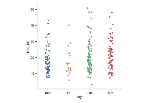
As you can see, in the above example I have not set the ‘kind’ parameter. Therefore it has returned the graph as the default scatterplot. You can specify any of the axes level function to change the graph as need be. Let’s take an example of this as well:
EXAMPLE:
import seaborn as sns
import matplotlib.pyplot as plt
sns.set(style="ticks", color_codes=True)
a = sns.load_dataset("tips")
sns.catplot(x="day", y="total_bill", kind="violin", data=a);
The above output shows the violinplot for the tips dataset. Now let us try to find how to visualize the distribution of a dataset.
This basically deals with understanding datasets with context to being univariate or bivariate. Before starting with this, just import the following:
import numpy as np
import pandas as pd
import seaborn as sns
import matplotlib.pyplot as plt
from scipy import stats
sns.set(color_codes=True)
Once this is done, you can continue plotting univariate and bivariate distributions.
Plotting Univariate distributions:
To plot them, you can make use of distplot() function as follows:
EXAMPLE:
a = np.random.normal(loc=5,size=100,scale=2)
sns.distplot(a);
OUTPUT:
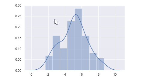
As you can see in the above example, we have plotted a graph for the variable a whose values are generated by the normal() function using distplot.
Plotting bivariate distributions:
This comes into picture when you have two random independent variables resulting in some probable event. The best function to plot these type of graphs is jointplot(). Let us now plot a bivariate graph using jointplot().
EXAMPLE:
x=pd.DataFrame({'Day':[1,2,3,4,5,6,7],'Grocery':[30,80,45,23,51,46,76],'Clothes':[13,40,34,23,54,67,98],'Utensils':[12,32,27,56,87,54,34]},index=[1,2,3,4,5,6,7])
y=pd.DataFrame({'Day':[8,9,10,11,12,13,14],'Grocery':[30,80,45,23,51,46,76],'Clothes':[13,40,34,23,54,67,98],'Utensils':[12,32,27,56,87,54,34]},index=[8,9,10,11,12,13,14])
mean, cov = [0, 1], [(1, .5), (.5, 1)]
data = np.random.multivariate_normal(mean, cov, 200)
with sns.axes_style("white"):
sns.jointplot(x=x, y=y, kind="kde", color="b");
Now that you have understood the various functions in Python Seaborn, let’s move on to build structured multi-plot grids.
Python Seaborn allows you to plot multiple grids side-by-side. These are basically plots or graphs that are plotted using the same scale and axes to aid comparison between them. This, in turn, helps the programmer to differentiate quickly between the plots and obtain large amounts of information.
Consider the following example of facetgrid() function to plot these graphs.
EXAMPLE:
sns.set(style="darkgrid")
a = sns.load_dataset("iris")
b = sns.FacetGrid(a, col="species")
b.map(plt.hist, "sepal_length");
OUTPUT:

The above output clearly shows the comparison between the tips that are given during Lunch and Dinner. You can also plot using PairGrid function when you have a pair of variables to compare. Consider the following example.
EXAMPLE:
sns.set(style="ticks")
a = sns.load_dataset("flights")
b = sns.PairGrid(a)
b.map(plt.scatter);
As you can see, the above output clearly compares between the year and the number of passengers in different ways.
Seaborn also allows customizations regarding aesthetics which is discussed further.
This segment of Python Seaborn tutorial deals with making our plots more attractive and delightful.
The first function that I shall be discussing is set(). I have been using the ‘style’ parameter of this function before. This parameter basically deals with seaborn themes. At present, there are five of them available namely darkgrid, ticks, whitegrid, white and dark.
Consider the following example demonstrating the white theme.
EXAMPLE:
import seaborn as sns
import matplotlib.pyplot as plt
sns.set(style="white", color_codes=True)
a = sns.load_dataset("tips")
sns.boxplot(x="day", y="total_bill", data=a);
OUTPUT:
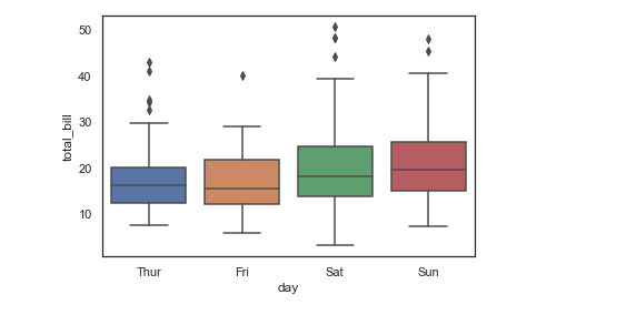
In the above output, you can notice the theme is changed to white. You can explore them further using the other themes as well. If you notice in the previous output, there are axes present all around the graph. However, this is also customizable using the despine() function. Look at the example below.
EXAMPLE:
import seaborn as sns
import matplotlib.pyplot as plt
sns.set(style="white", color_codes=True)
a = sns.load_dataset("tips")
sns.boxplot(x="day", y="total_bill", data=a);
sns.despine(offset=10, trim=True);
OUTPUT: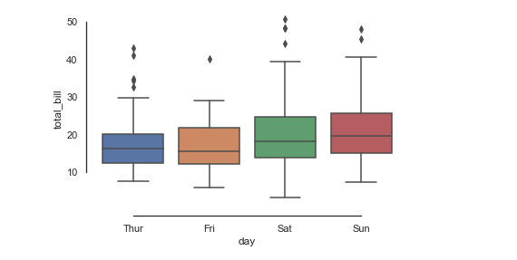
Note the difference between the previous two outputs. However, there are many more options that you can explore for yourself.
Color is basically the feature that approaches the human eyes beyond any other feature. Seaborn allows you to play with colors using various functions such as color_palette(), hls_palette(), husl_palette(), etc. Take a look at the colors that are currently present within seaborn.
EXAMPLE:
import numpy as np
import seaborn as sns
import matplotlib.pyplot as plt
sns.set()

presentcolors = sns.color_palette()
sns.palplot(presentcolors)
OUTPUT:

The above image shows the colors that are present within seaborn. I have done it using the palplot() function. For deeper variations, you can use hls_palette(), husl_palette(), etc.
This brings us to the end of Python Seaborn Tutorial. I hope you have understood everything clearly. Make sure you practice as much as possible.
Got a question for us? Please mention it in the comments section of this “Python Seaborn Tutorial” blog and we will get back to you as soon as possible.
To get in-depth knowledge on Python along with its various applications, you can enroll for live Python online course certification with 24/7 support and lifetime access.
 Thank you for registering Join Edureka Meetup community for 100+ Free Webinars each month JOIN MEETUP GROUP
edureka.co