
Data Science with Python Certification Course
- 131k Enrolled Learners
- Weekend
- Live Class
(49300)


 Copy Link!
In my previous blog, I discussed about a numerical library of python called Python NumPy. In this blog, I will be talking about another library, Python Matplotlib. matplotlib.pyplot is a python package used for 2D graphics. Learning to use this library efficiently is also an essential part of Python Certification curriculum. Below is the sequence in which I will be covering all the topics of python matplotlib:
matplotlib.pyplot is a plotting library used for 2D graphics in python programming language. It can be used in python scripts, shell, web application servers and other graphical user interface toolkits.
Matploitlib is a Python Library used for plotting, this python library provides and objected-oriented APIs for integrating plots into applications.
Matplotlib is not a part of the Standard Libraries which is installed by default when Python, there are several toolkits which are available that extend python matplotlib functionality. Some of them are separate downloads, others can be shipped with the matplotlib source code but have external dependencies.
You may go through this recording of Python Matplotlib where our instructor has explained how to download Matplotlib in Python and the topics in a detailed manner with examples that will help you to understand this concept better.
Next, let us move forward in this blog and explore different types of plots available in python matplotlib.
There are various plots which can be created using python matplotlib. Some of them are listed below:
I will demonstrate each one of them in detail.
But before that, let me show you very basic codes in python matplotlib in order to generate a simple graph.
from matplotlib import pyplot as plt

 #Plotting to our canvas

 plt.plot([1,2,3],[4,5,1])

 #Showing what we plotted

 plt.show()
Output –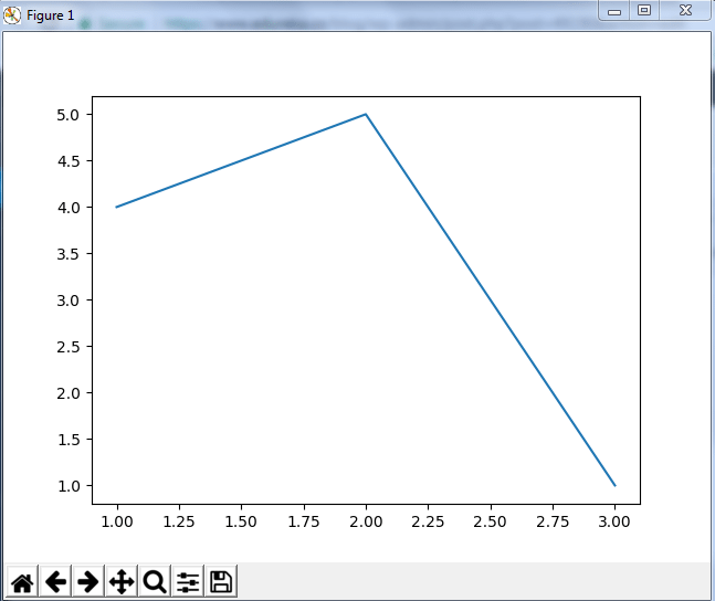
So, with three lines of code, you can generate a basic graph using python matplotlib. Simple, isn’t it?
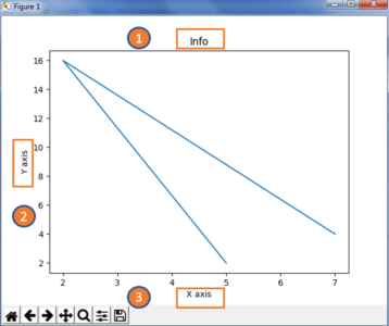
Let us see how can we add title, labels to our graph created by python matplotlib library to bring in more meaning to it. Consider the below example:
from matplotlib import pyplot as plt

x = [5,2,7]
y = [2,16,4]
plt.plot(x,y)
plt.title('Info')
plt.ylabel('Y axis')
plt.xlabel('X axis')
plt.show()
Output –
You can even try many styling techniques to create a better graph. What if you want to change the width or color of a particular line or what if you want to have some grid lines, there you need styling! So, let me show you how to add style to a graph using python matplotlib. First, you need to import the style package from python matplotlib library and then use styling functions as shown in below code:
from matplotlib import pyplot as plt
from matplotlib import style

style.use('ggplot')
x = [5,8,10]
y = [12,16,6]
x2 = [6,9,11]
y2 = [6,15,7]
plt.plot(x,y,'g',label='line one', linewidth=5)
plt.plot(x2,y2,'c',label='line two',linewidth=5)
plt.title('Epic Info')
plt.ylabel('Y axis')
plt.xlabel('X axis')
plt.legend()
plt.grid(True,color='k')
plt.show()
Output –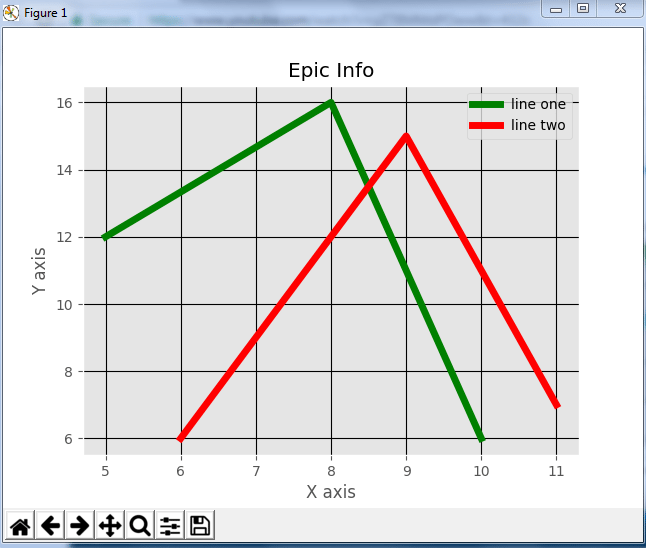
Next in this python matplotlib blog, we will understand different kinds of plots. Let’s start with bar graph!
First, let us understand why do we need a bar graph. A bar graph uses bars to compare data among different categories. It is well suited when you want to measure the changes over a period of time. It can be represented horizontally or vertically. Also, the important thing to keep in mind is that longer the bar, greater is the value. Now, let us practically implement it using python matplotlib.
from matplotlib import pyplot as plt

plt.bar([0.25,1.25,2.25,3.25,4.25],[50,40,70,80,20],
label="BMW",width=.5)
plt.bar([.75,1.75,2.75,3.75,4.75],[80,20,20,50,60],
label="Audi", color='r',width=.5)
plt.legend()
plt.xlabel('Days')
plt.ylabel('Distance (kms)')
plt.title('Information')
plt.show()
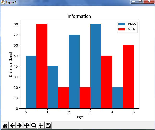
In the above plot, I have displayed the comparison between the distance covered by two cars BMW and Audi over a period of 5 days. Next, let us move on to another kind of plot using python matplotlib – Histogram.
Let me first tell you the difference between a bar graph and a histogram. Histograms are used to show a distribution whereas a bar chart is used to compare different entities. Histograms are useful when you have arrays or a very long list. Let’s consider an example where I have to plot the age of population with respect to bin. Now, bin refers to the range of values that are divided into series of intervals. Bins are usually created of the same size. In the below code, I have created the bins in the interval of 10 which means the first bin contains elements from 0 to 9, then 10 to 19 and so on.
import matplotlib.pyplot as plt
population_age = [22,55,62,45,21,22,34,42,42,4,2,102,95,85,55,110,120,70,65,55,111,115,80,75,65,54,44,43,42,48]
bins = [0,10,20,30,40,50,60,70,80,90,100]
plt.hist(population_age, bins, histtype='bar', rwidth=0.8)
plt.xlabel('age groups')
plt.ylabel('Number of people')
plt.title('Histogram')
plt.show()
Output –
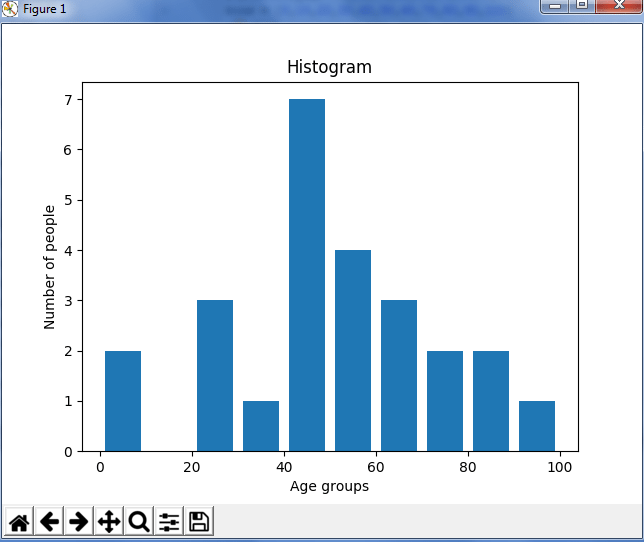
As you can see in the above plot, we got age groups with respect to the bins. Our biggest age group is between 40 and 50.
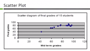
Usually we need scatter plots in order to compare variables, for example, how much one variable is affected by another variable to build a relation out of it. The data is displayed as a collection of points, each having the value of one variable which determines the position on the horizontal axis and the value of other variable determines the position on the vertical axis.
Consider the below example:
import matplotlib.pyplot as plt
x = [1,1.5,2,2.5,3,3.5,3.6]
y = [7.5,8,8.5,9,9.5,10,10.5]

x1=[8,8.5,9,9.5,10,10.5,11]
y1=[3,3.5,3.7,4,4.5,5,5.2]

plt.scatter(x,y, label='high income low saving',color='r')
plt.scatter(x1,y1,label='low income high savings',color='b')
plt.xlabel('saving*100')
plt.ylabel('income*1000')
plt.title('Scatter Plot')
plt.legend()
plt.show()
Output –
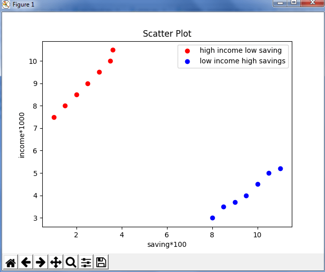
As you can see in the above graph, I have plotted two scatter plots based on the inputs specified in the above code. The data is displayed as a collection of points having ‘high income low salary’ and ‘low income high salary’.
Next, let us understand area plot or you can also say Stack plot using python matplotlib.
Area plots are pretty much similar to the line plot. They are also known as stack plots. These plots can be used to track changes over time for two or more related groups that make up one whole category. For example, let’s compile the work done during a day into categories, say sleeping, eating, working and playing. Consider the below code:
import matplotlib.pyplot as plt
days = [1,2,3,4,5]

 sleeping =[7,8,6,11,7]
 eating = [2,3,4,3,2]
 working =[7,8,7,2,2]
 playing = [8,5,7,8,13]

 plt.plot([],[],color='m', label='Sleeping', linewidth=5)
 plt.plot([],[],color='c', label='Eating', linewidth=5)
 plt.plot([],[],color='r', label='Working', linewidth=5)
 plt.plot([],[],color='k', label='Playing', linewidth=5)

 plt.stackplot(days, sleeping,eating,working,playing, colors=['m','c','r','k'])

 plt.xlabel('x')
 plt.ylabel('y')
 plt.title('Stack Plot')
 plt.legend()
 plt.show()
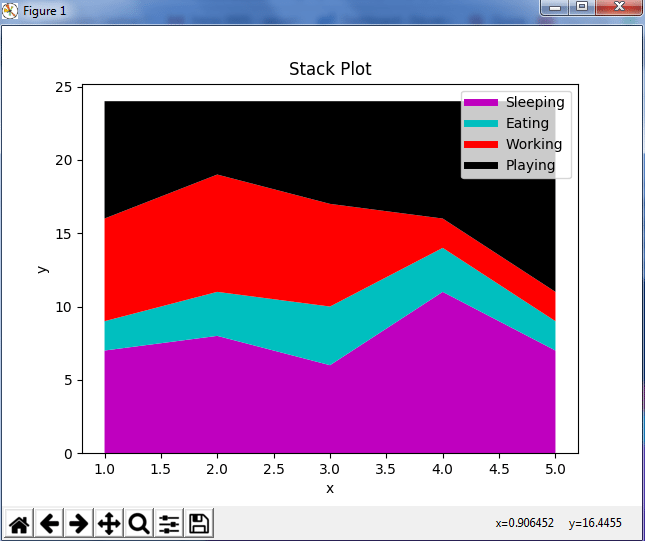
As we can see in the above image, we have time spent based on the categories. Therefore, area plot or stack plot is used to show trends over time, among different attributes. Next, let us move to our last yet most frequently used plot – Pie chart.
A pie chart refers to a circular graph which is broken down into segments i.e. slices of pie. It is basically used to show the percentage or proportional data where each slice of pie represents a category. Let’s have a look at the below example:
import matplotlib.pyplot as plt

days = [1,2,3,4,5]

sleeping =[7,8,6,11,7]
eating = [2,3,4,3,2]
working =[7,8,7,2,2]
playing = [8,5,7,8,13]
slices = [7,2,2,13]
activities = ['sleeping','eating','working','playing']
cols = ['c','m','r','b']

plt.pie(slices,
  labels=activities,
  colors=cols,
  startangle=90,
  shadow= True,
  explode=(0,0.1,0,0),
  autopct='%1.1f%%')

plt.title('Pie Plot')
plt.show()
Output –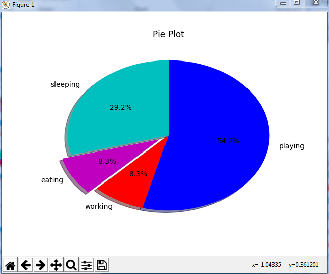
In the above pie chart, I have divided the circle into 4 sectors or slices which represents the respective category (playing, sleeping, eating and working) along with the percentage they hold. Now, if you have noticed these slices adds up to 24 hrs, but the calculation of pie slices is done automatically for you. In this way, pie charts are really useful as you don’t have to be the one who calculates the percentage or the slice of the pie.
Next in python matplotlib, let’s understand how to work with multiple plots.
I have discussed about multiple types of plots in python matplotlib such as bar plot, scatter plot, pie plot, area plot etc. Now, let me show you how to handle multiple plots. For this, I have to import numpy module which I discussed in my previous blog on Python Numpy. Let me implement it practically, consider the below example.
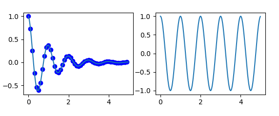
import numpy as np
import matplotlib.pyplot as plt

def f(t):
    return np.exp(-t) * np.cos(2*np.pi*t)
t1 = np.arange(0.0, 5.0, 0.1)
t2 = np.arange(0.0, 5.0, 0.02)
plt.subplot(221)
plt.plot(t1, f(t1), 'bo', t2, f(t2))
plt.subplot(222)
plt.plot(t2, np.cos(2*np.pi*t2))
plt.show()
Output -
The code is pretty much similar to the previous examples that you have seen but there is one new concept here i.e. subplot. The subplot() command specifies numrow, numcol, fignum which ranges from 1 to numrows*numcols. The commas in this command are optional if numrows*numcols<10. So subplot (221) is identical to subplot (2,2,1). Therefore, subplots helps us to plot multiple graphs in which you can define it by aligning vertically or horizontally. In the above example, I have aligned it horizontally.
Apart from these, python matplotlib has some disadvantages. Some of them are listed below:
We have come to an end of this python matplotlib tutorial. I have covered all the basics of matplotlib, so you can start practicing now. I hope you guys are clear about each and every aspect that I have discussed above. After this python matplotlib blog, I will be coming up with more blogs on python class, scikit learn and array. Stay tuned!
Got a question for us? Please mention it in the comments section of this “Python Matplotlib” blog and we will get back to you as soon as possible.
To get in-depth knowledge on python along with its various applications, you can enroll for live Python online training by Edureka with 24/7 support and lifetime access.


 Thank you for registering Join Edureka Meetup community for 100+ Free Webinars each month JOIN MEETUP GROUP

explanation of matplotlib is very easiest and its very helpfull for me thank you
Thanks! Just what I needed to get started!
Brilliant explanation. Well done
well done