


Advanced Power BI Certification Course with G ...
- 13k Enrolled Learners
- Weekend/Weekday
- Live Class
(4230)


 Copy Link!
The concept of Business Intelligence is something that is alien to very few people these days. With newer tools emerging every day to help solve the crisis of data management, most organizations have already moved in or have plans to use Business Intelligence in solving their crisis. Power BI is Microsoft’s latest BI tool mainly aimed to help everyone analyze and visualize their data.
Let us begin this tutorial by addressing the most essential and fundamental question, what exactly is Business Intelligence?
In an age where Business Intelligence has become a bigger domain than most trending technologies if you ask twenty people what the term business intelligence means, you are likely to get ten different answers. So let me put it in the simplest terms without losing the technicality of it. Business intelligence (BI) is the set of techniques and tools for the transformation of raw data into meaningful and useful information for business analysis. To put it simply, Business intelligence is the technology that gets the right data to the right people, at the right time so that they can make more effective business decisions.
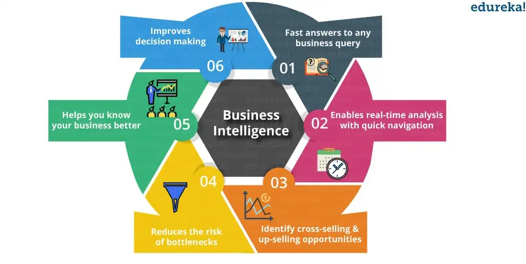
The image below shows the benefits of Business Intelligence.
 Over the years, the process of business intelligence has grown and adapted to help solve almost all the challenges while dealing with data by involving newer tools and techniques. The change that Business Intelligence has seen over the years can be divided into 3 waves, so let us continue with our tutorial and take a look at these three waves.
1st Wave: Technical (IT To End User)
During the first wave of business intelligence, the end-user had to be dependent on the IT department for data insights. This is because it was not possible for end-users to create visualizations/ reports on their own as tools available required technical knowledge. This dependence on the IT department for insights resulted in more effort and time consumption to get the updates done.
2nd Wave: Self-Service (Analyst To End User)
The second wave gave analysts access to BI. Now, people with some knowledge of analytics could use the BI tools. This meant more teams had access to BI and more people could have better data insights, this eased the role of IT teams.
3rd Wave: Everyone (End User)
The third wave has made it easier to access data and create reports, visuals to get better business insights. The introduction of tools like Power BI made this transition easy. Now anybody who has basic understanding of the data can create reports to build intuitive and shareable dashboards.
This was about BI, now let us continue with our tutorial and understand another important topic that is associated with BI.
You may go through this Microsoft Power BI recording where our Power BI Course expert has explained the topics in a detailed manner with examples that will help you to understand the concepts better.
Power BI Tutorial For Beginners | Power BI Training | Edureka
This video will help you to understand what is BI as well as Power BI. Then moving on in this video we have discussed the components and building blocks of Power BI.
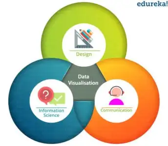 In a nutshell, data visualization is nothing but the pictorial or graphical representation of information/ data. It provides insights into complex data sets by communicating the key aspects in more intuitive and meaningful ways. Data visualization lies at the intersection of design, communication, and information science.
Even though data visualization has been termed as the key skill for research in the twenty-first century, it goes way back. It existed in the late 18th century and can be traced back to when William Playfair invented geometrical charts. His bar charts were used to represent Scotland’s imports and exports of 17 countries in 1781. These bar charts constituted a pure solution to the problem of discrete quantitative comparison.
The way, human brain processes information, it is easier to use images, charts, or graphs to understand and to visualize large amounts of complex data than to go through spreadsheets or reports. Take any image, for example, we all know the phrase ‘An image is worth a thousand words. This is completely true because images aren’t just a mere collection of pixels, they also hold a lot of information. This information in visual form is easy to understand than reading the same facts in text form.
Data visualization is a quick and easy way to convey concepts or information in a universal manner. Data visualization can help to:
This was about data visualization. Next, in this tutorial, we would see why is Power BI important.
The following points make Power BI one of the prominent tools for data visualization. This tutorial would be incomplete without understanding these points.
The above-mentioned reasons make Power BI very important in the context of data visualization. Let us continue with this Power BI tutorial for Beginners and understand What is Power BI.
Power BI, well this name has been in the BI market for quite a long time. Microsoft team has worked for a long time to build a big umbrella called Power BI, this umbrella is a combination of a strong visualization, data analysis, and a cloud-based tool.
To define it, Power BI is a business analytics service provided by Microsoft. It provides interactive visualizations with self-service business intelligence capabilities, where end users can create reports and dashboards by themselves, without having to depend on information technology staff or database administrators.
Power BI also gives you cloud-based BI services, known as “Power BI Services”, along with a desktop-based interface, called “Power BI Desktop”. It offers data warehouse capabilities, including data preparation, data discovery, and interactive dashboards. In March 2016, Microsoft released an additional service called Power BI Embedded on its Azure cloud platform which enables the user to analyze data easily, perform various ETL operations and deliver reports with Power BI.
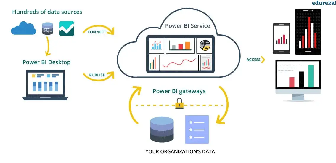
Power BI gateways let you connect with SQL Server databases, Analytical Services, and many other data sources to your dashboard in Power BI and reporting portals, embed Power BI reports and dashboards to give you a unified experience. The image below shows Power BI’s general workflow.
 Now that we have understood what Power BI is, let us try and understand its important components in the next topic of this Power BI tutorial for beginners.
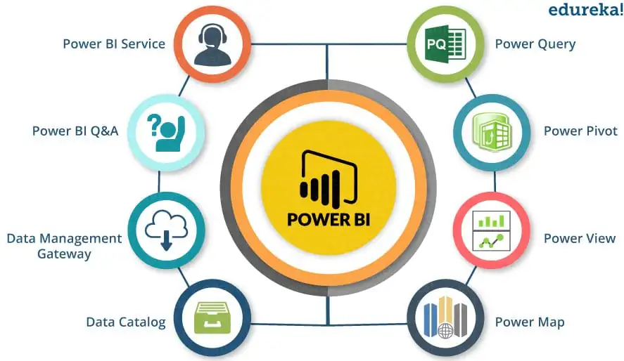 Power BI has the following components:
Now that we have seen the above mentioned components. Let us continue with this Power BI tutorial and understand Power BI’s architecture.
The following image shows Power BI’s architecture.
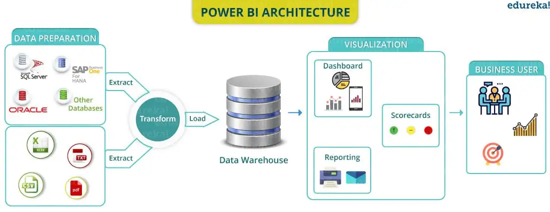 Power BI’s architecture has three phases. The first two phases partially use ETL (Extract, Transform and Load) to handle the data. Let us take a look at these phases one by one:
An organisation can be required to deal with data that comes from different sources. The data from data sources can be in different file formats. The data is first extracted from different sources which can be your different servers or databases etc. This data is then integrated in a standard format and then stored at a common area called as staging area.
The integrated data is still not ready for visualization because the data needs processing before it can be presented. This data is pre-processed or cleaned. For example, missing values or redundant values are removed from the data set. After the data is cleaned, business rules are applied to the data and it is transformed into presentable data. This data is then loaded into the Data Warehouse.
So once the data is loaded and processed now it can be visualized much better with use of various visualizations that Power BI has to offer. Use of reports, dashboards help one represent data in more intuitive manner. These visuals, reports help business end users to take business decisions based on the insights.
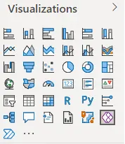
Power BI offers the functionality to visually represent our data or a subset of it so that it can be used to draw inferences or gain a deeper understanding of the data. These visuals can be bar graphs, pie charts, etc. Following are some examples of basic visual options provided in Power BI-
The following is an example of 4 basic visuals(Slicer, table, pie chart and stacked column chart) created using Power BI.
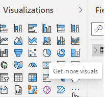
Apart from these basic visuals, there are options of obtaining more visuals as well. By clicking on the ‘Get more visuals’ option we obtain the following options-
Datasets in Power BI can be sourced from a variety of sources.
Some common examples of data sources are-
While sourcing the data, instead of importing the entire dataset, the user can source a subset of it. This subset may be as per the user requirement. Data may be integrated with Excel, SQL database, Azure, Facebook, MailChimp, etc.
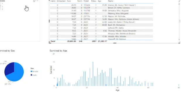
Data can be sourced from either a single source or from more than one source. The following is an example of a dataset sourced in Power BI-
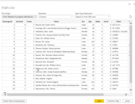
Click on Transform data.
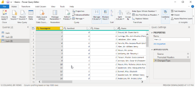
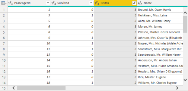
The user can choose the rows or columns as required by him and thus create the desired subset. This selection can be based on a condition such as selecting rows containing values for a particular field in a specific range.
The following image shows a filter applied to the Pclass field in the above dataset.
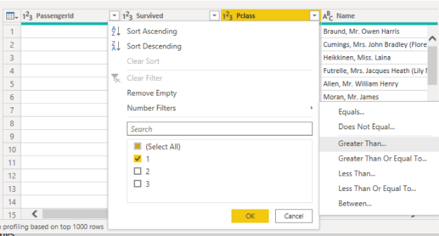
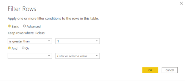
After applying the filter it shows only the rows belonging to Pclass 2 and 3.
A collection of visualizations relevant to a particular topic in Power BI form a dashboard. A combination of these dashboards forms a report. A report contains visuals related to a particular topic. The user may add any number of pages in the report. Each page is a single screen containing the visuals. The pages can be arranged in the order as required by the user.
The image below shows a sample report.
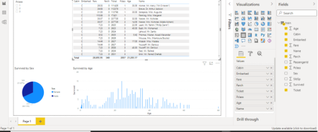
All the visuals appearing on a single Power BI page form a dashboard. It is a single page in a report. The visuals can be arranged in any order or position. Since it is a single page a dashboard generally contains only the most important or relevant visuals. Each dashboard can be shared with other users as well.
In Power BI, a tile is a single visualization found in a report or on a dashboard. A tile can be thought of as a square or rectangular boundary containing a single visual.
The height and width of each tile are adjustable. The order or position of each tile on the dashboard is adjustable as well.
The Navigation pane is present on the top of the Power BI screen. It has the following tabs-

There is a range of options in each tab to work with.
Click on the Q&A button in the Insert tab. The Q & A question box is available where users can type any question related to the data in natural language. Power BI will automatically try to auto complete the question using techniques like rephrasing, autofill, suggestions, etc. The answer is returned in form of visual or text. The user has the option of converting the Text reply to a visual as well.
The below image shows a question asked in natural language (spelling corrected automatically) and its answer in number which can also be converted to a visual.
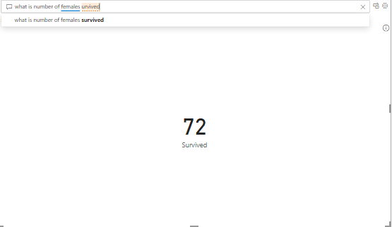
The following image shows the answer converted to a visual.

To perform functions on data, the user can use some predefined DAX Data Analysis functions. There are currently around 200 DAX predefined functions available in power BI. DAX or Data Analysis Expressions is a language used to interact with data on platforms like Power BI, PowerPivot and SSAS. It is simple and easy to learn and use.
![]()
Power BI can be integrated with R scripts as well. This helps in data cleaning, data shaping and thus obtaining advanced analytics.
Power BI provides robust security where access to each member is controlled. It provides quick responses to security threats. It also provides features like continuous monitoring, reporting, data protection, and unified endpoint management.
A collection of data that can be imported in PowerBI is known as a dataset. Through the Get Data feature, Power BI users can select from a range of data sources. The data sources can range anywhere from on-premise to cloud-based, unstructured to structured. New data sources are added every month. Data may be sourced from one or many different sources that can be combined together.
To source the data, click on the Get Data icon on the top of the screen. The data sources available for each category are as follows-
File category:
Database category
Power Platform category
Azure category
Online Services category
Other categories
The following are some of the companies currently using Power BI-

2. Click on the Download Free Button. The following Page appears.
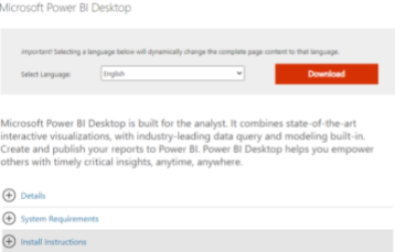
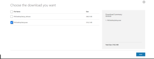
3. Choose the language and click the Download button. The following page appears-

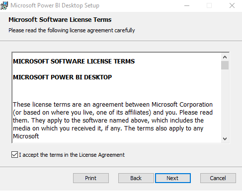

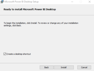
The setup is installed.
12. Click Finish.
Power BI desktop installation is complete.
Now I am going to take this tutorial a step further with a demonstration of creating a simple report using Power BI. However, there are few prerequisites to get started. First of all you need a ‘Power BI Desktop’ installed on your system, this is an interface where you can create reports. It can be downloaded for free. You may use this link to download Power BI Desktop.
You will be required to login with an organisational email ID like an institute Email ID or your Email ID of the organisation which you work for. It is important you create an account, because this will give you access to Power BI Service which is a must to publish your reports and create dashboards.
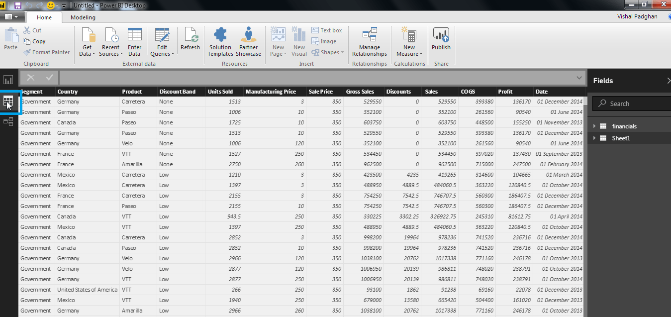
Once you have downloaded the Power BI Desktop. You would be needing a data set to visualize it. I would be using the finance data set created by Microsoft and it can be downloaded using this link.
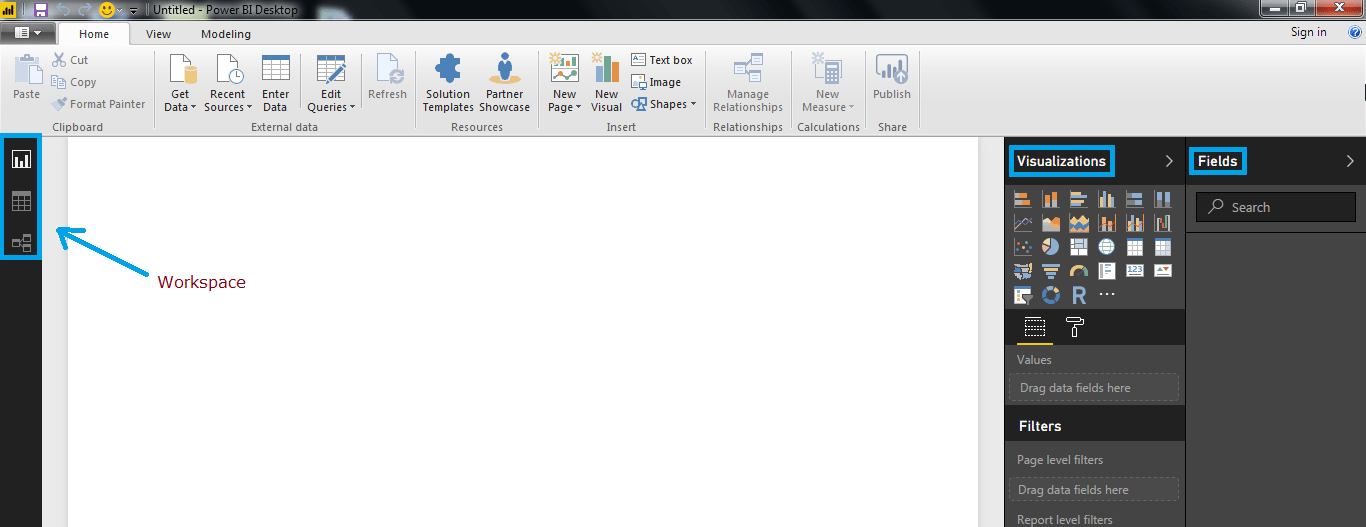
The image below shows how a Power BI Desktop’s interface looks. The highlighted section in blue colour, on the left panel shows the report, data and relationship workspaces. By default, the report workspace will open. This is where you create reports. Below the reports workspace is the data workspace which is used to see the imported data sets. Last tab is the relations tab which gives you relationship between different variables in a data set, if they are well defined. On the right side, you will see visualizations and field workspace.
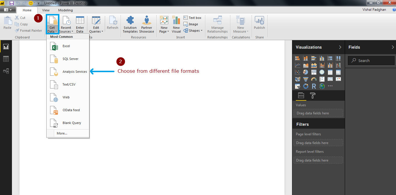
So let us import the finance data set in Power BI. You can click on the Get Data tab which is highlighted in the image below and load the data for usage.
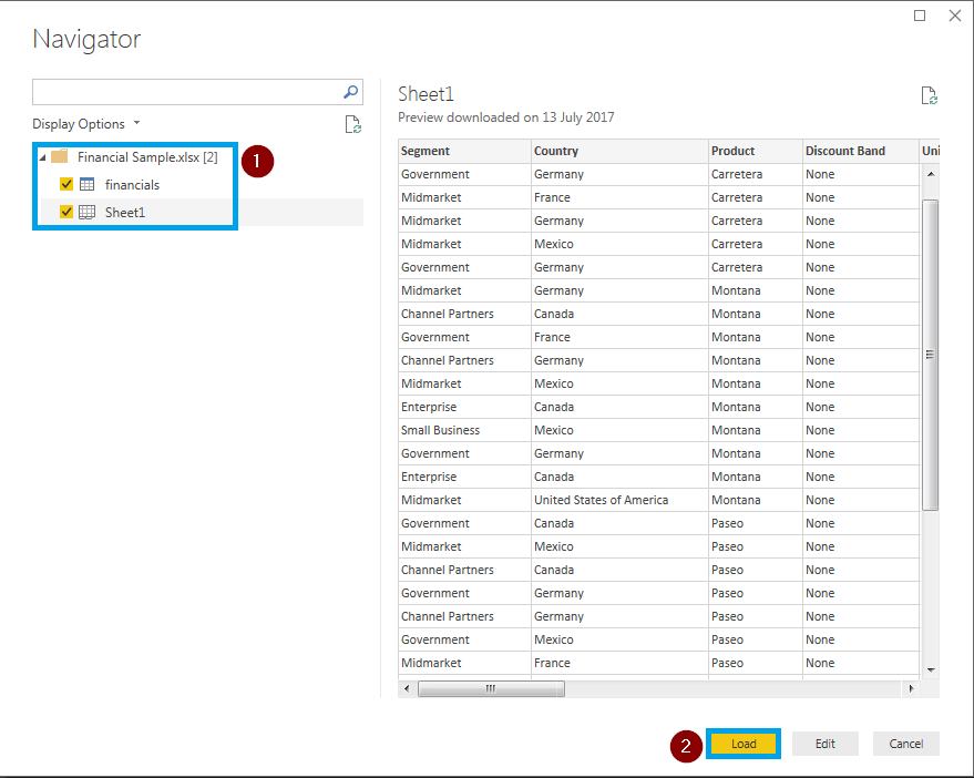
I have gone ahead and added the finance data set. Power BI will ask you whether you want to load data or edit it. I have simply loaded it because the data set won’t be needing any editing.
You can view by clicking on the data tab on the left hand corner of the interface. If you have taken a look at the data you would understand it is simple data about few countries and their sales in general. In the right corner of the screen, you can see all the fields the data set has. Use the image below for reference.
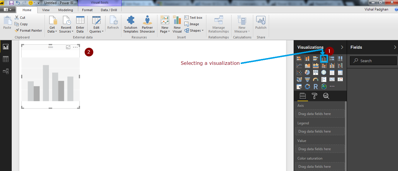
Let us go back to our report workspace and create a simple report. The first step is to select a visualization. I would be using a clustered column chart visualization. When you click on the desired visualization, a template is created in the report workspace.
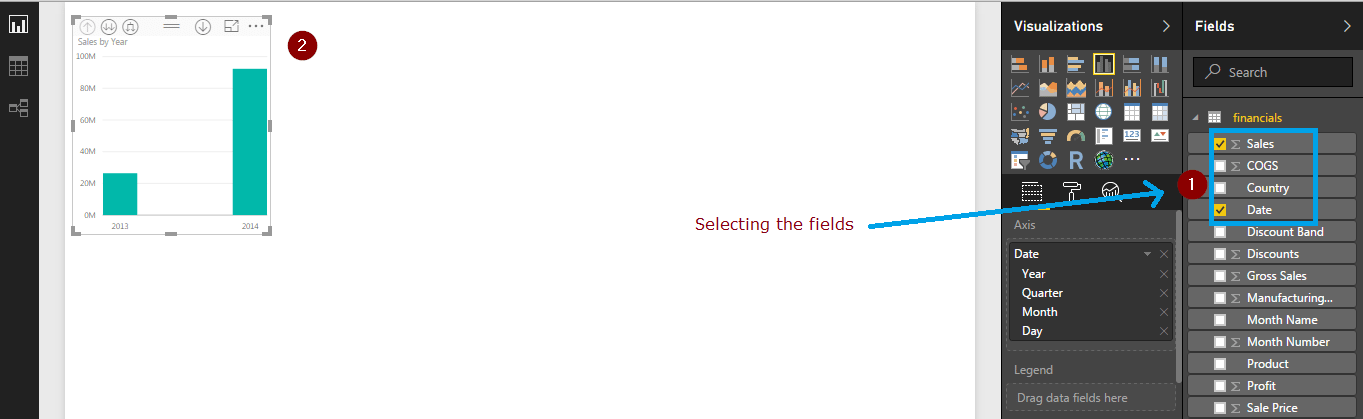
Now that we have selected a visualization, I am going to visualize sales and profits on Y-axis and date on X-axis. Since you are using Power BI, you don’t have to worry about complexities of choosing the axis. You just select the fields and it is reflected in the graph. Refer the image below.
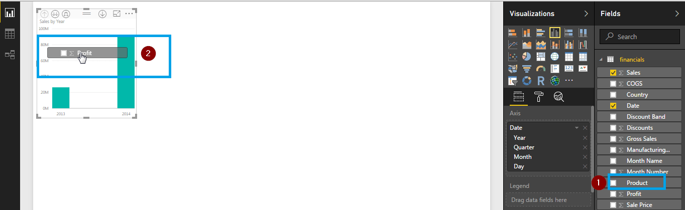
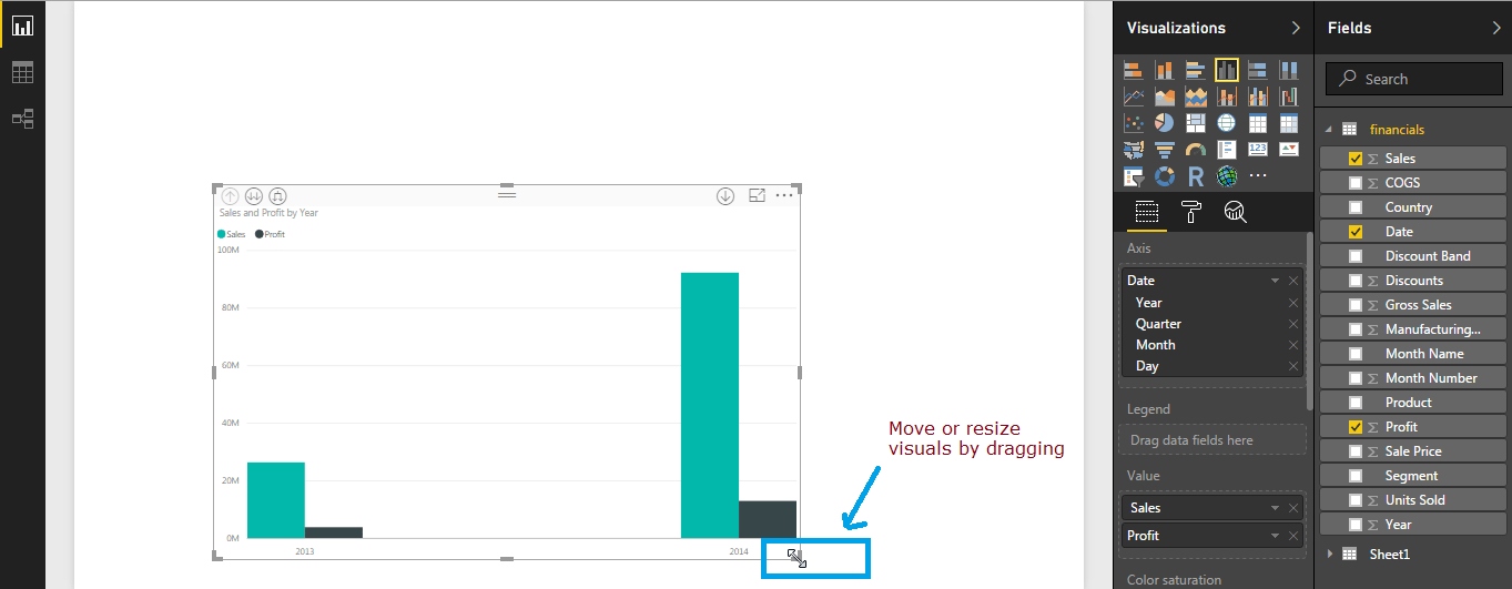
You can even drag and drop fields on the visualization and the changes would be reflected immediately. In the image below, I have dragged the ‘profit’ field.
You can resize these visualizations by just dragging the borders or even move the image by just clicking and placing it anywhere in the workspace.
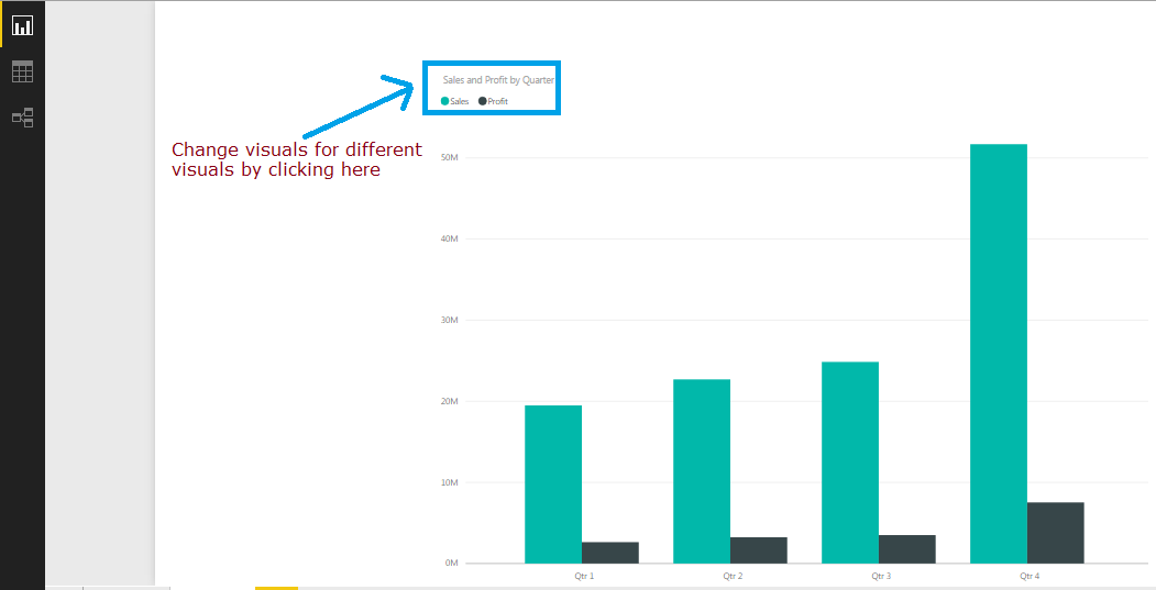
You can even change graphics based on timelines by just clicking. I have changed the yearly representation of the sales data in the above graph to monthly representation. And the insights have changed completely. You can refer the image below to see those changes.
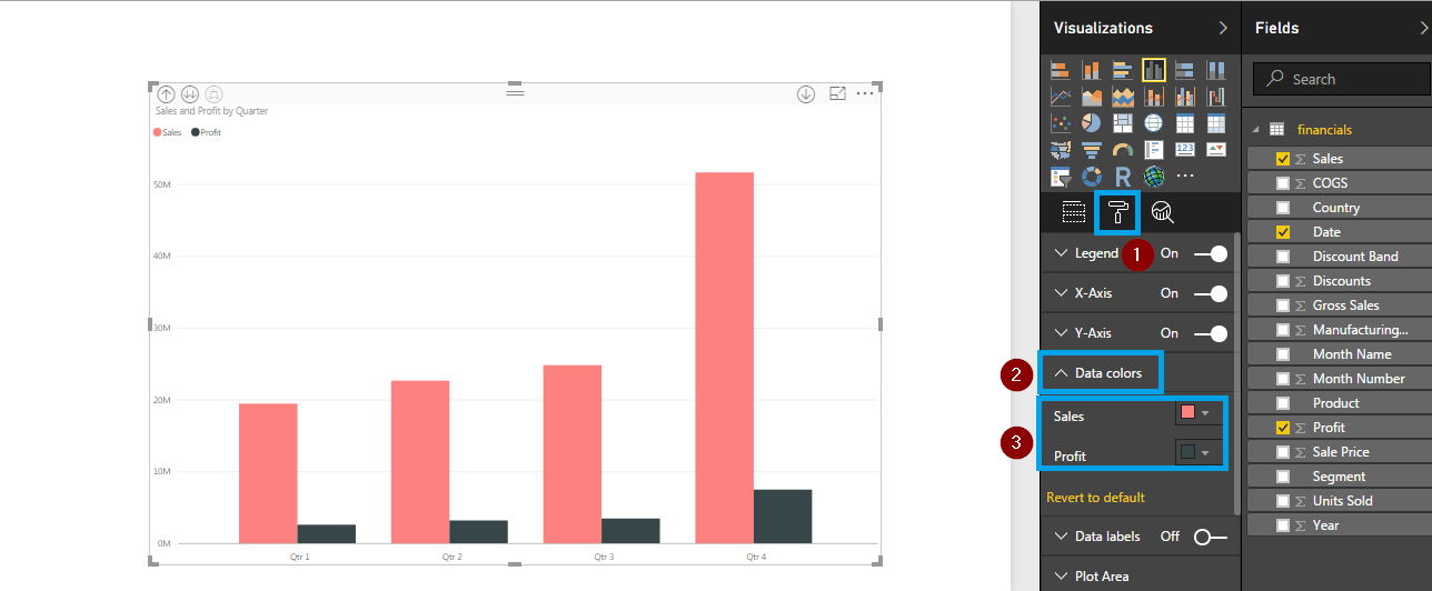
Below the visualization panel you have fields and format tabs. You perform statistical operations like calculating mean, median, sum and even filter data for various parameters by using fields tab. You can use different colour schemes to to make your visualization more appealing and insightful by using the format tab. The image below shows how you can change the colour of the fields used in the visualization.
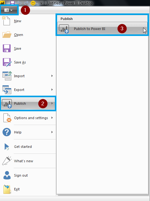
We have successfully created a visualization. Creating visualisations in Power BI is as simple as this. I hope by now, you are comfortable enough to create visualizations on your own. You can even go ahead and publish your reports to the web. The image below shows how to publish a report in Power BI.
Once you publish a report, Power BI will give you a link. You can click on that link and view your report after it is published. For your reference, I have created few other visualizations in a report and published it. You can that report in the form of GIF below. The following have been visualized:
When you create a report like this in your Power BI Desktop, you will get insights and you can drill-down into the stats. This can be achieved by clicking on different fields that are present in your visualizations.
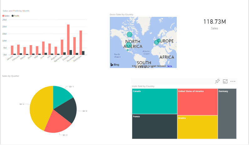
You may choose the visuals that suits your requirement and experiment accordingly. There are a lot of visualizations to try and experiment. Also, when it comes to visualization, no two individuals visualize data in the same way, so your reports may turn out differently. So this is how you can create reports and edit them using Power BI.
Power BI is used by these types of profiles:
Power BI is often used by management to draw insights and inferences about a company’s forecasts, customer behavior, etc. It can also be used to track an organization’s internal employee performance, etc.
Microsoft Power BI is most often used by companies with 50-200 employees and 10M-50M dollars in revenue.
The following are some of the key terms used in Power BI
There are several other keywords as well, that you should know of. Please check the following link for more keywords:
https://docs.microsoft.com/en-us/power-bi/consumer/end-user-glossary
Let us take a look at this use case and understand how Wirepas used Power BI to visualize a massive amount of sensor-collected data quickly, easily, and effectively.
About the company
Wirepas focuses on providing the most reliable, optimised, and scalable device connectivity to its customers. With Wirepas, customers can digitalise their current business processes and innovate for new disruptive models. Wirepas has its headquarters in Tampere, Finland, and offices in France, Germany, South Korea and the United States and was established in 2010 in Tampere.
Challenges
Wirepas technology collects a wide variety of data through its connectivity service. Every wireless device built on Wirepas software technology can collect and send a huge amount of data. This data is collected in several ways and then stored in database. Visualizing this data is key to getting an overview of the current state of “things” tracked by the technology. Wirepas had following obstacles to overcome:
Wirepas used Power BI to overcome all the above mentioned challenges. Let us take a look at the solution.
Solution and delivery
Acquire the data
The data was imported from different sources and cleaned up using Power BI and Query Editor.
Design the report using Power BI Desktop
After importing and cleaning up the data from 1 million sensors, Power BI was used to design dashboard that enabled the customers, to get overviews of all data and enable them to drill down to one single parcel and the parcel history.
Create a Power BI workspace
To create the Power BI workspace in Azure, the Power BI-CLI was used. Back then, there was no UI available to create workspaces for Power BI in Azure. Therefore, they used the Power BI command line tool for managing Power BI Embedded workspace collections.
Embed Power BI in a web app
Power BI Embedded enabled developers to embed reports in almost every kind of app. This was the easiest way to embed the report into a website.
The following architecture was used to overcome the overall problem: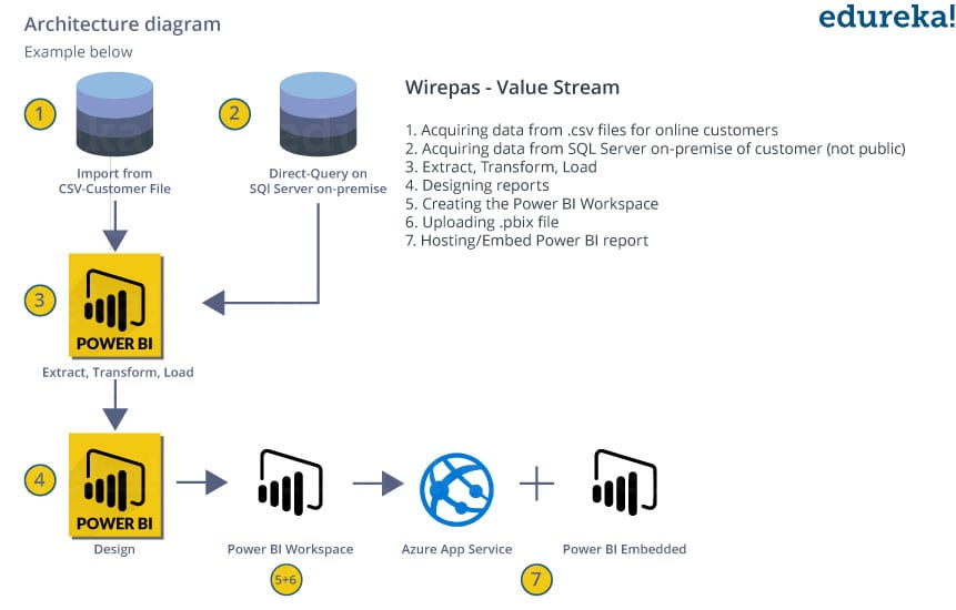 .
.
It uses DAX language for calculating and measuring columns
Difference between Power BI and SSRS
| PROS |
| It is open source and available free of cost. |
| Can Import data from native as well as other connected datasets |
| It is updated on a regular basis by taking in suggestions from users. |
| Since data is stored in a centralized location, it can be accessed from anywhere. |
| It offers interactive graphical visualization and so is user friendly and easy to use. |
| Power BI Embedded allows users to embed Power BI graphs, visuals and reports into emails and websites. |
| Users also have the option to upload and view data in excel. |
| It can integrate on premise and other data sources through personal gateways |
| There is no memory constraint when shifting to cloud |
The following are the various Power BI tools available-
This was a smart way for Wirepas to bring their IP to the cloud in an easy and fast implementation. The whole project needed limited calling time, consulting, and implementation.
For Bosch Connected World, this was an easy demonstration of complex data based on Azure and Power BI Embedded. Since the workshop, Wirepas has won several new customers who are using its products and dashboards powered by Power BI Embedded.
If you need a detailed understanding of this use case then you can refer thislink, which will direct you to the page where the actual case study was published.
Ready to showcase your skills? Dive into hands-on Power BI projects that will help you build stunning dashboards and gain real-world experience
This brings us to the end of this blog. I hope you liked this Power BI tutorial blog. This was the first blog of the Power BI series. This Power BI tutorial will be followed by my next blog, which will focus on Power BI Dashboards, do read that as well.
Power BI is used to see data visually, create dynamic dashboards, and get business insights. It does this with real-time reports and analytics.
Power BI Desktop is a free Windows application used to connect to data sources, transform data, and create interactive reports and visualizations for analysis and sharing.
To update Power BI Desktop, go to the official Power BI website, download the latest version, and install it over the existing one. If installed from the Microsoft Store, it updates automatically.
DAX (Data Analysis Expressions) in Power BI is a formula language used to create custom calculations and expressions for data analysis in reports and dashboards.
You can share a Power BI report by publishing it to the Power BI Service and then sharing the report link with others, or by embedding it in apps or websites, depending on your organization’s sharing permissions.
The best way to learn Power BI is through hands-on practice with real datasets, following official tutorials, and taking beginner-friendly courses that cover data modeling, DAX, and report building step by step.
Power BI offers several pricing options to suit different user needs:
Pricing may vary based on region and specific organizational agreements.
Subscribe to our youtube channel to get new updates..!
If you wish to build a career in business intelligence, our Business Intelligence Course will help you mine that data and enhance the decision-making processes throughout your organization.
Also, Acquire the in-demand skills and knowledge needed to excel as a Business Analyst in today’s market. Enroll in our Business Analyst Certification Course today and take the first step towards a fulfilling and lucrative career.
Related Questions
What are common pitfalls when using Power Query M language for data transformations?
What strategies can I use to handle large datasets without slowing down my Power BI reports?
What’s the best way to debug a DAX measure that’s producing incorrect results in visualizations?
How do you manage and optimize Power Query M code for transforming large datasets?
Got a question for us? Please mention it in the comments section and we will get back to you.


 Thank you for registering Join Edureka Meetup community for 100+ Free Webinars each month JOIN MEETUP GROUP
Recent survey reveals that more than 75% people are engrossed into on-line jobs. On line arena is now bigger and even better and making a lot of make money online opportunities. Working from home online tasks are becoming poplar and transforming individual’s day-to-day lives. Precisely why it is popular? This is because it lets you do the job from anywhere and anytime. You will enjoy more time to devote with your family members and can plan out journeys for getaways. Men and women are making great income of $32000 per week by utilizing the efficient and intelligent techniques. Performing right work in a right direction will definitely lead us in direction of becoming successful.
Thanks for sharing this information … nice