


Power BI Training Courses by PwC Academy
- 106k Enrolled Learners
- Weekend/Weekday
- Live Class
(33100)


 Copy Link!
Today, the concept of Business Intelligence is alien to very few people. Newer, more interactive BI tools emerge every single day, appealing to a lot of organizations to help solve their crisis. In such a scenario, professionals who are certified in Microsoft’s Power BI prove to be golden, mainly because it is aimed to help everybody analyze and visualize their data. Even non-technical Business people can use this tool to create interactive Power BI reports. This blog will be focused on Power BI Reports and would cover the following topics:
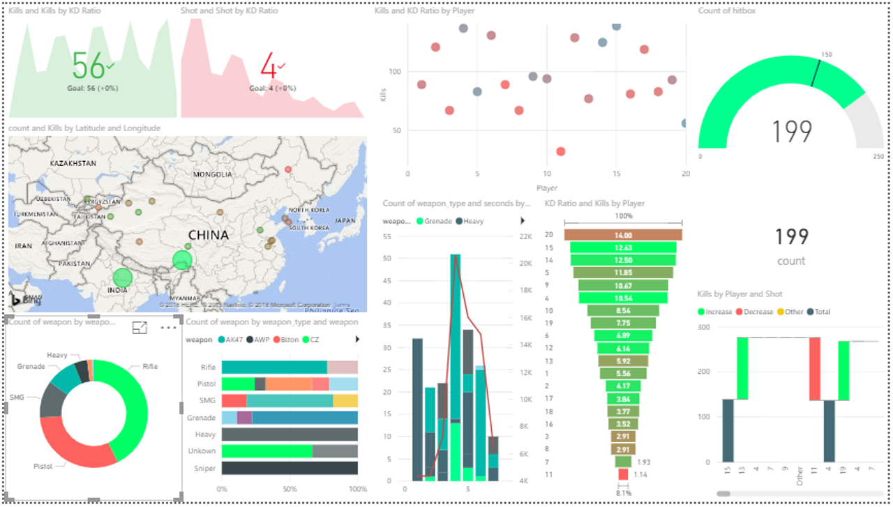
A Power BI report is a multi-perspective view of a dataset, with visualizations that represent different findings and insights from that dataset. A report can have a single visualization or pages full of visualizations. The visualizations in a report represent something like a dashboard does but serve a different purpose.
These visualizations aren’t static. In fact, far from it, with highly interactive & highly customizable visualizations which update, as the underlying data changes. You can add and remove data, change visualization types, and apply filters in your model to discover insights and look for answers.
So, the terms Report and Power BI Dashboard are used rather interchangeably but you can be assured they aren’t synonymous. The following table compares the features of a Report to those of a Dashboard.
| Capability | Dashboards | Reports |
| Pages | One page | One or more pages |
| Data sources | One or more reports and data sets, per dashboard | A single data set per report |
| Available in Power BI Desktop | No | Yes, can create and view reports in Desktop |
| Pinning | Can pin existing visualizations (tiles) only from the current dashboard to your other dashboards | Can pin visualizations (as tiles) to any of your dashboards. Can pin entire report pages to any of your dashboards. |
| Subscribe | Can’t subscribe to a dashboard | Can subscribe to report pages |
| Filtering | Can’t filter or slice | Many different ways to filter, highlight, and slice |
| Set alerts | No | Yes |
| Modify/change visualization type | No. In fact, if a report-owner changes the visualization type in the report, the pinned visualization on the dashboard does not update | Yes |
So basically, a report elaborates on a single dataset over many pages whereas a dashboard summarizes multiple datasets into a single page.
You can refer to this video curated by our Power BI Training expert for a more in-depth explanation.
Power BI Desktop | Power BI Desktop Tutorial For Beginners | Power BI Training | Edureka
This Edureka “Power BI Desktop” video will help you to understand what is Power BI Desktop and how to apply the best practices to build live and interactive dashboards and reports on this platform.
Power BI Report Server is an on-premises report server with a web portal in which you display and manage reports and KPIs, along with the tools to create Power BI reports, paginated reports, mobile reports, and KPIs.
It is like both SQL Server Reporting Services and the Power BI online service but in different ways. Like the Power BI service, Power BI Report Server hosts Power BI reports (.PBIX) and Excel files. Like Reporting Services, Power BI Report Server is on-premises and hosts paginated reports (.RDL). Your users can access those reports in different ways: viewing them in a web browser or mobile device, or as an email in their inbox.
Power BI Report Server is a superset of Reporting Services: everything you can do in Reporting Services, you can do with Power BI Report Server and more, with the addition of support for Power BI reports.
Also Read: How to get MS Power BI Data Analyst Associate PL-300 Badge for my Email Signature?
The Power BI Report Server has a lot in common with the Power BI Service but also a few dissimilarities. The table below explains it all.
| Features | Power BI Report Server | Power BI Service |
|---|---|---|
| Deployment | On-premises or hosted cloud | Cloud |
| Source data | Cloud and/or on-premises | Cloud and/or on-premises |
| License | Power BI Premium or SQL Server EE with SA | Power BI Pro and/or Power BI Premium |
| Lifecycle | Modern lifecycle policy | Fully managed service |
| Release cycle | Once every 4 months | Once a month |
| Create Power BI reports in Power BI Desktop | Yes | Yes |
| Create Power BI reports in the browser | No | Yes |
| Gateway required | No | Yes for on-premises data sources |
| Real-time streaming | No | Yes |
| Dashboards | No | Yes |
| Distribute group of reports using apps | No | Yes |
| Content packs | No | Yes |
| Connect to services like Salesforce | No | Yes |
| Q&A | No | Yes |
| Quick insights | No | Yes |
| Analyze in Excel | No | Yes |
| Paginated reports | Yes | No |
| Power BI mobile apps | Yes | Yes |
| ARC GIS maps | No | Yes |
| Email subscriptions for Power BI report | No | Yes |
| Email subscriptions for paginated reports | Yes | No |
| Data alerts | No | Yes |
| Row-level security | Only through data source in DirectQuery mode | Available in both DirectQuery (data source) & Import mode |
| Full-screen mode | No | Yes |
| Advanced Office 365 collaboration | No | Yes |
| R visuals | No | Yes |
| Preview features | No | Yes |
| Custom visuals | Yes | Yes |
| Power BI Desktop | Version optimized for Report Server, available for download with Report Server | Version optimized for Power BI Service, available from the Windows Store |
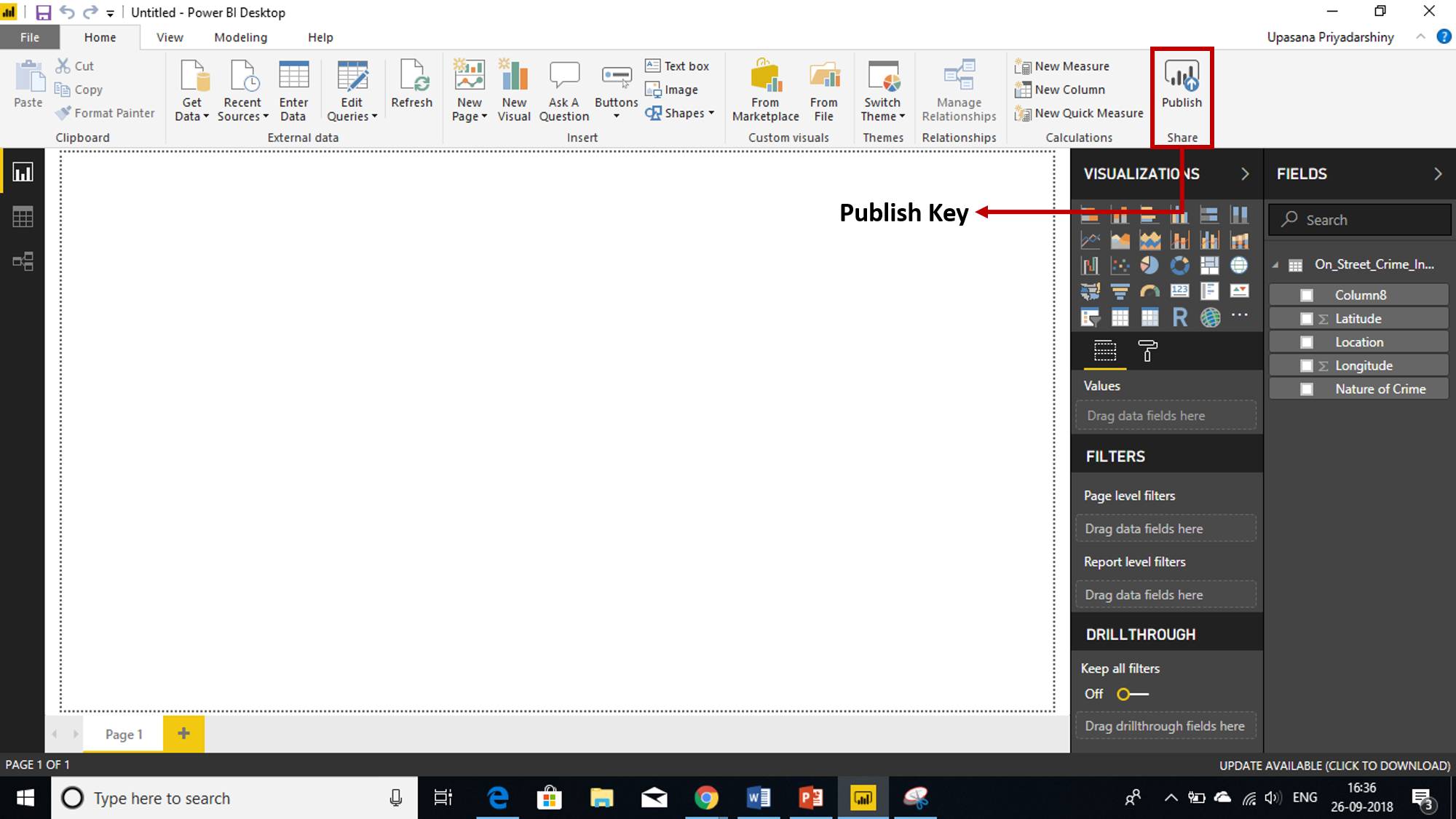
Now there isn’t much use of the theory of Power BI if you’re not going to create reports on your own. Depending on your role, you may be someone who creates reports for your own use or to share with colleagues. Either way, you want to learn how to create and share reports or at least understand how to interact with reports.
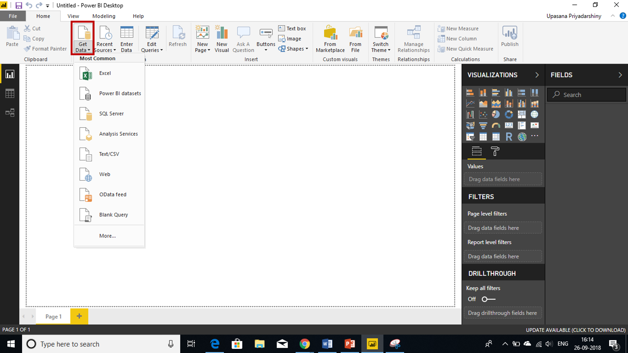
There are many ways to create a report, and in this blog, we’ll start by creating a very basic report from an Excel dataset using the Power BI service.
If you’ve already created Power BI reports in Power BI Desktop, then you’re almost ready to create Power BI reports for Power BI Report Server. I would recommend installing the version of Power BI Desktop optimized for Power BI Report Server, so you know the server and the app are always in sync. You can have both versions of Power BI Desktop on the same computer.
Power BI Reports now come in the convenience of your Mobile Apps. QR codes in Power BI can connect anything in the real world directly to related BI information – no navigation or search needed.
You can create a QR code in the Power BI service for any report, even for a report you can’t edit. Then you place the QR code in a key location. For example, you could paste it in an email, or print it out and paste it in a specific location.
When building Power BI reports, you may need to write DAX queries to retrieve specific data for visualization. However, a common issue many beginners face is the "IN operator is not supported" error when writing DAX queries in tools like DAX Studio or the Query Editor.
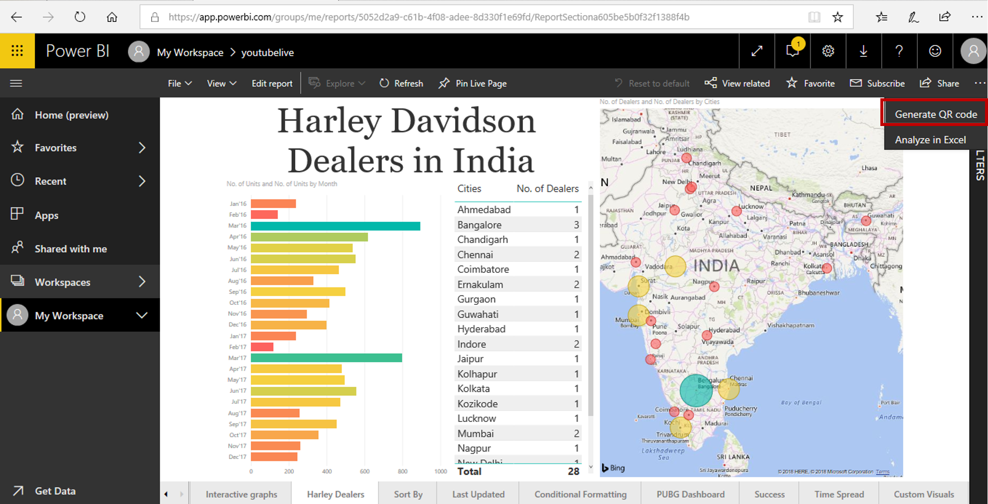
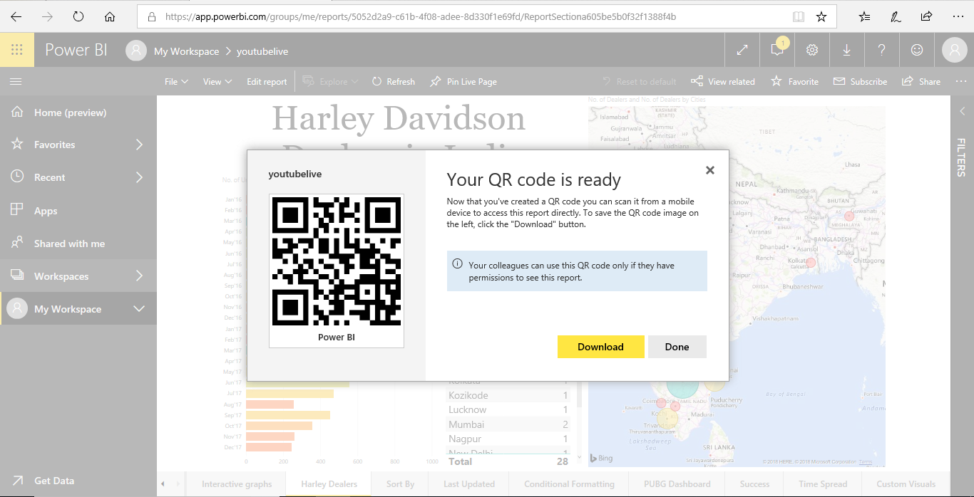
Colleagues you’ve shared the report with can scan the QR code for access to the report, right from their mobile device. They can use either the QR code scanner located in the Power BI App or any other QR scanner installed on their device. They can also scan a report QR code with the Power BI for Mixed Reality App.
Also Read Where to send bug report for Power BI Desktop?
Tips and Tricks to Create Powerful Reports on the Power BI
To get the most out of your data, sometimes you need a little extra help. So, here are some tips & tricks you can use when creating reports in the Microsoft Power BI Desktop.
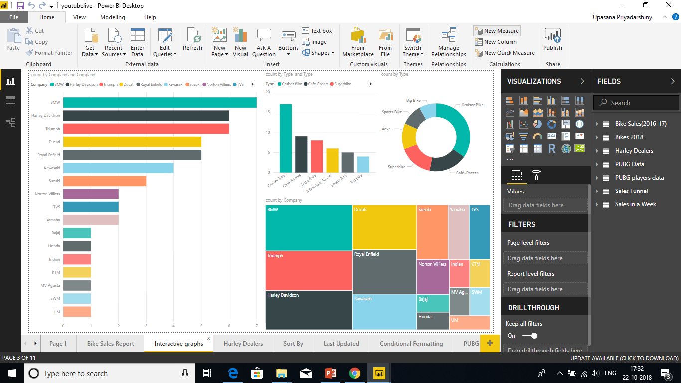
Avoid visualization variety for the sake of variety. Visualizations should paint a picture and be easy to “read” and interpret. For some data and visualizations, a simple graphics visualization is enough. But other data may call for a more-complex visualization – be sure to make use of titles and labels and other customization to help the reader.
Be careful using charts that distort reality i.e. 3-D charts and charts that don’t start at zero. Keep in mind that it is more difficult for the human brain to interpret circular shapes. Pie charts, donut charts, gauges, and other circular chart types may look pretty, but perhaps there’s a different visual you can use instead?
Be sure to encode quantitative data nicely. Don’t exceed three or four numerals when displaying numbers. Display measures to one or two numerals left of the decimal point and scale for thousands or millions i.e. 3.4 million, not 3,400,000.
Try to avoid mixing levels of precision and time. Make sure that time frames are well understood. Don’t have one chart that has last month next to filtered charts from a specific month of the year.
Also try to avoid mixing big and small measures on the same scale, such as on a line or bar chart. For example, one measure can be in the millions and the other measure in the thousands. With such a large scale, it would be difficult to see the differences of the measure that is in the thousands. If you need to mix, choose a visualization, like a combo chart, that allows the use of a second axis.
Pay attention to how charts are sorted. If you want to draw attention to the highest or lowest number, sort by the measure. If you want people to be able to quickly find a particular category within many other categories, sort by the axis.
Pie charts are best if they have fewer than eight categories. Because you can’t compare the values side by side, it’s harder to compare values in a pie chart than in bar and column charts. Pie charts can be good for viewing part-to-whole relationships rather than for comparing the parts. And Gauge charts are great for displaying the current status in the context of a goal.
Sort by Another Column. When you use a categorical (string) value in Power BI for chart axes or in a slicer or filter, the default order is alphabetical. If you need to override this order, for example for things like days of the week or months, then you can tell Power BI Desktop to sort by a different column.
One key thing to remember: italics in the data grid do not mean the data type is correctly set, it just means the data is not considered as Text.
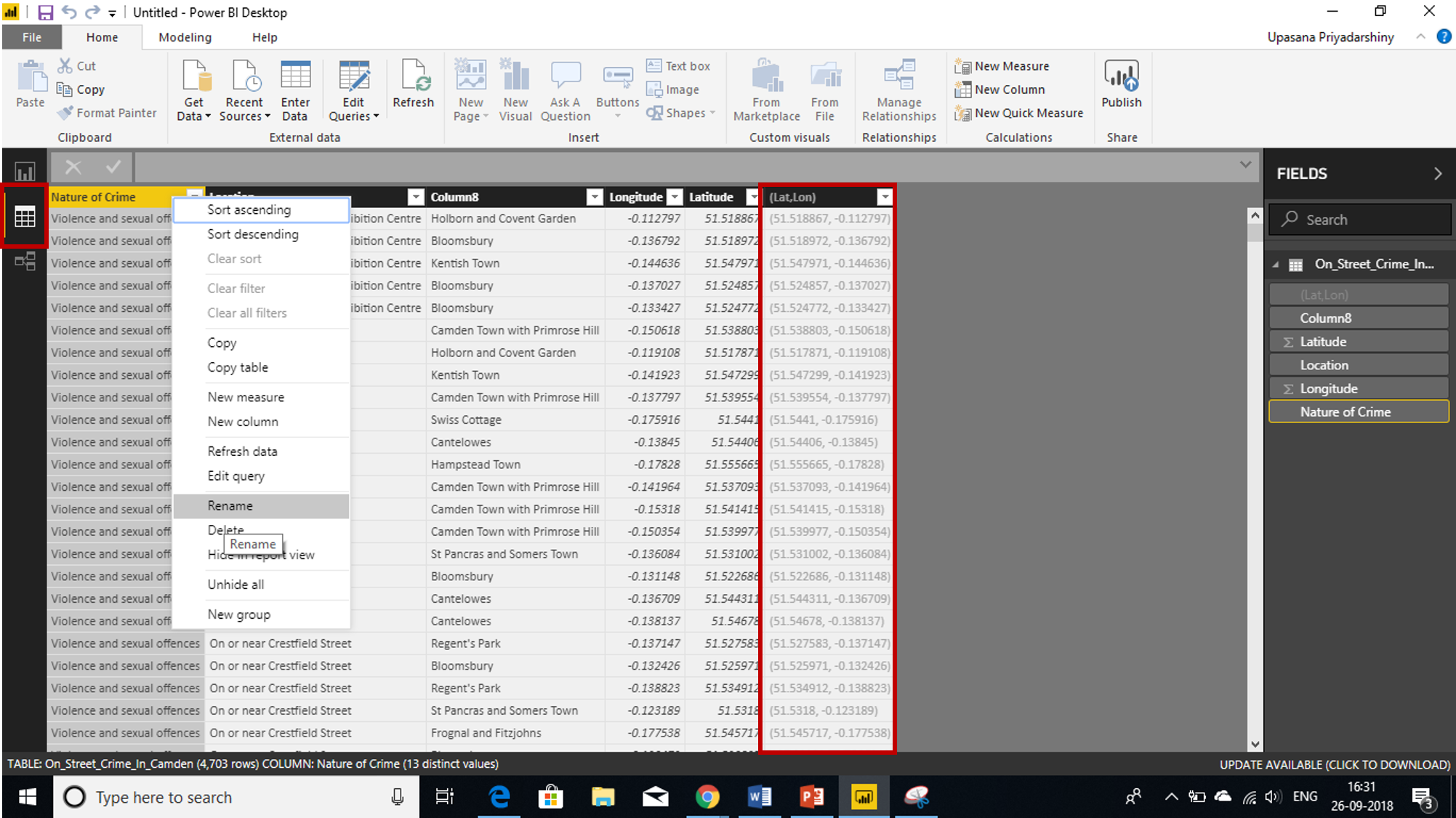
Power BI integrates with Bing to provide default map coordinates (a process called geocoding) so it’s easier for you to create maps. Bing uses some algorithms and hints to try to get the right location, but it’s the best guess. To increase the likelihood of correct geo-coding, you can do something like this. When you create a map, you’re often looking to plot countries, states, and cities. In Power BI Desktop, if you name columns after the geographic designation, it will help Bing guess what you’re looking to display.
For example, if you have a field of US state names such as “California” and “Washington”, Bing might return the location of Washington, DC instead of Washington State for the word “Washington”. Naming the column “State” will improve the geocoding. The same goes for columns named “Country” and “City”.
So, now that you know how to create reports on the Power BI, go ahead and create beautiful and impactful reports!
Related FAQ
How do you Hide and Unhide a Specific Report in Power BI?
What are effective methods for version control and deployment of Power BI reports?
What are the best practices for creating responsive layouts and custom themes in Power BI reports?
Power BI published to web reports are extremely slow to load. How we can fix this?
What are your best practices for managing code modularity and reusability in Power Query and DAX?


 Thank you for registering Join Edureka Meetup community for 100+ Free Webinars each month JOIN MEETUP GROUP


Great Aarticle Upasana but need to knw some detail about Power Bi Report Server