


Advanced Power BI Certification Course with G ...
- 13k Enrolled Learners
- Weekend
- Live Class
(4230)


 Copy Link!
Welcome to the second blog in this Power BI blog series. This blog will focus on the Power BI Dashboard. I will be talking about how to create a dashboard and use it for better data insights. In case you people are new to Power BI and want to get some insights on Power BI, you may go through my previous blog, which would help you to understand and get started with Power BI.
Power BI is a business analytics service provided by Microsoft. It provides interactive visualizations with self-service BI capabilities. End users can create reports and dashboards by themselves. This means they don’t have to depend on information technology staff or database administrators.
Power BI also gives you cloud-based BI services, known as “Power BI Services”, along with a desktop-based interface called “Power BI desktop”. It offers data warehouse capabilities including data preparation, data discovery and interactive dashboards. In March 2016, Microsoft released an additional service called Power BI Embedded on its Azure cloud platform. Using it, one can deliver reports, analyze data easily and perform various ETL operations with Power BI.
Power BI gateways let you connect SQL Server databases, Analytical Services, and many other data sources to your dashboards. Reporting portals embed Power BI reports and dashboards to give you a unified experience.
All this while I have used the terms ‘reports’ and ‘dashboards’ quite a few times. Let us try to understand these terms one by one in the next section of this Power BI dashboard blog.
A Power BI report is nothing but a multi-perspective view into a data set with visualizations that represent different findings and insights from that data set. A report may be a single visualization or pages full of visualizations.
Visualizations can be pinned to dashboards and if you select the pinned visualization, it will open the report from where it was pinned. One important point to remember is that reports are based on a single data set.
The visualizations in a report represent a nugget of information. These visualizations aren’t static, you have an option to add and remove data, change visualization types, and apply filters in your quest to discover insights and look for answers. Like a dashboard, a report is highly interactive, highly customizable and the visualizations update as the underlying data changes.
The image below represents how a sample report looks.
 Power BI Dashboard
A Power BI dashboard is a single page, often called a canvas, that uses visualizations to tell a story. Because it is limited to one page, a well-designed dashboard contains only the most important elements of that story.
The visualizations visible on the dashboard are known as tiles. These tiles are pinned to the dashboard from reports. The visualizations on a dashboard come from reports and each report is based on one data set. In fact, one way to look at a dashboard is to consider it as an entry point into the underlying reports and data sets. Selecting a visualization takes you to the report (and data set) which was used to create it.
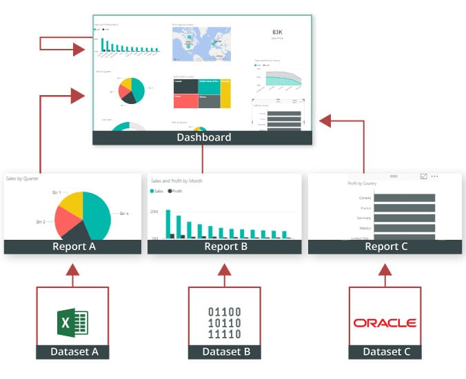
Dashboards are a wonderful way to monitor your business, to look for answers, and to see your most-important metrics at a glance. The visualizations on a dashboard may come from one underlying data set or many, and from one underlying report or many. A dashboard combines on-premises and cloud-born data, providing a consolidated view regardless of where the data lies.
A dashboard isn’t just a pretty picture, it is highly interactive and highly customizable. The tiles update as the underlying data changes.
People often confuse dashboards with reports since these are also canvases filled with visualizations. But there are some major differences. Let us take a look at these differences with the help of following table.
This Edureka video discusses the ” How to build Dashboards in Power BI ” that helps you to understand how we are creating reports and making dashboard from it using online Power BI Service
Power BI Dashboard Tutorial | How to Create Power BI Interactive Dashboard | Edureka
In this “Power BI Dashboard Tutorial* we will learn how to connect Power BI with PostgreSQL and create an interactive dashboard from scratch! In this tutorial, we’ll guide you through setting up the connection, importing data, and visualizing key insights using Power BI. Whether you’re a beginner or an experienced analyst, this video will help you master data integration and dashboard creation.
Dashboards vs Reports
| Capability | Dashboards | Reports |
| Pages | One page | One or more pages |
| Data sources | One or more reports and data sets per dashboard | A single data set per report |
| Available in Power BI Desktop | No | Yes, can create and view reports in Desktop |
| Pinning | Can pin existing visualizations (tiles) only from current dashboard to your other dashboards | Can pin visualizations (as tiles) to any of your dashboards. Can pin entire report pages to any of your dashboards. |
| Subscribe | Can’t subscribe to a dashboard | Can subscribe to report pages |
| Filtering | Can’t filter or slice | Many different ways to filter, highlight, and slice |
| Set alerts | No | Yes |
| Modify/change visualization type | No. In fact, if a report owner changes the visualization type in the report, the pinned visualization on the dashboard does not update | Yes |
Data Visualization: Dashboards in Power BI provide visually appealing and interactive representations of data, making it easier to grasp and understand complex information.
Real-Time Monitoring: Dashboards can display data in real time, allowing users to monitor key metrics and track performance metrics instantly.
Data Exploration: Users can interact with dashboards to explore data, apply filters, and drill down into specific details, gaining valuable insights and identifying trends or patterns.
Centralized Data: Dashboards bring together data from various sources, providing a consolidated view of the organization’s metrics. This centralized data helps users make informed decisions based on accurate and up-to-date information.
Collaboration and Sharing: Power BI dashboards can be shared with team members, stakeholders, or clients, enabling collaboration and fostering data-driven discussions.
Mobile Access: Power BI dashboards are responsive and can be accessed on mobile devices, ensuring that users can view and interact with data on the go.
Elevate your data analysis skills to expert levels with our in-depth Mastering Power BI Program. Gain the advanced expertise to analyze, visualize, and report data like a pro.
Dashboards in Power BI can be created by anyone with the necessary access and permissions. Generally, the following individuals or roles are involved in creating dashboards:
Data Analysts: Data analysts play a significant role in creating Power BI dashboards. They have expertise in data transformation, modeling, and visualization, enabling them to create insightful and visually appealing dashboards.
Business Intelligence Professionals: Business intelligence professionals, who specialize in extracting meaningful insights from data, can create dashboards to help organizations monitor performance and make data-driven decisions.
Power Users: Power users within an organization, such as managers, executives, or department heads, who have a good understanding of their business data, can create their own dashboards using Power BI’s intuitive interface.
IT Professionals: IT professionals can assist in data connectivity, security, and administration aspects of Power BI, ensuring that the dashboards are built on reliable and secure data sources.
It’s worth noting that while creating a dashboard might require technical skills and knowledge, Power BI’s user-friendly interface and drag-and-drop features make it accessible to a wide range of users, including those without extensive technical backgrounds
Also Read: How do you ensure dynamic titles, tooltips, or labels update correctly based on slicer selections?
The use of dashboard in Power BI can be best understood with an example where the data set has different data types, each of which has the potential to reveal valuable business insights. Let us consider a use-case of a retail superstore where you unlock insights from data around regional sales, individual store transactions, product categories, consumer segments, sales figures, discount margins and profit.
If you consider the above use case from a business perspective, you would want answers for the following points:
In order to achieve insights for above mentioned points you will be required to process data in a different way, the aim is to improve business productivity & profitability. Let’s now try to understand what insights we can get using superstore data set:-
So let us go ahead and see if we can visualize this data better using Power BI dashboard. But before that I would be creating a report with all the visualizations, so I can pin those visualizations on the dashboard. If you wish to create these reports with me, you can click on this link to download Power BI desktop, an interface which we are going to use for visualization.
So let us get started then, shall we?
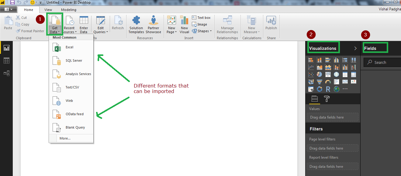
The image below, shows how the Power BI desktop interface looks like. We have three tabs on the left hand corner of the interface. The first tab is the report tab, which is visible by default and we are going to use it to create reports. Next is the data tab which is used to see the imported data sets. The last tab is the relations tab which gives you you relationship between different variables in a data set, if they are well defined.
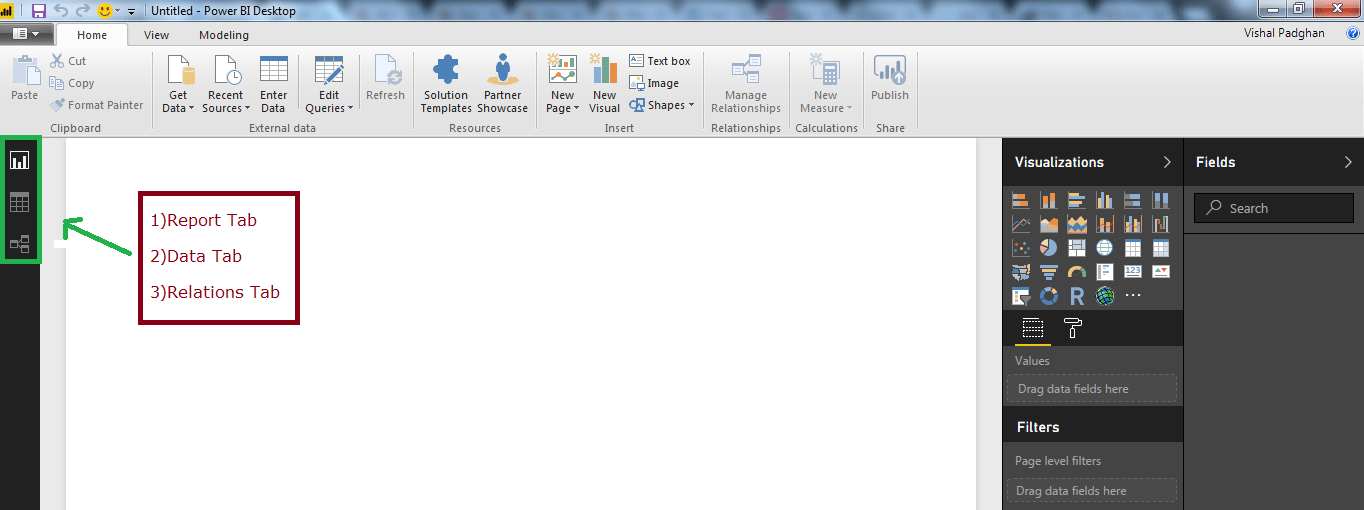
You can easily import data sets into Power BI. This can be done by clicking on the Get Data tab. We have the Visualizations tab on the right hand corner of the screen. All the different kinds of visualizations that are listed under it can be used to meet your requirements. There is a Fields tab next to the Visualizations tab which gives you all the fields that your data set has.
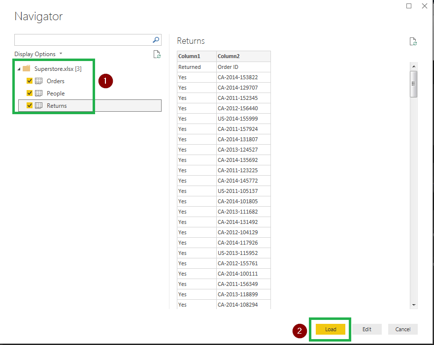
I have gone ahead and imported the Superstore data set. You may use this link to download the data set. Once you import the data set, the interface will give you an option to load or edit the data as it is visible in the image below.
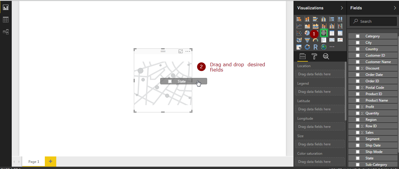
Once we have imported the data set, you are good to go ahead and visualize data. With Power BI, all you have to do is select the visualizations and drag the required fields and drop them on visualization template to view them. Please refer the image below. I have selected a map representation and have dragged the state field and dropped it on the map.
My aim was to make you understand these basics about Power BI’s interface. I believe they were fairly simple to understand. So let us continue with our use case and try and visualize data as discussed previously.
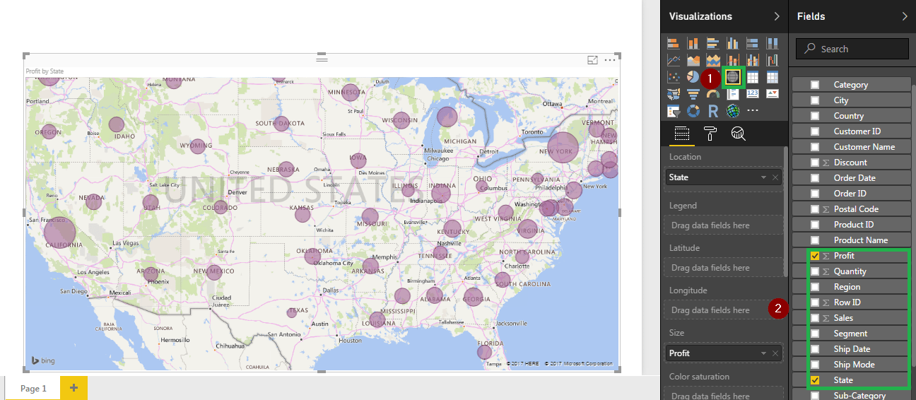
As you can see in the screenshot below, I have used the map representation and given it ‘state’ and ‘profit’ fields as inputs. The visualization gives us state wise ‘profit leaders’, which are represented by bigger bubbles.
You can go ahead and save this visualization or even publish it right away. I would instead be adding an extra page for all individual visualizations and then publish the complete report. This will make it easy to pin these visualizations to the Power BI dashboard and also prevent you from crowding a single page with multiple visualizations.
This can be done easily, just click on the plus sign on the left hand side at the bottom of the screen and your new page is added. I would do that and also create the next visualization.
I have selected a line graph to visualize ‘profits’, ‘sales’ and ‘order date’ fields. Once the visualization was created, I changed representation’s timeline from ‘yearly’ to ‘quarterly’ which can be done by clicking on the navigation available on top right corner of the screen. Refer the image below for the same.
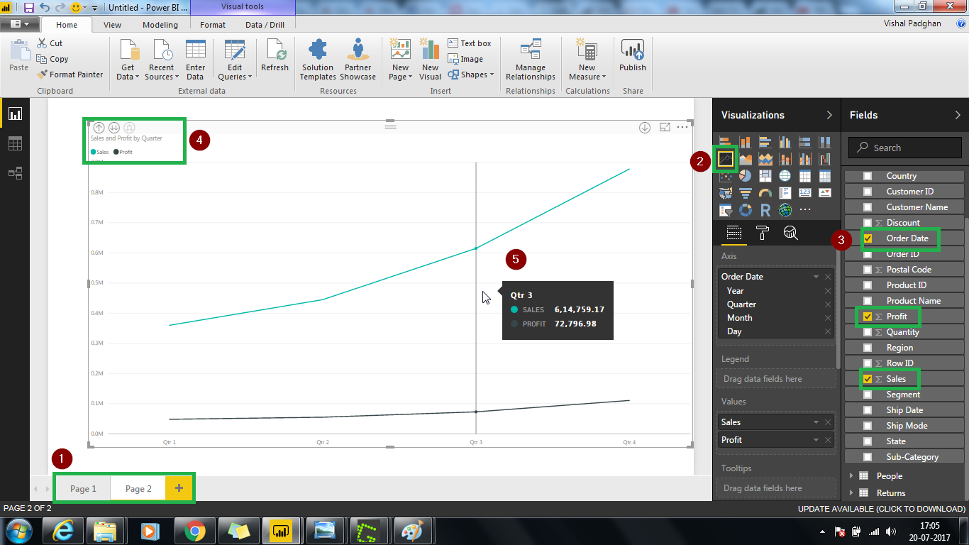
It is visible in the above image that the sales have gone up after second quarter. These visualizations are interactive. If you move the mouse pointer on the graph, it will display stats as it is visible in the image above.
In the following visualization, I have created a scatter-plot with X-axis as sales and Y-axis as profit. I have selected sum as an aggregate for both sales and profit axis.
This visualization can help us divide the states in three business strategic focus areas – Retain, Develop and Divest. The states on the top right corner with high sales and profit are currently at a good position and business would want to retain this in the coming future. States to the right of median line can be looked upon as opportunity by the business wherein the increase in sales would help increasing the business profits – Develop strategy. And finally the states with low sales and low profits or higher sales but low profits are definitely not the areas where the business should focus on divesting the money. This helps heavily in formulating business investment strategy.
The image below shows the scatter-plot.

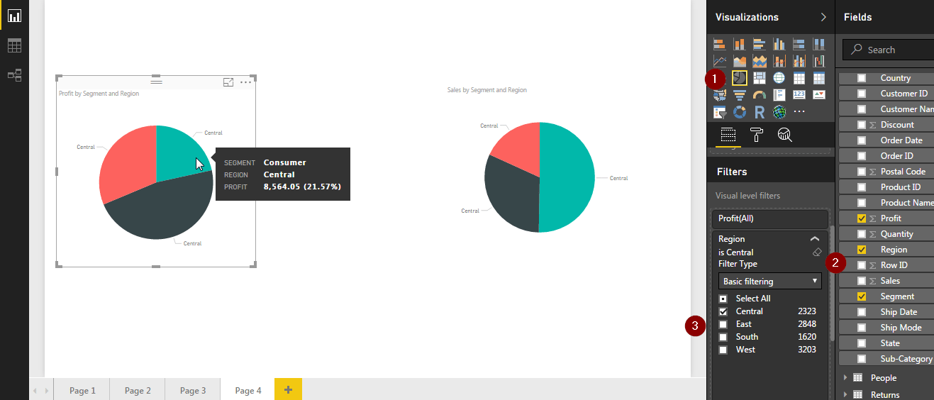
With a visibility at a region and state level, we can now look at which consumer segment is driving the sales and profits and identify which segment to focus on(among Customer, Corporate and Home Office).
For example, we can see that in Central region, although the consumer segment is contributing to 50% of sales, it has a low profits share. However, the Corporate segment has a much higher profit share with lower sales contribution. Definitely, the business should focus on increasing the Corporate sales contribution which can impact the profitability for the business.
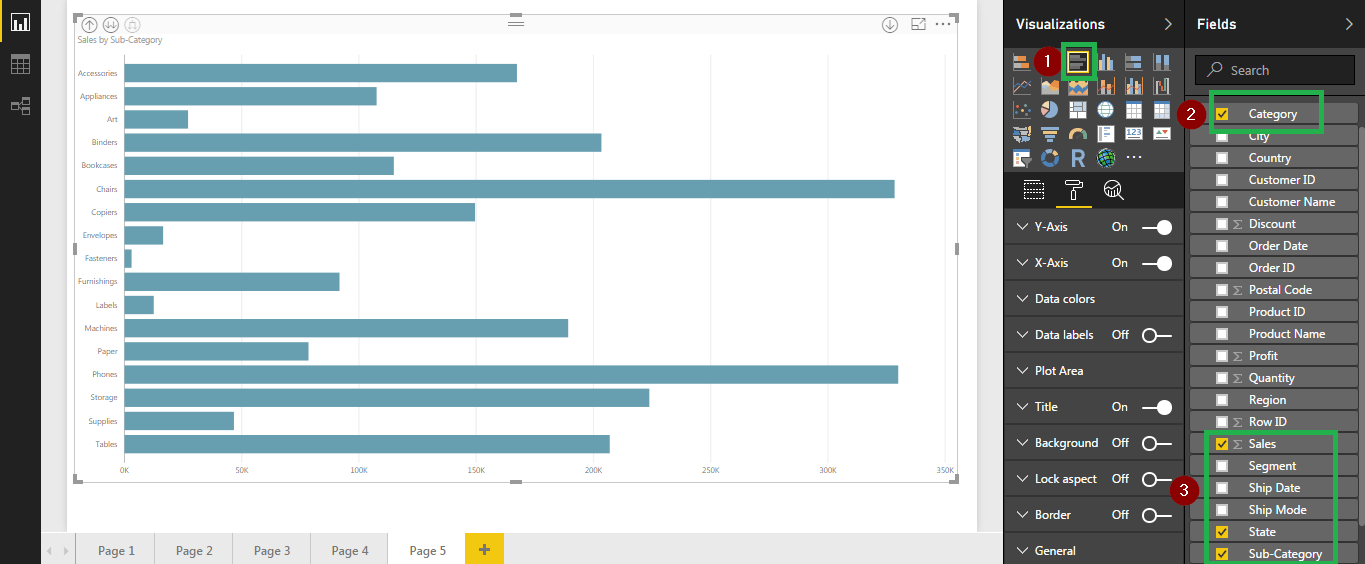
Revenue Generation by Category
The next logical step is to derive insights at a product category level. We can understand which product has higher sales and profits in a particular region and consumer segment. Or how the various product categories have performed in terms of sales and profits.
In Power BI, you can add multiple filters to your data to get the exact insight you desire. You can click on the drill down option available on the top left corner of the visualization to change representation of data. For our superstore data set you can use the drill down option to view sales by state, category and sub category to meet your needs.
By now, we have covered the basics of data visualization with Power BI. There are so many more insights that can be unlocked from the data we have. I urge you to go ahead and try other visualizations, this may help to unlock those insights which I may have missed.
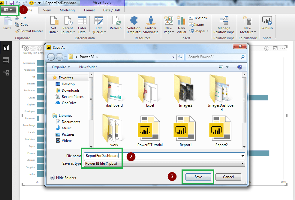
As far as this Power BI dashboard blog is concerned, let us now save this file and create a dashboard. The first step is to save our work as a report. I have done exactly that in the next image.
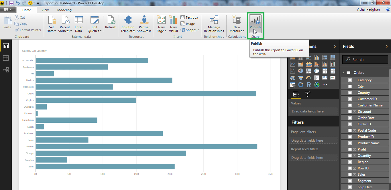
Once you have saved the file, you should go ahead and publish your report. The publish option is available on the top right corner of the screen.Please refer the image below.
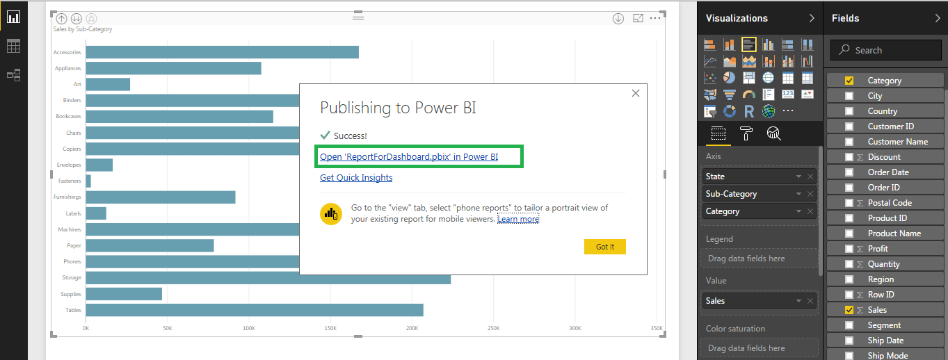
Once you have published the blog, you will get a pop up with a link, if you click on the link, it will redirect you to a webpage with your report published to web.
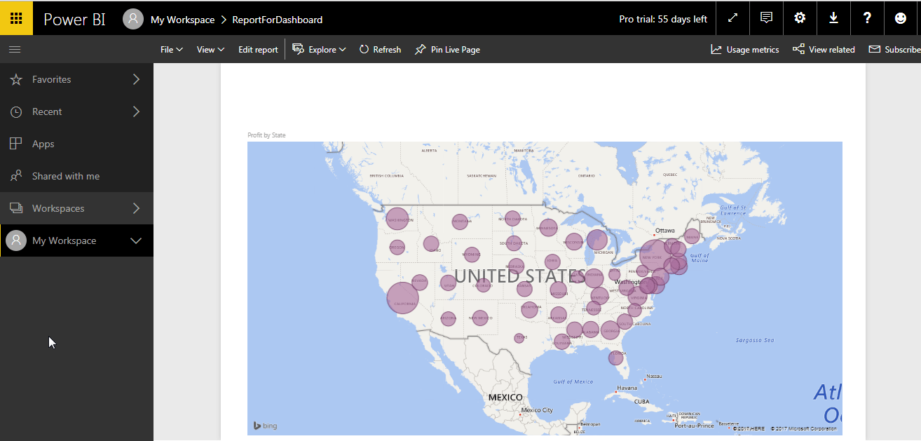
The image below shows a published report.
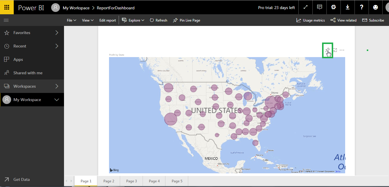
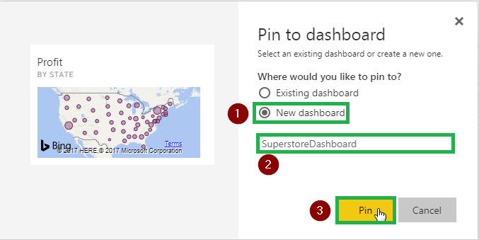
You can pin visuals from your report to a dashboard. First you need to select a visual. Once you have done that you click on the pin visual symbol to pin the visual to your dashboard. Please refer the image below.
Once you click on the pin visual option, the following tab will open. You can pin the visual to an existing dashboard or can create a new dashboard. I have created a new dashboard and then pinned the visual to it.
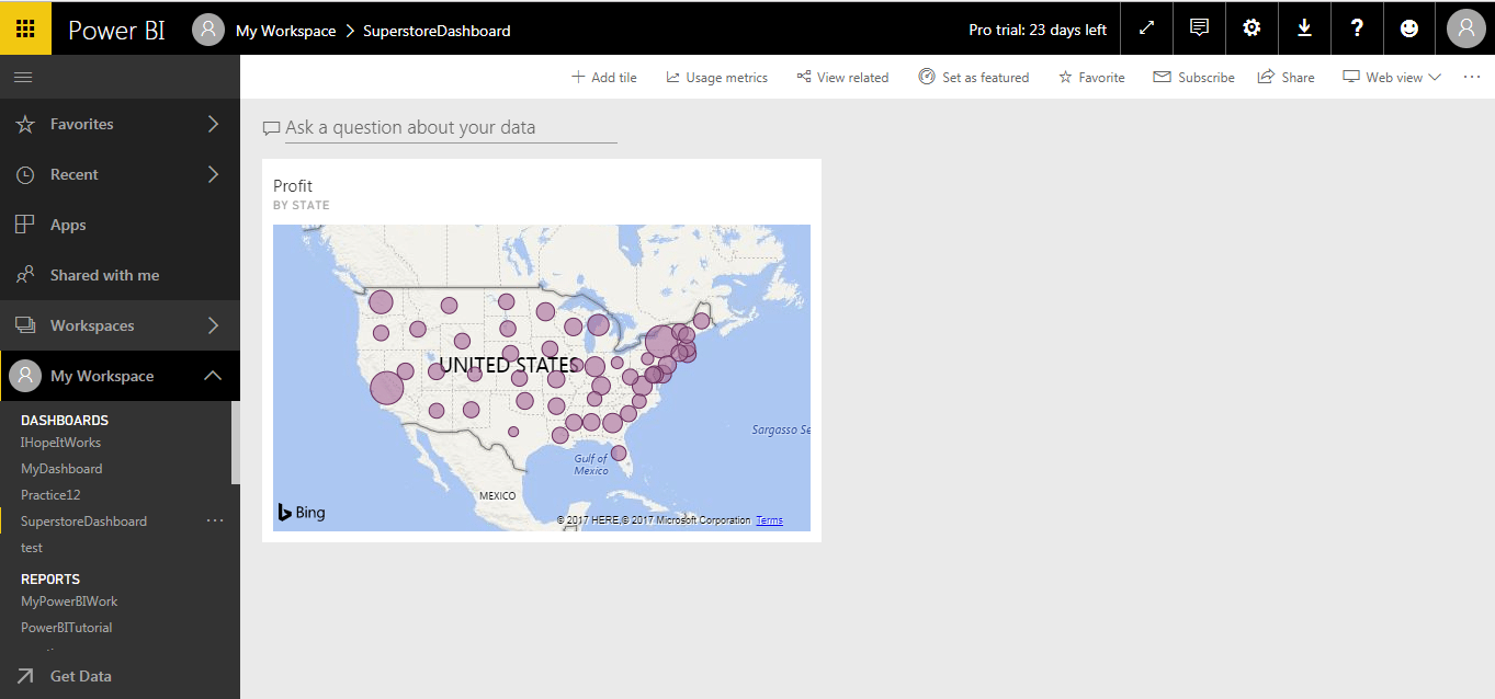
The image below shows how a visualization looks on a dashboard once you have pinned it.
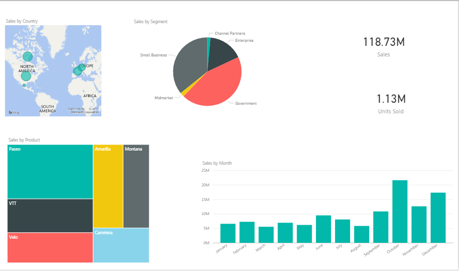
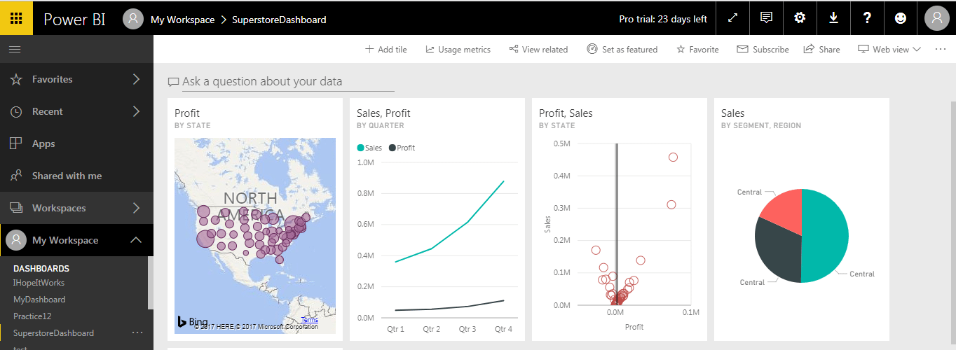
Now I will go ahead and add all the visuals we have created to the dashboard. Please refer the image below. You can resize and adjust the visuals on the dashboard to meet your requirements.
A Power BI dashboard gives you the following functionalities:

Let us see these functionalities of Power BI dashboard one by one:
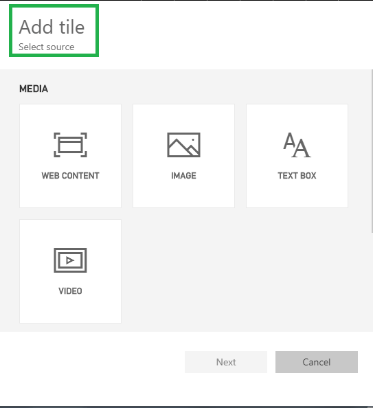
You can add a tile to your existing dashboard. The tile can be an image, web content, textbox or a video.
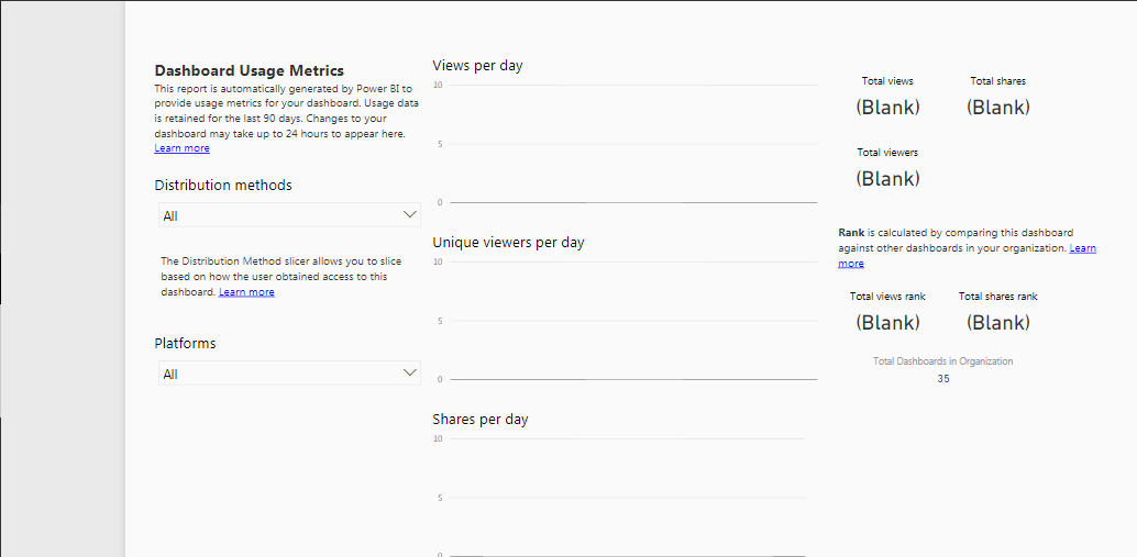
The Dashboard Usage Metrics gives you information like views per day, total shares, etc. Refer the image below.
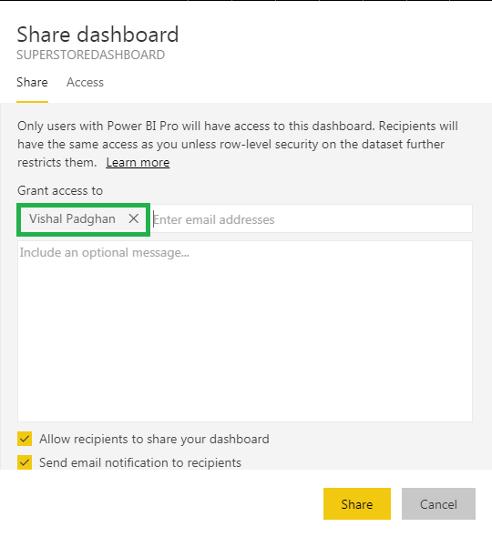
You can set your dashboard as featured, subscribe to related dashboards for updates and even share your dashboard. In order to share your dashboard you can click on share option and enter the recipient’s email Id. I have gone ahead and shared the dashboard. Please refer the image below.
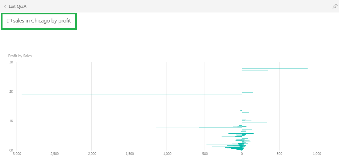
With Power BI Q & A (Question & Answer), you can ask questions and get immediate answers with natural language query. Just type your question or keyword in ‘Ask a question about your data’ tab in the top left corner and you will get the answer. However the keyword you type should be present in the data set. The image below shows sales in Chicago by profit.
Ready to showcase your skills? Dive into hands-on Power BI projects that will help you build stunning dashboards and gain real-world experience.
Subscribe to our youtube channel to get new updates..!
So this brings us to the end of this blog. I hope you liked this Power BI dashboard blog. If you wish to know the basic concepts of Power BI, you can refer my blog on Power BI Tutorial or to learn Power BI Dashboard and other BI concepts from scratch, You can check out the Power BI Course Syllabus curated by Industry Experts.
Also, Transform data into insights and advance your career with our comprehensive Business Analyst Course.
Related Queries
What coding languages or tools can I integrate with Power BI for advanced analytics?
Best way to combine multiple file with multiple same tabs?
Microsoft Power BI exam (PL 300) voucher – retake included ?
Got a question for us? Please mention it in the comments section and we will get back to you.


 Thank you for registering Join Edureka Meetup community for 100+ Free Webinars each month JOIN MEETUP GROUP