


Advanced Power BI Certification Course with G ...
- 13k Enrolled Learners
- Weekend
- Live Class
(4230)


 Copy Link!
These days Power BI-certified professionals hold value equivalent to gold, mainly because it is aimed to help individuals or an enterprise analyze and visualize their data and draw insights from the same. Business people can use this tool to create interactively and Popular Power BI Charts, technical and non-technical alike.
So let us get started then,
Power BI Charts give you a multi-perspective view of a certain data set. These charts represent different findings and insights from a given data set. The charts can give you reports with a single visualization or pages full of visualizations.
Power BI Charts aren’t static but highly interactive & highly customizable with the ability to update constantly, as the underlying data changes. You can add and remove data, change chart types, and apply filters in your model to discover insights and look for answers.
Power BI offers a variety of chart types to help users analyze and visualize data effectively. Among them, the matrix table is a crucial tool for displaying hierarchical data and aggregations. However, users often encounter issues where the matrix table displays duplicate rows or incorrect totals, leading to confusion in data interpretation.
So, here are a few Popular Power BI Charts, that you should always have at your fingertips.
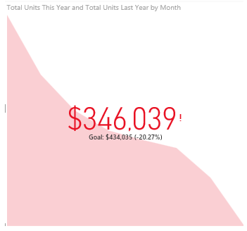
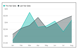 Now, an area chart is a great choice to see and compare the volume trend across time series. Not just that, these area charts are also meant for individual series representing a physically countable set.
The basic area chart, also known as the layered area chart, is based on the line chart. The area between axis and line is filled with colors to indicate volume and the lines show the trends over time.
Area charts, essentially, emphasize the magnitude of change over time. So, they are mostly used to draw attention to the total value across a trend.
Power BI offers a variety of chart types to help users visualize data effectively, from bar charts and line graphs to advanced visuals like maps and scatter plots. When working with dynamic data, it’s essential to choose the right visualization that updates in real time. What are some effective ways to visualize streaming data sources in real-time dashboards? Power BI supports real-time streaming datasets, enabling users to create dashboards that refresh automatically, ensuring that the latest data is always displayed through charts, gauges, and other visual elements.
Next amongst the Popular Power BI charts is,
Bar charts are the standard for looking at a specific value across different categories. Bar charts are definitely one of the most, if not the most common data visualizations across all BI platforms.
You can quickly highlight differences between categories, show trends and outliers, and reveal historical highs and lows at a glance.
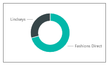 Pie charts are powerful for adding detail to other visualizations. The angle of the pie determines the value measured. Different colors can be assigned to the pie chart to represent the members in a certain dimension.
A doughnut chart is pretty similar to a pie chart in the context that it shows the relationship of parts to a whole. The only difference is that the center is blank and allows space for us to view it more like a stacked bar chart coiled around itself.
Moving on with this Popular Power BI charts article
Also read: How to access Power BI Pro benefit for MCT?
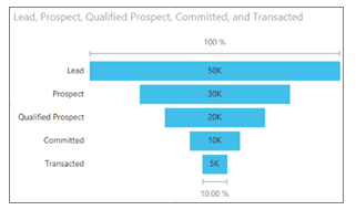 The funnel chart helps you visualize a process that has stages or levels. It portrays the items that flow sequentially from one stage to the next. You can use a funnel chart when there is a sequential flow between stages, such as a sales process that starts with leads, goes through the segregation of potential sales and dead leads, and finally comes down to purchase fulfillment.
Moving on towards the final section of this article on Power BI charts
 Key Performance Indicators display progress toward a measurable goal. KPIs mainly answer 2 questions:
Hence, A KPI visual requires a base measure that evaluates to a value and a target measure, and a threshold or goal.
Discover the key to unlocking insights and driving performance with Power BI KPIs in our detailed guide.
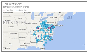 Maps in Power BI are used to associate both categorical and quantitative information with spatial locations. The combination of ArcGIS maps and Power BI takes these maps beyond the presentation of points on a map to a whole new level.
The options available to us are base maps, location types, themes, symbol styles, and reference layers and it creates gorgeous informative map visuals. The combination of authoritative data layers the likes of census data with spatial analysis conveys a deeper perception of your data.
Let us see how to use Popular Power BI charts to create a report,
Elevate your data analysis skills to expert levels with our in-depth Mastering Power BI Program. Gain the advanced expertise to analyze, visualize, and report data like a pro.
Also Read: How do you deal with report performance degradation after adding additional visuals or pages?
Now there isn’t much use of the theory of Power BI if you’re not going to build anything on your own. Depending on your role, you may be someone who uses these charts for your own use or to share with your colleagues at work. Either way, you want to learn which chart to use where or at least understand how to interact with these Power BI Charts.
Power BI Charts Tutorial | Counter Strike Data Analysis using Power BI | Power BI Training | Edureka
This Edureka Tutorial on “Power BI Charts” deals with the importance of all the basic visualizations available on Power BI Desktop. It will help you create Impactful and Comprehensive Reports on the Power BI Desktop.
There are many ways to create charts, but first things first, we’ll start by importing a very basic MS Excel dataset using the Power BI service.
If you’ve already created Power BI reports in Power BI Desktop, I would recommend installing the version of Power BI Desktop optimized for Power BI Report Server, so you know the server and the app are always in sync. You can have both versions
When you think you’re done, go ahead and publish the report to the Power BI website.
This brings us to the end of this article on Popular Power BI charts.
Business Analyst having Power BI Certification Course work at top companies VMware, Cisco, Dell, etc.
If you wish to build a career in business intelligence, our Business Intelligence Course will help you mine that data and enhance the decision-making processes throughout your organization.
Also, Acquire the in-demand skills and knowledge needed to excel as a Business Analyst in today’s market. Enroll in our Business Analyst Certification Course today and take the first step towards a fulfilling and lucrative career.
Check out Related Queries
How do you Hide and Unhide a Specific Report in Power BI?
What strategies can I use to handle large datasets without slowing down my Power BI reports?
What are the best practices for creating responsive layouts and custom themes in Power BI reports?
Power BI published to web reports are extremely slow to load. How we can fix this?
Got a question for us? Please mention it in the comments section and we will get back to you.


 Thank you for registering Join Edureka Meetup community for 100+ Free Webinars each month JOIN MEETUP GROUP