A Pareto Chart is a dual-axis combination chart. It is a chart in Tableau used to highlight dimension members that are having the biggest impact to the measure in question. It is named after Vilfredo Pareto. It is one of the more crucial things you learn in Tableau Certification Training.
Table of Content
So, let me take you through the steps to build a Pareto Chart in Tableau.
Let’s begin.
What is a Pareto Chart?
A Pareto chart is a dual-axis combination chart in Tableau. On its primary axis, bars are used to show the basic raw quantities for each dimension, usually sorted in descending order and on the secondary axis, a line graph is used to show the cumulative total in a percentage format. Now, while this chart type serves a variety of purposes, it is most known for being a part of the seven basic tools of quality control. So, it is traditionally used to identify the biggest opportunities for improvement.
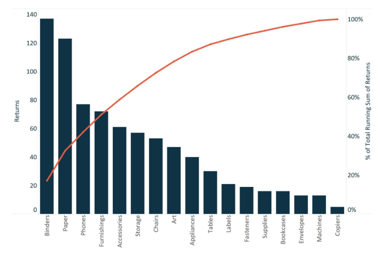
I’m going to be sticking with a quality control scenario. This article will use the Sample Superstore which is already available on the Tableau Desktop. We shall use this data set to look at which product sub-categories contribute the most returned items. The final chart will look like the following image;
First of all, this tutorial requires taking two additional steps to prepare the data.
Left join the Returns table to the Orders table
In this step, you need to right-click on the Sample Superstore data connection and choose Edit data source. A new interface will appear.
Now you can drag the Returns table next to the Orders table and set up a left join on Order ID.
Create a calculated field to count the number of returns
The formula to use for this calculation is the following;
COUNT([Returns] = “Yes”)
Now, we are all set to build out the Pareto Chart.
Building the Pareto Chart
First, you must create a bar chart that looks at the number of returns per Product Sub-Category and sort it in descending order. You shall have the following result on your screen.
Secondly, go ahead and create a dual-axis combination chart by dragging the Returns measure from the Measure Shelf to the right axis. Change the mark type on the primary axis back to bar and the secondary axis to line. At this point, the viz will look something like the following;
Now the step that makes a Pareto Chart a Pareto Chart. Adding a table calculation and a secondary table calculation to this Returns pill. This shall display the cumulative percent of returns across product sub-categories.
To add the first table calculation, click on the second Returns pill, hover over Quick table calculation, and choose Running total. With the table calculation for running total, you can add a second table calculation on the result. This is how we can calculate the raw running total number at each product sub-category, then add a secondary calculation to determine the cumulative percent of total.
For addition of a secondary table calculation, click the second Returns pill again, select the option Edit table calculation and check the box at the bottom of the interface named Add Secondary Calculation. Change the Secondary Calculation Type to Percent of Total. This will display the cumulative percent of total.
After changing the axis tick marks for a cleaner look, you will be left with the following viz;
This Pareto Chart in Tableau can now be used for drawing insights such as, “The business’ three most returned product sub-categories are causing about 40% of the total returns.” Pareto Charts are usually an effective way to quickly highlight potential for improvement and give enterprises a scale for how urgently a quality control problem should be treated.
Hope you enjoyed this article.
This brings us to the end of this article How to create a Pareto Chart in Tableau?.
If you wish to master Tableau, Edureka has a curated course on Tableau Training Coursewhich covers various concepts of data visualization in-depth, including conditional formatting, scripting, linking charts, dashboard integration, Tableau integration with R, and more. It comes with 24*7 support to guide you throughout your learning period. New batches are starting soon.
Got a question for us? Please mention it in the comments section and we will get back to you at the earliest.