
Data Science with Python Certification Course
- 132k Enrolled Learners
- Weekend
- Live Class
(49300)


 Copy Link!
_1648290501.jpg)
The world of data science went through a sea change in 2015. Data scientists began threatening the role of the CIO as a company’s foremost technology influencer. With quality of data directly impacting bottom-lines, data scientists are much sought after. Add to this the popularity of Internet of Things (IoT), data science is all set to make major inroads this year.
Jobs around data science are burgeoning, bringing with it newer career opportunities and opening up growth avenues. It is highly unlikely that you wouldn’t give a data science job interview in the days to come. We at Edureka are making it a cakewalk for you by providing a list of most probable data science interview questions.
In case you have attended a data science interview in the recent past or have questions you need answers to, do paste them in the comments section and we’ll answer them ASAP.
Enroll for the Data Science Program by IIT Guwahati, a Post Graduate program by Edureka to elevate your career.
All the best!
We can do data import using multiple methods:
The structure of a function is given below:
myfunction <- function(arg1, arg2, … ){
statements
return(object)
}
Example:
# function example – get measures of central tendency
# and spread for a numeric vector x. The user has a
# choice of measures and whether the results are printed.
mysummary <- function(x,npar=TRUE,print=TRUE) {
if (!npar) {
center <- mean(x); spread <- sd(x)
} else {
center <- median(x); spread <- mad(x)
}
if (print & !npar) {
cat(“Mean=”, center, ”
“, “SD=”, spread, ”
“)
} else if (print & npar) {
cat(“Median=”, center, ”
“, “MAD=”, spread, ”
“)
}
result <- list(center=center,spread=spread)
return(result)
}
# invoking the function
set.seed(1234)
x <- rpois(500, 4)
y <- mysummary(x)
Median= 4
MAD= 1.4826
# y$center is the median (4)
# y$spread is the median absolute deviation (1.4826)
y <- mysummary(x, npar=FALSE, print=FALSE)
# no output
# y$center is the mean (4.052)
# y$spread is the standard deviation (2.01927)
def method-
Structure of the function:
def func(arg1,arg2 …):
statement 1
statement 2
…
return value
Example- To determine mean of a list of values.
def find_mean(given_list):
sum_values= sum(given_list)
num_values= len(given_list)
return sum_values/num_values
print find_mean([i for i in range(1,9)])
# 4
SQLAlchemy Library: This allows you to execute raw SQL queries on tables in database present in MySQL-server from python. These also exists SQLAlchemy Expression Language which represents relational database structures and expressions using Python constructs. The expression language improves the maintainability of the code by hiding the SQL language and thus disallowing a mix of Python code and SQL code.
import sqlalchemy
engine =
sqlalchemy.create_engine(‘mysql://root:password@localhost/database_name’)
from sqlalchemy import text
with engine.connect() as con:
rs = con.execute(text(‘SELECT * FROM BigDiamonds limit 1’))
print rs.keys()
print rs.fetchall()
[u’Unnamed’, u’carat’, u’cut’, u’color’, u’clarity’, u’tabl’, u’depth’, u’cert’, u’measurements’, u’price’, u’x’, u’y’, u’z’] [(1L, 0.25, ‘V.Good’, ‘K’, ‘I1’, 59.0, 63.7, ‘GIA’, ‘3.96 x 3.95 x 2.52’, 0.0, 3.96, 3.95, 2.52)]
PandaSQL: allows you to query pandas DataFrames using SQL syntax. It works similarly to sqldf in R. For people new to Python or pandas it provides an easy functionality.
from pandasql import sqldf
pysqldf(“SELECT * FROM mycars LIMIT 1;”)
| brand | mpg | cyl | disp | hp | drat | wt | qsec | vs | am | gear | carb |
| 0 | Mazda RX4 | 21.0 | 6 | 160.0 | 110 | 3.90 | 2.620 | 16.46 | 0 | 1 | 4 |
library(sqldf)
sqldf(“select medv,rm from Boston limit 1”)
## medv rm
## 1 34.7 7.185
API, an abbreviation of application program interface, is a set of routines, protocols, and tools for building software applications. The API specifies how software components should interact and APIs are used when programming graphical user interface (GUI) components.
A good API makes it easier to develop a program by providing all the building blocks. There are many types of APIs for operating systems, applications or for websites.
NoSQL refers to the non-relational database. It is used for storage and retrieval of data that is modeled in means other than the tabular relations used in relational databases. Some examples of NoSQL databases are:
A key-value store, or key-value database, is a data storage paradigm designed for storing, retrieving, and managing associative arrays, a data structure more commonly known today as a dictionary or hash. Dictionaries contain a collection of objects, or records, which in turn have many different fields within them, each containing data. These records are stored and retrieved using a key that uniquely identifies the record, and is used to quickly find the data within the database.
A columnar database is a database management system (DBMS) that stores data in columns instead of rows. The goal of a columnar database is to efficiently write and read data to and from hard disk storage in order to speed up the time it takes to return a query.
Here is an example of a simple database table with 4 columns and 3 rows.
ID Last First Bonus
1 Doe John 8000
2 Smith Jane 4000
3 Beck Sam 1000
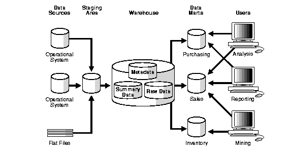
A data warehouse is a large store of data collected from a wide range of sources within an enterprise. It is also known as the central repository of integrated data. The repository maybe physical or logical.
JSON is an abbreviation for JavaScript Object Notation. It is a primary data format that uses human-readable text to transfer data objects consisting of data interpretation language. Although originally derived from the JavaScript scripting language, JSON is a language-independent data format. Code for generating JSON data is readily available in many programming languages.
XML is an abbreviation for Extensible Markup Language. It defines a set of rules that is used for encoding documents in a human and machine readable format. The design goals of XML emphasize simplicity, generality and usability across the Internet. It is a textual data format with strong support for different human languages. It is widely used for the representation of arbitrary data structures such as those used in web services.
Basic graphs in R:
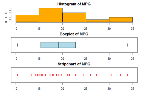
Creating a Graph:
In R, graphs are typically created interactively.
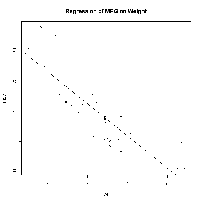
# Creating a Graph
attach(mtcars)
plot(wt, mpg)
abline(lm(mpg~wt))
title(“Regression of MPG on Weight”)
The plot( ) function opens a graph window and plots weight vs. miles per gallon.
The next line of code adds a regression line to this graph. The final line adds a title.
Data quality is an assessment of data’s fitness to serve its purpose in a given context. Different aspects of data quality include:
Maintaining data quality requires going through the data in different intervals and scrubbing it. This involves updating it, standardizing it, and removing duplicates to create a single view of the data, even if it is stored in multiple systems.
An outlier is an unusual observation that lie at an abnormal distance from the other values in a random sample of the data. Before abnormal observations can be singled out, it is necessary to characterize normal observations. Outliers can be of two types:
Outliers should be investigated carefully. Often they contain valuable information about the process under investigation or the data gathering and recording process. Before considering the possible elimination of these points from the data, one should try to understand why they appeared and whether it is likely similar values will continue to appear. Of course, outliers are often bad data points.

Methods to detect outliers:
Removing outliers:
Imputation is the process of replacing missing data with substitute values.
IN R
Missing values are represented in R by the NA symbol. NA is a special value whose properties are different from other values. NA is one of the very few reserved words in R: you cannot give anything this name. Here are some examples of operations that produce NA’s.
> var (8) # Variance of one number
[1] NA
> as.numeric (c(“1”, “2”, “three”, “4”)) # Illegal conversion
[1] 1 2 NA 4
Operations on missing values:
Almost every operation performed on an NA produces an NA. For example:
> x <- c(1, 2, NA, 4) # Set up a numeric vector
> x # There’s an NA in there
[1] 1 2 NA 4
> x + 1 # NA + 1 = NA
Excluding missing values:
Math functions generally have a way to exclude missing values in their calculations. mean(), median(), colSums(), var(), sd(), min() and max() all take the na.rm argument. When this is TRUE, missing values are omitted. The default is FALSE, meaning that each of these functions returns NA if any input number is NA. Note that cor() and its relatives don’t work that way: with those you need to supply the use= argument. This is to permit more complicated handling of missing values than simply omitting them.
R’s modeling functions accept an na.action argument that tells the function what to do when it encounters an NA. The filter functions are:
A couple of other packages supply more alternatives:
Python:
Missing values in pandas are represented by NaN or None. They can be detected using isnull() and notnull() functions.
Operations on missing values
For all math functions sum(), mean(), max(), min() NA (missing) values will be treated as zero. If the data are all NA, the result will be NA.
df[“one”]
one
a NaN
c NaN
e 0.294633
f -0.685597
h NaN
df[“one”].sum()
-0.39096437337883205
Cleaning/filling missing values
Imputing missing data:
Imputer is a transformer algorithm in scikitlearn library in python used to complete missing values to determine the best value for the missing data. Example:-
import pandas as pd
import numpy as np
from sklearn.preprocessing import Imputer
s = pd.Series([1, 2, 3, np.NaN, 5, 6, None])
imp = Imputer(missing_values=‘NaN’,
strategy=‘mean’, axis=0)
imp.fit([1, 2, 3, 4, 5, 6, 7])
x = pd.Series(imp.transform(s).tolist()[0])
print x
output-
0 1
1 2
2 3
3 4
4 5
5 6
6 7
dtype: float64
We use the ‘for’ loop if we need to do the same task a specific number of times.
In R, it looks like this:
for (counter in vector) {commands}
We will set up a loop to square every element of the dataset, foo, which contains the odd integers from 1 to 100 (keep in mind that vectorizing would be faster for a trivial example – see below):
foo = seq(1, 100, by=2)
foo.squared = NULL
for (i in 1:50 ) {
foo.squared[i] = foo[i]^2
}
If the creation of a new vector is the goal, first we have to set up a vector to store things in prior to running the loop. This is the foo.squared = NULL part.
Next, the real for-loop begins. This code says we’ll loop 50 times(1:50). The counter we set up is ‘i’ (but we can put whatever variable name we want there). For our new vector foo.squared, the ith element will equal the number of loops that we are on (for the first loop, i=1; second loop, i=2).
The apply function allows us to make entry-by-entry changes to data frames and matrices.
The usage in R is as follows:
apply(X, MARGIN, FUN, …)
where:
X is an array or matrix;
MARGIN is a variable that determines whether the function is applied over rows (MARGIN=1), columns (MARGIN=2), or both (MARGIN=c(1,2));
FUN is the function to be applied.
If MARGIN=1, the function accepts each row of X as a vector argument, and returns a vector of the results. Similarly, if MARGIN=2 the function acts on the columns of X. Most impressively, when MARGIN=c(1,2) the function is applied to every entry of X.
Advantage:
With the apply function we can edit every entry of a data frame with a single line command. No auto-filling, no wasted CPU cycles.
Lambda-
afunc=lambda a: func_on_a
You can then use lambda with map, reduce and filter functions based on requirement. Lambda applies the function on elements one at a time.
Python:
R:
Machine learning studies computer algorithms for learning to do stuff. There are many examples of machine learning problems. For e.g.:
Supervised learning is the type of learning that takes place when the training instances are labelled with the correct result, which gives feedback about how learning is progressing. Supervised learning is fairly common in classification problems because the goal is often to get the computer to learn a classification system that we have created. Digit recognition is a common example of classification learning.
In unsupervised learning, there are no pre-determined categorizations. There are two approaches to unsupervised learning:
Random forests involves building several decision trees based on sampling features and then making predictions based on majority voting among trees for classification problems or average for regression problems. This solves the problem of overfitting in Decision Trees.
Algorithm:-
Repeat K times:
Make a prediction by majority voting among K trees
Random Forests are more difficult to interpret than single decision trees, so understanding variable importance helps.
Random forests are easy to parallelize, trees can be built independently. Handles NbigP-Problems naturally since a subset of attributes are selected by importance.
Linear Regression:
Here we try to predict results within a continuous output. Hypothesis-
htheta(x)= theta0 + theta1x1 + theta2x2 …
Logistic Regression:
Here we try to map input variables into discrete categories. Used to solve classification problems. Hypothesis-
htheta(x)= g(thetaT x)
g(z)= 1/(1 + exp(-z))
It is known as logistic or sigmoid function.
htheta(x) in logistic regression is the measure of probability the sample belongs to a particular class. 0<=htheta(x)<=1
Multicollinearity refers to predictors that are correlated with other predictors. Multicollinearity occurs when your model includes multiple factors that are correlated not just to your response variable, but also to each other. In other words, it results when you have factors that are a bit redundant.
To measure multicollinearity variance inflation factor (VIF) is used, which assesses how much the variance of an estimated regression coefficient increases if your predictors are correlated. If no factors are correlated, the VIFs will all be 1. A VIF between 5 and 10 indicates high correlation that may be problematic. And if the VIF goes above 10, you can assume that the regression coefficients are poorly estimated due to multicollinearity.
To deal with Multicollinearity Try any one of the following methods:-
Heteroscedasticity:
A scatterplot of variables often create a cone-like shape, as the scatter (or variability) of the dependent variable widens or narrows as the value of the independent variable increases. This is known as heteroscedasticity. More formally it refers to the circumstance in which the variability of a variable is unequal across the range of values of a second variable that predicts it.
Packages for regression models in –
Python- StatsModels or Generalized Linear Models in Scikitlearn.
R – glm and lm functions.
Linear optimization or Linear Programming (LP) involves minimizing or maximizing an objective function subject to bounds, linear equality, and inequality constraints. Example problems include design optimization in engineering, profit maximization in manufacturing, portfolio optimization in finance, and scheduling in energy and transportation.
The following algorithms are commonly used to solve linear programming problems:
Travelling Salesman Problem belongs to the class of np-complete problems. TSP is a special case of the travelling purchaser problem and the Vehicle routing problem. It is used as a benchmark for many optimization methods. It is a problem in graph theory requiring the most efficient i.e. least squared distance a salesman can take through n cities.
CART:
CHAID:
Bagging:
Boosting:
Cluster is a group of objects that belongs to the same class. Clustering is the process of making a group of abstract objects into classes of similar objects.
Let us see why clustering is required in data analysis:
K-MEANS clustering:
K-means clustering is a well known partitioning method. In this method objects are classified as belonging to one of K-groups. The results of partitioning method are a set of K clusters, each object of data set belonging to one cluster. In each cluster there may be a centroid or a cluster representative. In the case where we consider real-valued data, the arithmetic mean of the attribute vectors for all objects within a cluster provides an appropriate representative; alternative types of centroid may be required in other cases.
Example: A cluster of documents can be represented by a list of those keywords that occur in some minimum number of documents within a cluster. If the number of the clusters is large, the centroids can be further clustered to produce hierarchy within a dataset. K-means is a data mining algorithm which performs clustering of the data samples. In order to cluster the database, K-means algorithm uses an iterative approach.
R code
# Determine number of clusters
wss <- (nrow(mydata)-1)*sum(apply(mydata,2,var))
for (i in 2:15) wss[i] <- sum(kmeans(mydata,
centers=i)$withinss)
plot(1:15, wss, type=”b”, xlab=”Number of Clusters”,
ylab=”Within groups sum of squares”)
# K-Means Cluster Analysis
fit <- kmeans(mydata, 5) # 5 cluster solution
# get cluster means
aggregate(mydata,by=list(fit$cluster),FUN=mean)
# append cluster assignment
mydata <- data.frame(mydata, fit$cluster)
A robust version of K-means based on mediods can be invoked by using pam( ) instead of kmeans( ). The function pamk( ) in the fpc package is a wrapper for pam that also prints the suggested number of clusters based on optimum average silhouette width.
Hierarchical Clustering:
This method creates a hierarchical decomposition of the given set of data objects. We can classify hierarchical methods on the basis of how the hierarchical decomposition is formed. There are two approaches here:
Agglomerative Approach:
This approach is also known as the bottom-up approach. In this, we start with each object forming a separate group. It keeps on merging the objects or groups that are close to one another. It keeps on doing so until all of the groups are merged into one or until the termination condition holds.
Divisive Approach:
This approach is also known as the top-down approach. In this, we start with all of the objects in the same cluster. In the continuous iteration, a cluster is split up into smaller clusters. It is down until each object in one cluster or the termination condition holds. This method is rigid, i.e., once a merging or splitting is done, it can never be undone.
R code
Cars example
# The mtcars data set is built into R:
help(mtcars)
# We will focus on the variables that are continuous in nature rather than discrete:
cars.data <- mtcars[,c(1,3,4,5,6,7)]
# Standardizing by dividing through by the sample range of each variable
samp.range <- function(x){
myrange <- diff(range(x))
return(myrange)
}
my.ranges <- apply(cars.data,2,samp.range)
cars.std <- sweep(cars.data,2,my.ranges,FUN=”/”)
# Getting distance matrix:
dist.cars <- dist(cars.std)
# Single linkage:
cars.single.link <- hclust(dist.cars, method=’single’)
# Plotting the single linkage dendrogram:
plclust(cars.single.link, labels=row.names(cars.data), ylab=”Distance”)
windows() # opening new window while keeping previous one open
# complete linkage:
cars.complete.link <- hclust(dist.cars, method=’complete’)
# Plotting the complete linkage dendrogram:
plclust(cars.complete.link, labels=row.names(cars.data), ylab=”Distance”)
windows() # opening new window while keeping previous one open
# Average linkage:
cars.avg.link <- hclust(dist.cars, method=’average’)
# Plotting the average linkage dendrogram:
plclust(cars.avg.link, labels=row.names(cars.data), ylab=”Distance”)
# Average Linkage dendrogram seems to indicate two major clusters,
# Single Linkage dendrogram may indicate three.
# Single Linkage Solution:
cut.3 <- cutree(cars.single.link, k=3)
cut.3 # printing the “clustering vector”
cars.3.clust <- lapply(1:3, function(nc) row.names(cars.data)[cut.3==nc])
cars.3.clust # printing the clusters in terms of the car names
# Cluster 1 seems to be mostly compact cars, Cluster 2 is sports cars, Cluster 3 is large Luxury sedans
Customer churn, also known as customer attrition, customer turnover, or customer defection, is the loss of clients or customers.
Banks, telephone service companies, internet service providers, pay TV companies, insurance firms, and alarm monitoring services, often use customer churn analysis and customer churn rates as one of their key business metrics because the cost of retaining an existing customer is far less than acquiring a new one. Companies from these sectors often have customer service branches which attempt to win back defecting clients, because recovered long-term customers can be worth much more to a company than newly recruited clients.
The statistical methods, which have been applied for decades in medicine and engineering, come in handy any time we are interested in understanding how long something (customers, patients, car parts) survives and what actions can help it survive longer.
Understanding through a problem:
Let’s frame the survival analysis idea using an illustrative example. We’ll be using this example (and associated dummy datasets).
Suppose you work at NetLixx, an online startup which maintains a library of guitar tabs for popular rock hits. Guitar enthusiasts can pay $5 a month for a subscription to your library, which lets them display the tabs on their computer, tablet, or phone while they rock out. After a year of hard work, you’ve got a working site, an extensive database of music, and a couple thousand customers.
But you’re also concerned. You’ve had a lot of people sign up for your service, but many seem to be quitting in only a couple of months. You want to know how long your customers are likely to stay with you, and whether customers with a certain demographic profile tend to churn more slowly.
You could, of course, try some basic statistics, but you’ll quickly find yourself stuck between a rock and a hard place.
So, what’s an analyst to do? Well, luckily, this is a case where you can have your cake and eat it too. How? With Kaplan-Meier estimators, for starters!
Kaplan-Meier Estimators:
Kaplan-Meier estimators predict survival probabilities over a given period of time for “right-censored” data. “Right-censored” just means that some of the observations in the data weren’t observed for as long as the period the researcher is interested in analyzing. (For example, we want to look at a year of churn, but some of our customers signed up a month ago). Kaplan-Meier estimators reliably incorporate all available data at each individual time interval to estimate how many observations are still “surviving” at that time.
To do simple survival analysis using these estimators, all you need is a table of customers with a binary value indicating whether they’ve churned, and a “follow-up time.” The follow-up time can take on one of two values. If the customer churned, it’s the number of days (or weeks, months, whatever) between the day they subscribed and the day they unsubscribed. Otherwise, it’s just the number of days between the day they subscribed and today (or the day the data was pulled).
For this , we’ll be using a simple CSV file of NetLixx data as an example. (Download the NetLixx data here.) The data includes follow-up time, a churn binary, and a gender indicator. The first few observations are displayed below. Note how the second customer has a follow-up time of 360, while the third has a follow-up time of 8, even though neither have churned. This means customer 2 signed up 360 days ago, but customer 3 signed up only 8 days ago. Neither have left us yet!
| Female | Time | Churned |
| 0 | 273 | 0 |
| 0 | 360 | 0 |
| 0 | 8 | 0 |
| 0 | 211 | 0 |
Let’s plot some data! For this analysis, we’ll be using R and the “survival” package, since both are free tools, and they work great for basic survival analysis.
Here’s some simple R code that uses the survival package to fit Kaplan-Meier estimators and plot a simple survival curve. (If you’re new to this… don’t forget to install the package with ‘install.packages(“survival”).’)
# Use the survival library
library(survival)
# Read in the NetLixx data… yes, I use Windows.
net_lixx <- read.csv(‘C:/Users/dayne/Desktop/NetLixx.csv’)
# Create a “survival object” for each observation, using time and churn data.
net_lixx$survival <- Surv(net_lixx$time, net_lixx$churned == 1)
# Fit a basic survival curve using the data
fit <- survfit(survival ~ 1, data = net_lixx)
# Plot the survival curve and add a title!
plot(fit, lty = 1, mark.time = FALSE, ylim=c(.75,1), xlab = ‘Days since Subscribing’, ylab = ‘Percent Surviving’)
title(main = ‘NetLixx Survival Curve’)
And here’s the resulting plot! That line in the middle represents the best estimate of the percent of customers surviving at each time interval. The dashed lines represent a 95% confidence interval. The confidence interval spreads out as we get closer to 365 days, since we have less and less customers with that much data to work with.
Looking at this graph, we know that we can expect 75% of customers (give or take) to make it through their first year with us… not bad!
So, there you have it, the basic Kaplan-Meier estimator.
Looking for Trend:
Of course, knowing how fast our customers churn is all well and good, but what we’re really interested in is understanding and analyzing churn. We want to know what makes a customer more likely to churn, and what causes them to stick around.
One easy way to do that is to create different Kaplan-Meier survival curves for each subset of subscribers you want to look at. The statistical significance of the differences can be tested in many ways, including the Log-Rank test. The Log-Rank test simply evaluates whether the underlying population survival curves for the two sampled groups are likely to be the same. The p-value is essentially the probability that the curves are the same, so statistical significance (I’ll use p < .05) is good!
R code
# Run basic setup again
library(survival)
net_lixx <- read.csv(‘C:/Users/dayne/Desktop/NetLixx.csv’)
net_lixx$survival <- Surv(net_lixx$time, net_lixx$churned == 1)
# Fit survival curves based on the female binary
fit <- survfit(survival ~ female, data = net_lixx)
# Plot the results, add a legend, add a title
plot(fit, lty = 1:2, mark.time = FALSE, ylim=c(.75,1), xlab = ‘Days since Subscribing’, ylab = ‘Percent Surviving’)
legend(20, .8, c(‘Male’, ‘Female’), lty=1:2, bty = ‘n’, ncol = 2)
title(main = “NetLixx Survival Curves by Gender”)
# And run a log-rank test
survdiff(survival ~ female, data = net_lixx)
Market basket analysis is the study of items that are purchased or grouped together in a single transaction or multiple, sequential transactions. Understanding the relationships and the strength of those relationships is valuable information that can be used to make recommendations, cross-sell, up-sell, offer coupons, etc.
The analysis reveals patterns such as that of the well-known study which found an association between purchases of diapers and beer.
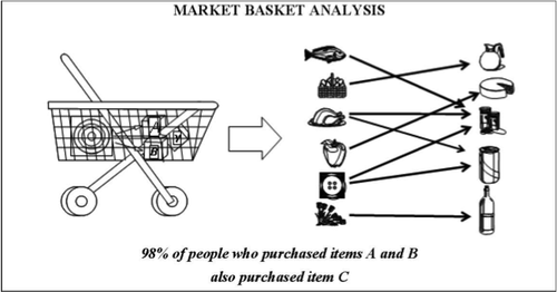
In a market basket analysis the transactions are analysed to identify rules of association. For example, one rule could be: {pencil, paper} => {rubber}. This means that if a customer has a transaction that contains a pencil and paper, then they are likely to be interested in also buying a rubber.
Before acting on a rule, a retailer needs to know whether there is sufficient evidence to suggest that it will result in a beneficial outcome. We therefore measure the strength of a rule by calculating the following three metrics (note other metrics are available, but these are the three most commonly used):
·To perform a Market Basket Analysis and identify potential rules, a data mining algorithm called the ‘Apriori algorithm’ is commonly used, which works in two steps:
The thresholds at which to set the support and confidence are user-specified and are likely to vary between transaction data sets. R does have default values, but we recommend you experiment with these to see how they affect the number of rules returned.
We are using arulespackage for performing a market basket analysis.
We use a data set of grocery sales that contains 9,835 individual transactions with 169 items. The first thing we do is have a look at the items in the transactions and, in particular, plot the relative frequency of the 25 most frequent items in Figure 1. This is equivalent to the support of these items where each item set contains only the single item. This bar plot illustrates the groceries that are frequently bought at this store, and it is notable that the support of even the most frequent items is relatively low (for example, the most frequent item occurs in only around 2.5% of transactions). We use these insights to inform the minimum threshold when running the Apriori algorithm; for example, we know that in order for the algorithm to return a reasonable number of rules we’ll need to set the support threshold at well below 0.025.
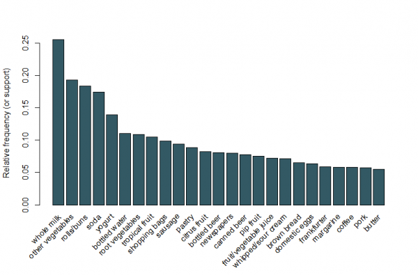
Figure 1: A bar plot of the support of the 25 most frequent items bought.
By setting a support threshold of 0.001 and confidence of 0.5, we can run the Apriori algorithm and obtain a set of 5,668 results. These threshold values are chosen so that the number of rules returned is high, but this number would reduce if we increased either threshold. We would recommend experimenting with these thresholds to obtain the most appropriate values. Whilst there are too many rules to be able to look at them all individually, we can look at the five rules with the largest lift:
| Rule | Product | Support | Confidence | Lift |
| {instant food products, soda} | =>{hamburger meat} | 0.001 | 0.632 | 19.000 |
| {soda, popcorn} | =>{salty snacks} | 0.001 | 0.632 | 16.698 |
| {flour, baking powder} | =>{sugar} | 0.001 | 0.556 | 16.408 |
| {ham, processed cheese} | =>{white bread} | 0.002 | 0.633 | 15.045 |
| {whole milk, instant food products} | =>{hamburger meat} | 0.002 | 0.500 | 15.038 |
These rules seem to make intuitive sense. For example, the first rule might represent the sort of items purchased for a BBQ, the second for a movie night and the third for baking.
Rather than using the thresholds to reduce the rules down to a smaller set, it is usual for a larger set of rules to be returned so that there is a greater chance of generating relevant rules. Alternatively, we can use visualisation techniques to inspect the set of rules returned and identify those that are likely to be useful.
Using the arulesViz package, we plot the rules by confidence, support and lift in Figure 2. This plot illustrates the relationship between the different metrics. It has been shown that the optimal rules are those that lie on what’s known as the “support-confidence boundary”. Essentially, these are the rules that lie on the right hand border of the plot where either support, confidence or both are maximised. The plot function in the arulesViz package has a useful interactive function that allows us to select individual rules (by clicking on the associated data point), which means the rules on the border can be easily identified.
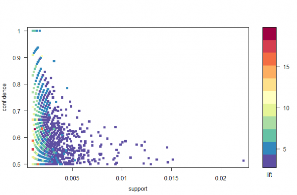
Figure 2: A scatter plot of the confidence, support and lift metrics.
There are lots of other plots available to visualize the rules, but one other figure that we would recommend exploring is the graph-based visualization (see Figure 3) of the top ten rules in terms of lift. In this graph the items grouped around a circle represent an item set and the arrows indicate the relationship in rules. For example, one rule is that the purchase of sugar is associated with purchases of flour and baking powder. The size of the circle represents the level of confidence associated with the rule and the color the level of lift (the larger the circle and the darker the grey the better).
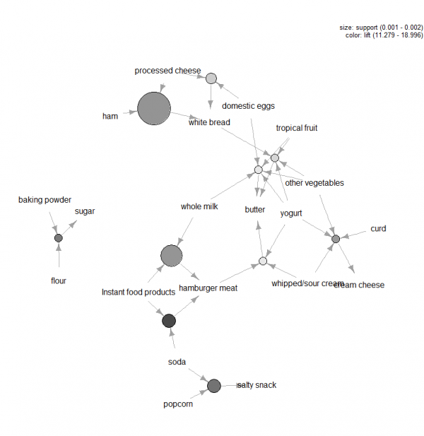
Figure 3: Graph-based visualization for the top ten rules in terms of lift.
There are many tools that can be applied when carrying out a market basket analysis and the trickiest aspects to the analysis are setting the confidence and support thresholds in the Apriori algorithm and identifying which rules are worth pursuing.
Typically the latter is done by measuring the rules in terms of metrics that summarize how interesting they are, using visualization techniques and also more formal multivariate statistics. Ultimately the key to market basket analysis is to extract value from the transaction data by building up an understanding of the needs of the consumers.
R code
library(“arules”)
library(“arulesViz”)
#Load data set:
data(“Groceries”)
summary(Groceries)
#Look at data:
inspect(Groceries[1])
LIST(Groceries)[1]
#Calculate rules using apriori algorithm and specifying support and confidence thresholds:
rules = apriori(Groceries, parameter=list(support=0.001, confidence=0.5))
#Inspect the top 5 rules in terms of lift:
inspect(head(sort(rules, by =”lift”),5))
#Plot a frequency plot:
itemFrequencyPlot(Groceries, topN = 25)
#Scatter plot of rules:
library(“RColorBrewer”)
plot(rules,control=list(col=brewer.pal(11,”Spectral”)),main=””)
#Rules with high lift typically have low support.
#The most interesting rules reside on the support/confidence border which can be clearly seen in this plot.
#Plot graph-based visualisation:
subrules2 <- head(sort(rules, by=”lift”), 10)
plot(subrules2, method=”graph”,control=list(type=”items”,main=””))
Association analysis uses a set of transactions to discover rules that indicate the likely occurrence of an item based on the occurrences of other items in the transaction. The technique of association rules is widely used for retail basket analysis. It can also be used for classification by using rules with class labels on the right-hand side. It is even used for outlier detection with rules indicating infrequent/abnormal association.
Association analysis also helps us to identify cross-selling opportunities, for example: we can use the rules resulting from the analysis to place associated products together in a catalog, in the supermarket, or in the Web shop, or apply them when targeting a marketing campaign for product B at customers who have already purchased product A
Association analysis determines these rules by using historic data to train the model. We can display and export the determined association rules.
Central limit theorem states that the distribution of an average will tend to be Normal as the sample size increases, regardless of the distribution from which the average is taken except when the moments of the parent distribution do not exist. All practical distributions in statistical engineering have defined moments, and thus the CLT applies.
Chi square distribution uses standard normal variates which are a part of normal distribution. In statistical terms:
If X is normally distributed with mean μ and variance σ2 > 0, then:
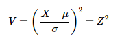
is distributed as a chi-square random variable with 1 degree of freedom.
Z-test is a statistical test where normal distribution is applied and is basically used for dealing with problems related to large samples when n (sample size) ≥ 30 .
It is used to determine whether two population means are different when the variances are known and the sample size is large. The test statistic is assumed to have a normal distribution and parameters such as standard deviation should be known in order for z-test to be performed.
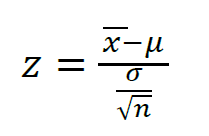
A one-sample location test, two-sample location test, paired difference test and maximum likelihood estimate are examples of tests that can be conducted as z-tests
Z-tests are closely related to t-tests, but t-tests are best performed when an experiment has a small sample size. Also, t-tests assume that the standard deviation is unknown, while z-tests assume that it is known. If the standard deviation of the population is unknown, the assumption that the sample variance equals the population variance is made.
It implements a z-test similar to the t.test function.
Usage:
simple.z.test(x, sigma, conf.level=0.95)
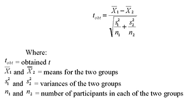
T-test assesses whether the means of two groups are statistically different from each other
A two-sample t-test examines whether two samples are different and is commonly used when the variances of two normal distributions are unknown and when an experiment uses a small sample size
For example, a t-test could be used to compare the average floor routine score of the U.S. women’s Olympic gymnastic team to the average floor routine score of China’s women’s team
It performs one and two sample t-tests on vectors of data.
Usage:
t.test(x, …)
## Default S3 method:
t.test(x, y = NULL,
alternative = c(“two.sided”, “less”, “greater”),
mu = 0, paired = FALSE, var.equal = FALSE,
conf.level = 0.95, …)
## S3 method for class ‘formula’
t.test(formula, data, subset, na.action, …)
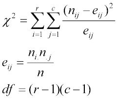
Chi square is a statistical test used to compare the observed data with the data that we would expect to obtain according to a specific hypothesis.
Formula for the chi square test is:
chisq.test performs chi-squared contingency table tests and goodness-of-fit tests.
Usage:
chisq.test(x, y = NULL, correct = TRUE,
p = rep(1/length(x), length(x)), rescale.p = FALSE,
simulate.p.value = FALSE, B = 2000)
The F-test is designed to test if two population variances are equal. It does this by comparing the ratio of two variances. So, if the variances are equal, the ratio of the variances will be 1.

Usage:
var.test(x, …)
## Default S3 method:
var.test(x, y, ratio = 1,
alternative = c(“two.sided”, “less”, “greater”),
conf.level = 0.95, …)
## S3 method for class ‘formula’
var.test(formula, data, subset, na.action, …)
I hope you enjoyed reading this blog. The need for Data Science with Python professionals has increased dramatically, making this course ideal for people at all levels of expertise. The Data Scientist Course is ideal for professionals in analytics who are looking to work in conjunction with Python, Software, and IT professionals who are interested in the area of Analytics, and anyone with a passion for Data Science.
Related Posts:


 Thank you for registering Join Edureka Meetup community for 100+ Free Webinars each month JOIN MEETUP GROUP
Usually I never comment on blogs but your article is so convincing that I never stop myself to say something about it. You’re doing a great job Man,Keep it up.
Great list of questions and answers ! Very useful
Thanks so much, Balaji! We’re happy we could be of help. We urge you to keep checking our blog page for new blogs.