


CSS has become an integral part of web-design. It defines how attractive your page is at a glance. An organisation will always prefer a web developer with a strong command over CSS as they tend to produce modern and stylish designs. This CSS Interview Questions blog will prepare you for all sorts of CSS questions that could be asked in an interview.
Top CSS Interview Questions
- What is the full form of CSS?
- Why was CSS developed?
- What are the major versions of CSS?
- What are the different ways you could integrate CSS into your HTML page?
- What is the meaning of cascading? How do style sheets cascade?
- What are the advantages of using CSS?
- What are the disadvantages of using CSS?
- Name a few prominent CSS frameworks.
- What is the difference between the usage of an ID and a Class?
- What is the RGB stream?
The questions have been divided into three categories namely:
Easy CSS Interview Questions
Q1. What is the full form of CSS?
CSS stands for Cascading Style Sheets. It is a technology developed by the World Wide Web Consortium or W3C. It was developed to streamline the styling of webpages into a separate technology.
Q2. Why was CSS developed?
CSS was first developed in 1997 as a way for web developers to define the visual appearance of the web pages that they were creating. It was intended to allow developers to separate the content and structure of a website’s code from the visual design, something that had not been possible prior to this time.
The separation of structure and style allows HTML to perform more of the function that it was originally based on — the markup of content, without having to worry about the design and layout of the page itself, something commonly known as the “look and feel” of the page.
Q3. What are the major versions of CSS?
The following are the major versions of CSS
- CSS 1
- CSS 2
- CSS 2.1
- CSS 3
- CSS 4
Q4. What are the different ways you could integrate CSS into your HTML page?
There are three ways that you could integrate a certain CSS style:
- You can integrate your style using the style-tags in the head section of your HTML page.
- You can integrate your style using inline-styling.
- You can write your CSS in a separate file and add it to your HTML page using the link tag.
Q5. What is the meaning of cascading? How do style sheets cascade?
CSS brought about a revolution in web-development and how people perceive the process of building a website. Prior to the existence of CSS, elements had to be styled in an in-line fashion or the style were implemented in the head section of an HTML page. This was changed due to the cascading nature of CSS. Here are the three major ways CSS cascades:
- Elements – The same CSS style can be applied to multiple elements to achieve the same style.
- Multiple Style One Element – Multiple styles can be applied to a particular HTML element to achieve a unique style.
- Same style, Multiple Pages – The same stylesheet can be applied to different HTML pages altogether to achieve a template styling very quickly.
HTML CSS Interview Questions and Answers | Top 30 HTML CSS Interview Questions | Edureka

In this video on * HTML and CSS Interview Questions and Answers *, we’ll guide you through the most commonly asked questions in interviews. We’ll cover the top 15 HTML interview questions, delving into topics like structuring web content, semantic elements, and more. Then, we’ll tackle the top 15 CSS interview questions, focusing on styling techniques, layout strategies, and responsive design concepts. Whether you’re preparing for your first job interview or aiming to polish your foundational web development knowledge, this video will equip you with the answers and insights needed to stand out. Join us and ace your next web development interview with confidence!
Q6. What are the advantages of using CSS?
Following are the advantages of using CSS:
- The style of several documents can be controlled from a single site by using them.
- Multiple HTML elements can have many documents, where classes can be created.
- To group styles in complex situations, selector and grouping methods are used.
Q7. What are the disadvantages of using CSS?
Following are the disadvantages of using CSS:
- Ascending by selectors is not possible
- Limitations of vertical control
- No expressions
- No column declaration
- Pseudo-class not controlled by dynamic behaviour
- Rules, styles, targeting specific text not possible
Q8. Name a few prominent CSS frameworks.
Below are the prominent CSS frameworks in the web development industry today:
- Bootstrap

Bootstrap is the most popular CSS framework for developing responsive and mobile-first websites. Bootstrap 4 is the newest version of Bootstrap
- Foundation

Foundation is a responsive front-end framework. Foundation provides a responsive grid and HTML and CSS UI components, templates, and code snippets, including typography, forms, buttons, navigation and other interface elements, as well as optional functionality provided by JavaScript extensions.
- Semantic UI
Semantic UI is a modern front-end development framework, powered by LESS(CSS-
- Ulkit
UIkit is a lightweight and modular front-end framework for developing fast and


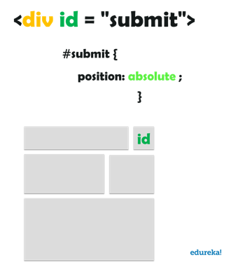
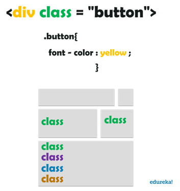
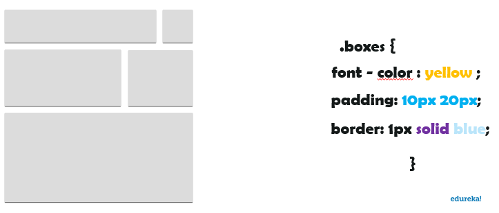
Q9. What is the difference between the usage of an ID and a Class?
ID – An ID is unique. A particular ID can be only assigned to a single element. IDs are used when specific styling is being tried to be achieved over a single element. Below is a pictorial example of how to use an ID.

Class – Just like the word suggests, a class is a collective way of targetting HTML elements for styling. Classes are not unique and multiple elements can have the same class. In fact, multiple classes can also be added to the same element to achieve the desired style and look. Below is an example of the usage of classes.
RGB is a system of representing a certain colour in CSS. There are three streams in this nomenclature of representing a colour, namely the Red, Green and Blue stream. The intensity of the three colours is represented in numbers ranging from 0 to 256. This allows CSS to have a wide range of colours spreading across the entire spectrum of visible colours.

These conclude the easy section. Here is getting started documentation for CSS. Things are going to get a much more particular now. It’s time for intermediate CSS interview questions.
Intermediate CSS Interview Questions
Q11. What are the ways to assign a certain colour to an element in CSS?
CSS can assign a wide range of colours to elements using different notations. There are three notations as of now that are used that are explained below:
- Hexadecimal notation
A colour in hexadecimal string notation always begins with the character “#”. After that, the hexadecimal digits of the colour code is written. The string is case-insensitive. - RGB functional notation
RGB (Red/Green/Blue) functional notation, like hexadecimal string notation, represents colours using their red, green, and blue components (as well as, optionally, an alpha channel component for opacity). However, instead of using a string, the colour is defined using the CSS function RGB(). This function accepts as its input parameters the values of the red, green, and blue components and an optional fourth parameter, the value for the alpha channel. - HSL functional notation
Designers and artists often prefer to work using the HSL (Hue/Saturation/Luminosity) colour method. On the web, HSL colours are represented using HSL functional notation. The HSL() CSS function is very similar to the RGB() function in usage otherwise
Q12. Explain the CSS Box Model and its different elements.
The CSS box model describes the rectangular boxes that are generated for elements in the document tree and laid out according to the visual formatting model. Each box has a content area (e.g. text, an image, etc.) and an optional surrounding padding, border, and margin areas.
The CSS box model is responsible for calculating:
- How much space a block element takes up.
- Whether or not borders and/or margins overlap, or collapse.
- A box’s dimensions.
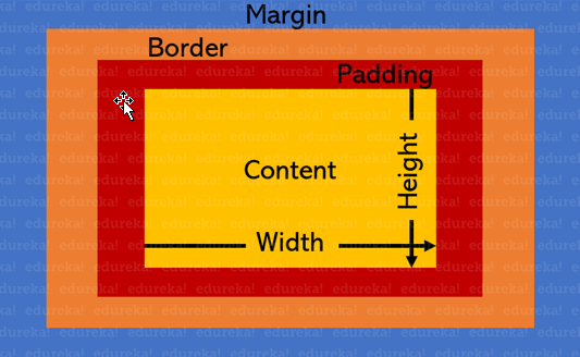

The box model has the following rules:
- The dimensions of a block element are calculated by
width,height,padding,borders, andmargin. - If no
heightis specified, a block element will be as high as the content it contains, pluspadding. - If no
widthis specified, a non-floated block element will expand to fit the width of its parent minuspadding. - The
heightof an element is calculated by the content’sheight. - The
widthof an element is calculated by the content’swidth. - By default,
paddingandborderare not part of thewidthandheightof an element.
Q13. What is the z-index in CSS?
The z-index helps specify the stack order of positioned elements that may overlap one another. The z-index default value is zero and can take on either a positive or negative number.
An element with a higher z-index is always stacked above than a lower index.
Z-Index can take the following values:
- Auto: Sets the stack order equal to its parents.
- Number: Orders the stack order.
- Initial: Sets this property to its default value (0).
- Inherit: Inherits this property from its parent element.
Q14. What are CSS Sprites?
CSS sprites combine multiple images into one single larger image. It is a commonly-used technique for icons (Gmail uses it). This is how you could implement it:
- Use a sprite generator that packs multiple images into one and generates the appropriate CSS for it.
- Each image would have a corresponding CSS class with
background-image,background-positionandbackground-sizeproperties defined. - To use that image, add the corresponding class to your element.
CSS Interview Questions
Q15. Mention a few benefits of using CSS Sprites.
CSS sprites come with their own advantages. Here are a few of them –
- Reduce the number of HTTP requests for multiple images (only one single request is required per sprite sheet). But with HTTP2, loading multiple images is no longer much of an issue.
- Advance downloading of assets that won’t be downloaded until needed, such as images that only appear upon
:hoverpseudo-states. Blinking wouldn’t be seen.
Q16. What are pseudo-elements in CSS?
A CSS pseudo-element is a keyword added to a selector that lets you style a specific part of the selected element(s). They can be used for decoration (:first-line, :first-letter) or adding elements to the markup (combined with content: ...) without having to modify the markup (:before, :after).
:first-lineand:first-lettercan be used to decorate text.- Triangular arrows in tooltips use
:beforeand:after. This encourages separation of concerns because the triangle is considered a part of styling and not really the DOM. It’s not really possible to draw a triangle with just CSS styles without using an additional HTML element.
Q17. How will you target an h2 and h3 with the same styling?
You can target multiple elements by separating the separators with a comma (,)
h2, h3 {
color: blue;
}
Q18. What is the float property used for in CSS?
The float CSS property places an element on the left or right side of its container, allowing text and inline elements to wrap around it. The element is removed from the normal flow of the page, though it still remains a part of the flow (in contrast to absolute positioning). Below is the usage of float
float: none;
float: left;
float: right;
Q19. What are the different modules used in the current version of CSS?
There are several modules in CSS. Below are a few of them:
- Selectors
- Box Model
- Backgrounds and Borders
- Text Effects
- 2D/3D Transformations
- Animations
- Multiple Column Layout
- User Interface
Q20. What are the different media types allowed by CSS?
There are four types of @media properties (including screen):
- all – for all media type devices
- print – for printers
- speech – for screenreaders that “reads” the page out loud
- screen – for computer screens, tablets, smart-phones etc.
Here is an example of print-media type’s usage:
@media print {
h1 {
background-color: yellow;
}
}
Q22. What are the different units used in CSS?
CSS has two types of lengths. Relative length and absolute length. Different units are used for them.
Relative Length
| UNIT | DESCRIPTION |
| em | Relative to the font-size of the element (2em means 2 times the size of the current font) |
| ex | Relative to the x-height of the current font (rarely used) |
| ch | Relative to the width of the “0” (zero) |
| rem | Relative to font-size of the root element |
| vw | Relative to 1% of the width of the viewport* |
| vh | Relative to 1% of the height of the viewport* |
| vmin | Relative to 1% of viewport’s* smaller dimension |
| vmax | Relative to 1% of viewport’s* larger dimension |
| % | Relative to the parent element |
Absolute Length
| UNIT | DESCRIPTION |
| CM | centimetres |
| MM | millimetres |
| IN | inches (1in = 96px = 2.54cm) |
| PX | pixels (1px = 1/96th of 1in) |
| PT | points (1pt = 1/72 of 1in) |
| PC | picas (1pc = 12 pt) |
Q23. How do you control image repetition using CSS?
You can use the background-repeat property to control image.
h1 {
background-repeat: none;
}
Q24. What is the general nomenclature of writing CSS?

Q25. What will this piece of CSS code do to an element? .container { margin: 0 auto; }
When you have specified a width on the object that you have applied margin: 0 auto to, the object will sit centrally within its parent container. Specifying auto as the second parameter basically tells the browser to automatically determine the left and right margins itself, which it does by setting them equally. It guarantees that the left and right margins will be set to the same size. The first parameter 0 indicates that the top and bottom margins will both be set to 0.
margin-top:0;margin-bottom:0;margin-left:auto;margin-right:auto;
Therefore, to give you an example, if the parent is 100px and the child is 50px, then the auto property will determine that there’s 50px of free space to share between margin-left and margin-right:
var freeSpace = 100 - 50;
var equalShare = freeSpace / 2;
Which would give:
margin-left:25;
margin-right:25;
Q26. What is the overflow property in CSS used for?
The overflow property specifies what should happen if content overflows an element’s box. This property specifies whether to clip content or to add scrollbars when an element’s content is too big to fit in a specified area. Below are the overflow options available in CSS –
overflow: auto;
overflow: none;
overflow: scroll;
overflow: visible;
Q27. What is the property that is used for controlling image-scroll?
The background-attachment property sets whether a background image scrolls with the rest of the page, or is fixed. Here is an example of a background-image that will not scroll with the page (fixed):
body {
background-image: url("img_tree.gif");
background-repeat: no-repeat;
background-attachment: fixed;
}
Q28. What is responsive web design?
Responsive design is an approach to web page creation that makes use of flexible layouts, flexible images and cascading style sheet media queries. The goal of responsive design is to build web pages that detect the visitor’s screen size and orientation and change the layout accordingly.
Q29. What is the difference between {visibility: hidden} and {display: none}?
display:none means that the tag in question will not appear on the page at all (although you can still interact with it through the DOM). There will be no space allocated for it between the other tags.
visibility:hidden means that unlike display:none, the tag is not visible, but space is allocated for it on the page. The tag is rendered, it just isn’t seen on the page.
For example:
test | <span style="[style-tag-value]">Appropriate style in this tag</span> | testReplacing [style-tag-value] with display:none results in:
test | | testReplacing [style-tag-value] with visibility:hidden results in:
test | | testQ30. Explain the concept of specificity in CSS.
Specificity is the means by which browsers decide which CSS property values are the most relevant to an element and, therefore, will be applied. Specificity is based on the matching rules which are composed of different sorts of CSS selectors.
Specificity is a weight that is applied to a given CSS declaration, determined by the number of each selector type in the matching selector. When multiple declarations have equal specificity, the last declaration found in the CSS is applied to the element. Specificity only applies when the same element is targeted by multiple declarations. As per CSS rules, directly targeted elements will always take precedence over rules which an element inherits from its ancestor.
CSS Interview Questions
Q31. What are the various font-related attributes in CSS?
Below are the different font-related attributes available in CSS:
- Font-style
- Font-variant
- Font-weight
- Font-size/line-height
- Font-family
- Caption
- Icon
Q32. What is the use of box-shadow in CSS?
The box-shadow CSS property adds shadow effects around an element’s frame. You can set multiple effects separated by commas. A box-shadow is described by X and Y offsets relative to the element, color, blur and spread radii. Below are a few implementations of box-shadow
box-shadow: 10px 5px 5px red;
box-shadow: 60px -16px teal;
box-shadow: 12px 12px 2px 1px rgba(0, 0, 255, .2);
box-shadow: inset 5em 1em gold;
Q34. What are contextual selectors?
Contextual selectors in CSS allow you to specify different styles for different parts of your document. You can assign styles directly to specific HTML tags, or, you could create independent classes and assign them to tags in the HTML. Either approach lets you mix and match styles.
Q35. How would you style an image or element to have rounded corners?
Use the border-radius property to add rounded corners to an image. 50% will make the image circular.
border-radius: 50%;
Now let’s discuss some of the more advanced CSS interview questions.
Advanced CSS Interview Questions
Q36. What is CSS flexbox?
The flexbox layout officially called CSS flexible box layout module is a new layout module in CSS3. It is made to improve the items align, directions and order in the container even when they are with dynamic, or even unknown size. The prime characteristic of the flex container is the ability to modify the width or height of its children to fill the available space in the best possible way on different screen sizes.
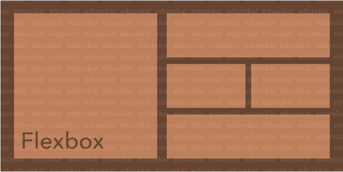

Many designers and developers find this flexbox layout easier to use, as the positioning of the elements is simpler thus more complex layouts can be achieved with less code, leading to a simpler development process. Flexbox layout algorithm is direction based unlike the block or inline layout which are vertically and horizontally based. This flexbox layout should be used for small application components, while the new CSS Grid Layout Module is emerging to handle the large scale layouts.
Q37. How does a browser determine what elements match a CSS selector?
Browsers match selectors from rightmost (key selector) to left. Browsers filter out elements in the DOM according to the key selector and traverse up its parent elements to determine matches. The shorter the length of the selector chain, the faster the browser can determine if that element matches the selector.
For example with this selector p span, browsers firstly find all the <span> elements and traverse up its parent all the way up to the root to find the <p> element. For a particular <span>, as soon as it finds a <p>, it knows that the <span> matches and can stop its matching.
Q38. Explain the scenario you would use translate() instead of absolute positioning?
Translate is a value of CSS transform. Changing transform or opacity does not trigger browser reflow or repaint but does trigger compositions; whereas changing the absolute positioning triggers reflow. Transform causes the browser to create a GPU layer for the element but changing absolute positioning properties uses the CPU. Hence translate() is more efficient and will result in shorter paint times for smoother animations.
When using translate(), the element still occupies its original space (sort of like position: relative), unlike in changing the absolute positioning.
Q39. Explain the difference in approach when designing a responsive website over a mobile-first strategy?
These two approaches are not exclusive. Making a website responsive means some elements will respond by adapting its size or other functionality according to the device’s screen size, typically the viewport width, through CSS media queries.
For example, making the font size smaller on smaller devices.
@media (min-width: 601px) {
.my-class {
font-size: 24px;
}
}
@media (max-width: 600px) {
.my-class {
font-size: 12px;
}
}
A mobile-first strategy is also responsive, however, it agrees we should default and define all the styles for mobile devices, and only add specific responsive rules to other devices later. Following the previous example:
.my-class {
font-size: 12px;
}
@media (min-width: 600px) {
.my-class {
font-size: 24px;
}
}
A mobile-first strategy has 2 main advantages:
- It’s more performant on mobile devices since all the rules applied for them don’t have to be validated against any media queries
- It forces to write cleaner code in respect to responsive CSS rules.
Web Development Full Course | Web Development Course for Beginners | Web Developer Course | Edureka
This Edureka “Web Development Full Course” video will help you understand and learn Web Development technologies like HTML, CSS, JavaScript, React.js, Angular concepts in detail. This Web Development Course is ideal for both beginners and professionals who want to learn and master end-to-end Frontend and Backend Web Development technologies.
Q40. What are the different ways to position a certain element in CSS?
The position property specifies the type of positioning method used for an element.
There are five different position values:
position: fixed;
position: static;
position: absolute;
position: sticky;
position: relative;
Elements are then positioned using the top, bottom, left, and right properties. However, these properties will not work unless the position property is set first. They also work differently depending on the position value.
CSS Interview Questions
Q41. What is Block Formatting Context? How does it work?
A Block Formatting Context (BFC) is part of the visual CSS rendering of a web page in which block boxes are laid out. Floats, absolutely positioned elements, inline-blocks, table-cells, table-captions, and elements with overflow other than visible (except when that value has been propagated to the viewport) establish new block formatting contexts.
Knowing how to establish a block formatting context is important because without doing so, the containing box will not contain floated children. This is similar to collapsing margins but more insidious as you will find entire boxes collapsing in odd ways.
A BFC is an HTML box that satisfies at least one of the following conditions:
- The value of float is not none.
- The value of position is neither static nor relative.
- The value of display is table-cell, table-caption, inline-block, flex, or inline-flex.
- The value of overflow is not visible.
- In a BFC, each box’s left outer edge touches the left edge of the containing block (for right-to-left formatting, right edges touch).
Q42. What effect would this piece of CSS code have? {box-sizing: border-box;}
- By default, elements have box-sizing: content-box applied, and only the content size is being accounted for.
- box-sizing: border-box changes how the width and height of elements are being calculated, border and padding are also being included in the calculation.
- The height of an element is now calculated by the content’s height + vertical padding + vertical border width.
- The width of an element is now calculated by the content’s width + horizontal padding + horizontal border width.
- Taking into account paddings and borders as part of our box model resonates better with how designers actually imagine content in grids.
Q43. What is a CSS pre-processor? When do you recommend a pre-processor be used in a project?
A CSS preprocessor is a program that lets you generate CSS from the preprocessor’s own unique syntax. There are many CSS preprocessors to choose from, however, most CSS preprocessors will add some features that don’t exist in pure CSS, such as mixin, nesting selector, inheritance selector, and so on. These features make the CSS structure more readable and easier to maintain.
The usage depends on the type of project but the following advantages/disadvantages come with a preprocessor.
Advantages:
- CSS is made more maintainable.
- Easy to write nested selectors.
- Variables for consistent theming. Can share theme files across different projects.
- Mixins to generate repeated CSS.
- Sass features like loops, lists, and maps can make configuration easier and less verbose.
- Splitting your code into multiple files. CSS files can be split up too but doing so will require an HTTP request to download each CSS file.
Disadvantages:
- Requires tools for preprocessing. Re-compilation time can be slow.
- Not writing currently and potentially usable CSS. For example, by using something like postcss-loader with webpack, you can write potentially future-compatible CSS, allowing you to use things like CSS variables instead of Sass variables. Thus, you’re learning new skills that could pay off if/when they become standardized.
Selecting a preprocessor really boils down to preference, and it can be revealing to see how a particular developer might decide to use one over the other for your project.
Q44. What’s the difference between a relative, fixed, absolute and statically positioned element?
A positioned element is an element whose computed position property is either relative, absolute, fixed or sticky.
- Static
The default position; the element will flow into the page as it normally would. The top, right, bottom, left and z-index properties do not apply. - Relative
The element’s position is adjusted relative to itself, without changing the layout (and thus leaving a gap for the element where it would have been had it not been positioned). - Absolute
The element is removed from the flow of the page and positioned at a specified position relative to its closest positioned ancestor if any, or otherwise relative to the initial containing block. Absolutely positioned boxes can have margins, and they do not collapse with any other margins. These elements do not affect the position of other elements. - Fixed
The element is removed from the flow of the page and positioned at a specified position relative to the viewport and doesn’t move when scrolled. - Sticky
Sticky positioning is a hybrid of relative and fixed positioning. The element is treated as relative positioned until it crosses a specified threshold, at which point it is treated as fixed positioned.
Q45. What are Vendor-Prefixes?
Browser vendors sometimes add prefixes to experimental or nonstandard CSS properties and JavaScript APIs, so developers can experiment with new ideas while—in theory—preventing their experiments from being relied upon and then breaking web developers’ code during the standardization process. Developers should wait to include the unprefixed property until browser behaviour is standardized.
The major browsers use the following prefixes:
-webkit-(Chrome, Safari, newer versions of Opera, almost all iOS browsers (including Firefox for iOS); basically, any WebKit based browser)-moz-(Firefox)-o-(Old, pre-WebKit, versions of Opera)-ms-(Internet Explorer and Microsoft Edge)
Q46. Give an example of how you would use counter-increment and counter-reset in CSS to create automatic numbering within a webpage.
The counter-reset and counter-increment properties allow a developer to automatically number CSS elements like an ordered list (<ol>). The counter-reset property resets a CSS counter to a given value. The counter-increment property then increases one or more counter values. Automatic numbering within a webpage is often useful, much like the section headers within this article. An example of how to use counters in CSS is displayed below.
body {
counter-reset: foo;
}
h1 {
counter-reset: bar;
}
h1:before {
counter-increment: foo;
content: "Section " counter(foo) ". ";
}
h2:before {
counter-increment: bar;
content: counter(foo) "." counter(bar) " ";
}
Q47. What is file splitting? When is it used?
Part of a good CSS architecture is file organization. A monolithic file is fine for solo developers or very small projects. For large projects—sites with multiple layouts and content types, or multiple brands under the same design umbrella—it’s smarter to use a modular approach and split your CSS across multiple files.
Splitting your CSS across files makes it easier to parcel tasks out to teams. One developer can work on typography-related styles, while another can focus on developing grid components. Teams can split work sensibly and increase overall productivity.
Here’s a dummy css structure:
- reset.css: reset and normalization styles; minimal color, border, or font-related declarations
- typography.css: font faces, weights, line heights, sizes, and styles for headings and body text
- layouts.css: styles that manage page layouts and segments, including grids
- forms.css: styles for form controls and labels
- lists.css: list-specific styles
- tables.css: table-specific styles
- carousel.css: styles required for carousel components
- accordion.css: styles for accordion components
Q48. What are functions/mixins?
Functions are blocks of code that return a single value of any Sass data type. A mixin is very similar to a function. The main difference between the two is that mixins output lines of Sass code that will compile directly into CSS styles, while functions return a value that can then become the value for a CSS property or become something that might be passed to another function or mixin.
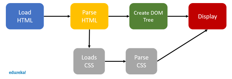
Q49. How does CSS work under the hood?
When a browser displays a document, it must combine the document’s content with its style information. It processes the document in two stages:
- The browser converts HTML and CSS into the DOM (Document Object Model). The DOM represents the document in the computer’s memory. It combines the document’s content with its style.
- The browser displays the contents of the DOM.

Q50. Recommend a way to optimize a certain webpage for prints.
The secret to creating printable pages is being able to identify and control the “content area(s)” of your website. Most websites are composed of a header, footer, sidebars/sub-navigation, and one main content area. Control the content area and most of your work is done. The following are my tips to conquering the print media without changing the integrity of your website.
- Create a stylesheet for print
- Avoid unnecessary HTML tables
- Know which portions of the page don’t have any print value
- Use page breaks
- Size your page for print – max height etc
This brings us to the end of this “CSS Interview Questions” blog. I hope this blog helps you ace your upcoming web-development interviews.
If you’re interested in learning more about web-development, check out the Web Development Certification Training by Edureka. Web Development Certification Training will help you learn how to create impressive websites using HTML5, CSS3, Twitter Bootstrap 3, jQuery and Google APIs and deploy it to Amazon Simple Storage Service(S3).