

Python Scripting Certification Training
- 15k Enrolled Learners
- Weekend
- Self Paced
(5900)


 Copy Link!
A color gradient specifies a range of position-dependent colors, usually used to fill a region. It is a very important aspect of beautification and adding a theme to your content. Let’s understand how we can implement Gradients in CSS in the following order:
If we are looking to style our webpages, then CSS has the power to do that. It is widely used in website development to transform a plain and static webpage to a completely new form. It provides us with various properties to explore.
In this post, we will look at the gradients in CSS. The gradients in CSS allows us to render smooth transitions between the combinations of two or more colors that are specified in the property. The gradients are the images that are created with the help of the browsers. Hence, this also provides with another way to set the background in webpages.
Linear Gradients: defined by their direction i.e. up, down, left, right, etc.
Radial Gradients: defined by the center position
Repeating Linear Gradients: linear-gradient executed in repeating fashion
Repeating Radial Gradients: radial-gradient executed in repeating fashion
NOTE: The CSS Gradients syntax are supported in all the browsers. However, there are some older browsers that do not support them such as old Mozilla or Safari browsers (until Version 8.0). Hence it is required to add a prefix “-webkit-“ or “ -moz-“ (depending upon the browsers) to make the browser interpret the gradients properties syntax.
The Linear Gradients are perhaps one of the most widely used gradients in CSS, commonly seen while designing web pages. It requires at least two colors to form a gradient. These colors are arranged in a linear format (e.g. top to bottom or left to right) and then rendered with smooth transitions.
There are many ways in which we can have the gradient effect and we will look into it in detail.
The linear-gradient() property of CSS is used to create the linear gradients and then set them as background images.
The possible values of this property are:
side or direction: This indicates the direction that the gradient should be rendered.
color_list: This represents the list of colors which comprise of two or more colors separated by commas. These colors are used to render smooth transitions. This parameter accepts all types of color syntax, i.e. name, hex, RGB or HSL.
Syntax:
background-image: linear-gradient(<side or direction>, < color_list > ...);
Example:
<html>
<head>
<style>
.gradient {
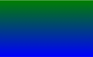
height: 300px;
background- image: linear-gradient(to bottom, green, blue);
}
</style>
</head>
<body>
<div class="gradient"/>
</body>
</html>
Output:
Types of Linear Gradients
Let us now explore various types of linear gradients:
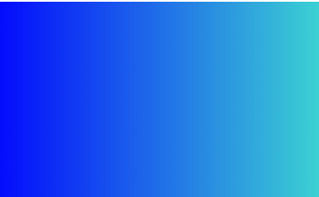
For Example, here we can see that the color stars with blue color and then has a transition towards the turquoise color.
<html>
<head>
<style>
.gradient {
height: 300px;
background-image: linear-gradient(blue, turquoise);
}
</style>
</head>
<body>

<div class="gradient"></div>

</body>
</html>
Output:
 Please note that here we have not specified the direction; the CSS interprets it to default i.e. top to bottom.
Here the transition starts from left with blue color and smoothly moves towards the right direction with turquoise.
<html>
<head>
<style>
.gradient {
height: 300px;
background-image: linear-gradient(to right, blue, turquoise);
}
</style>
</head>
<body>
<div class="gradient"/>
</body>
</html>
Output:
For example: to top left, to the bottom left, to top right, to bottom right, etc.
Here the color starts from purple and moves diagonally towards the top to orange color from left side.
<html>
<head>
<style>
.gradient {
height: 300px;
background-image: linear-gradient(to top left, purple, orange);
}
</style>
</head>
<body>
<div class="gradient"/>
</body>
</html>
Output:

Here the gradient starts with red and moves 45 degrees with blue color.
<html>
<head>
<style>
.gradient {
height: 300px;
background-image: linear-gradient(45deg, red, blue);
}
</style>
</head>
<body>
<div class="gradient"></div>
</body>
</html>
Output:
<html>
<head>
<style>
.gradient {
height: 300px;
background-image:linear-gradient(to left, blue, green, red, yellow, orange );
}
</style>
</head>
<body>
<div class="gradient"></div>
</body>
</html>
Output:
We can also define how much of a particular color we want by stating the beginning points of the color. These points are known as color stops as they declare the stop of the previous color.
For example: If we want a gradient where the color blue should be maximum and green only in the beginning for about say 20%, then we can make the color stop at 20% and blue can continue from that point.
<html>
<head>
<style>
.gradient {
height: 300px;
background-image:linear-gradient(to right, green, blue 20%);
}
</style>
</head>
<body>
<div class="gradient"></div>
</body>
</html>
Output: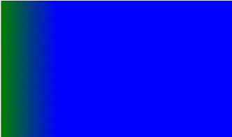
Here is an example that shows the linear gradient from top to bottom and gradually moves from being transparent to the color blue.
<html>
<head>
<style>
.gradient {
height: 300px;
background-image: linear-gradient(to bottom, rgba(0,0,255,0), rgba(0,0,255,1));
}
</style>
</head>
<body>
<div class="gradient"></div>
</body>
</html>
Output: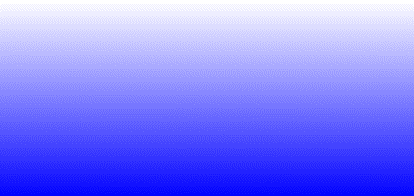
Let us see another way of creating a linear gradient using transparency and multiple colors using color stops.
body {
background-color:#001;
background-image: linear-gradient(white 15%, transparent 16%),
linear-gradient(white 15%, transparent 16%);
background-size: 60px 60px;
background-position: 0 0, 30px 30px;
}
Output: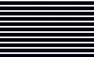
This is a linear gradient that repeats on every cycle. This repeating fashion of the gradient makes in more attractive.
Let us modify the same code we saw above and see the difference for repeating-linear-gradient
body {
background-color:#001;
background-image: repeating-linear-gradient(white 15%, transparent 16%),
repeating-linear-gradient(white 15%, transparent 16%);
background-size: 60px 60px;
background-position: 0 0, 30px 30px;
}
The Radial Gradients in CSS are those that emerge from the center. It also requires a minimum of at least two colors and transition happens from center to edges These colors are arranged in a linear format (e.g. top to bottom or left to right) and then rendered with smooth transitions. Since the gradients are radial in nature, the shape that it generates are mostly of the circular form like the circle or the ellipse.
The radial-gradient() property of CSS is used to create the radial gradients and then set them as background images.
Syntax:
background-image: radial-gradient(<shape and size>, starting color, …. , ending color);
shape: This parameter determines the shape of the gradient that it forms when outwards transitioning from one color to another in a circular fashion. E.g. circle or ellipse.
size: It defines the size of the gradient and determines the ending shape of the gradient-based on the center of the shape. It has below possible values.
The default parameter values for the shape is an ellipse, the size is farthest-corner, and the position is center.
Let us have a look at an example for radial gradient:
<html>
<head>
<style>
.gradient {
height: 300px;
background-image: radial-gradient(blue, red);
}
</style>
</head>
<body>
<div class="gradient"></div>
</body>
</html>
Output: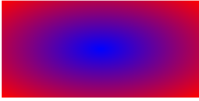
Now since we have specified a value for the size it will fade to the closest-side of the shape.
<html>
<head>
<style>
.gradient {
height: 300px;
background-image: radial-gradient( circle closest-side, cyan, orange);
}
}
</style>
</head>
<body>
<div class="gradient"></div>
</body>
</html>
Output:
This is a radial gradient that repeats on every cycle. This repeating of the gradient makes alluring patterns.
body {
background-color:#001;
background-image: repeating-radial-gradient(white 15%, transparent 16%),
repeating-radial-gradient(white 15%, transparent 16%);
background-size: 60px 60px;
background-position: 0 0, 30px 30px;
}
Output:
With this, we come to an end of this Gradients in CSS article. I hope you now have an understanding of how we can implement different types of Gradients in CSS.
Now that you know about Gradient in CSS, check out the Web Development Certification Training by Edureka. Web Development Certification Training will help you learn how to create impressive websites using HTML5, CSS3, Twitter Bootstrap 3, jQuery and Google APIs and deploy it to Amazon Simple Storage Service(S3).
Got a question for us? Please mention it in the comments section of “Gradient in CSS” and we will get back to you.


 REGISTER FOR FREE WEBINAR
  Thank you for registering Join Edureka Meetup community for 100+ Free Webinars each month JOIN MEETUP GROUP