


Data visualization is an essential component of a data scientist’s skill set which you need to master in the journey of becoming Data Scientist. It is statistics and design combined in a meaningful way to interpret the data with graphs and plots. In this ggplot2 tutorial we will see how to visualize data using gglot2 package provided by R.
Data, Data everywhere…. how do I understand it?
- Let’s say RBI wants to find out information about the fraud cases that happen in different banking sectors.
- John is a data scientist who works for RBI and he is assigned the responsibility to accomplish this task.
- He must work with a data-set which comprises of names of the banks, the sectors to which they belong to, number of fraud cases, amount of loss due to fraudulent cases and other similar attributes.
- John has to deal with a problem though, he is unable to comprehend the data directly by looking at the table. He wants to compare the percentage of fraud cases which happen in national sector banks to the percentage of fraud cases happening in the private sector banks.
- John is struck by a brilliant idea, he decides to visualize the data pictorially with the help of data visualization tools and is easily able to explore the relationship between different banking sectors and fraudulent cases.
We see that data visualization tools help in exploring the data, as well as explaining the data.
This blog will cover the following topics:
Let us begin this blog by first looking at the types of visualization.
GGPLOT2 tutorial: Types of Visualization
In statistics, we generally have two kinds of visualization:
- Exploratory data visualization: Exploring the data visually to find patterns among the data entities.
- Explanatory data visualization: Showcasing the identified patterns using simple graphs.
GGPLOT2 tutorial: What tools do I have for data visualization?
We have a number of visualization tools to make aesthetic graphs. Let’s look at some of them:
Paid Tools: These tools might be initially costly to purchase but the solutions provided by them are definitely worth the money spent.
- Tableau: Tableau is a data visualization monster which provides interactive visualizations for huge and fast moving data-sets.
- Qlikview: Similar to Tableau, it provides strong visualizations and BI reporting. It offers a single product for entire BI solution.
Open source Tools: Though not as effective as the paid tools, these do help in taking care of all the necessities.
GGPLOT2 tutorial: Grammar of graphics
In any language the grammatical rules are to be kept in mind to construct meaningful sentences, such as:
> “I am John” makes sense, because it follows proper grammar.
> “Am John I” doesn’t make sense because it doesn’t adhere to the grammatical rules.
Similarly, we have “grammar of graphics” which needs to be followed for creating perfect graphs.
Elements of Grammar of graphics
| Component | Description |
| Data | The data-set being plotted |
| Aesthetics | The scales onto which we plot our data |
| Geometry | The visual elements used for our data |
| Facet | Groups by which we divide the data |
GGPLOT2 tutorial: Visualisation using ggplot2
The ggplot2 package is a simplified implementation of grammar of graphics written by Hadley Wickham for R.
It takes care of many of the fiddly details that make plotting a hassle (like drawing legends) as well as providing a powerful model of graphics that makes it easy to produce complex multi-layered graphics.
So, let’s dive into the R code:
- Let’s start by installing the ggplot2 package by calling install.packages(“ggplot2”)
install.packages("ggplot2")- Now we need to load the package by using the library() function.
library(ggplot2)- We’ll be working with the “Birth_weight” data-set which is a part of “statisticalModeling” package. Thus, we have to intstall and load this package too.
install.packages("statisticalModeling")library(statisticalModeling)- Let’s look at the first six rows of “Birth_weight” dataset by calling head() function.
head(Birth_weight) ## baby_wt income mother_age smoke gestation mother_wt ## 1 120 level_1 27 nonsmoker 284 100 ## 2 113 level_4 33 nonsmoker 282 135 ## 3 128 level_2 28 smoker 279 115 ## 4 108 level_1 23 smoker 282 125 ## 5 132 level_2 23 nonsmoker 245 140 ## 6 120 level_2 25 nonsmoker 289 125
str(Birth_weight) This will give us the structure of the data-set
## 'data.frame':    884 obs. of  6 variables:
  ##  $ baby_wt   : int  120 113 128 108 132 120 143 144 141 110 ...
  ##  $ income    : chr  "level_1" "level_4" "level_2" "level_1" ...
  ##  $ mother_age: int  27 33 28 23 23 25 30 32 23 36 ...
  ##  $ smoke     : chr  "nonsmoker" "nonsmoker" "smoker" "smoker" ...
  ##  $ gestation : int  284 282 279 282 245 289 299 282 279 281 ...
  ##  $ mother_wt : int  100 135 115 125 140 125 136 124 128 99 ...
And now, let’s start plotting!!!!
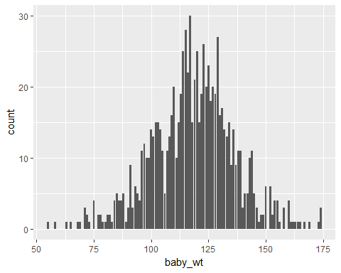
Plot1: Simple Bar-plot (Showing distribution of baby’s weight)
ggplot(data = Birth_weight,aes(x=baby_wt))+geom_bar()The above code has three parts:
- data: to which we provide the name of the data-set
- aes: This is where we provide the aesthetics, i.e. the “x-scale” which will be showing the distribution of “baby_wt”(baby weight)
- geometry: The geometry which we are using is bar plot and it can be invoked by using geom_bar() function.

ggplot2 tutorial:bar plot
We can easily say that the weight is in the range of 55-175 by just looking at this bar plot.
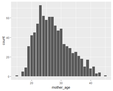
Plot2: Simple Bar-plot (Showing distribution of mother’s age)
ggplot(data = Birth_weight,aes(x=mother_age))+geom_bar()- We are using the same components, but this time we are plotting the mother’s age(mother_age) on the x-axis.
ggplot2 tutorial:bar plot
This graph shows that the mother’s age would lie in the range of 15-45.
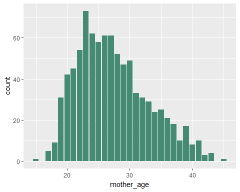
Plot3: Colored Bar-plot
ggplot(data = Birth_weight,aes(x=mother_age))+geom_bar(fill="aquamarine4")- In the above code, we are using the fill attribute in the geom_bar() function to give the bar plot a color.
ggplot2 tutorial:bar plot
Same plot as above, but it looks prettier, doesn’t it?
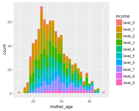
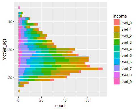
Plot4: Bar-plot(color variation w.r.t income levels)
ggplot(data = Birth_weight,aes(x=mother_age,fill=income))+geom_bar()- In this case, we are using “fill” as an aesthetic and assigning the variable “income” to this aesthetic.
ggplot2 tutorial:bar plot
We see the variation In income levels across the distribution of mother’s age, i.e. across each bar, we are also depicting the variation in income levels.
Plot5: Inverted Bar-plot
ggplot(data = Birth_weight,aes(x=mother_age,fill=income))+geom_bar()+coord_flip()- Just for the fun of it, let’s flip the axes using coord_flip()
ggplot2 tutorial:bar plot
What do we observe? Nothing much to be honest…
We’ll also be working with the “mtcars” dataset. Thus, let’s observe the first six rows of this dataset.
head(mtcars)## mpg cyl disp hp drat wt qsec vs am gear carb ## Mazda RX4 21.0 6 160 110 3.90 2.620 16.46 0 1 4 4 ## Mazda RX4 Wag 21.0 6 160 110 3.90 2.875 17.02 0 1 4 4 ## Datsun 710 22.8 4 108 93 3.85 2.320 18.61 1 1 4 1 ## Hornet 4 Drive 21.4 6 258 110 3.08 3.215 19.44 1 0 3 1 ## Hornet Sportabout 18.7 8 360 175 3.15 3.440 17.02 0 0 3 2 ## Valiant 18.1 6 225 105 2.76 3.460 20.22 1 0 3 1
Plot6: Bar-plot
ggplot(data = mtcars,aes(x=cyl,fill=factor(gear)))+geom_bar()- We are assigning cyl(number of cylinders) to the x-axis.
- factor(gear) i.e number of gears which is a categorical variable will determine the colour of the bars
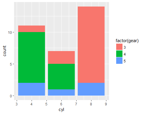
ggplot2 tutorial:bar plot
We see that:
- If it is a 4-cylinder car, it would most probably have 4-forward gears.
- Most of the 6-cylinder cars have 4-forward gears followed by 3 gears and and 5 gears.
- There is no 8-cylinder car which has 4-forward gears. Most of these cars have 3-forward gears.
Plot7: Bar-plot( Variation in terms of proportion)
ggplot(data = mtcars,aes(x=cyl,fill=factor(gear)))+geom_bar(position = "fill")- The attribute “position” is given as “fill”, i.e. we’ll get the bar plot in terms of proportion.
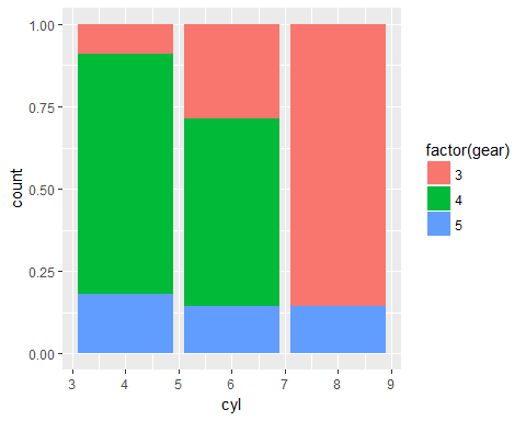
ggplot2 tutorial:bar plot
Same bar plot, showing proportion instead of count.
Plot8: Bar-plot(Dodge comparison)
ggplot(data = mtcars,aes(x=cyl,fill=factor(gear)))+geom_bar(position = "dodge")- The position attribute is “dodge” in geom_bar() function.
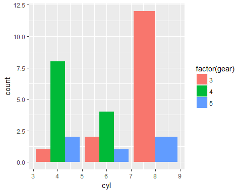
ggplot2 tutorial:bar plot
We see individual bars for number of gears.
The same inference can be drawn but it is much clear from this graph.
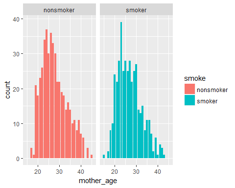
Plot9: Bar-plot (Facet division)
ggplot(data = Birth_weight,aes(x=mother_age,fill=smoke))+geom_bar()+facet_grid(. ~smoke)- X-axis shows distribution of mother’s age
- The colour is determined by whether the person smokes or not.
- We add a new graphic component here, which is the facet grid. It can be invoked by using facet_grid(. ~VARIABLE NAME).
ggplot2 tutorial:barplot
- Left facet is for non-smokers
- Right facet is for smokers
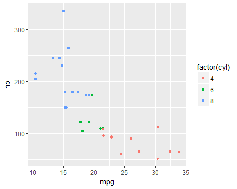
Plot10: Scatter-plot
ggplot(data = mtcars,aes(x=mpg,y=hp,col=factor(cyl)))+geom_point()- mpg(miles/galloon) is assigned to the x-axis
- hp(Horsepower) is assigned to the y-axis
- factor(cyl) {Number of cylinders} determines the color
- The geometry used is scatter plot. We can create a scatter plot by using the geom_point() function.
ggplot2 tutorial:scatter plot
We can infer that:
- As mpg(miles/gallon) increases hp(Horsepower) decreases.
- 4-cylinder cars have the highest horsepower and lowest mpg.
- 6-cylinder cars have a horse power range of 100-175 and mpg is in the range of 17.5-22.5
- 8-cylinder cars have lowest horse power and highest mpg.
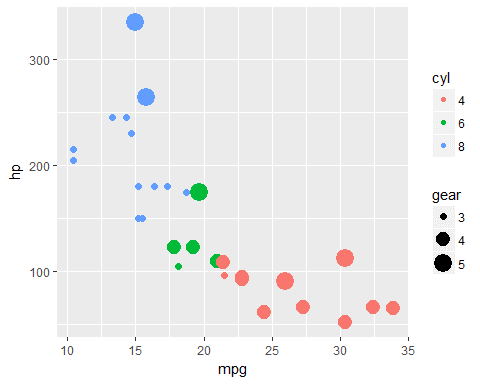
Plot11: Scatter-plot(Size variation)
ggplot(data = mtcars,aes(x=mpg,y=hp,col=factor(cyl),size=factor(gear)))+geom_point()+labs(size="gear",col="cyl")- factor(gear) {Number of forward gears} is assigned to the size aesthetic. i.e it will determine the size of the dots.
- labs() function is used to give custom labels to the aesthetics.
ggplot2 tutorial:Scatter plot
We can infer that:
- If a car has 3-forward gears, it will have mpg in the range of 10-17.5
- If a car has 4-forward gears, it will have hp below 150.
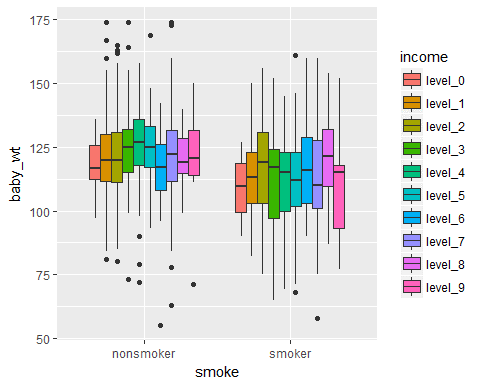
Plot12: Box-plot
ggplot(data = Birth_weight,aes(x=smoke,y=baby_wt,fill=income))+geom_boxplot()- The geometry used is box plot. A box plot can be created by using geom_boxplot().
ggplot2 tutorial:Box plot
- The graph shows distribution of baby weight across different income levels.
- The dots which lie outside will count as the outliers. Box plot is the go-to tool for outlier-check, because it clearly shows all the outliers.
Plot13: Line-plot
ggplot(data = Birth_weight,aes(x=mother_wt,y=baby_wt))+geom_smooth()- Mother’s weight (mother_wt) is assigned to the x-aesthetic.
- Baby’s weight (baby_wt) is assigned to the y-aesthetic.
- The geometry used is line plot. A line plot can be created by using the geom_smooth() function.
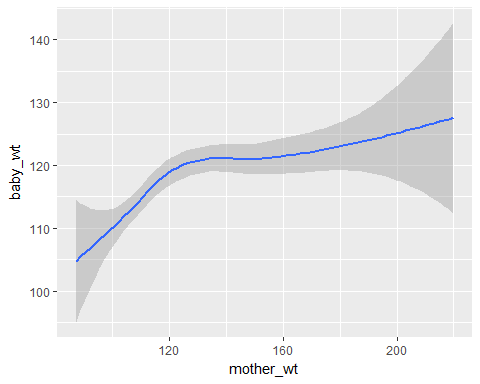
ggplot2 tutorial:line plot
We see that as the mother’s weight(mother_wt) increases, the baby’s weight(baby_wt) also increases.
Plot14: Line-plot(Comparison of two line curves)
ggplot(data = Birth_weight,aes(x=mother_wt,y=baby_wt,col=smoke))+geom_smooth()- Smoke is assigned to the color aesthetic. Since we are creating a line plot, this will create two lines of different colors.
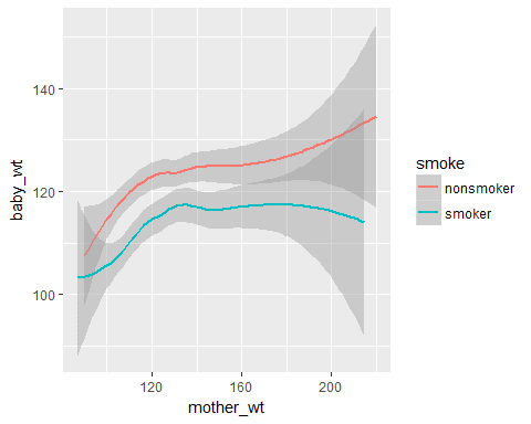
ggplot2 tutorial:Line plot
We see that if the mother is a non-smoker then the baby’s weight will be higher.
Plot15: Jitter-plot
ggplot(data = Birth_weight,aes(x=smoke,y=baby_wt,col=smoke))+geom_jitter()- Geometry used is jitter plot. We can create a jitter plot by using geom_jitter().
- Jitter is a random value that is assigned to the dots to separate them so that they aren’t plotted directly on top of each other.
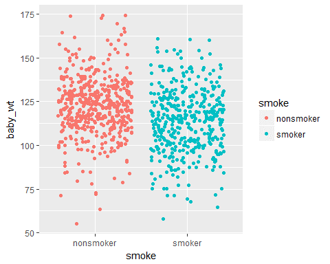
ggplot2 tutorial:Jitter plot
Prior to the statistical analysis and model building, it is essential to visually observe the relationship between the different data elements. This helps us in obtaining meaningful insights from the data to build better models. R’s ggplot2 package is one such data visualization tool which helps us in understanding the data.
Check out the R Certification Training by Edureka, a trusted online learning company with a network of more than 250,000 satisfied learners spread across the globe. Edureka’s Data Analytics with R training will help you gain expertise in R Programming, Data Manipulation, Exploratory Data Analysis, Data Visualization, Data Mining, Regression, Sentiment Analysis and using RStudio for real life case studies on Retail, Social Media.