Python Scripting Certification Training
- 15k Enrolled Learners
- Weekend
- Self Paced
(5900)


 Copy Link!
Flutter UI designs are an essential component of building mobile applications using the Flutter framework. Flutter, developed by Google, is an open-source mobile application development framework that enables developers to create high-performance, cross-platform mobile applications for Android and iOS devices. It provides a rich set of customizable widgets and tools for building beautiful, responsive, and engaging user interfaces for mobile applications.
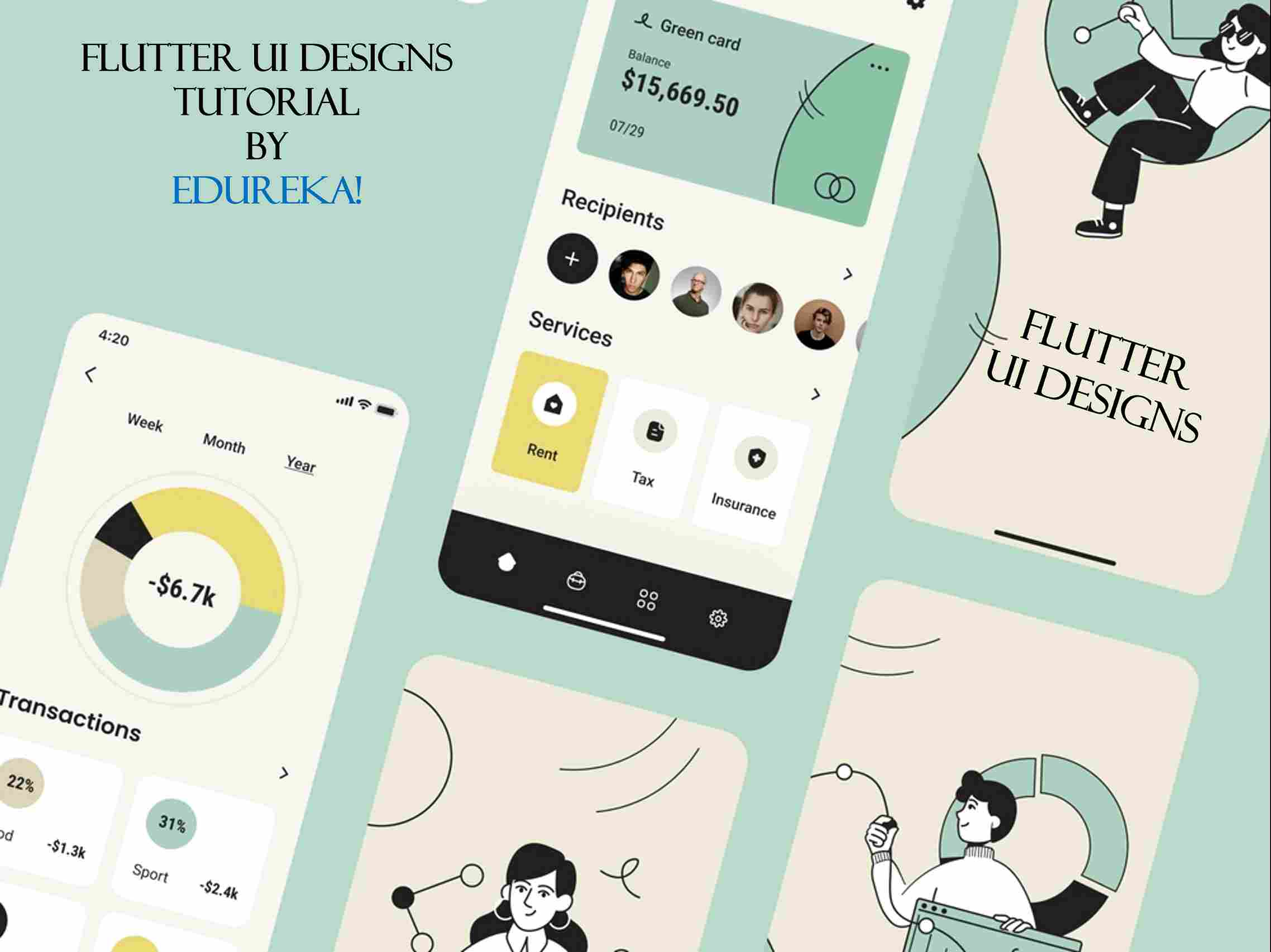
Flutter UI designs refer to the graphical and interactive elements of a Flutter application that make up the user interface. These elements include layouts, widgets, typography, colours, and animation effects. Flutter provides a wide range of customizable UI widgets that can be used to build user interfaces that are both visually appealing and responsive. Flutter also offers a range of animation and motion graphics capabilities that can be used to add more interactivity and visual interest to the UI.
There are several benefits to using Flutter UI designs when building mobile applications. Firstly, Flutter’s widgets are highly customizable and offer a range of pre-built components that can be easily used to build complex UI designs. Secondly, Flutter’s UI designs are highly responsive, which means they can adapt to different screen sizes, resolutions, and device orientations, making them suitable for use across a wide range of mobile devices. Additionally, Flutter’s UI designs are highly performant, ensuring that mobile applications built using Flutter are fast and responsive, even on low-end devices.

The difference between animation and UI features in Flutter is that animation refers to the movement and transition effects that can be applied to UI elements, while UI features refer to the design elements that make up the user interface. Animations are a powerful tool that can be used to add visual interest and enhance the user experience of an application. Flutter provides a wide range of animation and motion graphics capabilities, including explicit animations, implicit animations, and physics-based animations.
Explicit animations in Flutter involve animating a widget property from one state to another using an AnimationController object. Implicit animations, on the other hand, are automatically triggered whenever a widget property changes, making them more intuitive and easier to use. Physics-based animations, on the other hand, are a more advanced form of animation that simulates real-world physics effects, such as gravity, momentum, and friction, to create a more realistic and engaging user experience.
UI features, on the other hand, refer to the design elements that make up the user interface of a Flutter application. These elements include layouts, widgets, typography, colors, and other design elements that are used to create a visually appealing and intuitive user interface. Some of the popular UI features in Flutter include:
When it comes to designing Flutter UIs, there are several tools that developers can use to create visually appealing and engaging user interfaces. Some of the popular tools for designing Flutter UIs include:
In addition to these tools, Flutter also provides a range of developer tools that can be used to build and debug Flutter applications. These tools include:
This Flutter project implements a basic login page with a gradient background, two text fields for email and password, and a login button.
Here is a detailed breakdown of the code:
import 'package:flutter/material.dart';

void main() {

runApp(MyApp());

}
This code imports the flutter/material.dart library and creates a main function that runs the MyApp widget.
class MyApp extends StatelessWidget {

@override

Widget build(BuildContext context) {

return MaterialApp(

title: 'Login Page',

theme: ThemeData(

primarySwatch: Colors.blue,

visualDensity: VisualDensity.adaptivePlatformDensity,

),

home: LoginPage(),

);

}

}
This code defines a MyApp widget, which is a stateless widget that returns a MaterialApp. The MaterialApp widget sets the title of the app to “Login Page” and defines a ThemeData object that sets the primary swatch to blue and the visual density to adaptive. Finally, the MaterialApp widget sets the LoginPage widget as the home page of the app.
class LoginPage extends StatelessWidget {

@override

Widget build(BuildContext context) {

return Scaffold(

body: Container(

decoration: BoxDecoration(

gradient: LinearGradient(

begin: Alignment.topCenter,

end: Alignment.bottomCenter,

colors: [Colors.purple, Colors.blue],

),

),

child: Column(

mainAxisAlignment: MainAxisAlignment.center,

children: <Widget>[

Text(

'Login',</span>

style: TextStyle(

color: Colors.white,

fontSize: 40,

fontWeight: FontWeight.bold,

),

),

SizedBox(height: 30),

Padding(

padding: EdgeInsets.symmetric(horizontal: 20),

child: TextFormField(

decoration: InputDecoration(

labelText: 'Email',

labelStyle: TextStyle(color: Colors.white),

enabledBorder: OutlineInputBorder(

borderSide: BorderSide(color: Colors.white),

),

focusedBorder: OutlineInputBorder(

borderSide: BorderSide(color: Colors.white),

),

),

),

),

SizedBox(height: 20),

Padding(

padding: EdgeInsets.symmetric(horizontal: 20),

child: TextFormField(

obscureText: true,

decoration: InputDecoration(

labelText: 'Password',

labelStyle: TextStyle(color: Colors.white),

enabledBorder: OutlineInputBorder(

borderSide: BorderSide(color: Colors.white),

),

focusedBorder: OutlineInputBorder(

borderSide: BorderSide(color: Colors.white),

),

),

),

),

SizedBox(height: 20),

ElevatedButton(

onPressed: () {

// perform login action here

},

child: Text('Login'),

),

],

),

),

);

}

}
This code defines the LoginPage widget, which is also a stateless widget that returns a Scaffold. The Scaffold widget provides a basic structure for the app, including an app bar and a body. The body of the Scaffold widget contains a Container widget, which has a gradient background defined by a LinearGradient. Inside the Container, there is a Column widget that contains a Text widget with the title “Login”, two TextFormField widgets for email and password input, and an ElevatedButton widget for the login button.
The TextFormField widgets have a label and border defined by InputDecoration. The label text is “Email” or “Password” and has white text color. The border color is also white. The password field has the obscureText property set to true to hide the password as it is typed. The SizedBox widgets are used for spacing between the widgets.
The ElevatedButton widget has an onPressed function that is triggered when the user taps the button. Currently, the function is empty, but you could add code here to perform the login action.
 Overall, this project provides a basic login page UI that can be further customized and extended as needed. The flutter/material.dart library provides a wide range of widgets that can be used to build complex UIs for mobile apps.
In conclusion, Flutter UI designs are an essential component of building high-performance, cross-platform mobile applications using the Flutter framework. Flutter provides a range of customizable widgets and tools for building beautiful, responsive, and engaging user interfaces for mobile applications. By using these tools and design guidelines, developers can create mobile applications that are visually appealing, intuitive, and highly performant, making them a popular choice among mobile app developers.
This brings us to the end of this blog on the Flutter UI designs tutorial. Hope I could clearly explain Flutter UI designs tutorial and why you should use it.
If you want to get trained in Flutter and wish to develop interesting UI’s on your own, then check out the best Flutter Course offered by Edureka, Our Flutter Course Syllabus, curated by industry experts that will help you to master all its concepts.
Got a question for us? Please mention it in the comments section and we will get back to you.


 REGISTER FOR FREE WEBINAR
  Thank you for registering Join Edureka Meetup community for 100+ Free Webinars each month JOIN MEETUP GROUP