Flutter animations are a key component of creating engaging and immersive mobile app experiences. With Flutter’s built-in animation libraries and customizable widgets, developers can create stunning animations that respond to user interactions and data changes. From simple fade-ins and slide-outs to more complex physics-based interactions, Flutter’s animation capabilities offer a wide range of possibilities for enhancing the user experience. In this blog on flutter animations, we will cover all the basics of flutter animations with the following :
Content:
- What are Flutter Animations
- The Importance of Animations in UI/UX Design
- The Basics of Animations in Flutter
- The Different Types of Animations
- Examples of Popular Animations Used in Flutter Apps
- Example for Showing a Text Animation

What are Flutter Animations
Flutter animations are an essential part of developing beautiful and engaging user interfaces for mobile apps. In simple terms, Flutter animations are a way to add movement, visual interest, and interaction to an app’s interface. These animations can be used to enhance the user experience, convey information, provide feedback, and create a sense of continuity and flow within an app.
Flutter provides a powerful and flexible animation framework that allows developers to create complex animations with minimal effort. With the help of Flutter’s built-in widgets, APIs, and tools, developers can easily create animations such as fades, rotations, scaling, and translations. Additionally, Flutter supports more advanced animations such as implicit and explicit animations, hero animations, and staggered animations.
Animations play a crucial role in modern app design, and Flutter’s animation capabilities make it an ideal platform for developing rich and engaging user interfaces. Whether you are a beginner or an experienced developer, learning how to create animations in Flutter can take your app design skills to the next level.
Also Read: Flutter Vs. React Native
The Importance of Animations in UI/UX Design
Animations play a critical role in UI/UX design as they can greatly enhance the user experience by making the app more engaging, intuitive, and fun to use. Here are some reasons why animations are important in UI/UX design:
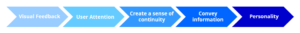
- Provide visual feedback: Animations can provide users with visual feedback, indicating that an action has been taken or completed. This feedback can help users understand how the app works, increasing their confidence in using it.
- Guide user attention: Animations can guide user attention to specific elements within an app. For example, an animation can draw a user’s attention to a new feature or an important message.
- Create a sense of continuity: Animations can create a sense of continuity and flow within an app. Smooth animations can make transitions between screens or interactions feel seamless and intuitive, making the app feel more polished.
- Convey information: Animations can be used to convey information to the user in a more engaging and memorable way. For example, a progress bar animation can show how much of a task is completed, and a loading animation can indicate that the app is still working on a task.
- Add personality: Animations can give an app personality and make it more fun to use. They can make an app stand out from the crowd and make users feel more connected to the app.
The Basics of Animations in Flutter
In Flutter, animations are created by changing the values of a widget’s properties over time. The basic idea is to define the starting and ending values of a widget’s properties, and then interpolate between these values over a specified duration. Flutter provides several animation classes that can be used to achieve different types of animations.
Here are some of the basic concepts to understand when working with animations in Flutter:
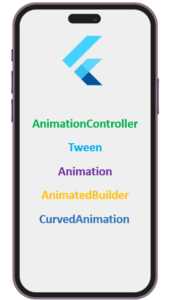
- AnimationController: This class is used to control the duration and progress of an animation. It defines the start and end times for the animation and provides a way to pause, resume, and reverse the animation.
- Tween: This class is used to define the starting and ending values of an animation. It can be used to animate a variety of properties such as size, position, opacity, and color.
- Animation: This class defines the intermediate values of an animation. It is created by passing a Tween and an AnimationController to the constructor. The Animation class provides a value that changes over time as the animation progresses.
- AnimatedBuilder: This widget is used to build a widget tree that depends on an Animation object. It takes an Animation object and a builder function as parameters and rebuilds the widget tree whenever the Animation value changes.
- CurvedAnimation: This class defines the rate of change of animation over time. It can be used to add easing effects such as acceleration or deceleration to an animation.
With these basic concepts, developers can create simple animations such as fades, rotations, scaling, and translations. As developers become more familiar with Flutter’s animation framework, they can create more complex animations that involve multiple widgets and interactions.
The Different Types of Animations
Flutter provides several types of animations that developers can use to create engaging and visually appealing user interfaces. Here are some of the different types of animations available in Flutter:
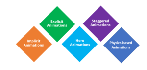
- Implicit Animations: Implicit animations are the simplest and most common type of animation in Flutter. They are created using a Tween and Animated widget, and Flutter automatically handles the animation by interpolating the values of the Tween over a specified duration. Examples of implicit animations include fading a widget in or out, moving a widget from one position to another, or changing the color of a widget.
- Explicit Animations: Explicit animations are more complex than implicit animations and give developers more control over the animation. They require an AnimationController to manage the animation’s duration, value, and state. Developers define the animation using a Tween and the AnimationController, and the animation is triggered by calling the AnimationController’s forward, reverse, or animateTo methods.
- Hero Animations: Hero animations are used to create seamless transitions between two screens or pages. They are often used when transitioning between screens that contain the same content but with different details or views. The animation creates a visual effect of the content flying from one screen to another, giving the user the impression of continuity.
- Staggered Animations: Staggered animations are used to animate multiple widgets in a sequence or staggered order. They are often used to create complex animations such as a staggered grid of images or a list of items that animate in as the user scrolls. Staggered animations can be created using the AnimatedList and StaggeredGrid widgets.
- Physics-based Animations: Physics-based animations simulate real-world physics, such as gravity, velocity, and friction. They are used to create more realistic and natural animations, such as bouncing, sliding, and flinging animations. Physics-based animations can be created using the physics property of the AnimationController, which takes a Physics object that defines the animation’s behavior.
Find out our Flutter Course in Top Cities
| India | Other Countries |
| Flutter Training in Chennai | Flutter Course in Australia |
| Flutter Course in Bangalore | Flutter Course in Canada |
| Flutter Training in Hyderabad | Flutter Course in London |
In summary, Flutter provides a wide range of animation types that can be used to create dynamic and engaging user interfaces. By understanding the different types of animations available, developers can choose the best animation type for their specific use case and create polished and intuitive user interfaces.
Examples of Popular Animations Used in Flutter Apps
Sure! Here are some examples of popular animations used in Flutter apps:

- Fade Animations: Fade animations are used to smoothly transition a widget’s opacity from one value to another. This animation is often used to create a smooth transition between screens or widgets.
- Scale Animations: Scale animations are used to increase or decrease the size of a widget smoothly. They are often used to create a visual effect of a widget growing or shrinking in response to user interactions.
- Slide Animations: Slide animations are used to move a widget from one position to another smoothly. This animation is often used to create a sense of movement in the UI.
- Rotation Animations: Rotation animations are used to rotate a widget smoothly around its centre point. This animation is often used to create a visual effect of a widget spinning or flipping.
- Bounce Animations: Bounce animations are used to simulate a bouncing motion, often used in button animations or for user feedback.
- Curved Animations: Curved animations are used to define the rate of change of animation over time. They are often used to add easing effects such as acceleration or deceleration to an animation.
- Hero Animations: Hero animations are used to create seamless transitions between two screens or pages. This animation creates a visual effect of the content flying from one screen to another.
- Parallax Animations: Parallax animations create an illusion of depth by moving multiple layers of a scene at different speeds. They are often used to create a visually rich and immersive experience.
These are just a few examples of popular animations used in Flutter apps. There are many more types of animations available in Flutter, and developers can use them to create unique and engaging user interfaces.
Example for Showing a Text Animation
import 'package:flutter/material.dart';
This line imports the flutter/material.dart library, which contains the necessary classes and widgets to build a Material Design application in Flutter.
void main() {
runApp(MyApp());
}
This is the entry point of the application, where the runApp() method is called with a MyApp() widget as a parameter to render the application.
class MyApp extends StatelessWidget {
const MyApp({Key? key}) : super(key: key);
@override
Widget build(BuildContext context) {
return MaterialApp(
title: 'Flutter Animation Demo',
home: WelcomeScreen(),
);
}
}
This is a stateless widget called MyApp, which is the root of the widget tree in this application. It returns a MaterialApp widget with a title and a home property set to WelcomeScreen() widget.
class WelcomeScreen extends StatefulWidget {
const WelcomeScreen({Key? key}) : super(key: key);
@override
_WelcomeScreenState createState() => _WelcomeScreenState();
}
This is a stateful widget called WelcomeScreen, which extends StatefulWidget. It returns a _WelcomeScreenState() instance as its state.
class _WelcomeScreenState extends State<WelcomeScreen>
with SingleTickerProviderStateMixin {
late AnimationController _controller;
late Animation<double> _opacityAnimation;
late Animation<double> _colorAnimation;
@override
void initState() {
super.initState();
_controller = AnimationController(
vsync: this,
duration: Duration(seconds: 3),
)..repeat(reverse: true);
_opacityAnimation = Tween<double>(begin: 0.0, end: 1.0).animate(_controller);
_colorAnimation = Tween<double>(begin: 0.0, end: 1.0).animate(_controller)
..addListener(() {
setState(() {});
});
}
This is the state class _WelcomeScreenState of WelcomeScreen, which extends State and mixes in SingleTickerProviderStateMixin. It creates three animation objects, _controller, _opacityAnimation, and _colorAnimation using the AnimationController and Tween classes.
_controller is an instance of AnimationController class, which is responsible for controlling the animation. It’s initialized with the duration of 3 seconds and repeats in reverse direction after completion.
_opacityAnimation is an instance of Animation<double> class, which is responsible for changing the opacity of a widget from 0.0 to 1.0.
_colorAnimation is also an instance of Animation<double> class, which is responsible for changing the background color of a widget from 0.0 to 1.0. It also calls the setState() method when the value of the animation changes, which triggers a rebuild of the widget tree.
@override
void dispose() {
_controller.dispose();
super.dispose();
}
This is the dispose() method that gets called when the state is destroyed. It’s used to dispose of the animation controller to avoid memory leaks.
@override
Widget build(BuildContext context) {
return Scaffold(
body: Stack(
children: [
Container(
decoration: BoxDecoration(
image: DecorationImage(
image: AssetImage('assets/images/background.jpg'),
fit: BoxFit.cover,
),
),
),
Center(
child: FadeTransition(
opacity: _opacity
- In the initState method, we initialize the _controller and _opacityAnimation variables using the AnimationController and Tween classes from the Flutter animation library. _controller is a stateful widget’s controller that is responsible for starting and stopping the animation. _opacityAnimation is an Animation object that represents a range of values (in this case, opacity values) that the widget should animate between.
- We use the addListener method on the _colorAnimation object to register a callback that is called every time the animation value changes. In this case, we are calling setState to rebuild the widget with the updated value of _colorAnimation. This causes the color of the widget to change over time as the animation runs.
- In the build method, we return a Scaffold widget with a Stack widget as its body. The Stack widget allows us to position the Container and FadeTransition widgets on top of each other.
- The Container widget is the bottom-most layer in the Stack. It is used to display the background image. We set the decoration property of the Container to a BoxDecoration object that specifies the image to display and how it should be sized.
- The FadeTransition widget is the top-most layer in the Stack. It is used to display the animated text. We set the opacity property of the FadeTransition to the _opacityAnimation object that we created earlier. This causes the text to fade in and out as the animation runs.
- Inside the FadeTransition, we have another Container widget. This is the widget that displays the text. We set its color property to a value that changes over time by using the withOpacity method on the Colors.white constant and passing in the value of _colorAnimation.value.
child: Container(
decoration: BoxDecoration(
color: Colors.white.withOpacity(_colorAnimation.value),
borderRadius: BorderRadius.circular(10),
),
padding: EdgeInsets.symmetric(
horizontal: 20,
vertical: 10,
),
child: Text(
'Welcome to Edureka',
style: TextStyle(
fontSize: 30,
fontWeight: FontWeight.bold,
color: _colorAnimation.value > 0.75
? Colors.black
: Colors.blue,
),
),
),
),
),
],
),
);
}
}
- Finally, we set the color property of the TextStyle object that is used to style the text to either black or blue depending on the value of _colorAnimation.value. If the value is greater than 0.75, we set the color to black. Otherwise, we set it to blue. This causes the color of the text to change over time as the animation runs.
- The child property of some parent widget (not shown) is set to a Container widget.
- The decoration property of the Container widget is set to a BoxDecoration widget, which gives the container a white background color with an opacity determined by the _colorAnimation.value variable.
- The borderRadius property of the BoxDecoration widget is set to a BorderRadius widget with a circular radius of 10 pixels.
- The padding property of the Container widget sets 20 horizontal pixels of padding and 10 vertical pixels of padding.
- The child property of the Container widget is set to a Text widget that displays the string “Welcome to Edureka”.
- The style property of the Text widget sets the text’s font size to 30 and weight to bold.
- The color property of the TextStyle widget is set to a conditional expression that evaluates to Colors.black if _colorAnimation.value is greater than 0.75 and Colors.blue otherwise.
Here is the Full Code
import 'package:flutter/material.dart';
void main() {
runApp(MyApp());
}
class MyApp extends StatelessWidget {
const MyApp({Key? key}) : super(key: key);
@override
Widget build(BuildContext context) {
return MaterialApp(
title: 'Flutter Animation Demo',
home: WelcomeScreen(),
);
}
}
class WelcomeScreen extends StatefulWidget {
const WelcomeScreen({Key? key}) : super(key: key);
@override
 _WelcomeScreenState createState() => _WelcomeScreenState();
}
class _WelcomeScreenState extends State<WelcomeScreen>
with SingleTickerProviderStateMixin {
late AnimationController _controller;
late Animation<double> _opacityAnimation;
late Animation<double>_colorAnimation;
@override
void initState() {
super.initState();
_controller = AnimationController(
vsync: this,
duration: Duration(seconds: 3),
)..repeat(reverse: true);
_opacityAnimation = Tween&<double>(begin: 0.0, end: 1.0).animate(_controller);
_colorAnimation = Tween<double>(begin: 0.0, end: 1.0).animate(_controller)
..addListener(() {
setState(() {});
});
}
@override
void dispose() {
_controller.dispose();
super.dispose();
}
@override
Widget build(BuildContext context) {
return Scaffold(
body: Stack(
children: [
Container(
decoration: BoxDecoration(
image: DecorationImage(
image: AssetImage('assets/images/background.jpg'),
fit: BoxFit.cover,
),
),
),
Center(
child: FadeTransition(
opacity: _opacityAnimation,
child: Container(
decoration: BoxDecoration(
color: Colors.white.withOpacity(_colorAnimation.value),
borderRadius: BorderRadius.circular(10),
),
padding: EdgeInsets.symmetric(
horizontal: 20,
vertical: 10,
),
child: Text(
'Welcome to Edureka',
style: TextStyle(
fontSize: 30,
fontWeight: FontWeight.bold,
color: _colorAnimation.value > 0.75
? Colors.black
: Colors.blue,
),
),
),
),
),
],
),
);
}
}
Conclusion
Flutter animations provide developers with a powerful and flexible framework for creating visually appealing and dynamic user interfaces in mobile applications. With the built-in animation library, developers can easily create complex animations and interactions, enhancing user engagement and experience. The hot reload feature in Flutter makes it easy to fine-tune and iterate animations in real time, saving time and effort during the development process. The availability of third-party animation packages and plugins further extends Flutter’s animation capabilities, providing developers with even more tools and resources to create captivating user interfaces. Overall, Flutter’s animation capabilities make it a popular choice for mobile application development, allowing developers to create visually stunning and interactive apps that stand out in today’s competitive mobile market.
This brings us to the end of this blog on Flutter Animations. Hope I was able to explain Flutter Animations and why you should use it clearly.
If you want to get trained in Flutter and wish to develop interesting UI’s on your own, then check out the best Flutter Course offered by Edureka, Our Flutter Application Development Certification Course Syllabus, curated by industry experts that will help you to master all its concepts.
Got a question for us? Please mention it in the comments section and we will get back to you.


