


Advanced Power BI Certification Course with G ...
- 12k Enrolled Learners
- Weekend/Weekday
- Live Class
(4230)


 Copy Link!
Excel provides several excellent features and one among them is Pivot Tables. Excel Pivot Tables are widely used all over the world by people belonging to various backgrounds such as Information Technology, Accounting, Management, etc. In this Excel Pivot Table Tutorial, you will be learning all that you need to know about Pivot Tables and also how you can visualize the same using Pivot Charts.
Before moving on, let’s take a quick look at all the topics that are discussed over here:
A Pivot Table in Excel is a statistical table that condenses data of those tables that have extensive information. The summary can be based on any field such as sales, averages, sums, etc that the pivot table represents in a simple and intelligent manner.
Excel Pivot Tables have a number of remarkable features such as:
Now that you are aware of what Excel Pivot Tables are, let’s move on to see how you can actually create them.
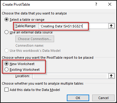
Before you actually start creating a Pivot table, you will need to jot down the data for which you intend to create pivot tables in Excel. In order to create a table for this purpose, keep the following points in mind:
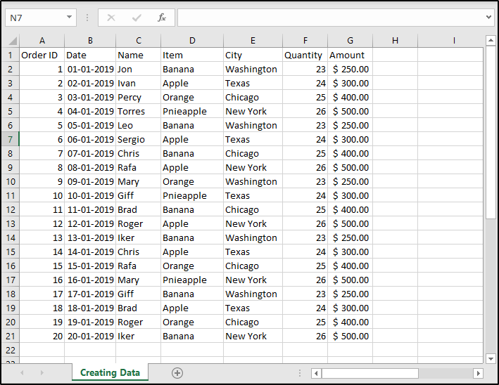
For example, take a look at the table below:
As you can see, I have created a table that holds information regarding the sale of fruits in different cities by various individuals along with its amount. There are no empty rows or columns in this table and the first row has unique names for every column i.e Order ID, Date, Name, etc. The columns contain the same type of data i.e the IDs, dates, names, etc respectively.
Follow the given steps to create Excel Pivot Tables:


When this is done, you will see that an empty Pivot table has been created and you will see a Pivot Table Fields pane opening towards the right of the Excel window using which you can configure your pivot table as shown in the image below:

This pane provides 4 areas i.e Filters, Columns, Rows and Values where,
All the fields present in your table will be represented as a list in the Pivot Table Fields pane. To add any field to any area, just drag and drop it there as shown below:

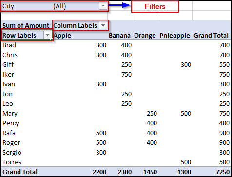
The table above shows a two-dimensional pivot table with the rows being vendor names and the items as columns. Therefore this table shows what each vendor has sold and the amount obtained by each of them. The final column shows the total amount of each vendor and the last row shows the total amount for each item.
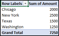
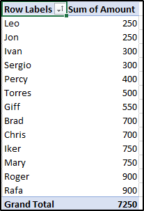
If you wish to create a one-dimensional pivot table, you can do so by selecting just the row or the column labels. Take a look at the following example where I have selected just the row labels to represent the Cities along with the Sum of Amount:
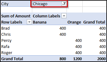
In case you want to filter out the data for some particular city, you will just have to open the dropdown menu for cities from the pivot table, and select the city of your choice. For example, if you filter out the statistics for Chicago from the above table you will see the following table:
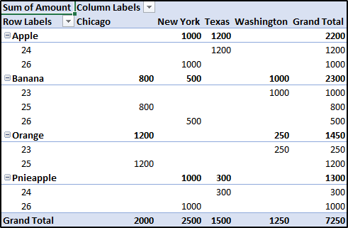
In order to change the fields in your pivot table, all you have to is drag and drop the fields you wish to see in any of the four areas. In case you want to remove any of these fields, you can simply drag the field back to the list. For example, if you change the row labels from vendor names to item names and the column labels to the quantity of each item you will see the following table:
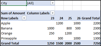
In the above table, you can see that all the items are mapped along with the quantity of each of them and the table has listed down the amount received for each of these items in all the cities. You can see that bananas are the most sold among all fruits and the total amount of it is 2300.
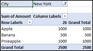
Now in case you want to see the same statistics for some particular city, simply select the appropriate city from the filter’s dropdown list. For example, if you filter out the data for New York, you will see the following table:
Similarly, you can create various pivot tables for any field of your choice.
In the above example, you have seen the total amount received by selling fruits in New York. In case you want to see the details of each statistic displayed in the pivot table, simply double click on the desired statistic and you will see that a new sheet has been created where you will have a table that shows you the details of how the final result is obtained. For example, if you double click on the amount for Apples, you will see the following table:
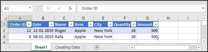
As you can see, Roger and Rafa have old 26 Apples for 500 each in New York. Therefore, the final amount received for all the Apples is 1000.
In case you want to sort out the table in ascending or descending order, you can do it as follows:
As you can see in the image, the pivot table has been sorted to show the amount received by each vendor starting from the least amount going up to the highest.
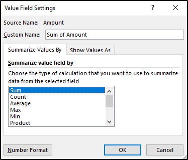
As you have seen in the previous examples, Excel shows the Grand Total by summing up the amount for every item. In case you want to change this in order to see other figures such as the average, count of items, product, etc just right-click on any of the Sum of Amount values and select the Value Field Settings option. You will the following dialog box:
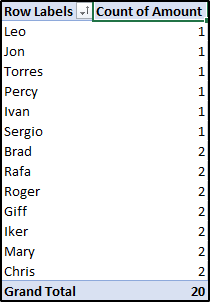
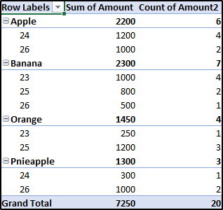
You can select any option from the given list. For example, if you select Count, your pivot table will show the number of times each vendor name is appearing in the Table with the total number of them at the end.
Now, if you want to see details as to where these names are appearing, double-click on any of the names and you will see a new table that has been created for it in a newly created Excel sheet. For example, if you double-click on Rafa, you will see the following details:

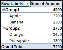
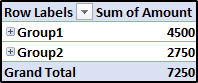
Excel allows you to group similar data while creating Pivot Tables. In order to group some data, simply select that piece of data and then right-click on it and from the list, click on Group option.
Take a look at the image below where I have grouped Apples and Bananas in Group1 and Oranges and Pineapples into Group2 and hence calculated the amount for each group.
In case you do not want to see the individual objects present in each group, you can simply collapse the group by selecting the Collapse from the Expand/ Collapse option present in the right-click menu.
Excel also allows you to add multiple fields to each area present in the PivotTable Fields window. All you have to do is drag and drop the desired field in the respective area.
For example, if you want to see what quantity of items are sold in each city, simply drag the Item and Quantity field to the Row area and the City field to the Column area. When you do this, the pivot table generated will be as shown below:
Similarly, you add multiple fields to the column as well as the values area. In the next example, I have added another amount field to the values area. To do this, simply drag and drop the Amount field for the second time to the values area. You will see that another Sum of Amount field will be created and Excel will also populate the columns accordingly. In the example below, I have changed the second value field to calculate the number of times each item is appearing along with the quantity for each city.
In order to format your Pivot Table, click on Design present in the Ribbon bar. From here, you will be able to configure the table however you want. For example, let me change the table design and remove the Grand totals present in my table. Also, I will create banded rows for my Pivot Table.

There are many other options that you can try out for yourself.
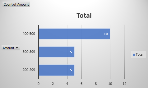
Pivot tables can be used to create frequency distribution tables very easily which can be represented using Pivot Charts. So in case, you want to create a Pivot Chart for the Amount field between the lower and upper range, follow the given steps:


Select the Pivot Chart option present in the Home tab and then you will see a window that allows you to select between various types of charts. In the example given below, I have chosen the Bar type:
This brings us to the end of this article on the Excel Pivot Tables Tutorial. I hope you are clear with all that has been shared with you. Make sure you practice as much as possible and revert your experience.
To get in-depth knowledge on any trending technologies along with their various applications, you can enroll for live Edureka MS Excel Online training with 24/7 support and lifetime access. Also, Don’t miss out on this opportunity to enhance your career prospects and become a sought-after business intelligence professional. Click the link below to enroll in our MSBI Course now!
If you’re looking to improve your abilities and learn more about Data Visualization to become certified as a Business Intelligence Professional. Go through our Tableau Training Course now to get all the information you should learn about this powerful software.


 Thank you for registering Join Edureka Meetup community for 100+ Free Webinars each month JOIN MEETUP GROUP