


In my previous blog, Data Visualization Techniques using MS Excel were discussed. Those were limited to the visualization of data in a single attribute. In this instalment of the series, we shall talk more about advanced aspects Data Visualization – Excel Charts. However, in many real-world scenarios, data visualization requires analysis of multiple attributes, which is an essential part of any MS Excel Training Program.
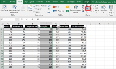
Suppose an ice cream company would like to analyze the revenue gained by the sale of its various ice creams. For such detailed analysis, you will have to analyze the effect of various parameters on the sale of ice creams. For example, how does temperature affect the sale? Are some locations better than others for selling ice cream? Does the sale increase by distributing more number of pamphlets?
So in order to answer such questions, you have to analyze the relationship between multiple attributes. In this blog, we will discuss exactly that.
Following are the Excel Charts which we shall discuss in this blog.
Line Chart
Line charts are very helpful in depicting continuous data on an evenly scaled axis. These Excel charts are a good option for showing trends in data at equal intervals, like days, months or years.
Let’s start by analyzing how revenue varies over time.
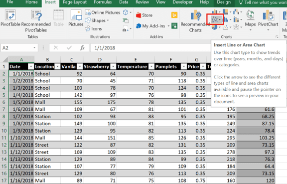
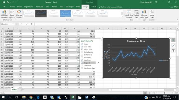
Select the values of the two columns (for example Date and Total Revenue) which are to be plotted in line chart. After selecting the values, click on the Insert menu and then click on the second icon in the Charts option.
On clicking the icon, various options will appear for the Line chart. For this example, click on the very first option under the 2 D Line section and the chart below will appear.
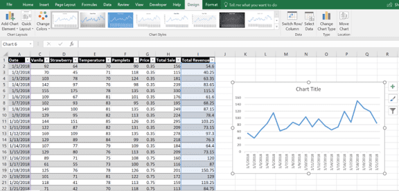
This chart shows how Revenue increases or decreases with time. However, this chart is not so easy to read. Hence, let’s try to make it more visual and informative.
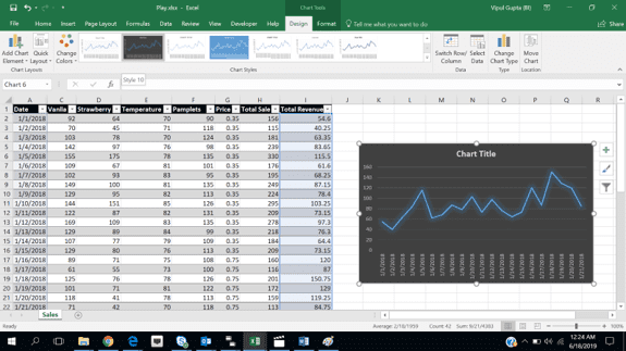
In the screenshot above, under the Design Section, choose the desired design style.
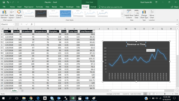
Double click on the text box, which says Chart Title, and rename it to Revenue vs Time.
Click on the chart again and then click on the plus (+) sign at the top right corner of the chart. It will open multiple options. Click on the option of Axis Titles and Legends.
For the sake of better illustration, drag the chart in the middle of the page. Now, observe that there are two text boxes present on the chart, one on the X-axis and one on the Y-axis. Both have the same content Axis Title.
Click on each text box and rename each axis as per the data. Choose a suitable font and then chart looks like the one below.
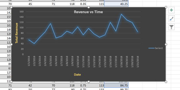
Now, the legend needs to be fixed. In the snapshot above, the legend is marked as Series 1, which is obviously incorrect.
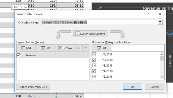
Right click on the chart and click on Select Data. It will open a new window as shown in the snapshot below.
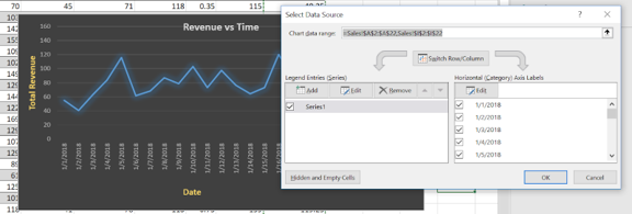
In the snapshot above, you can see the text Series1. This is what needs to be corrected. Click on Edit and type Revenue in the Series Name and press OK.
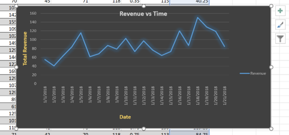
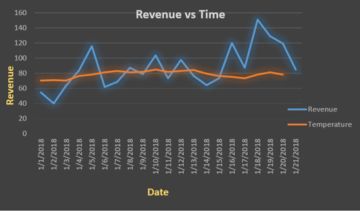
As you can see from the snapshot above, the overall revenue is fluctuating over time. In order to better understand this, you will have to analyze other parameters which are affecting the revenue.


Let’s try to understand if there is any correlation between revenue and temperature. In order to analyze this, let’s add one more attribute in the same chart: Temperature.
Click on the Design icon on the menu bar and then click on the Select Data option (at the right side of the menu bar). The following window will open.
Click on the Add button. A new window named “Edit Series” will be opened.
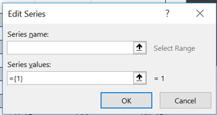
In the Series name, type “Temperature” and in Series Values, select all the values in the temperature column. After Pressing OK, now both Revenue and Temperature appear on the chart.


Column Chart
A column chart is used to visually compare values across multiple categories.
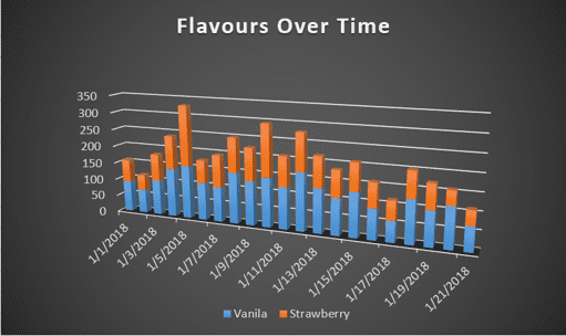
Let’s try to compare the sale of various ice cream flavours to understand which are more popular.
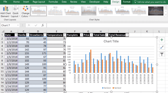
Select the values of the columns (for example Date, Vanilla, Strawberry) which are to be plotted in a column chart. After selecting the values, click on the Insert menu and then click on the first icon in the Charts option.
After clicking the icon, various options will appear for the Column chart. For this example, click on the very first option under the 2 D Column section and the chart below will appear.
Use the same steps as used in Line Chart to select the desired design, to rename the chart and rename the legends.
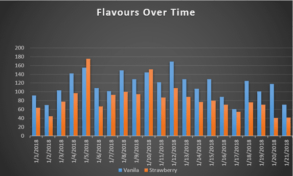
As seen in the chart above, the sale of vanilla ice cream is almost always higher than the sale of strawberry ice cream.


Let’s explore another useful variant of this chart, Stacked Column.
Click on Design Icon on the menu bar and then click on Change Chart Type.
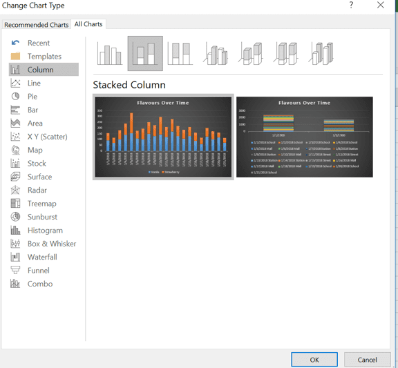
Select the option of Stacked Column.
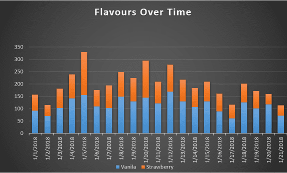
After pressing OK, the chart looks like the snapshot below.
There are multiple variants to this chart. For example, in the first step instead of selecting 2D chart, if 3D chart is selected then the chart will look like the snapshot below.


Histogram
Histograms are Excel charts that show the frequencies within a data distribution. The distribution of data is grouped into frequency bins, which can be changed to better analyze the data.
Let’s try to analyze the distribution of Pamphlets.
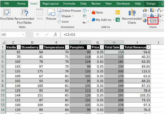
Select the values of the columns (for example, Pamphlets) which are to be plotted in Histogram. After selecting the values, click on the Insert menu and then click on the middle icon in the Charts option.
Click on the first chart under Histogram and press OK. The chart below will appear.
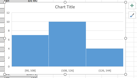


This chart groups the values of Pamphlets column into 3 categories(bins): 90-108, 108-126 and 126-144. As evident from the histogram, there are lesser number of pamphlets in the third bin than in the first 2 bins.
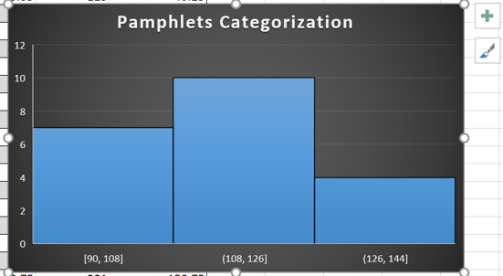
Apply the same techniques as discussed in the previous steps to choose the desired design and rename the chart.
To have a closer look at this data, let’s try to increase the number of bins. Right click on the X-axis and click on Format Axis option.
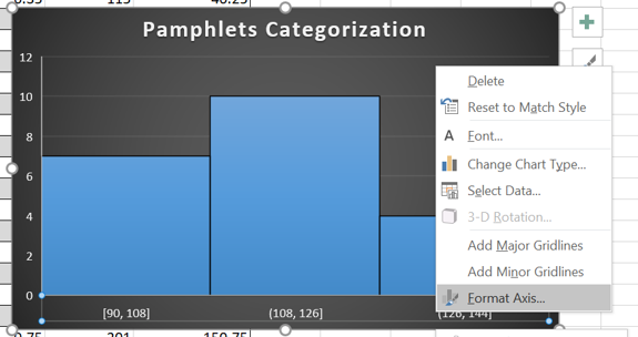
A new window will open on the right named Format Axis. In this window, change the Number of Bins option to 10.
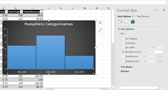
After selecting the number of bins as 10, close the window. The histogram will now change as shown in the snapshot below.
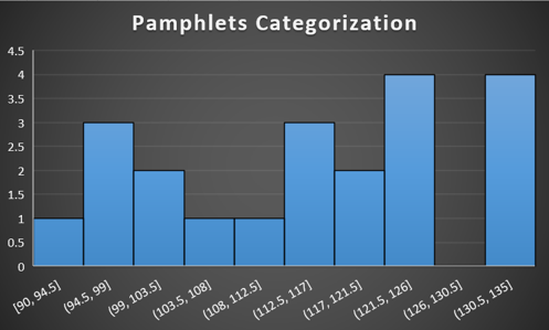


This histogram now shows much more detailed classification of Pamphlets. For example, it can be concluded that pamphlets within the range of 126 – 130.5 were never distributed.
Scatter Plot
A scatter plot has two value axes: a horizontal (X) and a vertical (Y) axis. It combines x and y values into single data points and shows them in irregular intervals, or clusters.
Let’s try to analyze if the Total Sale has any relation with the number of Pamphlets distributed.
Select the values of the columns (for example Pamphlets, Total Sale) which are to be plotted in Scatter Plot. After selecting the values, click on the Insert menu and then click on the Scatter Charts icon in the Charts option.
Click on the first chart under Scatter and press OK. The chart below will appear.
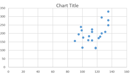
Apply the same techniques as discussed in the previous steps to choose the desired design and rename the chart.
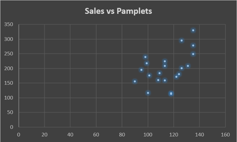
As you can see from the snapshot below, the ice cream sales tend to increase with an increase in the number of pamphlets distributed.


As demonstrated in this blog, MS Excel has various powerful and easy to use visualization tools like the various Excel charts we’ve discussed above. These tools help in finding the correlation between various data elements and in deriving useful patterns in the data.
There are multiple variants and plenty of options that each visualization tool comes with, and I’d like to encourage you to explore all the options so that next time when you get a data set to analyze, you will have sufficient ammunition to attack the data.
Microsoft Excel is a simple, yet powerful software application. Edureka’s Advanced Excel Training Programme helps you learn quantitative analysis, statistical analysis using the intuitive interface of MS Excel for data manipulation. The usage of MS Excel, and its charts span across different domains and professional requirements, hence, there’s no better time than now to begin your journey!
To get in-depth knowledge on any trending technologies along with its various applications, you can enroll for live Edureka Online training with 24/7 support and lifetime access. Don’t miss out on this opportunity to enhance your career prospects and become a sought-after business intelligence professional. Click the link below to enroll in our MSBI Course now!