


Dual Axes Charts in Tableau are named so because they have two independent axes layered on top of each other. More often than not, they display a combination of different mark types. For example, here you can create a visualization displaying a measure with bars on one axis and lines on the second.
This is one of my favorite charts in Tableau because there’s the ability to add a new axis, and yet have individual control over the axes. This unlocks some additional flexibility that creates several practical applications that can be used to improve your analysis, user experience, and design.
This post will show you how to build Dual Axes Charts in Tableau as well as three different ways to use them:
- Traditional use
- A method for making your end-user part of the story
- An option for improving the Aesthetics of your Dashboard
How to Build Dual Axes Charts in Tableau for their Traditional use
So, I’m going to be using the Sample – Superstore dataset provided by Tableau. Now, let’s begin by making a traditional dual-axis combination chart.
You might be familiar with it, but I’ll also be sharing a second approach that you may not know which might save you a click or two.
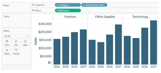
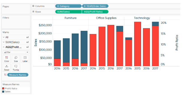
This first chart portrays sales by year as bars on one axis, and profit ratio by year as lines on the other; both measures shall also be broken down by the Category dimension.
- To begin, let’s create one of the charts, so I’ll start with Sales by Year by Category.
- Next, let’s place the second measure which is the Profit Ratio on the Rows Shelf.
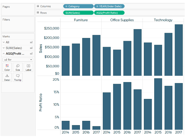


At this point, you have two individual bar charts on two rows. There are two ways in which you can convert these two separate bar charts into a dual-axis bar chart.
First, and the way most people learn, is to right-click on the second measure pill on the Rows Shelf, and choose Dual Axis.
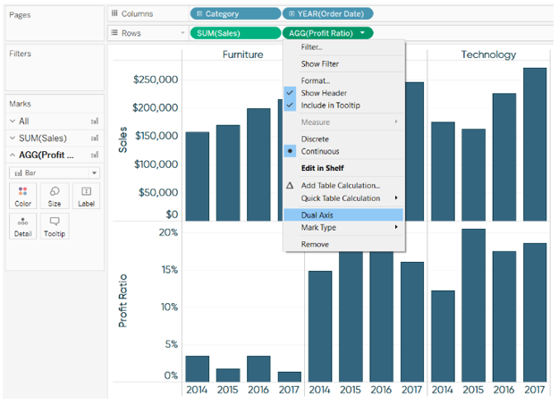

While hovering, a small triangle, green in color, will appear in the upper left-hand corner of the axis.
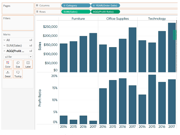
You can left-click on the triangle and drag it to the opposite axis of the left axis on the first row.
When you hover over the right side of the chart, you’ll see a dashed line where the axis is intended to show up once you release the left mouse key.


Now, for a dual-axis combination chart, we need a combination of mark types. When you have more than one measure on the Rows Shelf and/or Columns Shelf, each measure ends up getting its own Marks Shelf. What this means is that you can edit the mark types for the measures independently of each other.
Here’s how the final view looks after I change the mark type of Profit Ratio from bar to line.
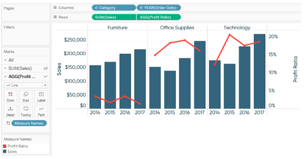

So for this example, Sales and Profit Ratio are broken down by the Category dimension first, then the Year(Order Date) dimension second.
That works, but what if we wanted to break the two measures down by first the Year(Order Date) and then Category? Here’s how it’d look:


Using a Dual Axes Chart to make your user part of the story
The following graph is a remake of the CNN Money Calculator from money.cnn.com.

The given viz features a curve that shows how each household income ranks by percentile. This is a very common “descriptive” view that describes high-level statistics. The real value is obtained by using the second axis to display where the individual using the dashboard, ranks on that curve. This makes the user a part of the story and is a way more engaging user experience.
To achieve this effect, I used a parameter in Tableau, which comes in-buit, that would allow the end user to choose any of the household income options between $2,000 and $450,000.
After making this selection, the circle moves to the appropriate place based on user selection. Also, the label would get updated with a caption telling the end user what percentile rank their household income is in.
This is a dual-axis combination chart.
The curve for the left axis uses the mark type of a line chart, and the circle is a second measure that only displays a circle for the end user’s selection on the right axis. The trick to getting just one circle to show up is this simple formula that computes whether the user’s parameter selection matches the household income value on the Y-axis.


This ensures the circle to line up perfectly with the line on the opposite axis. Lastly, hide the axis on the right by right-clicking on it and unchecking the option Show Header.
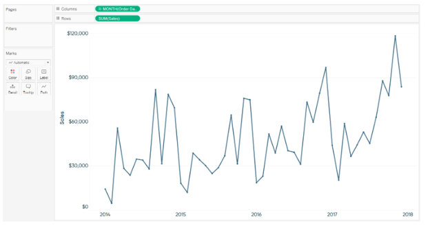
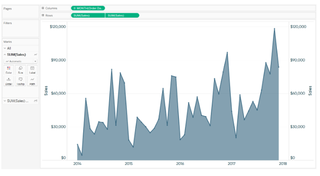
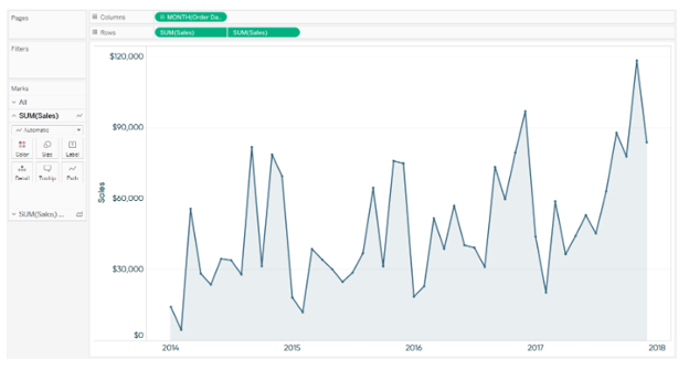
Using a dual-axis to Improve the Design of a line graph
Suppose you have a line graph showing sales by month trend.


I hope you have found this piece on Dual Axes Charts in Tableau interesting and understood what they are and how you can use them to unveil the potential in Tableau.
With this, we come to an end of this Dual Axes Charts in Tableau article. If you wish to master Tableau, Edureka has a curated course on Tableau Certification Training which covers various concepts of data visualization in depth, including conditional formatting, scripting, linking charts, dashboard integration, Tableau integration with R and more. It comes with 24*7 support to guide you throughout your learning period. New batches are starting soon.
Got a question for us? Please mention it in the comments section and we will get back to you at the earliest.