UpasanaResearch Analyst, Tech Enthusiast, Currently working on Azure IoT & Data Science...Research Analyst, Tech Enthusiast, Currently working on Azure IoT & Data Science with previous experience in Data Analytics & Business Intelligence.
Great visualization is achieved when we enable our audience to gain the maximum amount of insight with the least amount of effort. That is exactly what we intend to achieve through this article on Donut Charts in Tableau. The main aim here is to help you utilize donut charts as a tool in Tableau, not only for engagement but also for comprehension efficiency.
Table of Content
Let’s begin by answering the following questions
What is a Donut Chart?
To understand what a donut chart is we first need to know about its predecessor, the Pie Chart.
So, what is a Pie Chart?
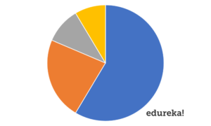
A pie chart is a circular statistical graph or visualization, which is divided into slices to illustrate numerical proportion. In a pie chart, the arc length of each slice is proportional to the quantity it represents.
But here’s the problem with a Pie Chart.
Now, pie charts are often criticised for attracting the focus of its viewers on the proportion of areas of the slices and inciting their comparison to one another and to the chart as a whole. This makes it tricky to see the differences between slices, especially when you try to compare multiple Pie Charts together.
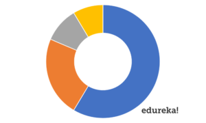
A donut chart somewhat remedies this problem by de-emphasizing the use of the area.
A donut chart is essentially a pie chart with an area of the center cut out.
In a donut chart, readers more often than not, focus on reading the length of the arcs, rather than comparing the proportions between slices. Also, donut charts are more space-efficient than Pie Charts because the blank space inside could be used to display data.
But what we need to understand about the donut chart, or rather both of these charts, is what brings about the difference. The answer is in how differently we perceive them.
What is the difference between the Pie Chart & Donut Chart?
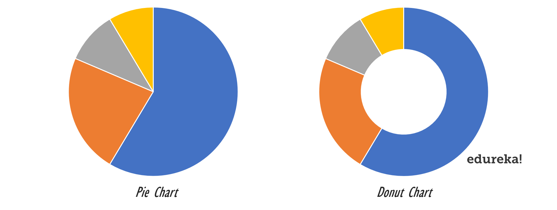
You’ve probably seen a pie chart before — big circle, cut into pieces, can’t miss it. A donut chart is essentially the same thing, except that it has a somewhat smaller circular cutout in the middle, turning the filled pie into a hollow donut. Let’s make it easier for you all. Here’s a side-by-side image of them both.
There may seem like a fairly minor difference, but something important happens upon Timbit removal that illuminates the complexities of the human brain and visual perception.
Let’s understand that.
Go ahead and look at the pie chart above. Noticehowyou look at it — chances are, your eyes go right to the center, and (at least at first) you view the pie chart in its entirety.
Because pie charts are filled in, you view them as a whole; you see the circle and judge the pieces according to their areas.
Then there’s this donut chart. Because donut charts are hollowed out, there is no central point to attract your attention. Where do your eyes go instead?
If you’re like most people, your eyes travel around the circumference and judge each piece according to its length. As a result, you can also think of a donut chart as being a stacked bar graph that has been curled around on itself.
So, why does it matter?
Why does it matter whether you read something by area or by length? Well,our brains process these two properties differently — and we’re only good at one of them.
Humans are exceptionally good at judging linear distances. You can easily tell if something is taller, wider, longer, shorter; single-dimension comparisons are pretty straightforward.
Areas aren’t so easy unless the difference is blatantly obvious. It may take you a moment to compare objects of different sizes.
My point is, when a reader sees a circle subdivided into sections, they’re going to want to compare section sizes, even if it isn’t your goal.
Comparing sizes is a sort of automatic behavior when you see a pie chart.
So what is it that the donut chart has to offer?
What are the Benefits of a Donut Chart?
Two things – Clarity & Spacial Efficiency.
Clarity
Pie charts actually offer three separate options. You compare the ratio of the angles, the ratio of the areas of each wedge or slice, or last you can use the length of the outer circumference. The donut chart only offers the latter, though it gives you both an inner and outer edge to work with.
The aforementioned complexity of the pie chart is rarely a benefit. A typical audience will contain individuals who prefer each of the three methods. This makes distortion of a pie chart far more common than people realise.
A donut can get distorted, too. It is just much easier to avoid. So long as the edge lengths remain a fixed ratio (no tilted view), the graph should remain true to the data.
Spacial Efficiency
The answer is the focus. As mentioned in the section above, the centre of both charts draws the eyes of the audience. So use it! That blank space in a donut chart is perfect for a total, a lift comparison, or a trend arrow. Honestly, you should be able to cleanly fit all three!
How To Build a Donut Chart in Tableau?
This blog will detail how to make a donut chart in Tableau using Sample-Superstore data. To create a donut chart in Tableau, we first need to know the dimension on which we want to segregate and measure to define the proportion.
So, in this case, the “Category” can be used as the dimension and “Sales” as the measure. Following are the steps to create a donut chart in Tableau:
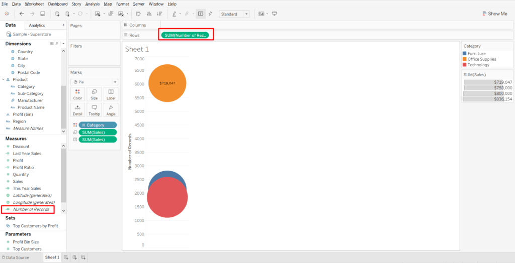
1. Connect to Sample-Superstore data set: Open the Tableau Desktop and select the “Sample-Superstore” data set
2. Go toSheet1:
3. In the “Marks” card, select chart type as pie
4. Drag the “Category” field to “Colour” and “Sales” measure to “Size” & “Label” marks card
5. Now, drag the “Number of Records” to “Rows” shelf
6. Select the “Number of Records”field in “Rows” shelf and change the default aggregation from “Sum” to “Minimum”
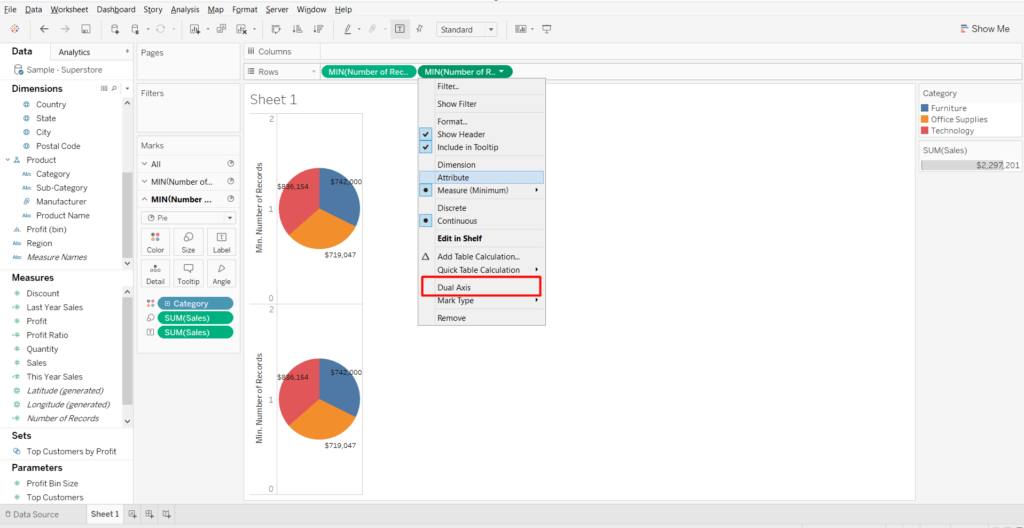
7. Again, drag the “Number of Records” from the measures and put it on “Rows” shelf on right after the 1st “Number of Records”
8. Change the default aggregation from “Sum” to “Minimum” for 2nd copy of “Number of Records” also
9. Do a right-click on 2nd copy of “Number of Records” field and select “Dual Axis” option
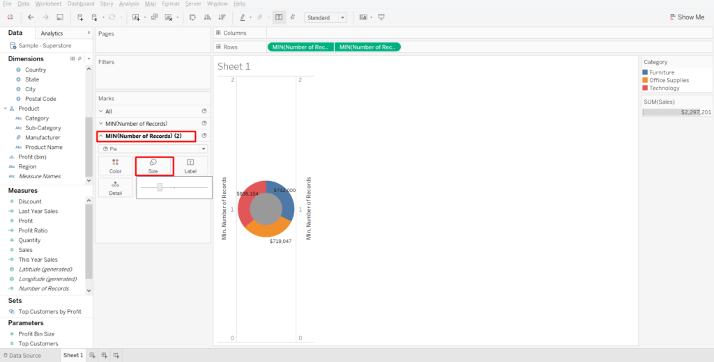
10. In the next step, select the “Min(Number of Records) (2)” in “Marks” card and remove the following: a. “Category” from “Colour” b. “Sales” from “Size” and “Label”
11. Again, select the “Min(Number of Records) (2)” in “Marks” card, reduce the size of the pie chart and then select the colour of the pie chart same as the background colour (“white” colour in this case)
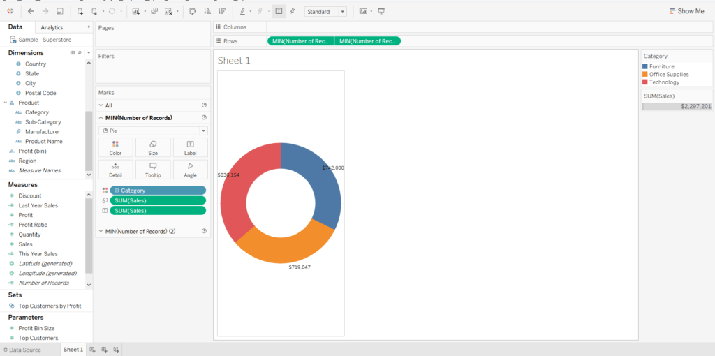
12. In the last step, do a right-click on each of the axis and de-select “Show-Header”
13. This is how the donut chart will look like in Tableau.
What are the pitfalls of a Donut Chart?
The Donut chart in Tableau still has its drawbacks, of course — while easierto read, it’s still not the greatestfor comparisons within the same graph and downright terrible for comparisons between two different graphs.
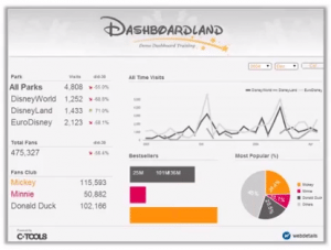
To compensate for this deficiency, I prefer to use these charts in a complete dashboard or set of charts. But that lone chart will not be able to convey a depth of information that is very actionable or satisfying.
So, returning to my initial call-out, visualization is an art. Considerations are not fixed rules. Balance, style, and creativity should also be part of your arsenal. So, go ahead and graph away!
And if you wish to master Tableau, Edureka has a curated course on Tableau Certification which covers various concepts of data visualization in-depth, including conditional formatting, scripting, linking charts, dashboard integration, Tableau integration with R, and more. It comes with 24*7 support to guide you throughout your learning period. New batches are starting soon.
Got a question for us? Please mention it in the comments section and we will get back to you at the earliest.


 There may seem like a fairly minor difference, but something important happens upon
  Humans are exceptionally good at judging linear distances. You can easily tell if something is taller, wider, longer, shorter; single-dimension comparisons are pretty straightforward.