


The demand for Tableau training online is at peak because of its accelerating adoption in the market. This blog post is meant to give you a heads up on what tableau is all about, and what benefits you get from tableau for data visualization.
What is Tableau?
Most of you would be knowing that tableau is a data visualization tool, but why should you learn tableau and not any other data visualization tool which is available for your access. It’s very important to understand this, before understanding basic concepts of Tableau.
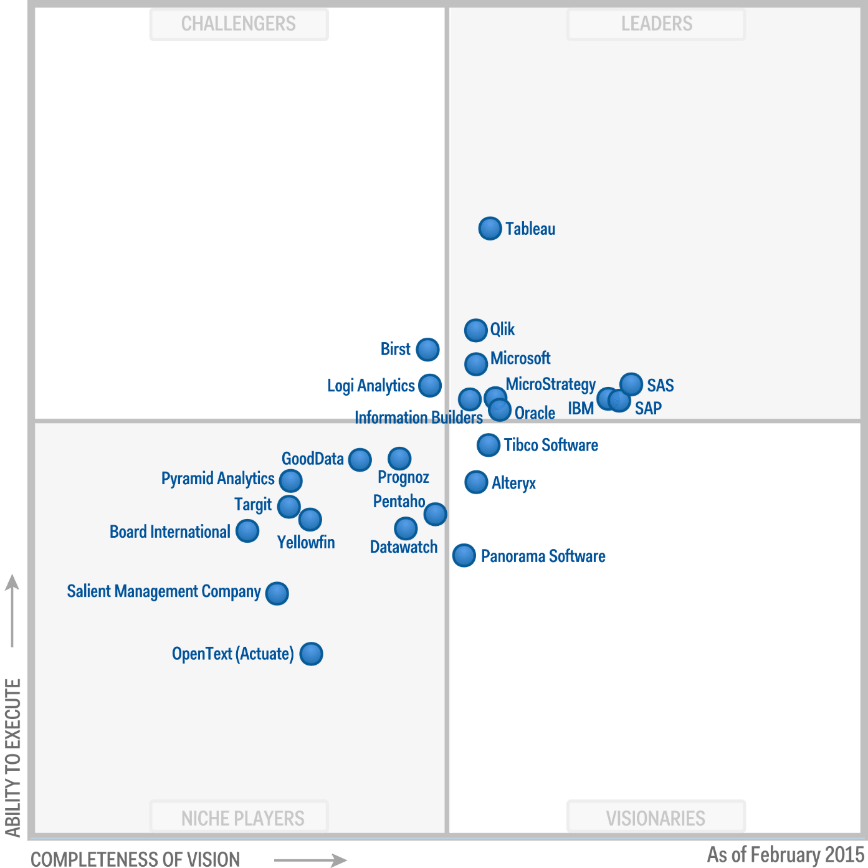
There is something called Gartner’s magic quadrants and this is available on the tableau website and as you can see tableau holds the leader’s position which is extremely well respected across the globe.

Let me tell you one thing upfront. Data visualization is not about generating fancy graphs. The objective is to tell a story using data visualization to our various stakeholders. If a client gives you a product, clients must be having lot of questions that they need answers to, as part of data visualization. Now that should be your objective to meet business priorities of the client and not just to present some fancy statistics and graphs.
Let us see one example which will tell you what data visualization means and how it will help you meet your client’s objective.
So in NBA basketball we have 32 teams participating in 82 games every year and there is huge amount of data (1.04 million records), this is the count of records which are extracted for player game, now we want to analyze this data and make sense out of it. So what are the key questions we want to answer as part of this? We want to develop a data visualization which helps 2 key stakeholders one is team coaches, another is Player.
Team:
- What is the trend in the performance of the team?
- Which are the worst lost games and best win games of the season?
- Against which team the team is strong and against which team they are weak?
- How is the performance varying when played in home courts Vs when played in non-home courts?
Players:
- How are they performing from game to game in a season?
- What is the shooting success rate?
- Against which team they perform well and against which team they don’t?
Now these are the kind of questions we want answers to as part of visualization and this is exactly what tableau will help you do.
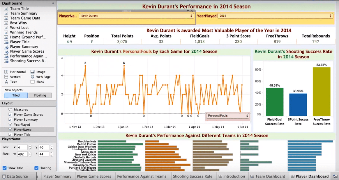
Now we have created dashboard here and in order to make this dashboard we have worked on lot of individual worksheets. I can select the team and year of my choice and I can see now how many games they have won and how many they lost. They played best against Denver Nuggets, Philadelphia etc. and worst against Los Angeles, Sacramento Kings etc.
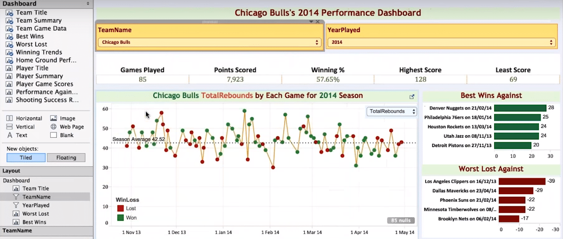

So here you get to see best 5 performances of the team and what went well, and worst 5 performances and what went wrong.
If you see home ground vs non home ground, it is visible clearly that the team is performing better on home than non-home.
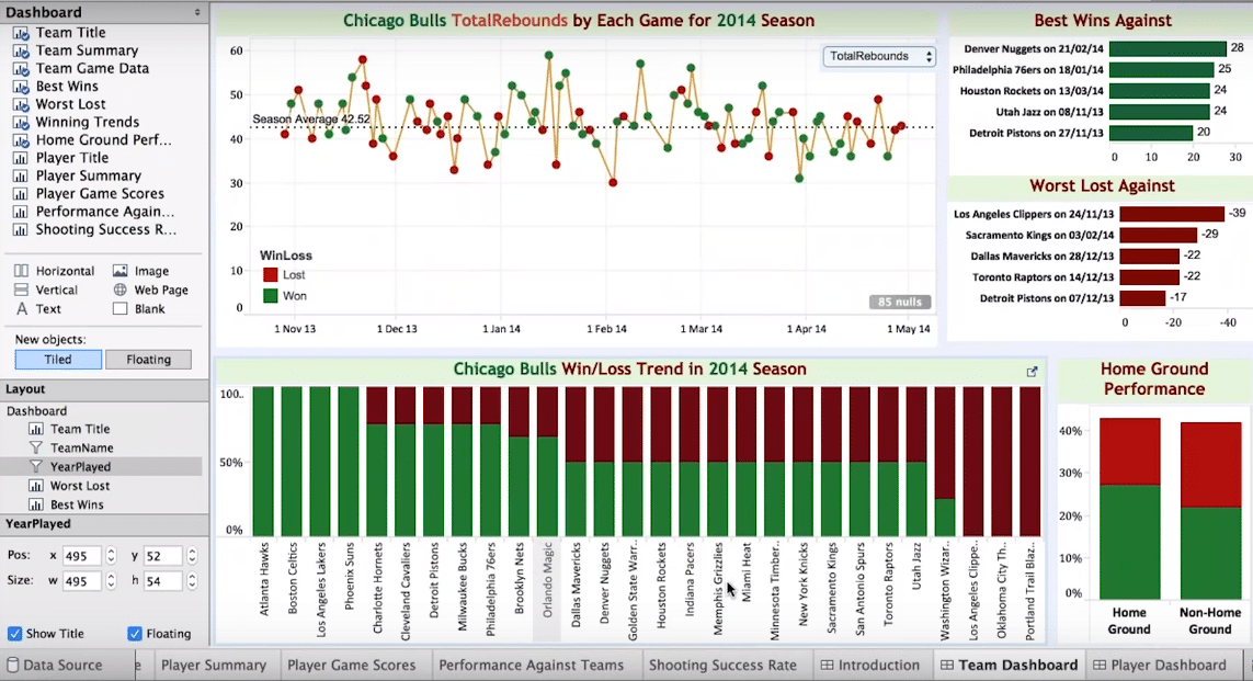

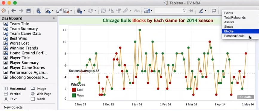
You can come up with lot of analysis like total number of rebounds, total assists, number of steals, personal fouls etc.

The intention here is to give you an overview of what are the various business problems and questions which can be answered using data visualization in tableau.
From player perspective you can see the detailed performance of a player in a season.

We have something called animation chart in tableau using which you can come up with very effective presentations. Below representation shows the average GDP (gross domestic product) of different countries. You can click on play button and it will show the changes happening in GDP as you move forward with the timeline.
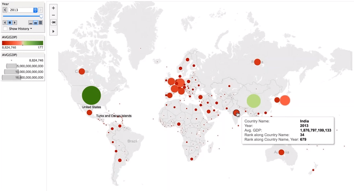

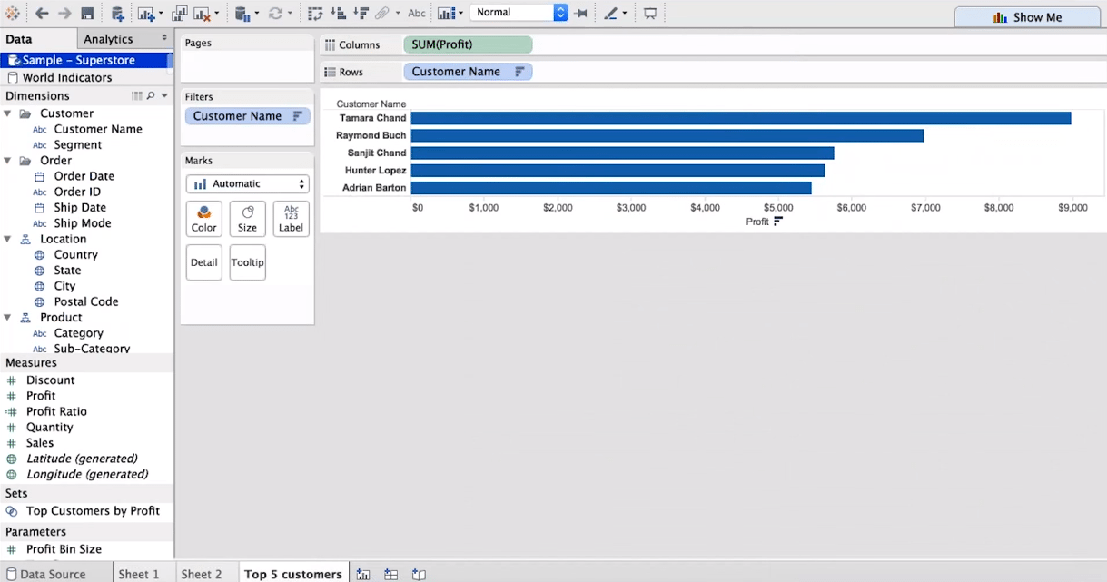
Tableau tool gives two datasets: Sample – Superstore and World Indicators.
Below is the first worksheet which I have created – Top 5 Customers, for which I have taken SUM(profit) in columns and Customer Name in rows and filtered the top 5 customers generating more profits.

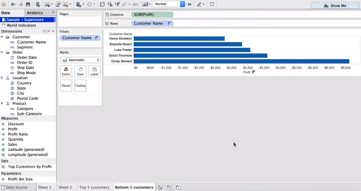
Below is the second worksheet which I have created – Bottom 5 Customers, for which is just the opposite of above worksheet.

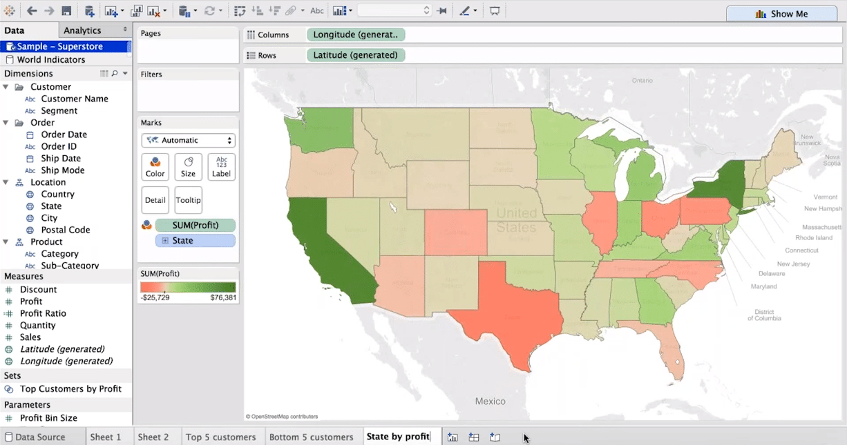
Below is the third worksheet which I have created – State by profit, for which I have taken Longitude in columns and Latitude in rows and gave different colors to each state according to their profits.

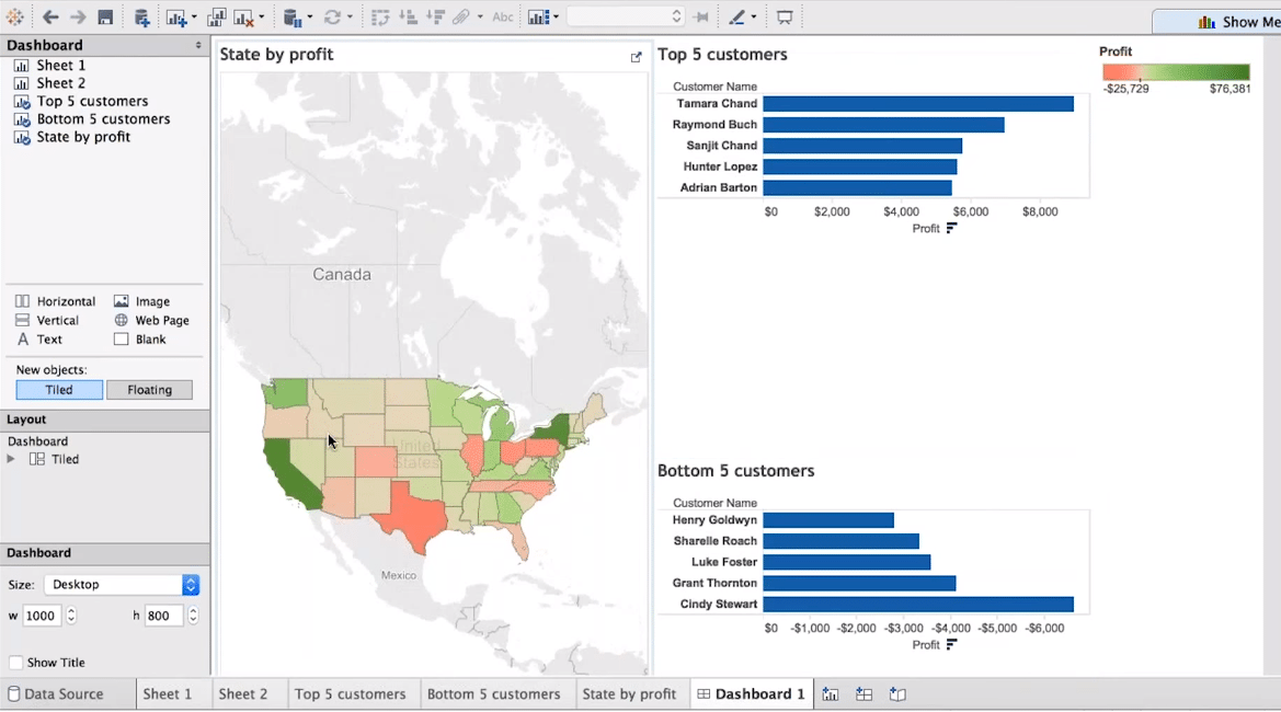
Now I will create a dashboard, below is the option to create a new dashboard.
In this dashboard, I have done drag-drop from the Dashboard pane to place the 3 worksheets I created above inside my dashboard. You can place them left or right or top or bottom, according to your needs, depending on how you want to represent to your client.

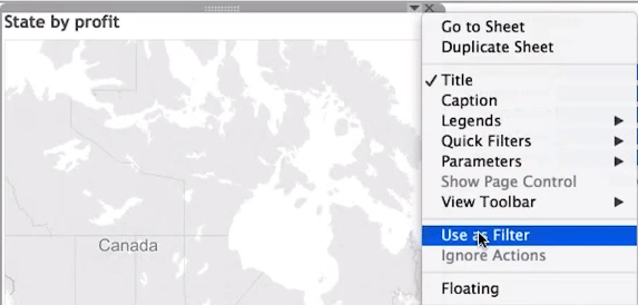
Now I don’t want overall top 5 and bottom 5 customers, I want it to display state wise data. But when I click on any state, nothing happens, my top 5 and bottom 5 customers are not changing. That is because we haven’t done anything here yet.
Now click on the dropdown arrow as shown in below snapshot and click on Use as Filter.

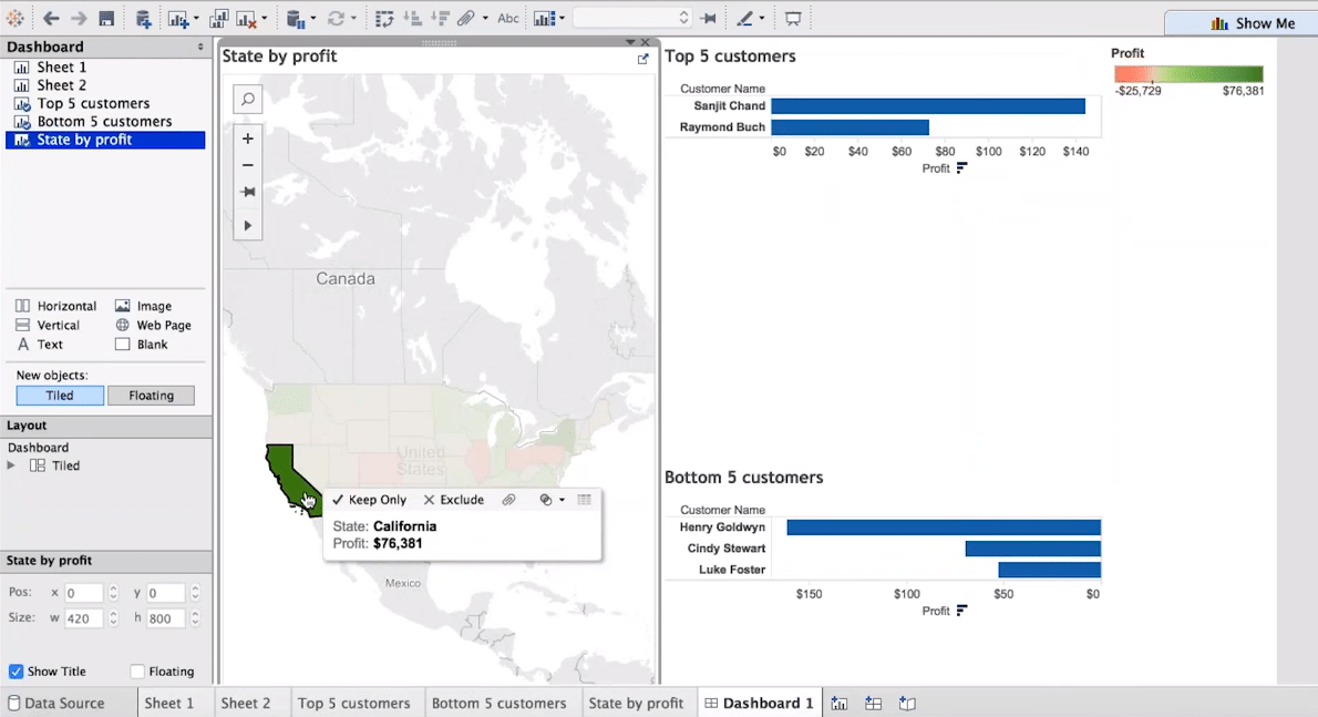
Now when I click on California, the data in Top 5 and Bottom 5 customers are changing accordingly. Note: Depending on the dataset, for California we have only 2 customers in top 5 and 3 customers in bottom 5.

This is the kind of magic you can do in Tableau. A Tableau online course or Tableau Certification will help you gain an edge over other analysts and lets you present data in a much better and insightful manner. Get started with a Tableau tutorial here. Unlock the full potential of your data with hands-on Tableau projects in our next blog on projects.
Got a question for us? Please mention them in the comments section and we will get back to you.