
Python Scripting Certification Training
- 15k Enrolled Learners
- Weekend
- Self Paced
(5900)


 Copy Link!
Animations in a web page can attract more users. Ask yourself this – if you were to see a web page that has quite a bit of animation, wouldn’t you want to explore more? Now, with CSS transitions you can make your work come alive with some great animations. And, mind you, these need to be done right. Let’s explore the world of CSS Transitions in the following order:
Let’s take an instance. If you were to change the color of an element from white to blue, this change is almost instantaneous. For a more animated effect, you can make this change happen gradually. This looks quite visually appealing too. By enabling CSS transitions, you can customize the way the changes occur. You can define how the changes in elements occur at specific time intervals which follow an acceleration curve.
CSS transitions let you define the changes for HTML elements, the specific time intervals, the speed of the acceleration curve and much more. You can do all of this without using Flash or JavaScript.
For a better understanding, you can refer to the image below:
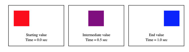 In the image above, the HTML element will change from red to blue in a matter of one second. You will also see the intermediate color when the transition is taking place. If you aren’t going to use CSS transitions, you will notice that the change in color from red to blue is instant – you will not see the intermediate color. With CSS transitions, you will notice an animated effect when the HTML elements are changing from the old state to the new one.
You can use the shorthand transition property to control CSS transitions. The use of this shorthand is not only easy, but it can also avoid out-of-sync parameters that can be quite frustrating to debug in CSS.
The transition-property specifies the CSS properties to which you want the transition effect. Only these CSS properties are animated.
Syntax:
transition: <property> <duration> <timing-function> <delay>;

As a beginner, you might face some difficulties in using the shorthand. If you think that using the shorthand is a little complex for you right now, you can specify the transition properties separately. For an HTML element, you can specify the transition properties one by one as shown in the below example:
<!DOCTYPE html>
<html>
<head>
<style>
div {
width: 100px;
height: 100px;
background: lightblue;
transition-property: width;
transition-duration: 2s;
transition-timing-function: linear;
transition-delay: 1s;
}

div:hover {
width: 300px;
}
</style>
</head>
<body>

<p>Hover over the box </p>

<div></div>

</body>
</html>
In the above example, we have specified the properties (transition-property, transition-duration, transition-timing-function and transition-delay) and their values separately. We will learn about these transition properties shortly.
There are primarily two things that you need to specify to create CSS transitions: the CSS property that wants to add an effect to, and the time duration of that effect. You need to keep one thing in mind – when you don’t specify the time duration, the transition will take a default value of 0, and there won’t be any effect.
Let’s consider an example:
The below code defines a transition effect of the width property for a duration of five seconds.
<!DOCTYPE html>
<html>
<head>
<style>
div{
width: 100px;
height: 100px;
background: blue;
transition: width 5s;
}
div:hover {
width: 600px;
}
</style>
</head>
<body>
<div></div>
<p>Move the cursor over the div element above, to see the transition effect.</p>
</body>
</html>
In the above code, you will see that when you hover your cursor over the blue box, the blue box increases its width gradually for a time duration of five seconds. You will also notice that when you remove the cursor from the blue box, the blue box will return to its original size gradually (not instantaneously). You can also change the values for width and time duration to see how this transition property affects the HTML element.
You can also add the transition effect to more than one property. You can do so by using commas to separate the properties. Let’s consider an example:
In the code below, the transition property is specified for width, height, and transformation.
<!DOCTYPE html>
<html>
<head>
<style>
div {
padding:15px;
width: 150px;
height: 100px;
background: green;
transition: width 2s, height 2s, transform 2s;
}
div:hover {
width: 300px;
height: 200px;
transform: rotate(360deg);
}
</style>
</head>
<body>
<div><b>Hello World</b><p> (Hover Over Me)</p></div>
</body>
</html>
With the above example, you will see how the green box moves when you hover over the box.
We have specified only the property and time duration. Let’s see the other parameters with various examples.
This property defines the speed curve for the transition effect. It can take the following values:
The code below shows the transition effects for linear, ease, ease-in, ease-out and ease-in-out values.
<!DOCTYPE html>
<html>
<head>
<style>
div {
width: 100px;
height: 100px;
background: pink;
transition: width 2s;
}

#div1 {transition-timing-function: linear;}
#div2 {transition-timing-function: ease;}
#div3 {transition-timing-function: ease-in;}
#div4 {transition-timing-function: ease-out;}
#div5 {transition-timing-function: ease-in-out;}

div:hover {
width: 300px;
}
</style>
</head>
<body>

<p>Hover over the div elements below </p>

<div id="div1">linear</div><br>
<div id="div2">ease</div><br>
<div id="div3">ease-in</div><br>
<div id="div4">ease-out</div><br>
<div id="div5">ease-in-out</div><br>

</body>
</html>
Sometimes, you want an animation to occur after a certain time duration. The transition-delay property lets you specify the delay for a transition effect. You can specify the delay in seconds.
Let’s take an example to see the delay in the transition effect:
<!DOCTYPE html>
<html>
<head>
<style>
div {
width: 100px;
height: 100px;
background: yellow;
transition: width 3s;
transition-delay: 1s;
}

div:hover {
width: 300px;
}
</style>
</head>
<body>

<p>Hover over the div element below</p>

<div></div>

<p><b>Note:</b> You can observe that 1 second delay before the effect starts</p>

</body>
</html>
In the code above, when you hover over the yellow box with your cursor, you will notice (for one second) that there is no effect. After a wait of one second, you will notice the effect.
With this, we come to an end of this CSS Transitions article. You can add animations to your WebPages now. Try out these examples.
Check out our Full Stack Web Developer Masters Program which comes with instructor-led live training and real-life project experience. This training makes you proficient in skills to work with back-end and front-end web technologies. It includes training on Web Development, jQuery, Angular, NodeJS, ExpressJS, and MongoDB.
Got a question for us? Please mention it in the comments section of “CSS Transition” blog and we will get back to you.


 REGISTER FOR FREE WEBINAR
  Thank you for registering Join Edureka Meetup community for 100+ Free Webinars each month JOIN MEETUP GROUP