

Advanced Certification in Agentic AI Engineer ...
- 65k Enrolled Learners
- Weekend
- Live Class
(45931)


 Copy Link!
On day one, no one you know is sick. It feels like a normal day. But then one day, a few people you know are sick and suddenly, you see everyone is sick and it will feel like it happened so instantly. Everything looks fine until it isn’t. This is the paradox of pandemics. In this article, we shall analyse the outbreak of COVID-19 using Machine Learning.
Following is the outline of all you’re going to learn today:
The Problem
Corona Virus disease (COVID-19) is an infectious disease caused by a newly discovered virus, which emerged in Wuhan, China in December of 2019.
 Most people infected with the COVID-19 virus will experience mild to moderate respiratory illness and recover without requiring special treatment. Older people and those with underlying medical problems like cardiovascular disease, diabetes, chronic respiratory disease, and cancer are more likely to develop serious illness.
The COVID-19 virus spreads primarily through droplets of saliva or discharge from the nose when an infected person coughs or sneezes, so you might have heard caution to practice respiratory etiquette (for example, by coughing into a flexed elbow).
To understand this better let’s look a small riddle.
There’s a glass slide held under a microscope which consists of a specific germ. This germ has a property to double every day. So on the first day, there’s one, on the second day there are two, on the third day there four and the fourth day eight, and so on.
 On the 60th day, the slide is full. So on which day is the slide half full?
Day 59. But of course, you knew that.
 But on which day, is the slide 1% full?
Surprisingly, not until the 54th day!
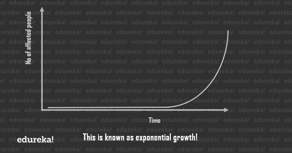
What it means that the slide goes from being 1% full to 100% in less than a week and hence, displays a property called exponential growth. And this is also how a Pandemic works. The outbreak is fairly unnoticeable in the beginning, then, once it reaches a significant value, the growth to maxima is extremely quick.
 But it cannot go on forever. The virus will eventually stop finding people to infect and ultimate will slow down the count. This is called logistic growth and the curve is known as a sigmoid.
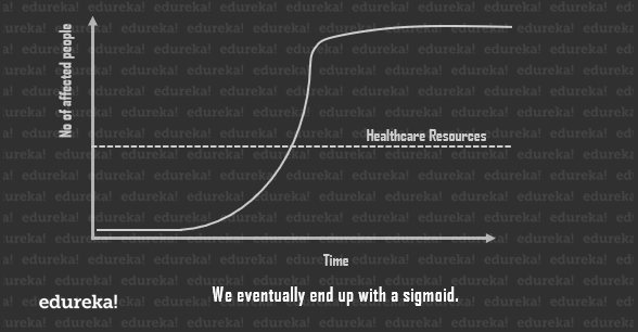 Now every point in the curve will give you to running total of cases of the current day. But if you delve a little into statistics, you’ll discover that by plotting the slope of each day, you shall get the new cases per day. There are fewer new cases right at the beginning and at the end, with a sharp rise in the stages in between.
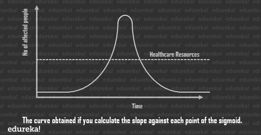 As you can see, the peak of the curve may greatly overwhelm our healthcare systems, which is the amount of resources available to us for the care of affected individuals at any given point in time.
Since we can’t really help the total number of individuals affected by the pandemic, the best solution is to flatten the curve so as to bring down the total number of cases, at any given point in time, as close to the healthcare line as possible.
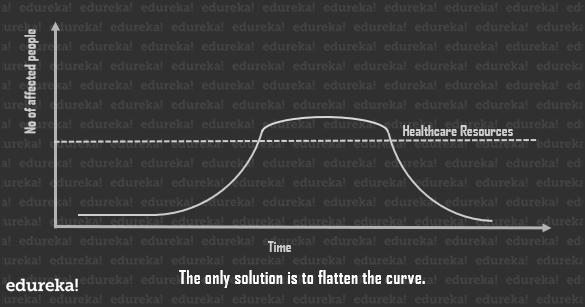 This spreads the duration of this whole process a little longer, but since the healthcare system can tend to the number of cases at any given point in time, the casualties are way lower.
The Solution
Social Distancing. The logic here is, the virus can’t infect bodies if it cannot find bodies to infect!
World Leaders in all affected countries announced quarantines and lock-downs to keep their folks safe and away from anything or anyone that could infect them, all big social events were postponed and all major sports leagues cancelled as well.
On March 24, the Indian Prime Minister announced that the country would go under a lock-down to combat the spread of the virus, until further notice. Infections are rapidly rising in Italy, France, Germany, Spain, the United Kingdom and the United States. It has has a massive impact on the global economy and stock markets
The outbreak of COVID-19 is developing into a major international crisis, and it’s starting to influence important aspects of daily life.
For example:
You can also take a look at the following tutorial on “COVID 19 Outbreak Prediction using Machine Learning” to get to know the subject in a way more comprehensive manner.
This Edureka Session explores and analyses the spread and impact of the novel coronavirus pandemic which has taken the world by storm with its rapid growth.
We need a strong model that predicts how the virus could spread across different countries and regions. The goal of this task is to build a model that predicts the spread of the virus in the next 7 days.
🔴NOTE: The model was built on a test dataset updated till April,’20. But you can access the source to these datasets at the ‘John Hopkins University Coronavirus Resource Centre’ which gets updated on a daily basis, so you can run this model for the date you prefer.
Before we begin with the model, let’s first import the libraries that we need. Consider this a Step 0 if you may.
# importing the required libraries
import pandas as pd
# Visualisation libraries
import matplotlib.pyplot as plt
%matplotlib inline
import seaborn as sns
import plotly.express as px
import plotly.graph_objects as go
import folium
from folium import plugins
# Manipulating the default plot size
plt.rcParams['figure.figsize'] = 10, 12
# Disable warnings
import warnings
warnings.filterwarnings('ignore')So, how did it actually start in India?
The first COVID-19 case was reported on 30th January 2020 when a student arrived in Kerala, India from Wuhan, China. Just in the next 2 days, Kerela reported 2 more cases. For almost a month, no new cases were reported in India, however, on 2nd March 2020, five new cases of coronavirus were reported in Kerala again and since then the cases have only been rising.
First, we’re going to start out by reading our datasets by creating a data frame using Pandas.
# Reading the datasets
df= pd.read_excel('/content/Covid cases in India.xlsx')
df_india = df.copy()
df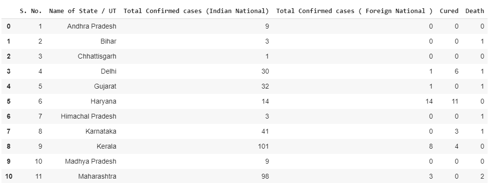
# Coordinates of India States and Union Territories
India_coord = pd.read_excel('/content/Indian Coordinates.xlsx')
#Day by day data of India, Korea, Italy and Wuhan
dbd_India = pd.read_excel('/content/per_day_cases.xlsx',parse_dates=True, sheet_name='India')
dbd_Italy = pd.read_excel('/content/per_day_cases.xlsx',parse_dates=True, sheet_name="Italy")
dbd_Korea = pd.read_excel('/content/per_day_cases.xlsx',parse_dates=True, sheet_name="Korea")
dbd_Wuhan = pd.read_excel('/content/per_day_cases.xlsx',parse_dates=True, sheet_name="Wuhan")df.drop(['S. No.'],axis=1,inplace=True)
df['Total cases'] = df['Total Confirmed cases (Indian National)'] + df['Total Confirmed cases ( Foreign National )']
total_cases = df['Total cases'].sum()
print('Total number of confirmed COVID 2019 cases across India till date (22nd March, 2020):', total_cases)df.style.background_gradient(cmap='Reds')
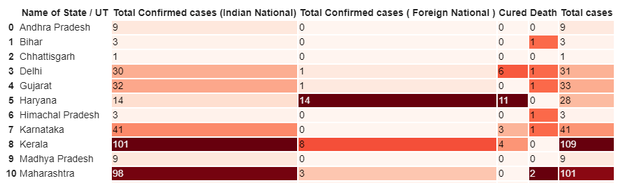
As you might have guessed, the redder the cell the bigger the value. So, the darker cells represent a higher number of affected cases and the lighter ones show otherwise.
#Total Active  is the Total cases - (Number of death + Cured)
df['Total Active'] = df['Total cases'] - (df['Death'] + df['Cured'])
total_active = df['Total Active'].sum()
print('Total number of active COVID 2019 cases across India:', total_active)
Tot_Cases = df.groupby('Name of State / UT')['Total Active'].sum().sort_values(ascending=False).to_frame()
Tot_Cases.style.background_gradient(cmap='Reds')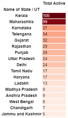
df_full = pd.merge(India_coord,df,on='Name of State / UT')
map = folium.Map(location=[20, 70], zoom_start=4,tiles='Stamenterrain')
for lat, lon, value, name inzip(df_full['Latitude'], df_full['Longitude'], df_full['Total cases'], df_full['Name of State / UT']):
folium.CircleMarker([lat, lon], radius=value*0.8, popup = ('<strong>State</strong>: ' + str(name).capitalize() + '
''<strong>Total Cases</strong>: ' + str(value) + '
'),color='red',fill_color='red',fill_opacity=0.3 ).add_to(map)
map
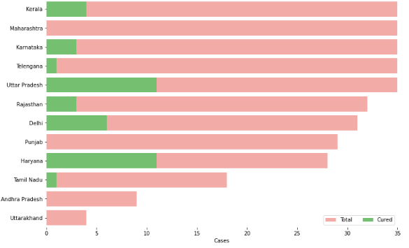
f, ax = plt.subplots(figsize=(12, 8))
data = df_full[['Name of State / UT','Total cases','Cured','Death']]
data.sort_values('Total cases',ascending=False,inplace=True)
sns.set_color_codes("pastel")
sns.barplot(x="Total cases", y="Name of State / UT", data=data,label="Total", color="r")
sns.set_color_codes("muted")
sns.barplot(x="Cured", y="Name of State / UT", data=data, label="Cured", color="g")
# Add a legend and informative axis label ax.legend(ncol=2, loc="lower right", frameon=True) ax.set(xlim=(0, 35), ylabel="",xlabel="Cases") sns.despine(left=True, bottom=True)
 1.6 The Rise of the Coronavirus cases
 Next, you’re going to use Plotly to obtain graphs depicting the trends of the rise of coronavirus cases across India.
#This cell's code is required when you are working with plotly on colab
import plotly
plotly.io.renderers.default = 'colab'
# Rise of COVID-19 cases in India
fig = go.Figure()
fig.add_trace(go.Scatter(x=dbd_India['Date'], y = dbd_India['Total Cases'], mode='lines+markers',name='Total Cases'))
fig.update_layout(title_text='Trend of Coronavirus Cases in India (Cumulative cases)',plot_bgcolor='rgb(230, 230, 230)')
fig.show()
import plotly.express as px
fig = px.bar(dbd_India, x="Date", y="New Cases", barmode='group', height=400)
fig.update_layout(title_text='Coronavirus Cases in India on daily basis',plot_bgcolor='rgb(230, 230, 230)')
fig.show()
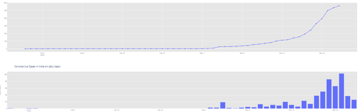
At this point, India had already crossed 500 cases. It still is very important to contain the situation in the coming days. The numbers of coronavirus patients had started doubling after many countries hit the 100 marks, and almost starting increasing exponentially.
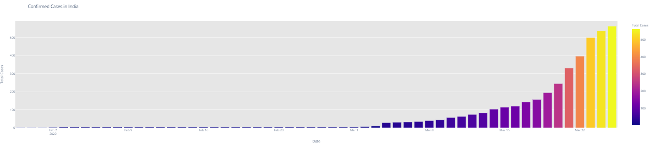
# import plotly.express as px
fig = px.bar(dbd_India, x="Date", y="Total Cases", color='Total Cases', orientation='v', height=600,
             title='Confirmed Cases in India', color_discrete_sequence = px.colors.cyclical.IceFire)
'''Colour Scale for plotly
https://plot.ly/python/builtin-colorscales/
'''
fig.update_layout(plot_bgcolor='rgb(230, 230, 230)')
fig.show()
fig = px.bar(dbd_Italy, x="Date", y="Total Cases", color='Total Cases', orientation='v', height=600,
             title='Confirmed Cases in Italy', color_discrete_sequence = px.colors.cyclical.IceFire)
fig.update_layout(plot_bgcolor='rgb(230, 230, 230)')
fig.show()
fig = px.bar(dbd_Korea, x="Date", y="Total Cases", color='Total Cases', orientation='v', height=600,
             title='Confirmed Cases in South Korea', color_discrete_sequence = px.colors.cyclical.IceFire)
fig.update_layout(plot_bgcolor='rgb(230, 230, 230)')
fig.show()
fig = px.bar(dbd_Wuhan, x="Date", y="Total Cases", color='Total Cases', orientation='v', height=600,
             title='Confirmed Cases in Wuhan', color_discrete_sequence = px.colors.cyclical.IceFire)
fig.update_layout(plot_bgcolor='rgb(230, 230, 230)')
fig.show()
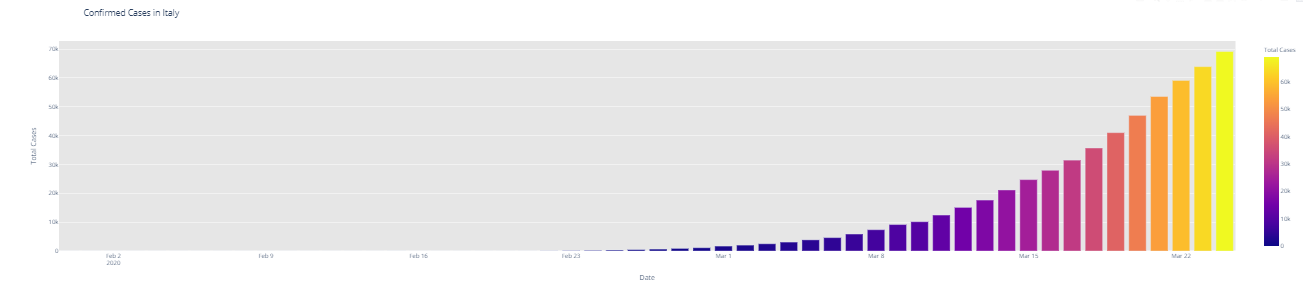
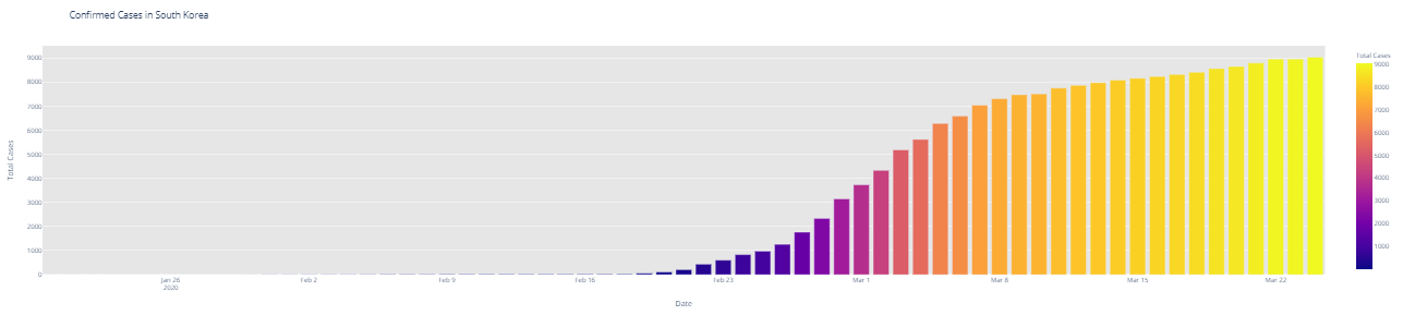
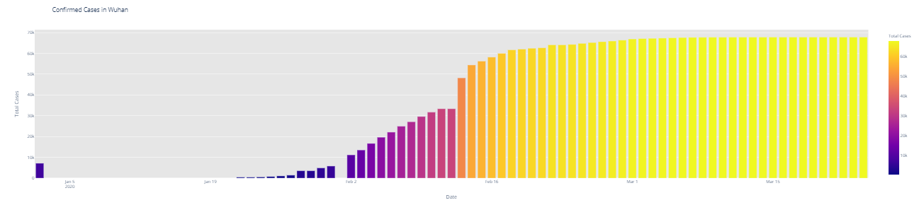
From the visualization above, one can infer the following:
# import plotly.graph_objects as go
from plotly.subplots import make_subplots
fig = make_subplots(
rows=2, cols=2,
specs=[[{}, {}],
[{"colspan": 2}, None]],
subplot_titles=("S.Korea","Italy", "India","Wuhan"))
fig.add_trace(go.Bar(x=dbd_Korea['Date'], y=dbd_Korea['Total Cases'],
marker=dict(color=dbd_Korea['Total Cases'], coloraxis="coloraxis")),1, 1)
fig.add_trace(go.Bar(x=dbd_Italy['Date'], y=dbd_Italy['Total Cases'],
marker=dict(color=dbd_Italy['Total Cases'], coloraxis="coloraxis")),1, 2)
fig.add_trace(go.Bar(x=dbd_India['Date'], y=dbd_India['Total Cases'],
marker=dict(color=dbd_India['Total Cases'], coloraxis="coloraxis")),2, 1)
# fig.add_trace(go.Bar(x=dbd_Wuhan['Date'], y=dbd_Wuhan['Total Cases'],
# marker=dict(color=dbd_Wuhan['Total Cases'], coloraxis="coloraxis")),2, 2)
fig.update_layout(coloraxis=dict(colorscale='Bluered_r'), showlegend=False,title_text="Total Confirmed cases(Cumulative)")
fig.update_layout(plot_bgcolor='rgb(230, 230, 230)')
fig.show()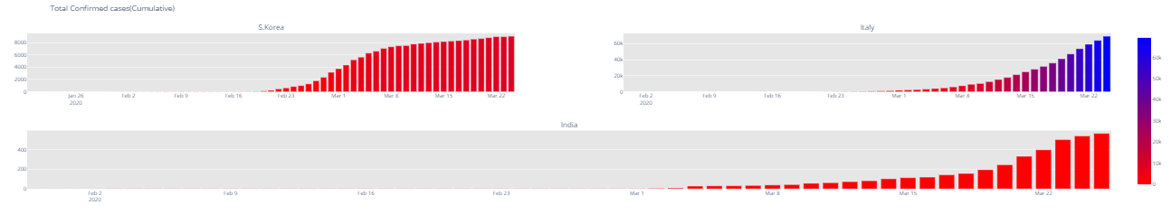 2.3 Trend after crossing 100 cases
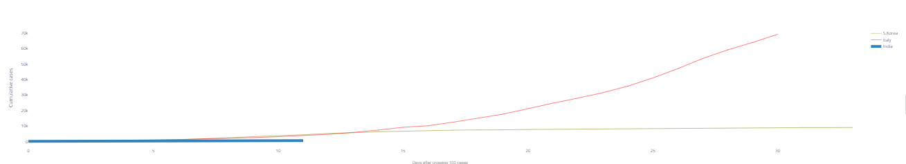
# import plotly.graph_objects as go
title = 'Main Source for News'
labels = ['S.Korea', 'Italy', 'India']
colors = ['rgb(122,128,0)', 'rgb(255,0,0)', 'rgb(49,130,189)']
mode_size = [10, 10, 12]
line_size = [1, 1, 8]
fig = go.Figure()
fig.add_trace(go.Scatter(x=dbd_Korea['Days after surpassing 100 cases'],
                 y=dbd_Korea['Total Cases'],mode='lines',
                 name=labels[0],
                 line=dict(color=colors[0], width=line_size[0]),
                 connectgaps=True))
fig.add_trace(go.Scatter(x=dbd_Italy['Days after surpassing 100 cases'],
                 y=dbd_Italy['Total Cases'],mode='lines',
                 name=labels[1],
                 line=dict(color=colors[1], width=line_size[1]),
                 connectgaps=True))
fig.add_trace(go.Scatter(x=dbd_India['Days after surpassing 100 cases'],
                 y=dbd_India['Total Cases'],mode='lines',
                 name=labels[2],
                 line=dict(color=colors[2], width=line_size[2]),
                 connectgaps=True))
annotations = []
annotations.append(dict(xref='paper', yref='paper', x=0.5, y=-0.1,
                              xanchor='center', yanchor='top',
                              text='Days after crossing 100 cases ',
                              font=dict(family='Arial',
                                        size=12,
                                        color='rgb(150,150,150)'),
                              showarrow=False))
fig.update_layout(annotations=annotations,plot_bgcolor='white',yaxis_title='Cumulative cases')
fig.show()
df = pd.read_csv('/content/covid_19_clean_complete.csv',parse_dates=['Date'])
df.rename(columns={'ObservationDate':'Date', 'Country/Region':'Country'}, inplace=True)
df_confirmed = pd.read_csv("/content/time_series_covid19_confirmed_global.csv")
df_recovered = pd.read_csv("/content/time_series_covid19_recovered_global.csv")
df_deaths = pd.read_csv("/content/time_series_covid19_deaths_global.csv")
df_confirmed.rename(columns={'Country/Region':'Country'}, inplace=True)
df_recovered.rename(columns={'Country/Region':'Country'}, inplace=True)
df_deaths.rename(columns={'Country/Region':'Country'}, inplace=True)
df_deaths.head()
df2 = df.groupby(["Date", "Country", "Province/State"])[['Date', 'Province/State', 'Country', 'Confirmed', 'Deaths', 'Recovered']].sum().reset_index() df2.head()
#Overall worldwide Confirmed/ Deaths/ Recovered cases
df.groupby('Date').sum().head()confirmed = df.groupby('Date').sum()['Confirmed'].reset_index()
deaths = df.groupby('Date').sum()['Deaths'].reset_index()
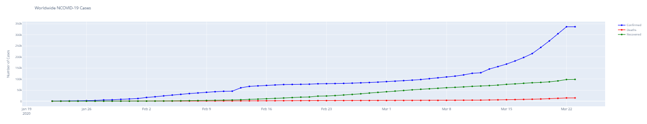
recovered = df.groupby('Date').sum()['Recovered'].reset_index()fig = go.Figure() #Plotting datewise confirmed cases fig.add_trace(go.Scatter(x=confirmed['Date'], y=confirmed['Confirmed'], mode='lines+markers', name='Confirmed',line=dict(color='blue', width=2))) fig.add_trace(go.Scatter(x=deaths['Date'], y=deaths['Deaths'], mode='lines+markers', name='Deaths', line=dict(color='Red', width=2))) fig.add_trace(go.Scatter(x=recovered['Date'], y=recovered['Recovered'], mode='lines+markers', name='Recovered', line=dict(color='Green', width=2))) fig.update_layout(title='Worldwide NCOVID-19 Cases', xaxis_tickfont_size=14,yaxis=dict(title='Number of Cases')) fig.show()
In this segment, we’re going to generate a week ahead forecast of confirmed cases of COVID-19 using Prophet, with specific prediction intervals by creating a base model both with and without tweaking of seasonality-related parameters and additional regressors.
Prophet is open source software released by Facebook’s Core Data Science team. It is available for download on CRAN and PyPI.
We use Prophet, a procedure for forecasting time series data based on an additive model where non-linear trends are fit with yearly, weekly, and daily seasonality, plus holiday effects. It works best with time series that have strong seasonal effects and several seasons of historical data. Prophet is robust to missing data and shifts in the trend, and typically handles outliers well.
Accurate and fast: Prophet is used in many applications across Facebook for producing reliable forecasts for planning and goal setting. Facebook finds it to perform better than any other approach in the majority of cases. It fit models in Stan, so that you get forecasts in just a few seconds.
Fully automatic: Get a reasonable forecast on messy data with no manual effort. Prophet is robust to outliers, missing data, and dramatic changes in your time series.
Tunable forecasts: The Prophet procedure includes many possibilities for users to tweak and adjust forecasts. You can use human-interpretable parameters to improve your forecast by adding your domain knowledge
Available in R or Python: Facebook has implemented the Prophet procedure in R and Python. Both of them share the same underlying Stan code for fitting. You can use whatever language you’re comfortable with to get forecasts.
from fbprophet import Prophet
confirmed = df.groupby('Date').sum()['Confirmed'].reset_index()
deaths = df.groupby('Date').sum()['Deaths'].reset_index()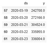
recovered = df.groupby('Date').sum()['Recovered'].reset_index()confirmed.columns = ['ds','y'] #confirmed['ds'] = confirmed['ds'].dt.date confirmed['ds'] = pd.to_datetime(confirmed['ds']) confirmed.tail()
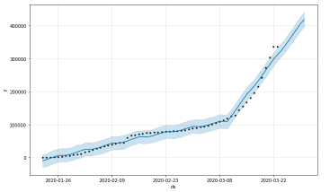
 4.1 Forecasting Confirmed COVID-19 Cases Worldwide with Prophet (Base model)
Generating a week ahead forecast of confirmed cases of COVID-19 using Prophet, with a 95% prediction interval by creating a base model with no tweaking of seasonality-related parameters and additional regressors.
m = Prophet(interval_width=0.95)
m.fit(confirmed)
future = m.make_future_dataframe(periods=7)
future.tail()
#predicting the future with date, and upper and lower limit of y value
forecast = m.predict(future)
forecast[['ds', 'yhat', 'yhat_lower', 'yhat_upper']].tail()
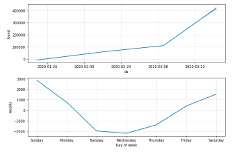
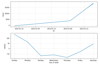
You can plot the forecast by calling the Prophet.plot method and passing in your forecast data frame.

confirmed_forecast_plot =m.plot_components(forecast)
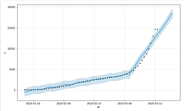
 4.2 Forecasting Worldwide Deaths using Prophet (Base model)
Generating a week ahead forecast of confirmed cases of COVID-19 using the Machine Learning library – Prophet, with 95% prediction interval by creating a base model with no tweaking of seasonality-related parameters and additional regressors.
deaths.columns = ['ds','y']
deaths['ds'] = pd.to_datetime(deaths['ds'])
m = Prophet(interval_width=0.95)
m.fit(deaths)
future = m.make_future_dataframe(periods=7)
future.tail()
forecast = m.predict(future)
forecast[['ds', 'yhat', 'yhat_lower', 'yhat_upper']].tail()
deaths_forecast_plot = m.plot(forecast)
deaths_forecast_plot = m.plot_components(forecast)
 4.3 Forecasting Worldwide Recovered Cases with Prophet (Base model)
Generating a week ahead forecast of confirmed cases of COVID-19 using Prophet, with 95% prediction interval by creating a base model with no tweaking of seasonality-related parameters and additional regressors.
recovered.columns = ['ds','y']
recovered['ds'] = pd.to_datetime(recovered['ds'])
m = Prophet(interval_width=0.95)
m.fit(recovered)
future = m.make_future_dataframe(periods=7)
future.tail()


forecast = m.predict(future)
forecast[['ds', 'yhat', 'yhat_lower', 'yhat_upper']].tail()


recovered_forecast_plot = m.plot(forecast)
recovered_forecast_plot = m.plot_components(forecast)


 Thank you for registering Join Edureka Meetup community for 100+ Free Webinars each month JOIN MEETUP GROUP