


Python Scripting Certification Training
- 15k Enrolled Learners
- Weekend
- Self Paced
(5900)


 Copy Link!
When you need to keep your user engaged to increase the stay time or session of your website, you need to add videos, images or other sources of media to keep them busy. The Bootstrap gallery is easy to construct.
In this blog, we shall see how to design:
As complicated as it sounds, all of the above examples can be created easily. Let’s get started!
If you would like to add an option of segregating your images into different categories, you’ll have to use an image filtering option.
There are three parts involved while creating a gallery:
First, create a grid row and column as necessary, then add the images. Read the comments before every line of code, to understand the code better.
<!-- Grid row →
<div class="row">
<!-- Grid column -->

<div class="col-md-12 d-flex justify-content-center mb-5">
<button type="button" class="btn btn-outline-black waves-effect filter" data-rel="all"> All </button>
<button type="button" class="btn btn-outline-black waves-effect filter" data-rel="1">Mountains</button>
<button type="button" class="btn btn-outline-black waves-effect filter" data-rel="2">Sea</button>
</div>

<!-- Grid column →
</div>

<!-- Grid row -->
<!-- Grid row →

<div class="gallery" id="gallery">
<!-- Grid column -->
<div class="mb-3 pics animation all 2">
<img class="img-fluid" src="https://mdbootstrap.com/img/Photos/Horizontal/Nature/4-col/img%20(73).jpg" alt="Card image cap">
</div>

<!-- Grid column -->
<!-- Grid column →

<div class="mb-3 pics animation all 1">
<img class="img-fluid" src="https://mdbootstrap.com/img/Photos/Vertical/mountain1.jpg" alt="Card image cap">
</div>
<!-- Grid column -->

<!-- Grid column -->
<div class="mb-3 pics animation all 1">
<img class="img-fluid" src="https://mdbootstrap.com/img/Photos/Vertical/mountain2.jpg" alt="Card image cap">
</div>

<!-- Grid column -->
<!-- Grid column →

<div class="mb-3 pics animation all 2">
<img class="img-fluid" src="https://mdbootstrap.com/img/Photos/Horizontal/Nature/4-col/img%20(35).jpg" alt="Card image cap">
</div>

<!-- Grid column -->
<!-- Grid column -->
<div class="mb-3 pics animation all 2">
<img class="img-fluid" src="https://mdbootstrap.com/img/Photos/Horizontal/Nature/4-col/img%20(18).jpg" alt="Card image cap">
</div>

<!-- Grid column -->
<!-- Grid column -->
<div class="mb-3 pics animation all 1">
<img class="img-fluid" src="https://mdbootstrap.com/img/Photos/Vertical/mountain3.jpg" alt="Card image cap">
</div>

<!-- Grid column -->

</div>

<!-- Grid row -->
.gallery
{
-webkit-column-count: 3;
-moz-column-count: 3;
column-count: 3;
-webkit-column-width: 33%;
-moz-column-width: 33%;
column-width: 33%;
}
.gallery .pics
{
-webkit-transition: all 350ms ease;
transition: all 350ms ease;
}
.gallery .animation
{
-webkit-transform: scale(1);
-ms-transform: scale(1);
transform: scale(1);
}
@media (max-width: 450px)
{
.gallery
{
-webkit-column-count: 1;
-moz-column-count: 1;
column-count: 1;
-webkit-column-width: 100%;
-moz-column-width: 100%;
column-width: 100%;
}
}

@media (max-width: 400px)
{
.btn.filter
{
padding-left: 1.1rem;
padding-right: 1.1rem;
}
}
$(function()
{
var selectedClass = "";
$(".filter").click(function()
{
selectedClass = $(this).attr("data-rel");
$("#gallery").fadeTo(100, 0.1);
$("#gallery div").not("."+selectedClass).fadeOut().removeClass('animation');
setTimeout(function()
{
$("."+selectedClass).fadeIn().addClass('animation');
$("#gallery").fadeTo(300, 1);
}, 300);
});
});
Output:
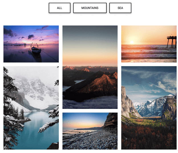
There’s an option to view “All” images, “Mountains”, or just “Sea” images.
When you click on the mountains option, this is what appears:

When you choose the sea option, this is what appears:
Next, let’s learn how to create a Lightbox image bootstrap gallery.
Lightbox is mostly used to portray a complied presentation of someone’s work. Here the “.mdb-lightbox” class is used to There are two parts involved in creating a Lightbox bootstrap gallery:
src="https://mdbootstrap.com/img/Ph<div class="row">
<div class="col-md-12">
<div id=“mdb-lightbox-ui"></div>
<div class="mdb-lightbox no-margin">
<figure class="col-md-4">
<a href="https://mdbootstrap.com/img/Photos/Horizontal/Nature/12-col/img%20(117).jpg" data-size="1600x1067">
<img alt="picture" src="https://mdbootstrap.com/img/Photos/Horizontal/Nature/4-col/img%20(117).jpg"
class="img-fluid">
</a>
</figure>

<figure class="col-md-4">
<a href="https://mdbootstrap.com/img/Photos/Horizontal/Nature/12-col/img%20(98).jpg" data-size="1600x1067">
<img alt="picture" src="https://mdbootstrap.com/img/Photos/Horizontal/Nature/4-col/img%20(98).jpg"
class="img-fluid" />
</a>
</figure>

<figure class="col-md-4">
<a href="https://mdbootstrap.com/img/Photos/Horizontal/Nature/12-col/img%20(131).jpg" data-size="1600x1067">
<img alt="picture" src="https://mdbootstrap.com/img/Photos/Horizontal/Nature/4-col/img%20(131).jpg"
class="img-fluid" />
</a>
</figure>

<figure class="col-md-4">
<a href="https://mdbootstrap.com/img/Photos/Horizontal/Nature/12-col/img%20(123).jpg" data-size="1600x1067">
<img alt="picture" otos/Horizontal/Nature/4-col/img%20(123).jpg"
class="img-fluid" />
</a>
</figure>

<figure class="col-md-4">
<a href="https://mdbootstrap.com/img/Photos/Horizontal/Nature/12-col/img%20(118).jpg" data-size="1600x1067">
<img alt="picture" src="https://mdbootstrap.com/img/Photos/Horizontal/Nature/4-col/img%20(118).jpg"
class="img-fluid" />
</a>
</figure>

<figure class="col-md-4">
<a href="https://mdbootstrap.com/img/Photos/Horizontal/Nature/12-col/img%20(128).jpg" data-size="1600x1067">
<img alt="picture" src="https://mdbootstrap.com/img/Photos/Horizontal/Nature/4-col/img%20(128).jpg"
class="img-fluid" />
</a>
</figure>

<figure class="col-md-4">
<a href="https://mdbootstrap.com/img/Photos/Horizontal/Nature/12-col/img%20(132).jpg" data-size="1600x1067">
<img alt="picture" src="https://mdbootstrap.com/img/Photos/Horizontal/Nature/4-col/img%20(132).jpg"
class="img-fluid" />
</a>
</figure>

<figure class="col-md-4">
<a href="https://mdbootstrap.com/img/Photos/Horizontal/Nature/12-col/img%20(115).jpg" data-size="1600x1067">
<img alt="picture" src="https://mdbootstrap.com/img/Photos/Horizontal/Nature/4-col/img%20(115).jpg"
class="img-fluid" />
</a>
</figure>

<figure class="col-md-4">
<a href="https://mdbootstrap.com/img/Photos/Horizontal/Nature/12-col/img%20(133).jpg" data-size="1600x1067">
<img alt="picture" src="https://mdbootstrap.com/img/Photos/Horizontal/Nature/4-col/img%20(133).jpg"
class="img-fluid" />
</a>
</figure>
</div>
</div>
</div>
</div>
// MDB Lightbox Init
$(function ()
{
$("#mdb-lightbox-ui").load("mdb-addons/mdb-lightbox-ui.html");
});
Output:
When you’re short on space on your webpage, a carousel gallery comes in handy. Multiple images can be added by occupying a small space on the site. End users can scroll through these images with the help of buttons.
Carousel gallery consists of two parts:
In the Carousel bootstrap gallery, you first create the controller(the buttons) and then create the slides as per requirement.
<!--Carousel Wrapper-->
<div id="multi-item-example" class="carousel slide carousel-multi-item carousel-multi-item-2" data-ride="carousel">
—————————————————————————————————————-
<!--Controls-->
<div class="controls-top">
<a class="black-text" href="#multi-item-example" data-slide="prev"><i class="fas fa-angle-left fa-3x pr-3"></i></a>
<a class="black-text" href="#multi-item-example" data-slide="next"><i class="fas fa-angle-right fa-3x pl-3"></i></a>
</div>
<!--/.Controls-->
—————————————————————————————————————-
<!--Slides-->
<div class="carousel-inner" role="listbox">

<!--First slide-->
<div class="carousel-item active">

<div class="col-md-3 mb-3">
<div class="card">
<img class="img-fluid" src="https://mdbootstrap.com/img/Photos/Horizontal/Nature/4-col/img%20(38).jpg"
alt="Card image cap">
</div>
</div>

<div class="col-md-3 mb-3">
<div class="card">
<img class="img-fluid" src="https://mdbootstrap.com/img/Photos/Horizontal/Nature/4-col/img%20(19).jpg"
alt="Card image cap">
</div>
</div>

<div class="col-md-3 mb-3">
<div class="card">
<img class="img-fluid" src="https://mdbootstrap.com/img/Photos/Horizontal/Nature/4-col/img%20(42).jpg"
alt="Card image cap">
</div>
</div>

<div class="col-md-3 mb-3">
<div class="card">
<img class="img-fluid" src="https://mdbootstrap.com/img/Photos/Horizontal/Nature/4-col/img%20(8).jpg"
alt="Card image cap">
</div>
</div>

</div>
<!--/.First slide-->
—————————————————————————————————————-
<!--Second slide-->
<div class="carousel-item">

<div class="col-md-3 mb-3">
<div class="card">
<img class="img-fluid" src="https://mdbootstrap.com/img/Photos/Horizontal/Nature/4-col/img%20(53).jpg"
alt="Card image cap">
</div>
</div>

<div class="col-md-3 mb-3">
<div class="card">
<img class="img-fluid" src="https://mdbootstrap.com/img/Photos/Horizontal/Nature/4-col/img%20(25).jpg"
alt="Card image cap">
</div>
</div>

<div class="col-md-3 mb-3">
<div class="card">
<img class="img-fluid" src="https://mdbootstrap.com/img/Photos/Horizontal/Nature/4-col/img%20(47).jpg"
alt="Card image cap">
</div>
</div>

<div class="col-md-3 mb-3">
<div class="card">
<img class="img-fluid" src="https://mdbootstrap.com/img/Photos/Horizontal/Nature/4-col/img%20(26).jpg"
alt="Card image cap">
</div>
</div>

</div>
<!--/.Second slide-->
—————————————————————————————————————-
<!--Third slide-->
<div class="carousel-item">

<div class="col-md-3 mb-3">
<div class="card">
<img class="img-fluid" src="https://mdbootstrap.com/img/Photos/Horizontal/Nature/4-col/img%20(64).jpg"
alt="Card image cap">
</div>
</div>

<div class="col-md-3 mb-3">
<div class="card">
<img class="img-fluid" src="https://mdbootstrap.com/img/Photos/Horizontal/Nature/4-col/img%20(51).jpg"
alt="Card image cap">
</div>
</div>

<div class="col-md-3 mb-3">
<div class="card">
<img class="img-fluid" src="https://mdbootstrap.com/img/Photos/Horizontal/Nature/4-col/img%20(59).jpg"
alt="Card image cap">
</div>
</div>

<div class="col-md-3 mb-3">
<div class="card">
<img class="img-fluid" src="https://mdbootstrap.com/img/Photos/Horizontal/Nature/4-col/img%20(63).jpg"
alt="Card image cap">
</div>
</div>

</div>
<!--/.Third slide-->
—————————————————————————————————————- </div>
<!--/.Slides-->

</div>
<!--/.Carousel Wrapper-->
Output:


With this, we have come to the end of this article. I hope you understood how gallery in bootstrap works.
Check out our Full Stack Web Developer Masters Program which comes with instructor-led live training and real-life project experience. This training makes you proficient in skills to work with back-end and front-end web technologies. It includes training on Web Development, jQuery, Angular, NodeJS, ExpressJS, and MongoDB.
Got a question for us? Please mention it in the comments section of this blog and we will get back to you.


 REGISTER FOR FREE WEBINAR
  Thank you for registering Join Edureka Meetup community for 100+ Free Webinars each month JOIN MEETUP GROUP