
Python Scripting Certification Training
- 15k Enrolled Learners
- Weekend
- Self Paced
(5900)


 Copy Link!
Bootstrap is a platform for web development based on a front-end framework. It is used to create exceptional responsive designs using HTML, and CSS. These templates are used for forms, tables, buttons, typography, models, tables, navigation, carousels and images. Bootstrap Color is used to make your background and text look aesthetically pleasing. In this blog, you will be studying:
The text bootstrap color is used to explain meaning through colors. In Bootstrap, there are multiple colors to explain to express the significance of a text. The classes of text colors are:
| Class | Description |
.text-muted | Indicates the text color in light grey. Used to mute the text. |
.text-primary | Indicates the text color in blue. Used to indicate the importance of a text |
.text-success | Indicates the text color in green. Used to indicate success |
.text-info | Indicates the text color in light blue. Used to indicate some information |
.text-warning | Indicates the text color in yellow. Used to indicate a warning |
.text-danger | Indicates the text color in red. Used to indicate danger |
.text-secondary | Indicates the text color in grey. Used to indicate secondary text |
.text-white | Indicates the text color in white |
.text-dark | Indicates the text color in dark grey |
.text-body | Indicates the text color in black. This is the default text color |
.text-light | Indicates the text color in light grey on the white background |
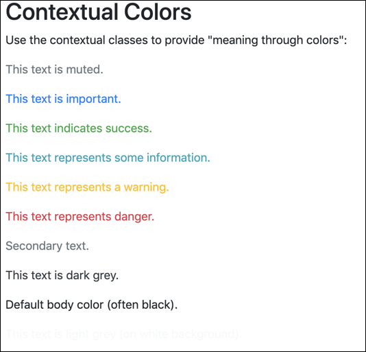
Now that we have learned about the different types of classes of bootstrap color and their meaning, let’s execute them.
Example:
<body>
<div class="container">
<h2> Contextual Colors </h2>
<p> Use the contextual classes to provide "meaning through colors”: </p>
<p class = "text-muted"> This text is muted. </p>
<p class = "text-primary" > This text is important. </p>
<p class = "text-success"> This text indicates success. </p>
<p class = "text-info"> This text represents some information. </p>
<p class = "text-warning"> This text represents a warning. </p>
<p class = "text-danger"> This text represents danger. </p>
<p class = "text-secondary"> Secondary text. </p>
<p class = "text-dark"> This text is dark grey. </p>
<p class = "text-body"> Default body color (often black). </p>
<p class = "text-light" > This text is light grey (on white background). </p>
<p class = "text-white"> This text is white (on white background). </p>
</div>
</body>
Output:
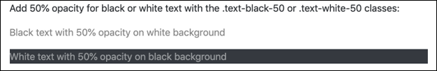
In addition to that, you can also add 50% opacity using the “.text-black-50” or “.text-white-50” classes.
For Example:
<body>
<div class = "container">
<p> Add 50% opacity for black or white text with the .text-black-50 or .text-white-50 classes: </p>
<p class = "text-black-50"> Black text with 50% opacity on white background </p>
<p class = "text-white-50 bg-dark"> White text with 50% opacity on black background </p>
</div>
</body>
Output:
The background-colors classes that can be used are:
| Class | Description |
.bg-primary | Highlights the important text in ink blue |
.bg-success | Highlight the success text in green |
.bg-info | Highlights the infomation in light blue |
.bg-warning | Highlights the warning text in yellow |
.bg-red | Highlights the danger text in red |
.bg-secondary | Highlights the secondary text in grey |
.bg-dark | Highlights the text in grey |
.bbg-lights | Highlights the text in light grey |
Example:
<body>
<div class="container">
<p> Use the contextual background classes to provide " meaning through colors". </p>
<p> Note that you can also add a .text - * class if you want a different text color: </p>
<p class = "bg-primary text-white"> This text is important. </p>
<p class = "bg-success text-white"> This text indicates success. </p>
<p class = "bg-info text-white"> This text represents some information. </p>
<p class = "bg-warning text-white"> This text represents a warning. </p>
<p class = "bg-danger text-white"> This text represents danger. </p>
<p class = "bg-secondary text-white"> Secondary background color. </p>
<p class = "bg-dark text-white"> Dark grey background color. </p>
<p class = "bg-light text-dark"> Light grey background color. </p>
</div>
</body>
Output:

With this, we have come to the end of this article. I hope you understand how bootstrap color is used to style.
Check out our Full Stack Developer Training which comes with instructor-led live training and real-life project experience. This training will make you proficient in skills to work with back-end and front-end web technologies. It includes training on Web Development, jQuery, Angular, NodeJS, ExpressJS, and MongoDB.
Got a question for us? Please mention it in the comments section of the “Bootstrap Color” blog and we will get back to you.


 REGISTER FOR FREE WEBINAR
  Thank you for registering Join Edureka Meetup community for 100+ Free Webinars each month JOIN MEETUP GROUP