


Python Scripting Certification Training
- 15k Enrolled Learners
- Weekend
- Self Paced
(5900)


 Copy Link!
Bootstrap is a platform for web development based on a front-end framework. It is used to create exceptional responsive designs using HTML, and CSS. These templates are used for forms, tables, buttons, typography, models, tables, navigation, carousels and images. Buttons are an integral part of a website and application. In this article, we will learn about different types of bootstrap button in the following sequence:
Buttons are used for various purposes. You can submit or reset an HTML form, perform interactive actions such as showing or hiding something on a web page on click of the button, redirecting the user to another page, etc. Bootstrap provides a quick and easy way to create and customize the buttons.
There are different actions that can be performed using the buttons. Let’s move on and get into the depth of bootstrap buttons and their different activities.
Different classes are available in Bootstrap for styling the buttons. Also, they indicate different states or semantic. Button styles can be applied to any element. However, it is applied normally to the <a>, <input>, and <button> elements for the best rendering. To achieve the styles, Bootstrap has classes such as .btn, .btn-default, .btn-primary, .btn-success, .btn-info, .btn-warning, .btn-danger, .btn-link.
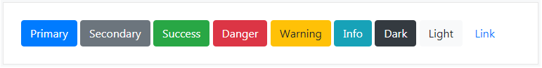
Here is an example to show you how to create different styles of buttons in Bootstrap:
<button type="button" class="btn btn-primary">Primary</button>
<button type="button" class="btn btn-secondary">Secondary</button>
<button type="button" class="btn btn-success">Success</button>
<button type="button" class="btn btn-danger">Danger</button>
<button type="button" class="btn btn-warning">Warning</button>
<button type="button" class="btn btn-info">Info</button>
<button type="button" class="btn btn-dark">Dark</button>
<button type="button" class="btn btn-light">Light</button>
<button type="button" class="btn btn-link">Link</button>
Output:
You can scale a button up or down with the help of bootstrap. Thus, you can make buttons larger or smaller through adding an extra class .btn-lg or .btn-sm.
Let’s take an example and see how it works:
<button type="button" class="btn btn-primary btn-lg">Large</button>
<button type="button" class="btn btn-primary">Default</button>
<button type="button" class="btn btn-primary btn-sm">Small</button>
Output:
The outline buttons are a different way of styling them. You can also create outline buttons by replacing the button modifier classes.
Here is an example to show how the outline buttons work:
<button type="button" class="btn btn-outline-primary">Primary</button>
<button type="button" class="btn btn-outline-secondary">Secondary</button>
<button type="button" class="btn btn-outline-success">Success</button>
<button type="button" class="btn btn-outline-danger">Danger</button>
<button type="button" class="btn btn-outline-warning">Warning</button>
<button type="button" class="btn btn-outline-info">Info</button>
<button type="button" class="btn btn-outline-dark">Dark</button>
<button type="button" class="btn btn-outline-light">Light</button>
Output:
We might need to disable a button for a certain reason. For example, a user in case is not eligible to perform this particular action, or we want to ensure that user should performed all other required actions before proceed to this particular action.
Let’s take an example and see how to disable the buttons:
<button type="button" class="btn btn-primary btn-lg" disabled>Primary button</button>
<button type="button" class="btn btn-secondary btn-lg" disabled>Button</button>
Output:

You can also disable buttons created through <a> tag by adding the class .disabled
<a href="#" class="btn btn-primary btn-lg disabled">Primary link</a>
<a href="#" class="btn btn-secondary btn-lg disabled">Link</a>
Output:
You can use the class .active to force the buttons look like active or pressed. Usually you don’t need to add this class to the buttons, as their active state is automatically styled by the Bootstrap using CSS :active pseudo-class.
Here is an example to activate the buttons:
<a href="#" class="btn btn-primary btn-lg active" role="button" aria-pressed="true">Primary link</a>
<a href="#" class="btn btn-secondary btn-lg active" role="button" aria-pressed="true">Link</a>
Output:

These were the different types of Bootstrap Buttons. With this, we have come to the end of this article. I hope you understood how you can style the buttons differently according to your needs.
Check out our Full Stack Web Developer Masters Program which comes with instructor-led live training and real-life project experience. This training makes you proficient in skills to work with back-end and front-end web technologies. It includes training on Web Development, jQuery, Angular, NodeJS, ExpressJS, and MongoDB.
Got a question for us? Please mention it in the comments section of the “Bootstrap Button” blog and we will get back to you.


 REGISTER FOR FREE WEBINAR
  Thank you for registering Join Edureka Meetup community for 100+ Free Webinars each month JOIN MEETUP GROUP